これは何
あるGitHub Organizationの去年1年間のコミット数を、週単位で集計してグラフにする方法。
忙しかった時期とかが見えて面白いかもしれん。
リポジトリのアクティビティはInsightsから簡単に見れるが、Organization単位のInsightsはGitHub Enterprise Cloudでしか見れないらしいので、Pythonでサクッと書いてみた。
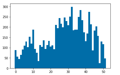
例
こんな感じのグラフが得られるぞい。x軸が週、y軸がコミット数。
やり方
依存パッケージを入れて↓のコードを実行するだけ。ローカルで普通に実行してもよし、jupyter notebookでもよし、Colaboratoryでもよし。
GitHub APIの仕様的に初回の実行はかなり遅い。
import isoweek
import datetime
import matplotlib.pyplot as plt
from github import Github
from operator import add

# See: https://pygithub.readthedocs.io/en/latest/introduction.html
g = Github("{ユーザー名}", "{パスワード}")
# For GitHub Enterprise
# g = Github(base_url="https://{hostname}/api/v3", login_or_token="{access_token}")

weeks = isoweek.Week.last_week_of_year(datetime.datetime.now().year - 1).week
stat = [0] * weeks

for repo in g.get_organization("{organization名}").get_repos():
    activity = repo.get_stats_commit_activity()
    if activity is not None:
        activity_per_week = [x.total for x in activity]
        stats = list(map(add, stat, activity_per_week))

x = list(range(weeks))
plt.bar(x, stats, width=1.0)
plt.show()
補足
ちょっと修正すれば日単位にもできるゾ。totalを取っているところを変えればいいはず。
参考: GitHub Statistics API
コミット数じゃなくて、Code frequency的な感じで差分のLOCまで分かると面白そうなので、誰かやってほしい。