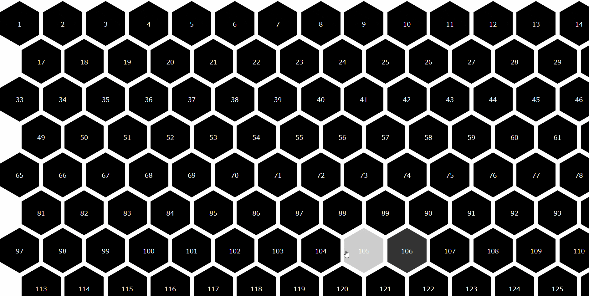
作ったもの
参考にしたサイト
See the Pen CSS Hexagon Grid by Eric Cornelissen (@ericornelissen) on CodePen.
- 基本的に上記のコードを使ってます.
作り方
コードは,Vue CLI で作られる App.vue に全部書いてます.
最終的な App.vue は以下の通り
App.vue
<template>
  <div id="hexagonA-container">
    <div v-for = "i in 150" v-bind:key="i.id" class = "hexagonA">
      <span>{{ i }}</span>
    </div>
  </div>
</template>

<script>
export default {
  data(){
    return{
    }
  }
};
</script>

<style lang="scss" scoped>
# app {
  font-family: "Avenir", Helvetica, Arial, sans-serif;
  -webkit-font-smoothing: antialiased;
  -moz-osx-font-smoothing: grayscale;
  text-align: center;
  color: #2c3e50;
}

$hex-width: 100px;
$hex-between: 10px;

/* Other hexagon dimentions */
// どれが,hexのどの長さに対応するかを理解すること
$hex-height: $hex-width / 1.73 /* sqrt(3) */;
$hex-margin: $hex-width / 2;
$hex-border: $hex-margin / 1.73 /* sqrt(3) */;
$hex-transition: all .2s ease;

/* Colors */
$color-hex-default: #000000;
$color-hex-hover:   #FFFFFF;
$color-sass:        #CC6699;

# hexagonA-container {
  display: grid;
  grid-template-columns: $hex-width $hex-width $hex-width $hex-width $hex-width $hex-width $hex-width $hex-width $hex-width $hex-width $hex-width $hex-width $hex-width $hex-width $hex-width $hex-width;
  grid-auto-rows: $hex-height + $hex-border;
  grid-gap: $hex-between $hex-between;
  padding-bottom: $hex-border;
}

.hexagonA {
  align-items: center;  //センターに配置?http://www.htmq.com/css/align-items.shtml
  background-color: $color-hex-default;
  cursor: pointer;  //リンクカーソル
  display: flex;  //要素が並列になる? https://mamewaza.com/support/blog/howto-use-flex.html
  fill: white;
  height: $hex-height;
  justify-content: center;  //https://developer.mozilla.org/ja/docs/Web/CSS/justify-content
  margin: $hex-border 0;
  position: relative;
  transition: $hex-transition;
  width: $hex-width;
}
.hexagonA span {
  width: 100%;
  height: $hex-height * 0.9;
  line-height: $hex-height;
  color: rgb(255, 255, 255);
  text-align: center;
  display: block;
  position: relative;
  z-index: 1;
}

.hexagonA:after,
.hexagonA:before{
  // border-left,border-rightは三角形の横幅
  border-left: $hex-margin solid transparent;
  border-right: $hex-margin solid transparent;
  content: "";
  left: 0;
  position: absolute;
  transition: $hex-transition;
  width: 0;
}
.hexagonA:after {
  //border-topは三角形の縦幅
  border-top: $hex-border solid $color-hex-default;
  top: 100%;
  width: 0;
}
.hexagonA:before {
  border-bottom: $hex-border solid $color-hex-default;
  bottom: 100%;
}
.hexagonA:hover {
  background-color: $color-hex-hover;
}
.hexagonA:hover:after,
.hexagonA:hover:before {
  border-top-color: $color-hex-hover;
  border-bottom-color: $color-hex-hover;
}
// https://developer.mozilla.org/ja/docs/Web/CSS/:nth-child
.hexagonA:nth-child(32n + 17),
.hexagonA:nth-child(32n + 18),
.hexagonA:nth-child(32n + 19),
.hexagonA:nth-child(32n + 20),
.hexagonA:nth-child(32n + 21),
.hexagonA:nth-child(32n + 22),
.hexagonA:nth-child(32n + 23),
.hexagonA:nth-child(32n + 24),
.hexagonA:nth-child(32n + 25),
.hexagonA:nth-child(32n + 26),
.hexagonA:nth-child(32n + 27),
.hexagonA:nth-child(32n + 28),
.hexagonA:nth-child(32n + 29),
.hexagonA:nth-child(32n + 30),
.hexagonA:nth-child(32n + 31),
.hexagonA:nth-child(32n + 32) {
  margin-left: $hex-width / 2 + $hex-between / 2;
}
</style>
多分,余計なコードも交じってます.
六角形の作り方
.hexagonA {
  align-items: center;  //センターに配置?http://www.htmq.com/css/align-items.shtml
  background-color: $color-hex-default;
  cursor: pointer;  //リンクカーソル
  display: flex;  //要素が並列になる? https://mamewaza.com/support/blog/howto-use-flex.html
  fill: white;
  height: $hex-height;
  justify-content: center;  //https://developer.mozilla.org/ja/docs/Web/CSS/justify-content
  margin: $hex-border 0;
  position: relative;
  transition: $hex-transition;
  width: $hex-width;
}
.hexagonA:after,
.hexagonA:before{
  // border-left,border-rightは三角形の横幅
  border-left: $hex-margin solid transparent;
  border-right: $hex-margin solid transparent;
  content: "";
  left: 0;
  position: absolute;
  transition: $hex-transition;
  width: 0;
}
.hexagonA:after {
  //border-topは三角形の縦幅
  border-top: $hex-border solid $color-hex-default;
  top: 100%;
  width: 0;
}
.hexagonA:before {
  border-bottom: $hex-border solid $color-hex-default;
  bottom: 100%;
}
うまいこと四角と三角を組み合わせてる?
以下の記事のコップを作るところ辺りを参考に
参考:[CSSアニメーション]●●●CSSでタピオカ作ってふわふわ浮かせる●●● - Qiita
六角形の配置決め
# hexagonA-container {
  display: grid;
  grid-template-columns: $hex-width $hex-width $hex-width $hex-width $hex-width $hex-width $hex-width $hex-width $hex-width $hex-width $hex-width $hex-width $hex-width $hex-width $hex-width $hex-width;
  grid-auto-rows: $hex-height + $hex-border;
  grid-gap: $hex-between $hex-between;
  padding-bottom: $hex-border;
}
ここと
.hexagonA:nth-child(32n + 17),
.hexagonA:nth-child(32n + 18),
.hexagonA:nth-child(32n + 19),
.hexagonA:nth-child(32n + 20),
.hexagonA:nth-child(32n + 21),
.hexagonA:nth-child(32n + 22),
.hexagonA:nth-child(32n + 23),
.hexagonA:nth-child(32n + 24),
.hexagonA:nth-child(32n + 25),
.hexagonA:nth-child(32n + 26),
.hexagonA:nth-child(32n + 27),
.hexagonA:nth-child(32n + 28),
.hexagonA:nth-child(32n + 29),
.hexagonA:nth-child(32n + 30),
.hexagonA:nth-child(32n + 31),
.hexagonA:nth-child(32n + 32) {
  margin-left: $hex-width / 2 + $hex-between / 2;
}
ここ
参考:CSS Grid Layout を極める! - Qiita
参考:MDN web docs :nth-child()
この辺を参考にしながら,強引に配置
もっとうまい方法がある気がしてる.
教えてください.
六角形を配置
<div id="hexagonA-container">
  <div v-for = "i in 150" v-bind:key="i.id" class = "hexagonA">
    <span>{{ i }}</span>
  </div>
</div>
Vueっぽいことしてるの,ここだけな気がする
公式リファレンスをどうぞ
感想
特に何かに使うわけでもないですが,作ってみました.
もっと効率のいい方法がありそう……
アドバイス等あればぜひ!!