気象庁のデータを読み出し、データを整形し、matplotlibで表示する。
気象庁のデータを読みだし、データを整形するまでは前回の記事に書いた通りです。
前回の記事
# ave
temperature_ave.iloc[:, 0]
for i in range(0, 12):
    plt.plot(temperature_ave.iloc[:, i], '-o', label=i+1, color=cm.hsv(i/12.0))

plt.xlabel("year")
plt.ylabel("temperature(ave)")
plt.grid(True)
plt.legend(bbox_to_anchor=(1.05, 1), loc='upper left', borderaxespad=0.)
plt.show
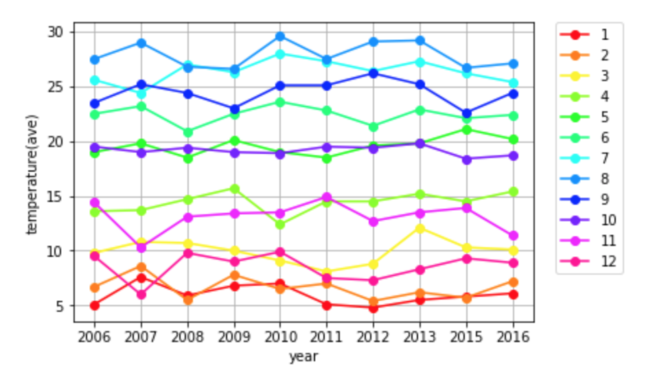
表示すると上記のようになります。
plt.grid(True)によりグリッド表示をします。
plt.legend(bbox_to_anchor=(1.05, 1), loc='upper left', borderaxespad=0.)により凡例を外部に表示します。
plt.plot('-o', color=cm.hsv(i/12.0))によりグラフのカラーを設定し、グラフの種類を決定します。
これにより上記のようなグラフが完成します。
参考サイト
https://qiita.com/ti-ginkgo/items/881ebf7d8ea0776d83ab
https://matplotlib.org/users/legend_guide.html