ios-chartsは、iOSでグラフを描画するためのライブラリです。
https://github.com/danielgindi/Charts
Xcode8、Swift3に対応した記事がなかったのでメモを記します。
プロジェクトの作成手順
Xcodeで適当にプロジェクトを作成します。
$ cd $(Your Xcode project)
Cartfileを作成します。CocoaPodsでは上手くできませんでした。
$ vi Cartfile
Cartfile
github "danielgindi/Charts" == 3.0.0
Carthageを実行します。
$ carthage update --platform iOS
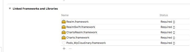
XcodeからプロジェクトのTARGETSを選択し、General > Linked Frameworks and Libraries から、+をクリックします。
Add Other... をクリックし、$(Your Xcode project)/Carthage/Build/iOSフォルダにある*.frameworkを選択します。
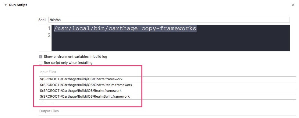
Build Phases から、+をクリックし、New Run Script Phase を選択します。
Shellに下記のコマンドを設定し、Input Filesにframeworkを指定します。
/usr/local/bin/carthage copy-frameworks
以上でライブラリの設定は完了です。
次に、ストーリーボードで、UIViewを配置します。
Custom ClassのClassにBarChartView、ModuleにChartsを指定します。
アウトレットを作成します。ここにグラフを描画します。
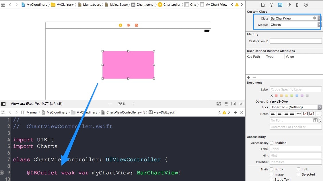
ViewControllerに下記のコードを記述します。
ViewController.swift
//
// ChartViewController.swift
import UIKit
import Charts
class ChartViewController: UIViewController {
// ここに棒グラフを描きます
@IBOutlet weak var myChartView: BarChartView!
override func viewDidLoad() {
super.viewDidLoad()
// y軸のプロットデータ
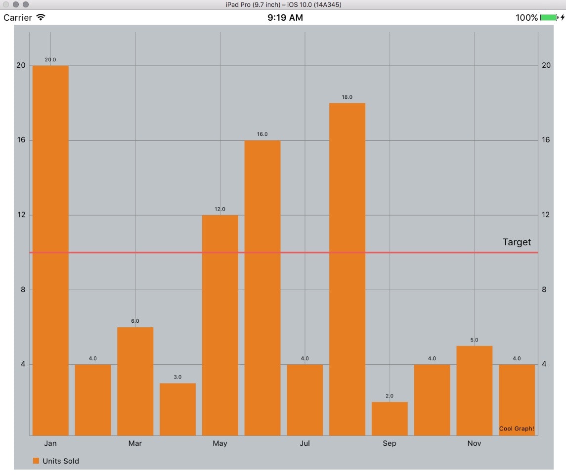
let unitsSold = [20.0, 4.0, 6.0, 3.0, 12.0, 16.0, 4.0, 18.0, 2.0, 4.0, 5.0, 4.0]
setChart(y: unitsSold)
}
func setChart(y: [Double]) {
// プロットデータ(y軸)を保持する配列
var dataEntries = [BarChartDataEntry]()
for (i, val) in y.enumerated() {
let dataEntry = BarChartDataEntry(x: Double(i), y: val) // X軸データは、0,1,2,...
dataEntries.append(dataEntry)
}
// グラフをUIViewにセット
let chartDataSet = BarChartDataSet(values: dataEntries, label: "Units Sold")
myChartView.data = BarChartData(dataSet: chartDataSet)
// X軸のラベルを設定
let xaxis = XAxis()
xaxis.valueFormatter = BarChartFormatter()
myChartView.xAxis.valueFormatter = xaxis.valueFormatter
// x軸のラベルをボトムに表示
myChartView.xAxis.labelPosition = .bottom
// グラフの色
chartDataSet.colors = [UIColor(red: 230/255, green: 126/255, blue: 34/255, alpha: 1)]
// グラフの背景色
myChartView.backgroundColor = UIColor(red: 189/255, green: 195/255, blue: 199/255, alpha: 1)
// グラフの棒をニョキッとアニメーションさせる
myChartView.animate(xAxisDuration: 2.0, yAxisDuration: 2.0)
// 横に赤いボーダーラインを描く
let ll = ChartLimitLine(limit: 10.0, label: "Target")
myChartView.rightAxis.addLimitLine(ll)
// グラフのタイトル
myChartView.chartDescription?.text = "Cool Graph!"
}
}
public class BarChartFormatter: NSObject, IAxisValueFormatter{
// x軸のラベル
var months: [String]! = ["Jan", "Feb", "Mar", "Apr", "May", "Jun", "Jul", "Aug", "Sep", "Oct", "Nov", "Dec"]
// デリゲート。TableViewのcellForRowAtで、indexで渡されたセルをレンダリングするのに似てる。
public func stringForValue(_ value: Double, axis: AxisBase?) -> String {
// 0 -> Jan, 1 -> Feb...
return months[Int(value)]
}
}
実行結果