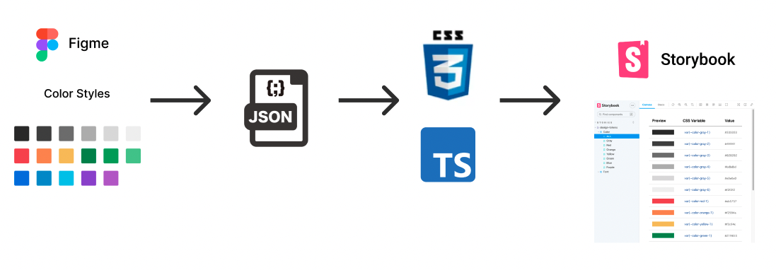
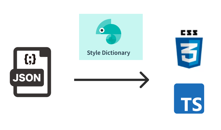
「デザイン -> 開発」のつなぎとして、デザインファイルのデザイントークンを JSON ファイルに変換、さらに CSS / TypeScript へ変換、Storybook でプレビューまでやってみたので解説。
特に JSON から CSS / TypeScript に変換する際の、Style Dictionary でのカスタマイズ設定は厚めに記載しています。
作ったもの
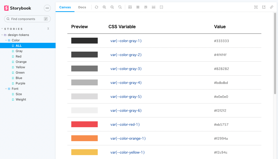
▷ Storybook:デザイントークンのプレビューを作成しました。
▷ コード:Style Dictionary でのカスタマイズ設定などご参考までに。
使用技術
- Figma:効率よく UI 設計やプロトタイプ作成が可能。個人的にコンポーネント駆動開発と相性◎
- Design Tokens:Figma で登録したデザイントークンを JSON ファイルとして出力できる Figma プラグイン
- Style Dictionary:JSON 形式のデザイントークンを css / ios / javascript など様々なプラットフォームで扱えるよう変換。
- Storybook:コンポーネント駆動開発ツール。アプリとは別の独立環境でコンポーネントごとに挙動確認できる。
Figma のデザイントークンを JSON ファイルへ変換する
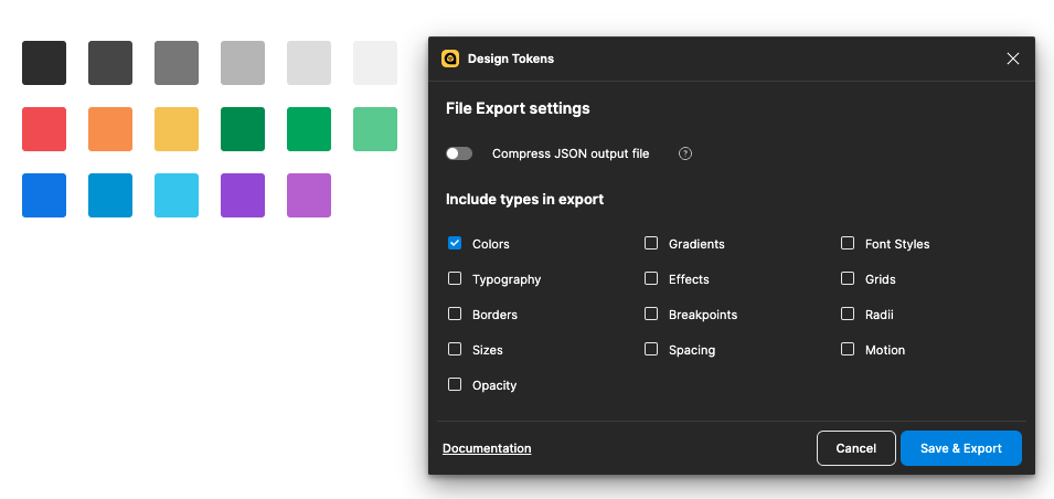
Figma プラグインの「Design Tokens」を用いて、登録したカラースタイルを JSON ファイルとして出力します。
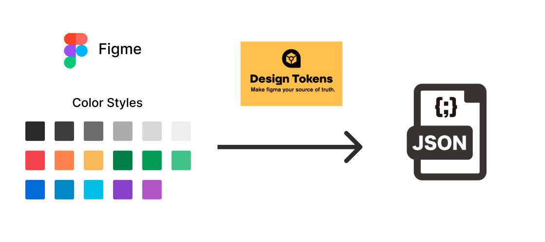
今回はカラースタイルが対象なので、「Colors」を選択して「Save & Export」から JSON ファイルを出力します。
実際に出力された JSON ファイルはこちら
Style Dictionary で JSON ファイルを CSS / TypeScript へ変換する
「Style Dictionary」を用いて、デザイントークンを CSS / TypeScript で扱えるように変換します。
Style Dictionary の設定に関する記載が長くなってしまったので、下記からご興味あるものを参照ください。
インストール
Style Dictionary - Installation
Create React App を用いてプロジェクト作成し、dev dependency としてインストールします。
$ npx create-react-app my-app --template typescript
$ npm install -D style-dictionary
また、公式で提供されている Basic サンプル を
下記コマンドでプロジェクトに取り込むことができます。
  "scripts": {
+   "style-dictionary:init": "style-dictionary init basic"
  }
$ npm run style-dictionary:init
CSS / TypeScript 変換設定
Basic サンプルでは、scss / ios / android など様々なプラットフォームに変換されていました。
こちらの設定は、config.jsonにて行われています。
今回は、CSS / TypeScript に変換したいのでドキュメントを参照しながらconfig.jsonを修正します。
- Style Dictionary - Platform
- Style Dictionary - Transform Groups
- Style Dictionary - Pre-defined Formats
{
"source": ["tokens/**/*.json"],
"platforms": {
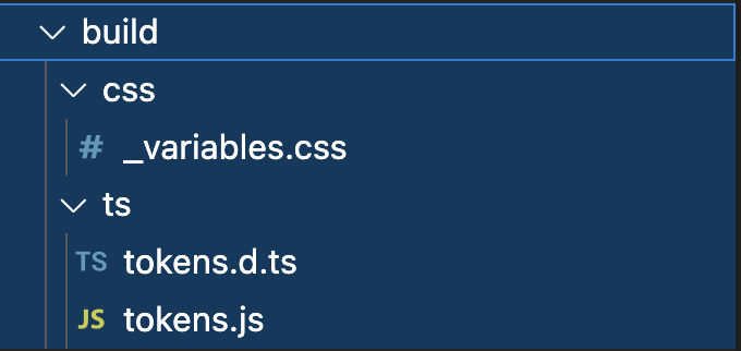
"css": {
"transformGroup": "css",
"buildPath": "build/css/",
"files": [
{
"destination": "_variables.css",
"format": "css/variables"
}
]
},
"typescript": {
"transformGroup": "js",
"buildPath": "build/ts/",
"files": [
{
"format": "javascript/module",
"destination": "tokens.js"
},
{
"format": "typescript/module-declarations",
"destination": "tokens.d.ts"
}
]
}
}
}
  "scripts": {
+   "style-dictionary:build": "style-dictionary build"
  }
$ npm run style-dictionary:build
ビルドコマンドを実行して、CSS / TypeScript ファイルが出力されることを確認します。
詳細な変換設定(命名規則や単位など / 独自の型定義)
命名規則や単位などの設定
Style Dicitonary - Transform groups - js を参照すると、詳細な変換設定は「attribute/cti name/cti/pascal size/rem color/hex」となっています。
今回は名前をケバブケースに変換してほしいので「name/cti/pascal -> name/cti/kebab」に修正します。
Style Dicitonary - Transforms を参照し、config.jsonを下記のように修正しました。
    "typescript": {
-      "transformGroup": "js",
+      "transforms": [
+        "attribute/cti",
+        "name/cti/kebab",
+        "size/rem",
+        "color/hex"
+      ],
      "buildPath": "build/ts/",
      "files": [
        {
          "format": "javascript/module",
          "destination": "tokens.js"
        },
        {
          "format": "typescript/module-declarations",
          "destination": "tokens.d.ts"
        }
      ]
    }
ビルドコマンドを実行すると、出力される名前が修正されたことが確認できます。
module.exports = {
  "color": {
    "base": {
      "gray": {
        "light": {
          "value": "#cccccc",
-          "name": "ColorBaseGrayLight",
+          "name": "color-base-gray-light",
また他も同様に、サイズをpx単位で取得した場合は「size/rem -> size/px」と修正することで設定できます。
独自の型定義の設定
Style Dicitonary - Pre-defined Transforms - typescript/module-declarations
既存の変換設定では 100% 正確な型が生成されることが出来ません。
As you can see above example output this does not generate 100% accurate d.ts. This is a compromise between of what style-dictionary can do to help and not bloating the library with rarely used dependencies.
例として、カラートークンの用途を説明するdescriptionプロパティが存在しても、生成される型には反映されません。
{
  "color": {
    "base": {
      "red": { "value": "#FF0000", "description": "ブランドカラーです。" },
    }
  }
}
// `description`プロパティ反映されていない
declare interface DesignToken {
  value: any;
  name?: string;
  comment?: string;
  themeable?: boolean;
  attributes?: {
    category?: string;
    type?: string;
    item?: string;
    subitem?: string;
    state?: string;
    [key: string]: any;
  };
  [key: string]: any;
}
回避策として、自前の型定義ファイルを参照するフォーマットを作成します。
はじめに、descriptionプロパティを含むよう修正した型定義を作成します。
interface DesignToken {
  value: any;
  name?: string;
  comment?: string;
  description?: string; // プロパティの追加
  themeable?: boolean;
  attributes?: {
    category?: string;
    type?: string;
    item?: string;
    subitem?: string;
    state?: string;
    [key: string]: any;
  };
  [key: string]: any;
}

// 型定義のエクスポート
export { DesignToken };
export interface DesignTokens {
  [key: string]: DesignTokens | DesignToken;
}
次に、既存の typescript/module-declarations の実装をベースに、型定義ファイルを指定する箇所で自前の型定義ファイルを参照するフォーマットを作成します。
また、カスタマイズするためにconfig.jsonからconfig.jsへ置換しています。
StyleDictionaryPackage.registerFormat({
-  name: "typescript/module-declarations",
+  name: "typescript/custom-module-declarations",

   ...

    const designTokenInterface = fs.readFileSync(
-      path.resolve(__dirname, `../../types/DesignToken.d.ts`), {encoding:'UTF-8'}
+      path.resolve(__dirname, `./CustomDesignToken.d.ts`),
      { encoding: "UTF-8" }
    );

   ...

});

module.exports = {
  source: ["tokens/**/**.json"],
  platforms: {
    javascript: {
      files: [
        {
          format: "javascript/module",
          destination: "tokens.js",
        },
        {
-          format: "typescript/module-declarations",
+          format: "typescript/custom-module-declarations",
          destination: "tokens.d.ts",
        },
      ],
    },
  },
};
ビルドコマンドを実行すると、独自の型定義が反映されていることが確認できます。
declare interface DesignToken {
  value: any;
  name?: string;
  comment?: string;
+  description?: string;
  themeable?: boolean;
  attributes?: {
    category?: string;
    type?: string;
    item?: string;
    subitem?: string;
    state?: string;
    [key: string]: any;
  };
  [key: string]: any;
}

+ export { DesignToken };
+ export interface DesignTokens {
+  [key: string]: DesignTokens | DesignToken;
+  }
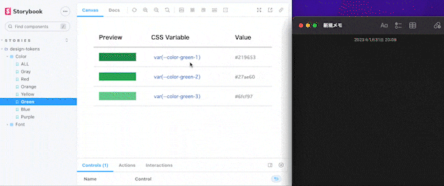
CSS / TypeScript から Storybook に落とし込む
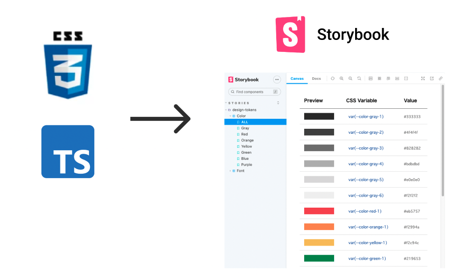
Story の実装にあたっては、デザイナー視点では「デザイントークンが再現されているか」、エンジニア視点では「用意されているデザイントークンは何があるか」「デザイントークンの名前は?」を意識し確認できるようにしています。
特に、開発を進めるうえで「デザイントークンの名前」は頻繁に使用するため、コピー可能なテキストとして実装しました。
まとめ
- デザイントークンの JSON 形式と、Style Dictionary が期待する JSON 形式が異なる場合、Style Dictionary カスタマイズ設定でフォローしてあげる
- メンテナンス性を向上させるために、Figma の更新と Storybook への反映を同期させる仕組みが必要
- ブランディングを意識したデザインシステム構築 / 運用に適していそう