はじめに
HTML/CSSでレイアウトを組むうえで、今や必須とも言えるのが Flexbox(フレックスボックス)。
本記事では、Flexboxの基本プロパティと、実務でよく使われるレイアウトパターンを備忘録としてまとめておきます。
①Flexboxとは?
CSSの display: flex を使って、要素を横並び・縦並び・中央揃え・スペース調整など、柔軟にレイアウトできる仕組みです。
②基本の書き方
.container {
  display: flex;
}
これだけで、.container の中の要素(子要素)は 横並びになります!
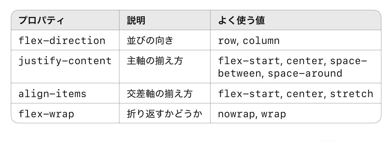
③よく使うプロパティまとめ(親要素)
④よく使うプロパティまとめ(子要素)

⑤実務でよく使うレイアウトパターン
パターン1: 横並びで中央揃え
.container {
  display: flex;
  justify-content: center;
  align-items: center;
}
使いどころ: ナビゲーション、ボタン、画像+テキストのセンター表示など
パターン2:左右に2つを分ける(space-between)
.container {
  display: flex;
  justify-content: space-between;
  align-items: center;
}
使いどころ: ヘッダーのロゴとメニュー、価格表のラベルと値 など
パターン3:縦並び(column)で上下中央揃え
.container {
  display: flex;
  flex-direction: column;
  justify-content: center;
  align-items: center;
}
使いどころ: ログイン画面、フォーム中心揃え など
パターン4:折り返し可能なアイテム一覧(レスポンシブ対応)
.container {
  display: flex;
  flex-wrap: wrap;
  gap: 16px;
}
.item {
  width: 48%;
}
使いどころ: 商品一覧、画像ギャラリー、カード型UIなど
パターン5:要素が余白を埋めるように伸びる(flex: 1)
.container {
  display: flex;
}
.item {
  flex: 1;
}
使いどころ: 均等なカラム割り、ボタンを等間隔で並べたいとき
⑥よくあるトラブルと対処法

⑦まとめ
-
Flexboxは、現代のWebレイアウトの基本技術
-
覚えるべきは親要素(container)のプロパティが中心
-
よく使うパターンを「手癖レベル」で覚えておくと、実務で超便利!