Python データ分析 テンプレ
kaggleに取り組んでいると、データを分析して自分から特徴量を作り出す必要がある。
その際の、グラフを用いてデータ分析をする。
この記事では、データ分析を目的として、グラフを作成するテンプレを載せる。
使用ライブラリ
import numpy as np
import pandas as pd

import matplotlib.pyplot as plt
import matplotlib as mpl
import seaborn as sns
相関の観察
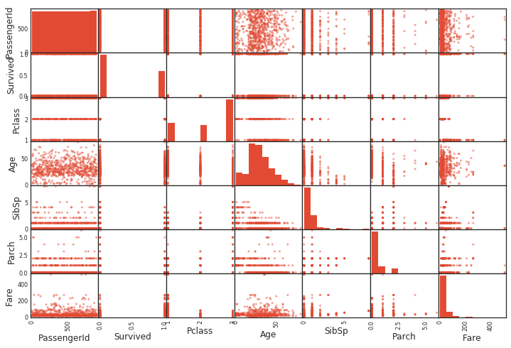
全ての変数間の散布図
pandasを使えば、一発で散布図が出る。
同じ変数同士では、ヒストグラムを描いてる。(同じ変数同士では直線になあるだけなので)
from pandas.plotting import scatter_matrix
scatter_matrix(df)
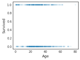
散布図
また、特定の変数同士の散布図は、以下のようにして簡単に作成可能
df.plot(kind='scatter',x='Age',y='Survived',alpha=0.1,figsize=(4,3))
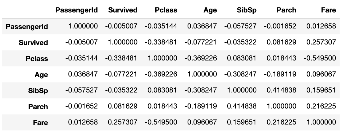
相関係数の算出
相関係数
Pearsonの相関係数をcorr()で一発で表示できる。すごく便利。
data1.corr()
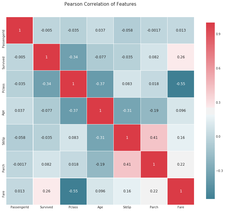
相関係数のヒートマップ
def correlation_heatmap(df):
    _ , ax = plt.subplots(figsize =(14, 12))
    colormap = sns.diverging_palette(220, 10, as_cmap = True)

    _ = sns.heatmap(
        df.corr(),
        cmap = colormap,
        square=True,
        cbar_kws={'shrink':.9 },
        ax=ax,
        annot=True,
        linewidths=0.1,vmax=1.0, linecolor='white',
        annot_kws={'fontsize':12 }
    )

    plt.title('Pearson Correlation of Features', y=1.05, size=15)

correlation_heatmap(data1)
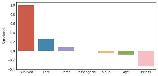
目的変数に関する相関係数
corr_matrix = data1.corr()
fig,ax=plt.subplots(figsize=(15,6))
y=pd.DataFrame(corr_matrix['Survived'].sort_values(ascending=False))
sns.barplot(x = y.index,y='Survived',data=y)
plt.tick_params(labelsize=10)
ヒストグラム
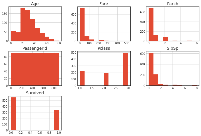
全変数のヒストグラム
hist() で一発で出せる。
df.hist()
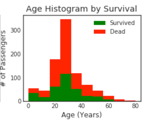
ヒストグラムを重ねる
plt.figure(figsize=[8,6])

plt.subplot(222)
plt.hist(x = [data1[data1['Survived']==1]['Age'], data1[data1['Survived']==0]['Age']], stacked=True, color = ['g','r'],label = ['Survived','Dead'])
plt.title('Age Histogram by Survival')
plt.xlabel('Age (Years)')
plt.ylabel('# of Passengers')
plt.legend()
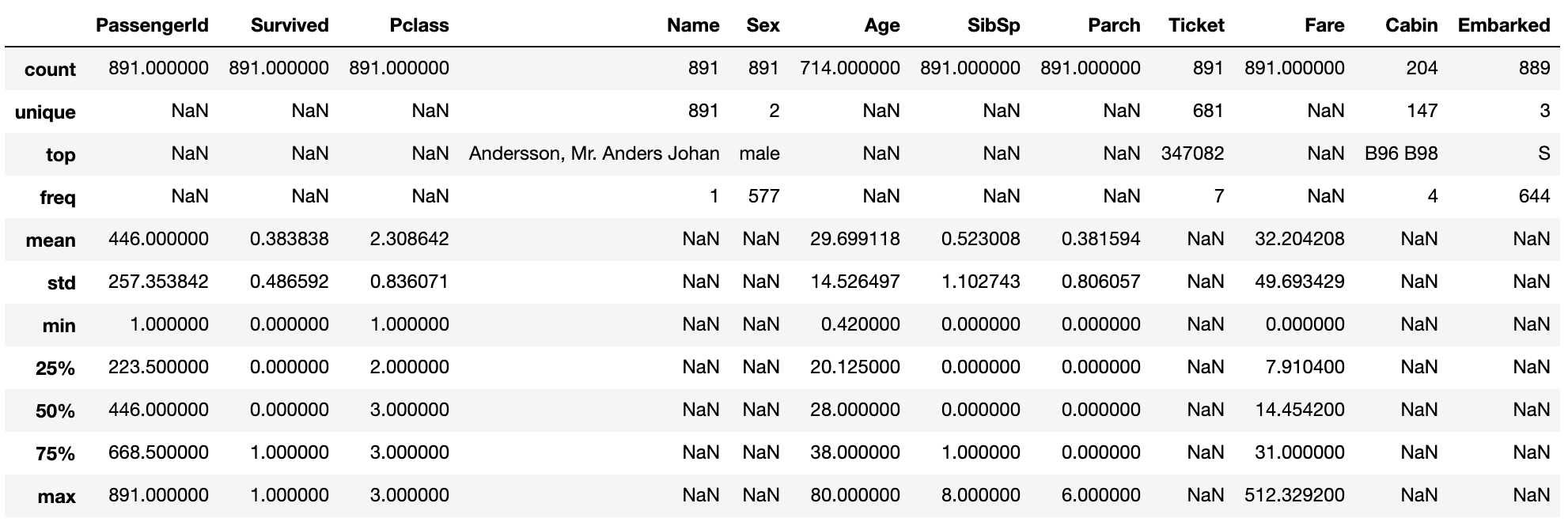
変数分布の説明
include = 'all' にすると数値ではない特徴量も表示される。
data1.describe(include = 'all')
四分位数
plt.figure(figsize=[8,6])

"""
o is treated as a Outlier.
minimun
25パーセンタイル	第一四分位数
50パーセンタイル	第二四分位数(中央値)
75パーセンタイル	第三四分位数
maximum
"""

plt.subplot(221)
plt.boxplot(data1['Age'], showmeans = True, meanline = True)
plt.title('Age Boxplot')
plt.ylabel('Age (Years)')
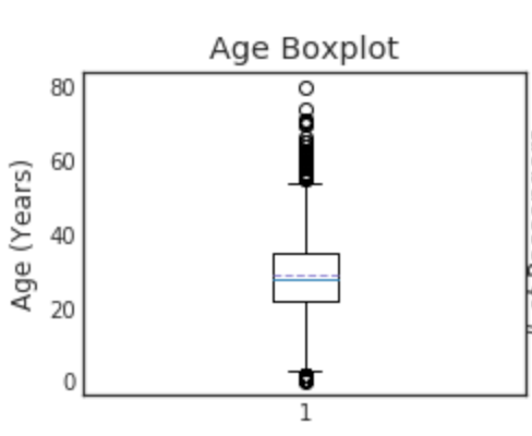
Boxplotを見て、外れ値があるかどうか、検討できる。
これは、欠損値の穴埋めにも利用できる。
外れ値が合ったり、分布が偏っていたりする時は、平均を使うよりも中央値とかを使った方が良い。
一方、左右対象で、偏りがない分布になっていたら平均値を使う方が良いかも。