概要
ApacheやTomcatなどのアクセスログを解析しようと思っても、意外といいツールってありませんよね。様々な出力形式に対応していて、必要な情報だけをフィルタリングし、手軽に分かりやすく視覚化できるようなツールがあればいいのですが、なかなか見つかりません。
そこで、データ分析の世界では定番のPandasやMatplotlibを利用して、Jupyter Notebook上でApacheのアクセスログを解析、視覚化することが簡単にできるか試してみました。
※Pandas、Matplotlib、Jupyter Notebookのインストールについては、すでに多くの分かりやすい記事がありますので、ここでは触れません。
アクセスログを読み込む
必要なライブラリーのインポート
まずは最低限必要なPandasとMatplotlibをインポートします。
import pandas as pd
from pandas import DataFrame, Series
import matplotlib.pyplot as plt
環境設定
好みに応じて、環境設定します。
# グラフなどはNotebook内に描画
%matplotlib inline

# DataFrameの列の最大文字列長をデフォルトの50から150に変更
pd.set_option("display.max_colwidth", 150)
アクセスログのロード
アクセスログのロード方法については、このブログエントリーを参考にしました。アクセスログをロードする前に、それに必要な型解析用の関数を定義します。
from datetime import datetime
import pytz

def parse_str(x):
    return x[1:-1]

def parse_datetime(x):
    dt = datetime.strptime(x[1:-7], '%d/%b/%Y:%H:%M:%S')
    dt_tz = int(x[-6:-3])*60+int(x[-3:-1])
    return dt.replace(tzinfo=pytz.FixedOffset(dt_tz))
そして、pd.read_csv()でアクセスログをロードします。私の手元にあったアクセスログは少し出力形式が異なっていたので、以下のように修正しました。今回は簡略化のため、一部のカラムだけを抽出しています。
df = pd.read_csv(
    '/var/log/httpd/access_log',
    sep=r'\s(?=(?:[^"]*"[^"]*")*[^"]*$)(?![^\[]*\])',
    engine='python',
    na_values='-',
    header=None,
    usecols=[0, 4, 6, 7, 8, 9, 10],
    names=['ip', 'time', 'response_time', 'request', 'status', 'size', 'user_agent'],
    converters={'time': parse_datetime,
                'response_time': int,
                'request': parse_str,
                'status': int,
                'size': int,
                'user_agent': parse_str})
アクセスログを解析する
アクセスログをロードしたら、解析してみましょう。
データを加工せずに確認
まずはファイルの先頭と最後の5行ずつを確認します。
df
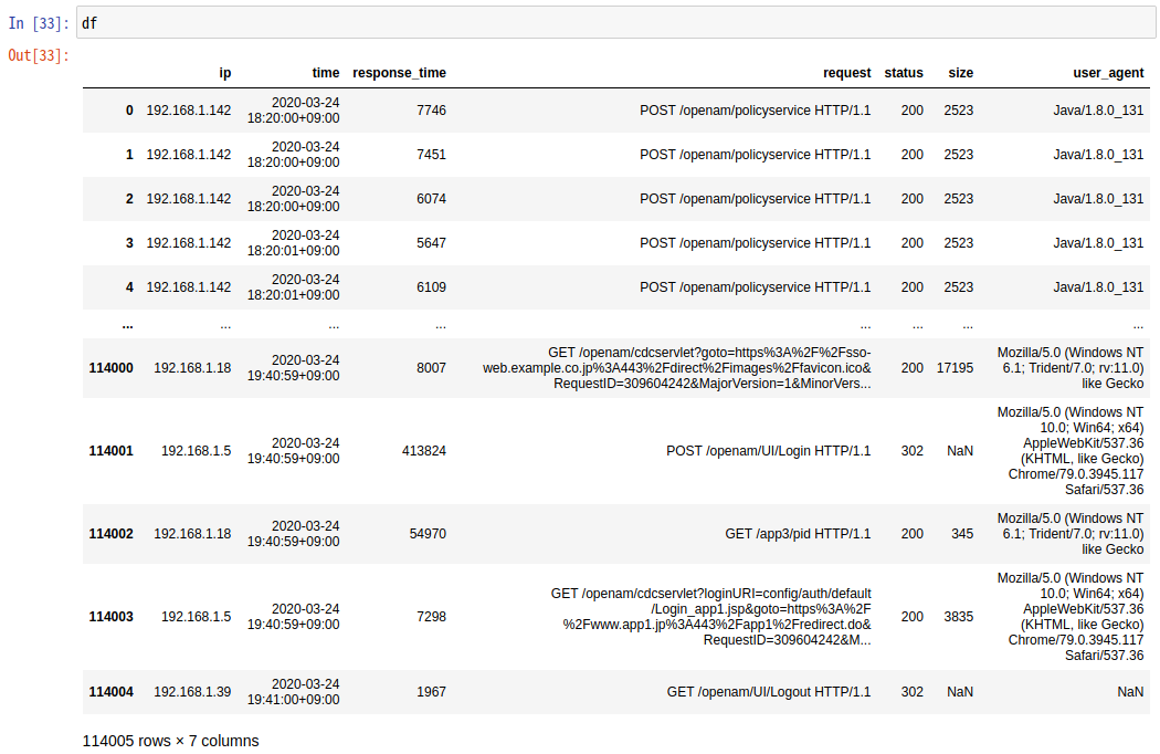
03月24日の18:20から1時間20分ほどで114,004件のリクエストがあったことが分かります。
応答時間の集計結果確認
応答時間の平均値や最大値を表示してみましょう。
print('応答時間の集計結果(マイクロ秒)\n')
print('最小値 : {}'.format(str(df['response_time'].min()).rjust(10)))
print('平均値 : {}'.format(str(round(df['response_time'].mean())).rjust(10)))
print('中央値 : {}'.format(str(round(df['response_time'].median())).rjust(10)))
print('最大値 : {}'.format(str(df['response_time'].max()).rjust(10)))

print('\n応答時間のワースト15')
df.sort_values('response_time', ascending=False).head(15)
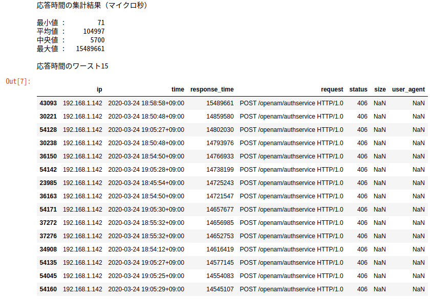
応答時間のワースト15件は、いずれもOpenAMの認証サービスへのリクエストで、15秒ほどかけてHTTPステータス406のレスポンスが返っていました。OpenAMと連携するアプリケーションとの間で問題が発生していたことが分かります。
欠損値の確認
応答時間のワースト15を見ると、size(レスポンスのサイズ)とuser_agent(ユーザーエージェント)がNaNになっています。欠損値がどの程度あるのか確認してみましょう。
df.isnull().sum()
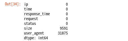
sizeがNaNなものは、リダイレクトなどです。また、3割ほどのuser_agentが不明です。OpenAMにアクセスするのは、エンドユーザーのブラウザーだけではないので、その中には「User-Agent」ヘッダーが未指定なものが多いということでしょう。他にはどのようなユーザーエージェントがあるのか調べてみましょう。
ユーザーエージェントの確認
ua_df = DataFrame(df.groupby(['user_agent']).size().index)
ua_df['count'] = df.groupby(['user_agent']).size().values
ua_df
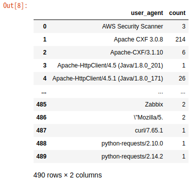
なんと490種類もありました。エンドユーザーだけでなく、多数のアプリケーションが連携しているので、このような結果になったようです。
アクセスログを視覚化する
ここまで全く視覚化していないので、イマイチ面白くなかったかと思います。円グラフなどで表示してみましょう。まずは、レスポンスのステータスコードの割合を円グラフで描いてみます。
plt.figure(figsize = (5, 5))
labels = [str(n)+'xx' for n in list(df.groupby([df['status'] // 100]).groups.keys())]
plt.pie(df.groupby([df['status'] // 100]).size(), autopct = '%1.1f%%', labels = labels, shadow = True, startangle = 90)
plt.axis('equal')
df.groupby([df['status'] // 100]).size()
plt.show()
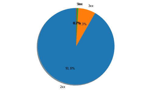
うーん、割合が低いステータスコードのラベルが重なってよく見えないですね...
視覚化のためのユーティリティー関数を定義
ということで、少数の要素(1%以下の割合のもの)を「others」(その他)にまとめる関数を定義しておきます。Matplotlibの機能を使えば、こういった関数は不要かもしれませんが、見つけられなかったので、簡単なものをつくってみました。
# DataFrame用
def replace_df_minors_with_others(df_before, column_name):
    elm_num = 1
    for index, row in df_before.sort_values([column_name], ascending=False).iterrows():
        if (row[column_name] / df_before[column_name].sum()) > 0.01:
            elm_num = elm_num + 1

    df_after = df_before.sort_values([column_name], ascending=False).nlargest(elm_num, columns=column_name)
    df_after.loc[len(df_after)] = ['others', df_before.drop(df_after.index)[column_name].sum()]
    return df_after

# 辞書用
def replace_dict_minors_with_others(dict_before):
    dict_after = {}
    others = 0
    total = sum(dict_before.values())
    for key in dict_before.keys():
        if (dict_before.get(key) / total) > 0.01:
            dict_after[key] = dict_before.get(key)
        else:
            others = others + dict_before.get(key)
    dict_after = {k: v for k, v in sorted(dict_after.items(), reverse=True, key=lambda item: item[1])}
    dict_after['others'] = others
    return dict_after
ユーザーエージェントの視覚化
では、この関数を使用して、次はユーザーエージェントの種類を円グラフで表示してみましょう。
plt.figure(figsize = (15, 10))
ua_df_with_others = replace_df_minors_with_others(ua_df, 'count')
plt.pie(ua_df_with_others['count'], labels = ua_df_with_others['user_agent'], autopct = '%1.1f%%', shadow = True, startangle = 90)
plt.title('User Agent')
plt.show()
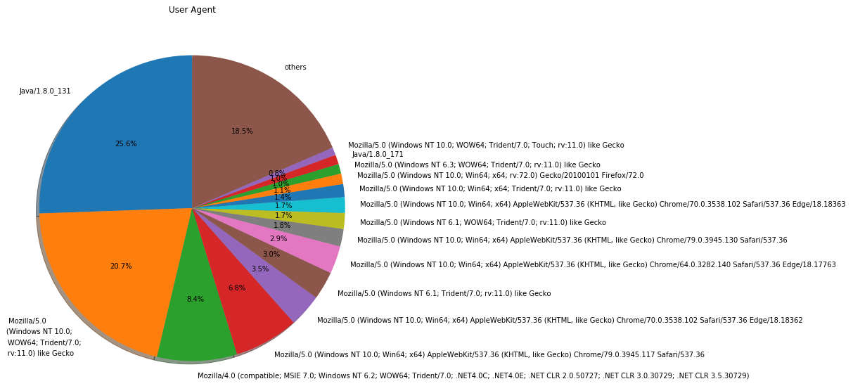
「User-Agent」ヘッダーを直接表示しても、イマイチ分かりづらいですね。「Mozilla/5.0 (Windows NT 6.1; WOW64; Trident/7.0; rv:11.0) like Gecko」って何でしょう...
ということで、Wootheeというライブラリーを利用して分かりやすい表示に変換してみます。以下のコマンドでインストールします。
$ pip install woothee
これを利用して、クライアントのOSとユーザーエージェントを円グラフで表示してみます。
import woothee

ua_counter = {}
os_counter = {}

for index, row in ua_df.sort_values(['count'], ascending=False).iterrows():
    ua = woothee.parse(row['user_agent'])
    uaKey = ua.get('name') + ' (' + ua.get('version') + ')'
    if not uaKey in ua_counter:
        ua_counter[uaKey] = 0
    ua_counter[uaKey] = ua_counter[uaKey] + 1
    osKey = ua.get('os') + ' (' + ua.get('os_version') + ')'
    if not osKey in os_counter:
        os_counter[osKey] = 0
    os_counter[osKey] = os_counter[osKey] + 1

plt.figure(figsize = (15, 10))
plt.subplot(1,2,1)
plt.title('Client OS')
os_counter_with_others = replace_dict_minors_with_others(os_counter)
plt.pie(os_counter_with_others.values(), labels = os_counter_with_others.keys(), autopct = '%1.1f%%', shadow = True, startangle = 90)

plt.subplot(1,2,2)
plt.title('User Agent')
ua_counter_with_others = replace_dict_minors_with_others(ua_counter)
plt.pie(ua_counter_with_others.values(), labels = ua_counter_with_others.keys(), autopct = '%1.1f%%', shadow = True, startangle = 90)
plt.show()
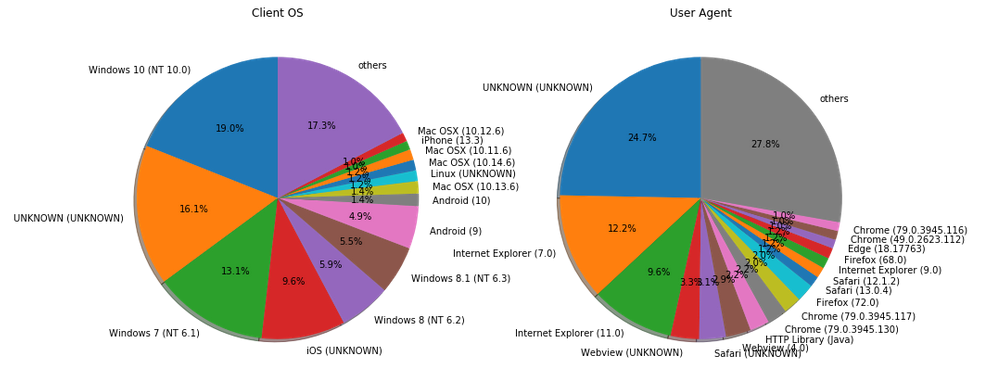
「UNKNOWN」が増えてしまいましたが、分かりやすくはなったでしょうか。それにしても、いまだにWindows上でIEを使ってる人が多いですね...
エラーレスポンスのステータスコードの視覚化
次にエラーとなったレスポンスのステータスコード(400以上)の割合を見てみましょう。
error_df = df[df['status'] >= 400]
plt.figure(figsize = (10, 10))
labels = [str(int(n))+'xx' for n in list(df.groupby([error_df['status'] // 100]).groups.keys())]
plt.pie(error_df.groupby([error_df['status'] // 100]).count().time, labels=labels, counterclock=False, startangle=90)

labels2 = [str(n) for n in list(df[df['status'] >= 400]['status'].unique())]
plt.pie(error_df.groupby(['status']).count().time, labels=labels2, counterclock=False, startangle=90, radius=0.7)

centre_circle = plt.Circle((0,0),0.4, fc='white')
fig = plt.gcf()
fig.gca().add_artist(centre_circle)
plt.title('Error Status Code')
plt.show()
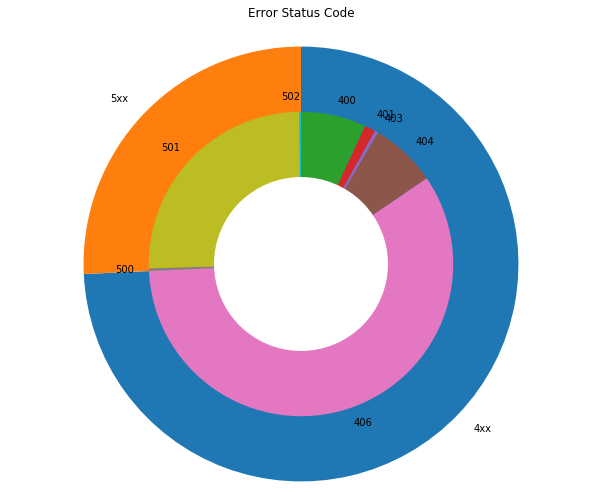
一般的にはあまり見慣れないステータスコード406のエラーレスポンスが多いのが、このアクセスログの特徴ですね。
負荷の状況の視覚化
では、違うグラフを出力してみましょう。まずは負荷の状況を確認します。
plt.figure(figsize = (15, 5))
access = df['request']
access.index = df['time']
access = access.resample('S').count()
access.index.name = 'Time'
access.plot()
plt.title('Total Access')
plt.ylabel('Access')
plt.show()
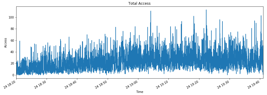
コンスタントにアクセスがあり、時々秒間100件以上を超えるような状況です。
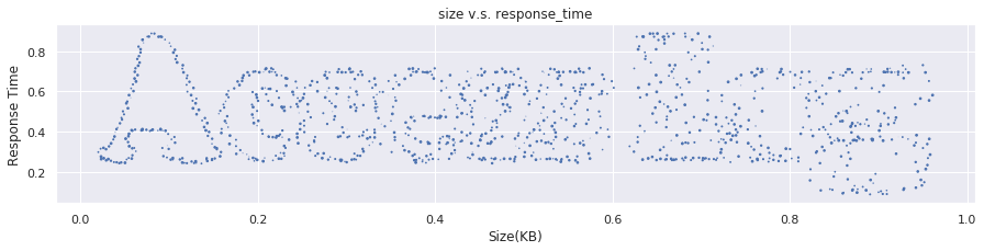
レスポンスのサイズと時間の関係性の視覚化
レスポンスのサイズと時間に何らかの関係性があるか見てみましょう。
plt.figure(figsize = (15, 5))
plt.title('size v.s. response_time')
plt.scatter(df['size']/1000, df['response_time']/1000000, marker='.')
plt.xlabel('Size(KB)')
plt.ylabel('Response Time')
plt.grid()
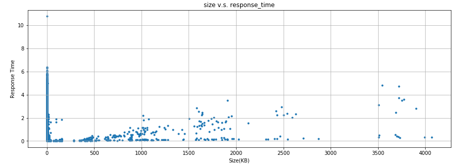
明確な関係性は無いものの、レスポンスのサイズが0でなければ、サイズが大きいほど時間がかかる傾向が無いとも言えないですね。
最後に
アクセスログの解析にPandasとMatplotlibは使えると思います。これらのライブラリーを使いこなせるようになれば、トラブルシューティングにも十分に活用できそうです。
まだ思い付きでつくった試作段階ですが、GitHubにもコミットしておきます。