この記事でやること
**- k-shapeによる時系列データの分類を実装
- データには心電図データを使用**
はじめに
時系列データの分類手法として、k-shape法 がよく用いられます。 この記事ではk-shape法を 用いて心電図データのクラスタリングを行います。
データやコードは[「pythonによる教師なし学習」](url https://www.amazon.co.jp/Python%E3%81%A7%E3%81%AF%E3%81%98%E3%82%81%E3%82%8B%E6%95%99%E5%B8%AB%E3%81%AA%E3%81%97%E5%AD%A6%E7%BF%92-%E2%80%95%E6%A9%9F%E6%A2%B0%E5%AD%A6%E7%BF%92%E3%81%AE%E5%8F%AF%E8%83%BD%E6%80%A7%E3%82%92%E5%BA%83%E3%81%92%E3%82%8B%E3%83%A9%E3%83%99%E3%83%AB%E3%81%AA%E3%81%97%E3%83%87%E3%83%BC%E3%82%BF%E3%81%AE%E5%88%A9%E7%94%A8-Ankur-Patel/dp/4873119103)を参考にさせて頂いています。
扱うデータ
カリフォルニア大学リバーサイド校の時系列データコレクション(UCR Time Series Classification Archive)を使います。
https://www.cs.ucr.edu/~eamonn/time_series_data/
このなかのECG5000を用います。passwordは【attempttoclassify】です。
ライブラリのインポート
ここは参考本を引用しています。一部この記事では扱わないものも入っています。
colabで実行する場合がのインストールが必要です。
!pip install kshape
!pip install tslearn
'''Main'''
import numpy as np
import pandas as pd
import os, time, re
import pickle, gzip, datetime
from os import listdir, walk
from os.path import isfile, join

'''Data Viz'''
import matplotlib.pyplot as plt
import seaborn as sns
color = sns.color_palette()
import matplotlib as mpl
from mpl_toolkits.axes_grid1 import Grid

%matplotlib inline

'''Data Prep and Model Evaluation'''
from sklearn import preprocessing as pp
from sklearn.model_selection import train_test_split
from sklearn.model_selection import StratifiedKFold
from sklearn.metrics import log_loss, accuracy_score
from sklearn.metrics import precision_recall_curve, average_precision_score
from sklearn.metrics import roc_curve, auc, roc_auc_score, mean_squared_error
from keras.utils import to_categorical
from sklearn.metrics import adjusted_rand_score
import random

'''Algos'''
from kshape.core import kshape, zscore
import tslearn
from tslearn.utils import to_time_series_dataset
from tslearn.clustering import KShape, TimeSeriesScalerMeanVariance
from tslearn.clustering import TimeSeriesKMeans
import hdbscan

sns.set("talk")
データ読込
次にデータの読込です。時系列データが4000個あり、5個のクラスタに分類されるデータです。
# データ読込
current_path = os.getcwd()
file = os.path.sep.join(["",'data', 'datasets', 'ucr_time_series_data', '']) #個人のフォルダに応じて書き換え
data_train = np.loadtxt(current_path+file+
                        "ECG5000/ECG5000_TRAIN",
                        delimiter=",")

data_test = np.loadtxt(current_path+file+
                       "ECG5000/ECG5000_TEST",
                       delimiter=",")

data_joined = np.concatenate((data_train,data_test),axis=0)
data_train, data_test = train_test_split(data_joined,
                                    test_size=0.20, random_state=2019)

X_train = to_time_series_dataset(data_train[:, 1:])
y_train = data_train[:, 0].astype(np.int)
X_test = to_time_series_dataset(data_test[:, 1:])
y_test = data_test[:, 0].astype(np.int)

# データ構造の表示
print("Number of time series:", len(data_train))
print("Number of unique classes:", len(np.unique(data_train[:,0])))
print("Time series length:", len(data_train[0,1:]))

# Calculate number of readings per class
print("Number of time series in class 1.0:",
      len(data_train[data_train[:,0]==1.0]))
print("Number of time series in class 2.0:",
      len(data_train[data_train[:,0]==2.0]))
print("Number of time series in class 3.0:",
      len(data_train[data_train[:,0]==3.0]))
print("Number of time series in class 4.0:",
      len(data_train[data_train[:,0]==4.0]))
print("Number of time series in class 5.0:",
      len(data_train[data_train[:,0]==5.0]))

"""
Number of time series: 4000
Number of unique classes: 5
Time series length: 140
Number of time series in class 1.0: 2327
Number of time series in class 2.0: 1423
Number of time series in class 3.0: 75
Number of time series in class 4.0: 156
Number of time series in class 5.0: 19
"""
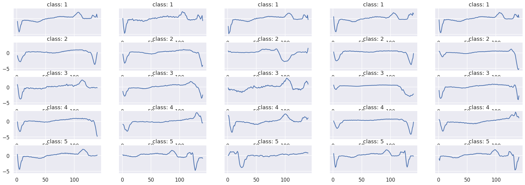
データの可視化
class1~5のデータを可視化します。素人がみてもいまいち違いがわかりませんね。
fig, ax = plt.subplots(5,5,figsize=[30,10],sharey=True)

ax_f = ax.flatten()

# class1~5のプロット
df_train = pd.DataFrame(data_train)

cnt = 0
for class_i in range(1,6):
  df_train_plot = df_train[df_train[0] == class_i]
  for i in range(0,5):
      ax_f[cnt].set_title("class: {}".format(class_i))
      ax_f[cnt].plot(df_train_plot.iloc[i][1:])
      cnt += 1
k-shapeによる分類
k-shapeの実装とその評価です。
評価には「調整ランド法」という手法を用いて1に近いほど、クラスタリングの精度が高いということになります。
# k-shape
ks = KShape(n_clusters=5,max_iter=100,n_init=100,verbose=0)
ks.fit(X_train)

# 調整ランド法による評価
# 実際のラベルとどのくらいあっているかを確かめる
# 1に近いほど予測クラスタリングがあっていることになる

preds=ks.predict(X_train)
ars = adjusted_rand_score(data_train[:,0],preds)
print("train Adjusted Rand Index:",ars)

preds_test=ks.predict(X_test)
ars = adjusted_rand_score(data_test[:,0],preds)
print("test Adjusted Rand Index:",ars)
UCR Time Series Classification Archive
また、クラスターごとのクラス分布を表示すると下記のようになります。
分布が偏っていることからまあまあうまくクラスタリングできていますね。
ただ、数の少ない3,4,5が最も多いというような分け方にはなっていない点には注意が必要です。
# クラスター内部の分布可視化
preds_test = preds_test.reshape(1000,1)
preds_test = np.hstack((preds_test,data_test[:,0].reshape(1000,1)))
preds_test = pd.DataFrame(data=preds_test)
preds_test = preds_test.rename(columns={0: 'prediction', 1: 'actual'})

counter = 0
for i in np.sort(preds_test.prediction.unique()):
    print("Predicted Cluster ", i)
    print(preds_test.actual[preds_test.prediction==i].value_counts())
    print()
    cnt = preds_test.actual[preds_test.prediction==i] \
                        .value_counts().iloc[1:].sum()
    counter = counter + cnt
print("Count of Non-Primary Points: ", counter)

"""
Predicted Cluster  0.0
2.0    29
4.0     2
1.0     2
3.0     2
5.0     1
Name: actual, dtype: int64

Predicted Cluster  1.0
2.0    270
4.0     14
3.0      8
1.0      2
5.0      1
Name: actual, dtype: int64

Predicted Cluster  2.0
1.0    553
4.0     16
2.0      9
3.0      7
Name: actual, dtype: int64

Predicted Cluster  3.0
2.0    35
1.0     5
4.0     5
5.0     3
3.0     3
Name: actual, dtype: int64

Predicted Cluster  4.0
1.0    30
4.0     1
3.0     1
2.0     1
Name: actual, dtype: int64

Count of Non-Primary Points:  83
"""
終わりに
この記事では時系列データのクラスタリング手法であるk-shapeの実装を行いました。k-meansを行うときとかなり似てますね。
信号処理や異常検知なんかに役立つと思います。
参考になった方はLGTMなどしていただけると励みになります。