フォームは特にブラウザごとの表示の差異が大きいので、普段あまりCSSを使わない人向けにベース用のCSSを書いてみました。
フォームのJavaScript、フォームのHTMLも併せてご参照ください。
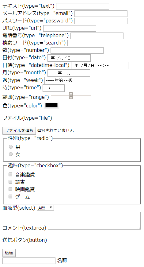
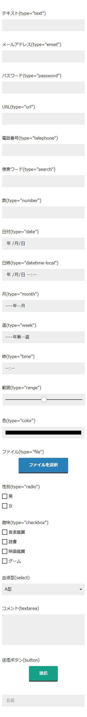
CSS適用前後の比較
before
CSS適用前画像
after
CSS適用後画像(HTMLもデザイン変更に必要な部分は一部変更しています)
共通リセット
css
input,
button,
textarea,
select {
  /* デフォルトスタイルをリセット */
  -webkit-appearance: none;
  -moz-appearance: none;
  appearance: none;

  /* font-familyを継承しないので、継承させる */
  font-family: inherit;

  /* iOSの角丸をリセット */
  border-radius: 0;

  /* box-size */
  box-sizing: border-box;

  /* 文字の大きさ iOSでズームさせないために16px以上を指定 */
  font-size: 16px;

  /* 文字色を親から継承 */
  color: inherit;
}

label {
  /* iOSでのlabelとinput,select,textareaの関連付け */
  cursor: pointer;
}

/* スピンボタン非表示 chrome,safari */
input[type="number"]::-webkit-outer-spin-button,
input[type="number"]::-webkit-inner-spin-button,
input[type="month"]::-webkit-outer-spin-button,
input[type="month"]::-webkit-inner-spin-button,
input[type="datetime-local"]::-webkit-outer-spin-button,
input[type="datetime-local"]::-webkit-inner-spin-button,
input[type="week"]::-webkit-outer-spin-button,
input[type="week"]::-webkit-inner-spin-button,
input[type="time"]::-webkit-outer-spin-button,
input[type="time"]::-webkit-inner-spin-button,
input[type="date"]::-webkit-outer-spin-button,
input[type="date"]::-webkit-inner-spin-button {
  /*-webkit-appearance: none;
  margin: 0;*/
  display: none;
}

/* スピンボタン非表示(firefox) */
input[type="number"],
input[type="month"],
input[type="datetime-local"],
input[type="week"],
input[type="time"],
input[type="date"] {
  -moz-appearance: textfield;
}

/* クリアボタン非表示 */
input[type="date"]::-webkit-clear-button,
input[type="month"]::-webkit-clear-button,
input[type="datetime-local"]::-webkit-clear-button,
input[type="time"]::-webkit-clear-button,
input[type="week"]::-webkit-clear-button {
  -webkit-appearance: none;
}
input
input共通CSS
css
/* input */
input {
  /* 背景色(任意の色を指定) */
  background-color: #eee;

  /* inputの枠線を消す */
  border: 1px solid transparent;
  transition: border 0.2s ease-out;

  /* 文字色を親から継承 */
  color: inherit;

  /* 任意の高さ */
  height: 46px;

  /*inputのフォーカス時の枠線を消す*/
  outline: 0;
}

/* inputにフォーカスが当たっている時 */
input:focus {
  border-bottom: 1px solid#e74c3c;
}
input(日時系以外)
html
<div>
  <label for="form__input--text">テキスト(type="text")</label>
  <input type="text" name="text" id="form__input--text">
</div>

<div>
  <label for="form__input--email">メールアドレス(type="email")</label>
  <input type="email" name="email" id="form__input--email">
</div>

<div>
  <label for="form__input--password">パスワード(type="password")</label>
  <input type="password" name="password" id="form__input--password">
</div>

<div>
  <label for="form__input--url">URL(type="url")</label>
  <input type="url" name="url" id="form__input--url">
</div>

<div>
  <label for="form__input--tel">電話番号(type="telephone")</label>
  <input type="tel" name="tel" id="form__input--tel">
</div>

<div>
  <label for="form__input--search">検索ワード(type="search")</label>
  <input type="search" name="search" id="form__input--search">
</div>

<div>
  <label for="form__input--number">数(type="number")</label>
  <input type="number" name="number" id="form__input--number">
</div>
css
/* サーチキャンセルボタンのデザイン変更 */
input[type="search"]::-webkit-search-cancel-button {
  -webkit-appearance: none;
  height: 16px;
  width: 16px;
  background-image: url(cancel.svg);
  background-repeat: no-repeat;
  background-size: cover;

  /* サーチキャンセルボタンを非表示にする場合 */
  /*-webkit-appearance: none;*/
}

input[type="search"]::-webkit-search-decoration {
  display: none;
}

input[type="search"]:focus {
  outline-offset: -2px;
}

/* パスワードの表示/非表示の切り替えスイッチ表示(IE、Edge)の非表示 */
input[type=password]::-ms-reveal{
   display:none;
 }
input(日時系)
html
<div>
  <label for="form__input--date">日付(type="date")</label>
  <input type="date" name="date" id="form__input--date">
</div>

<div>
  <label for="form__input--datetime-local">日時(type="datetime-local")</label>
  <input type="datetime-local" name="datetime-local" id="form__input--datetime-local">
</div>

<div>
  <label for="form__input--month">月(type="month")</label>
  <input type="month" name="month" id="form__input--month">
</div>

<div>
  <label for="form__input--week">週(type="week")</label>
  <input type="week" name="week" id="form__input--week">
</div>

<div>
  <label for="form__input--time">時(type="time")</label>
  <input type="time" name="time" id="form__input--time">
</div>
css
/* カレンダー表示ボタン アイコン変更 */
input[type="date"]::-webkit-calendar-picker-indicator,
input[type="datetime-local"]::-webkit-calendar-picker-indicator,
input[type="month"]::-webkit-calendar-picker-indicator,
input[type="week"]::-webkit-calendar-picker-indicator {
  color: transparent;
  cursor: pointer;
  background: #eee url(calendar.svg) no-repeat center right 0px/16px 16px;
  background-size: 16px;
}
range
html
<div>
  <label for="form__input--range">範囲(type="range")</label>
  <input type="range" name="range" id="form__input--range">
</div>
css
input[type=range] {
  -webkit-appearance: none;
  /* height: 46px; */
}

/* ツールチップ 非表示(ms) */
input[type=range]::-ms-tooltip {
  display: none;
}

/* ツマミ(webkit) */
input[type=range]::-webkit-slider-thumb {
  -webkit-appearance: none;
  background: #fff;
  border-radius: 50%;
  box-shadow: 0 0 4px 0 #333;
  cursor: pointer;
  height: 20px;
  width: 20px;
  margin-top: -10px;
  /* iOS safari */
  border: none;
}

/* ツマミ(mozilla) */
input[type=range]::-moz-range-thumb {
  background-color: #fff;
  border: none;
  border-radius: 50%;
  box-shadow: 0 0 4px 0 #333;
  cursor: pointer;
  height: 20px;
  width: 20px;
}

/* ツマミ(ms) */
input[type=range]::-ms-thumb {
  background-color: #fff;
  border: none;
  border-radius: 50%;
  box-shadow: 0 0 4px 0 #333;
  cursor: pointer;
  height: 20px;
  width: 20px;
  margin: 0 1px;
}

/* ツマミ(ms) chomeツマミ調整の影響を消す */
@supports (-ms-ime-align: auto) {
  input[type=range]::-webkit-slider-thumb {
    margin-top: 0px !important;
  }

}

/* 溝(mozilla) */
input[type=range]::-moz-range-track {
  height: 0;
  border: 1px solid #333;
}

/* 溝(WebKit) */
input[type=range]::-webkit-slider-runnable-track {
  width: 100%;
  height: 0;
  cursor: pointer;
  background: #cccccc;
  border: 1px solid #333;
  margin-top: 0px;
}

/* 溝(ms) */
input[type=range]::-ms-track {
  width: 100%;
  height: 12px;
  cursor: pointer;
  background: transparent;
  border-color: transparent;
  border-width: 16px 0;
  color: transparent;
}

/* 溝の位置調整(ie) */
@media all and (-ms-high-contrast: none) {
  input[type=range]::-ms-track {
    margin-top: -5px !important;
  }
}

/* 溝の色(ms)(つまみより左側) */
input[type=range]::-ms-fill-lower {
  background: #cccccc;
  border: 0.2px solid #010101;
  border-radius: 2.6px;
  box-shadow: 1px 1px 1px #000000, 0px 0px 1px #0d0d0d;
}

/* 溝の色(ms)(つまみより右側) */
input[type=range]::-ms-fill-upper {
  background: #cccccc;
  border: 0.2px solid #010101;
  border-radius: 2.6px;
  box-shadow: 1px 1px 1px #000000, 0px 0px 1px #0d0d0d;
}

/* 溝の色(ms)(つまみより左側)フォーカス時 */
input[type=range]:focus::-ms-fill-lower {
  background: #999999;
}

/* 溝の色(ms)(つまみより右側)フォーカス時 */
input[type=range]:focus::-ms-fill-upper {
  background: #999999;
}
color
html
<div>
  <label for="form__input--color">色(type="color")</label>
  <input type="color" name="color" id="form__input--color">
</div>
css
/* なし(共通リセットのみ) */
file
html
<div>
  <p>ファイル(type="file")</p>

  <input type="file" name="file" id="form__input--file">
  <label for="form__input--file">ファイルを選択</label>
</div>
css
input[type="file"] {
  display: initial;
  position: absolute;
  opacity: 0;
}

input[type="file"]+label {
  background: #2980b9;
  border-bottom: 4px solid #434343;
  border-radius: 4px;
  color: #FFF;
  display: table;
  font-weight: bold;
  line-height: 1;
  margin: 10px auto 0;
  padding: 20px 40px;
  transition: background-color 0.2s ease-out, transform 0.2s ease-out, border-bottom 0.2s ease-out;
  -webkit-user-select: none;
  -moz-user-select: none;
  -ms-user-select: none;
  user-select: none;
}

input[type="file"]:hover+label,
input[type="file"]:focus+label{
  background: #3498db;
}

input[type="file"]:active+label {
  background: #34495e;
  border-bottom: 4px solid transparent;
  transform: translateY(4px);
}
radio
html
<fieldset>
  <legend>性別(type="radio")</legend>

  <div class="radiobuttonMember">
    <input type="radio" name="sex" value="male" id="form__input--radio1">
    <label for="form__input--radio1">
      <svg xmlns="http://www.w3.org/2000/svg" x="0px" y="0px" viewBox="0 0 64 64">
        <path d="M21.184 54.944c-9.963-.554-17.871-8.793-17.871-18.88 0-10.442 8.479-18.909 18.938-18.909s18.938 8.466 18.938 18.909-8.479 18.91-18.938 18.91" />
      </svg>男
    </label>
  </div>

  <div class="radiobuttonMember">
    <input type="radio" name="sex" value="female" id="form__input--radio2">
    <label for="form__input--radio2">
    <svg xmlns="http://www.w3.org/2000/svg" x="0px" y="0px" viewBox="0 0 64 64">
      <path d="M21.184 54.944c-9.963-.554-17.871-8.793-17.871-18.88 0-10.442 8.479-18.909 18.938-18.909s18.938 8.466 18.938 18.909-8.479 18.91-18.938 18.91" />
     </svg>女</label>
  </div>
</fieldset>
css
.radiobuttonMember {
  margin-top: 10px;
}

/* デフォルトのinputを隠す */
input[type="radio"] {
  display: initial;
  position: relative;
  opacity: 0;
}

/* ラベルの前の四角形を作る */
input[type="radio"]+label::before {
  content: "";
  position: absolute;
  border: 2px solid #343434;
  width: 16px;
  height: 16px;
  margin-top: 4px;
}

/* ラベルの前の四角形のフォーカス時 */
input[type="radio"]:focus+label::before {
  border: 2px solid #e74c3c;
}

/* SVGの位置と大きさの指定 */
input[type="radio"]+label>svg {
  width: 20px;
  height: 20px;
  position: relative;
  margin-right: 5px;
  left: 3px;
  top: 3px;
}

/* チェックマークの設定(未チェック時)  */
input[type="radio"]+label>svg>path {
  fill: none;
  stroke: #27ae60;
  stroke-linejoin: round;
  stroke-linecap: round;
  stroke-dasharray: 130;
  stroke-dashoffset: 100;
  stroke-opacity: 0;
  stroke-width: 8px;
  transition: stroke-dashoffset 0.2s ease-out;
}

/* チェックマークの設定(チェック時) */
input[type="radio"]:checked+label>svg>path {
  stroke-dashoffset: 0;
  stroke-opacity: 1;
}

/* ラベルの位置調整 */
input[type="radio"]+label {
  left: -30px;
  position: relative;
}
checkbox
html
<fieldset>
  <legend>趣味(type="checkbox")</legend>

  <div class="checkboxMember">
    <input type="checkbox" name="hobby" value="listenmusic" id="form__input--checkbox1">
    <label for="form__input--checkbox1">
      <svg xmlns="http://www.w3.org/2000/svg" x="0px" y="0px" viewBox="0 0 64 64">
        <path d="M18 4l-6 42s66-68 74-40" />
      </svg>音楽鑑賞
    </label>
  </div>

  <div class="checkboxMember">
    <input type="checkbox" name="hobby" value="readbook" id="form__input--checkbox2">
    <label for="form__input--checkbox2">
      <svg xmlns="http://www.w3.org/2000/svg" x="0px" y="0px" viewBox="0 0 64 64">
        <path d="M18 4l-6 42s66-68 74-40" />
      </svg>読書
    </label>
  </div>

  <div class="checkboxMember">
    <input type="checkbox" name="hobby" value="watchmovie" id="form__input--checkbox3">
    <label for="form__input--checkbox3">
      <svg xmlns="http://www.w3.org/2000/svg" x="0px" y="0px" viewBox="0 0 64 64">
        <path d="M18 4l-6 42s66-68 74-40" />
      </svg>映画鑑賞
    </label>
  </div>

  <div class="checkboxMember">
    <input type="checkbox" name="hobby" value="playgame" id="form__input--checkbox4">
    <label for="form__input--checkbox4">
      <svg xmlns="http://www.w3.org/2000/svg" x="0px" y="0px" viewBox="0 0 64 64">
        <path d="M18 4l-6 42s66-68 74-40" />
      </svg>ゲーム
    </label>
  </div>

</fieldset>
css
.checkboxMember {
  margin-top: 10px;
}

/* デフォルトのinputを隠す */
input[type="checkbox"] {
  display: initial;
  position: relative;
  opacity: 0;
}

/* ラベルの前の四角形を作る */
input[type="checkbox"]+label::before {
  content: "";
  position: absolute;
  border: 2px solid #343434;
  width: 16px;
  height: 16px;
  margin-top: 4px;
}

/* ラベルの前の四角形のフォーカス時 */
input[type="checkbox"]:focus+label::before {
  border: 2px solid #e74c3c;
}

/* SVGの位置と大きさの指定 */
input[type="checkbox"]+label>svg {
  width: 20px;
  height: 20px;
  position: relative;
  margin-right: 5px;
  left: 3px;
  top: 2px;
}

/* チェックマークの設定(未チェック時)  */
input[type="checkbox"]+label>svg>path {
  fill: none;
  stroke: #e74c3c;
  stroke-linejoin: round;
  stroke-linecap: round;
  stroke-dasharray: 100;
  stroke-dashoffset: 100;
  stroke-opacity: 0;
  stroke-width: 8px;
  transition: stroke-dashoffset 0.1s ease-out;
}

/* チェックマークの設定(チェック時) */
input[type="checkbox"]:checked+label>svg>path {
  stroke-dashoffset: 0;
  stroke-opacity: 1;
}

/* ラベルの位置調整 */
input[type="checkbox"]+label {
  left: -30px;
  position: relative;
}
selectbox
html
<div>
  <label for="form__select--blood">血液型(select)</label>
  <select name="blood" id="form__select--blood">
    <option value="A">A型</option>
    <option value="B">B型</option>
    <option value="O">O型</option>
    <option value="AB">AB型</option>
  </select>
</div>
css
select {
  /* 右端の▼を消す */
  -webkit-appearance: none;
  -moz-appearance: none;
  appearance: none;
  border: none;

  /* 代わりに任意の画像を指定 */
  background: #eee url(triangle_down.svg) no-repeat center right 10px/16px 16px;
  background-size: 10px;
}


/* 右端の▼を消す(IE) */
select::-ms-expand {
  display: none;
}

select:focus {
  background: #eee url(triangle_up.svg) no-repeat center right 10px/16px 16px;
  background-size: 10px;
  border-bottom: 1px solid#e74c3c;
  outline: none;
}
textarea
html
<div>
  <label for="form__textarea">コメント(textarea)</label>
  <textarea name="comments" rows="4" cols="40" id="form__textarea"></textarea>
</div>
css
textarea {
  padding: 10px;
  border-radius: 0;
  resize: none;
  border: 1px solid transparent;
  transition: border 0.2s ease-out;
  outline: none;
  background-color: #eee;
}

textarea::-webkit-scrollbar {
  width: 10px;
}

textarea::-webkit-scrollbar-track {
  background-color: #eee;
}

textarea::-webkit-scrollbar-thumb {
  background-color: #ccc;
}

textarea:focus {
  border-bottom: 1px solid #e74c3c;
  box-shadow: none;
  outline: none;
}
ボタン
フォームではinput[type="submit"]やinput[type="reset"]が用意されていますが、特に理由がなければbutton[type="submit"]を使用したほうが良いです。
- 送信ボタン
input[type="submit"]、リセットボタンinput[type="reset"]はCSSが効きにくい - リセットボタンはユーザビリティ的に配置自体しない方が良いので
button[type="reset"]も使わない
html
<div>
  <p>送信ボタン(button)</p>
  <button type="submit" value="send">送信</button>
</div>
css
button {
  background: #16a085;
  border: none;
  border-bottom: 4px solid #434343;
  border-radius: 4px;
  color: #FFF;
  display: table;
  font-weight: bold;
  line-height: 1;
  margin: 10px auto 0;
  outline: none;
  padding: 20px 40px;
  transition: background-color 0.2s ease-out, transform 0.2s ease-out, border-bottom 0.2s ease-out;
  -webkit-user-select: none;
  -moz-user-select: none;
  -ms-user-select: none;
  user-select: none;
}

button:hover,
button:focus {
  background: #1abc9c;
}

button:active {
  background: #006266;
  border-bottom: 4px solid transparent;
  transform: translateY(4px);
}
状態別
プレースホルダの文字色
html
<div>
  <label for="form__input--text">テキスト(type="text")</label>
  <input type="text" name="text" id="form__input--text" placeholder="プレースホルダ">
</div>

<div>
  <label>コメント</label>
  <textarea name="comments" rows="2" cols="40" placeholder="プレースホルダ"></textarea>
</div>
css
/* placeholderの文字色指定 */
input::placeholder,
textarea::placeholder {
  color: #7f8c8d;
}

/* IE (疑似クラスで指定) */
input:-ms-input-placeholder,
textarea:-ms-input-placeholder {
  color: #7f8c8d;

}

/* Edge (疑似要素で指定)*/
input::-ms-input-placeholder,
textarea::-ms-input-placeholder {
  color: #7f8c8d;
}
オートコンプリート有効時
browser-syncを使用しているときは無効なので気づきにくいですが、chromeはオートコンプリート使用時に独自のスタイルが効いてしまうので、リセットします。
css
/* auto complete(chrome) */
input:-webkit-autofill {
  /* 背景色(background-colorではなくbox-shadow) */
  -webkit-box-shadow: 0 0 0 1000px #eee inset;

  /* 文字色(colorではなく-webkit-text-fill-color) */
  -webkit-text-fill-color: #333 !important;
}
入力値の検証
inputタグのtype属性で指定されている形式に合致しているか、していないかを判定できます。
css
input:invalid{
  /* 入力値がOKのときのスタイルを記述 */
}

input:valid {
  /* 入力値がNGのときのスタイルを記述 */
}
値の範囲の検証
| 疑似クラス | 状態 |
|---|---|
| in-range | inputタグのminやmax属性で指定されている数値の範囲に合致している |
| out-of-range | inputタグのminやmax属性で指定されている数値の範囲に合致していない |
html
<input type="number" min="1" max="20">
css
input:in-range {
  /* 範囲内のときのスタイルを記述 */
}

input:out-of-range {
  /* 範囲外のときのスタイルを記述 */
}
その他の擬似クラス
| 疑似クラス | 状態 |
|---|---|
| required | requiredが指定されている(入力必須) |
| optional | 入力必須でない入力要素 |
| disabled | disabledが指定されている(変更できない) |
| read-only | readonlyが指定されている(変更できない) |
| empty | 値が空 |
| placeholder-shown | スレースホルダが表示されている |
| focus | フォーカスが当たっている |
table:disabledとreadonlyの違い
| disabled | readonly | |
|---|---|---|
| 値の編集 | できない | できない |
| form送信時 | 値を送信しない | 値を送信する |
| 値の選択やコピー | 選択不可 | 選択可 |
フローティングラベル
最近流行りのフローティングラベルもCSSで対応できます。
html
<div>
<label class="floatinglabel">
<input type="text" placeholder=" ">
<span class="labeltext">名前</span>
</label>
</div>
css
.floatinglabel {
  margin-top: 40px;
  position: relative;
}

.floatinglabel input:not(:placeholder-shown) + span {
  transform: translateY(-38px) translateX(-16px);
}

.labeltext {
  position: absolute;
  top: 0px;
  left: 16px;
  font-size: 16px;
  color: #7f8c8d;
  transform-origin: 0 0;
  transition: all 0.2s ease-out;
}

.floatinglabel input:focus+span {
  color: #333;
  transform: translateY(-38px) translateX(-16px)
}
リポジトリ