0.初めに
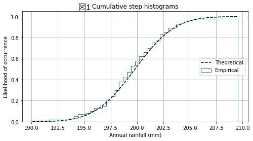
生産現場で不良解析をしていると、CUM_plotなるものをよく用いる。正規分布だと直線になり、外れ値や複数の正規分布が混じっているかなどが分かりやすい。ふとpythonで作成しようと思ったらどうしても図1のCUMが出てくるが、図2のCUMが出てこない。。。どうやら通常はCUMというと図1を示すよう。
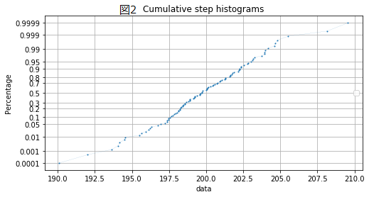
という事で、図2のCUM作成にチャレンジしてみました。正しいか不明なので、誤り等あればご指摘いただけると助かります。
1.CUM plotとは?
累積分布関数(cumulative distribution)の略。ただしこれでググると図1しか出てこない。。。
https://ja.wikipedia.org/wiki/%E7%B4%AF%E7%A9%8D%E5%88%86%E5%B8%83%E9%96%A2%E6%95%B0
図1のCUMの作成方法は下記URL参照
https://matplotlib.org/3.1.1/gallery/statistics/histogram_cumulative.html
2.CUMの作り方
図2のCUMをよく見るとy軸が正規分布を写像しているように見える。ただしそんなスケールはmatplotlibにないので、無理やりスケール変換し割り当てて見ました。
# 宣言
from scipy.stats import norm
import numpy as np
import matplotlib.pyplot as plt

# dataの作成
np.random.seed(19680803)
mu = 200
sigma = 3
x = np.random.normal(mu, sigma, size=100)

# 累積分布関数の逆関数をxに割り当てる
norm_arr = list()
for no in range(1,len(x)+1):
   norm_arr.append(norm.ppf((no)/(len(x)+1))-norm.ppf(1/(len(x)+1)))
norm_arr=norm_arr/max(norm_arr)#正規化
x.sort()#xを小さい順にソート

# y軸表示の変更
scale =[]
list_axis =[0.0001,0.001,0.01,0.05,0.1,0.2,0.3,0.5,0.7,0.8,0.9,0.95,0.99,0.999,0.9999]
for no in list_axis:
   scale.append(norm.ppf(no)-norm.ppf(0.0001))
scale=scale/max(scale)

# 描画
fig, ax = plt.subplots(figsize=(8, 4))
linestyles = '-'
ax.grid(True)
ax.legend(loc='right')
ax.set_title('Cumulative step histograms')
ax.set_xlabel('data')
ax.set_ylabel('Percentage')
plt.yticks(scale,list_axis)
ax.plot(x,norm_arr,label='linear',marker='o',markersize=1.0,linewidth=0.1,linestyle=linestyles)

plt.show()
実行すると上記図2がそのまま出力されます。