完全な備忘録です。
ある程度まとまったら見やすい形に編集しますが、それまでは殴り書きです。
ご容赦ください。
import
import matplotlib.pyplot as plt #Visulization
import seaborn as sns #Visulization
%matplotlib inline
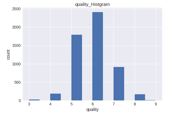
ヒストグラムを表示
plt.hist(train['quality'], bins=12)
plt.title("quality_Histgram")
plt.xlabel('quality')
plt.ylabel('count')
plt.show()
データの作成からやってみる
random.seed(0)
plt.figure(figsize=(20, 6))
plt.hist(np.random.randn(10**5)*10 + 50, bins=60,range=(20,80))
plt.grid(True)

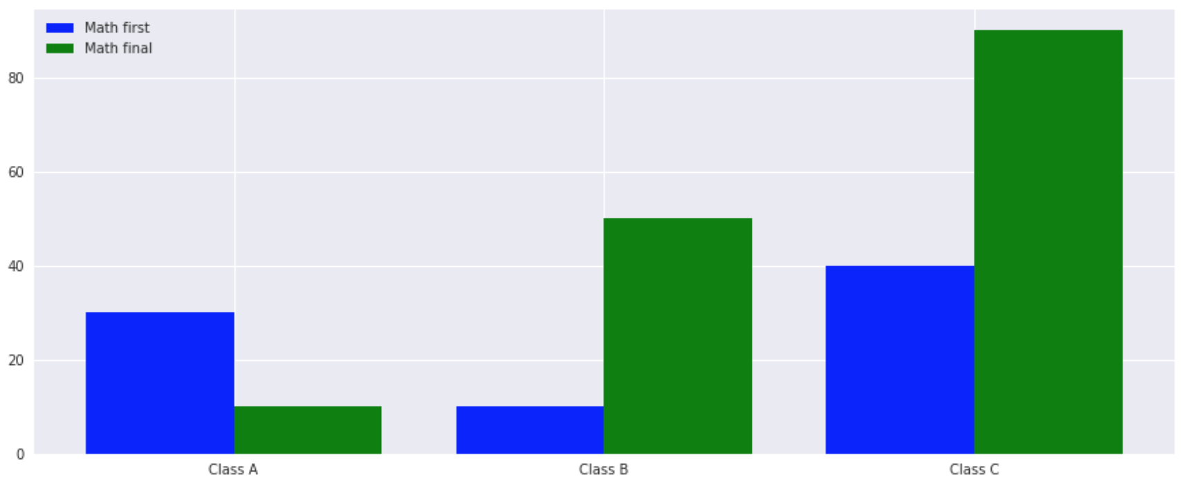
棒グラフ
2つのデータを比較したい場合
plt.figure(figsize=(4,3),facecolor="white")

Y1 = np.array([30,10,40])
Y2 = np.array([10,50,90])

X = np.arange(len(Y1))
# X = [0 1 2]

# グラフの幅
w=0.4

# グラフの大きさ指定
plt.figure(figsize=(15, 6))

plt.bar(X, Y1, color='b', width=w, label='Math first', align="center")
plt.bar(X + w, Y2, color='g', width=w, label='Math final', align="center")

# 凡例を最適な位置に配置
plt.legend(loc="best")

plt.xticks(X + w/2, ['Class A','Class B','Class C'])
plt.grid(True)
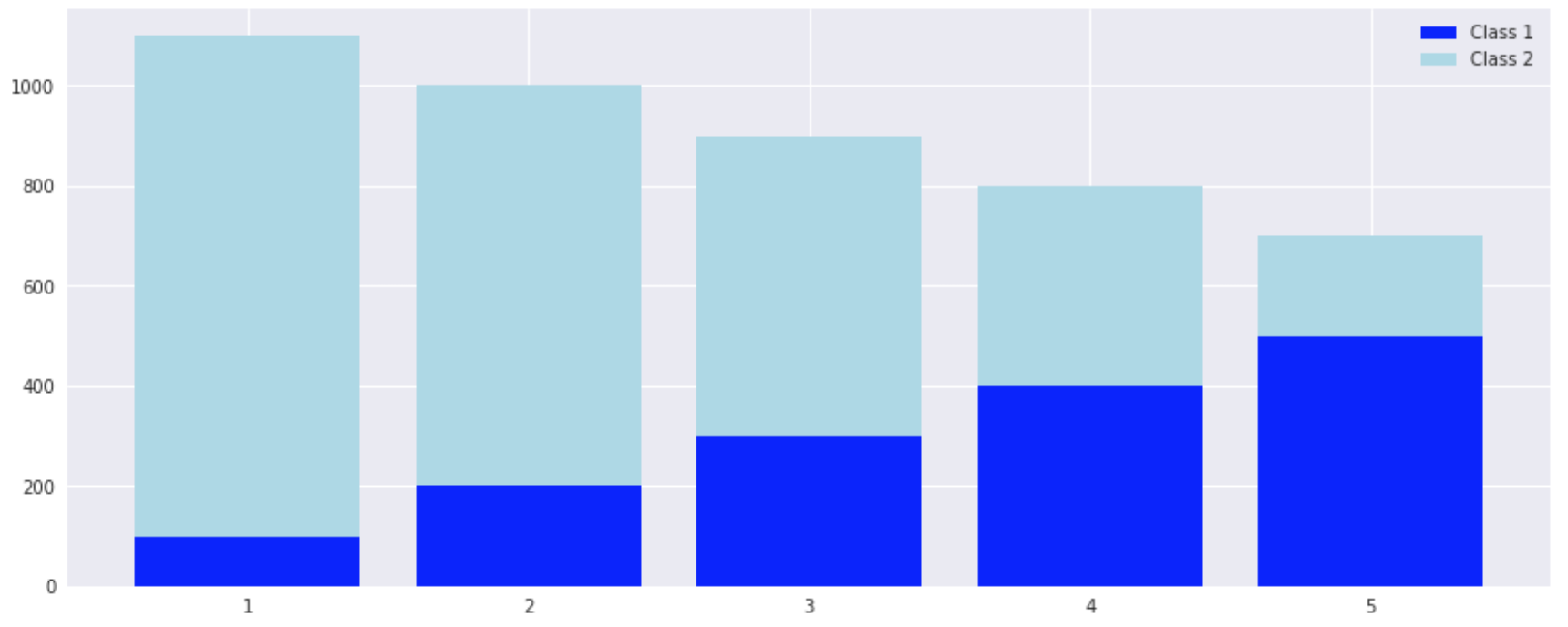
積み上げ棒グラフ
left = np.array([1, 2, 3, 4, 5])

height1 = np.array([100, 200, 300, 400, 500])
height2 = np.array([1000, 800, 600, 400, 200])

# グラフの大きさ指定
plt.figure(figsize=(15, 6))

p1 = plt.bar(left, height1, color="blue")
p2 = plt.bar(left, height2, bottom=height1, color="lightblue")

plt.legend((p1[0], p2[0]), ("Class 1", "Class 2"))
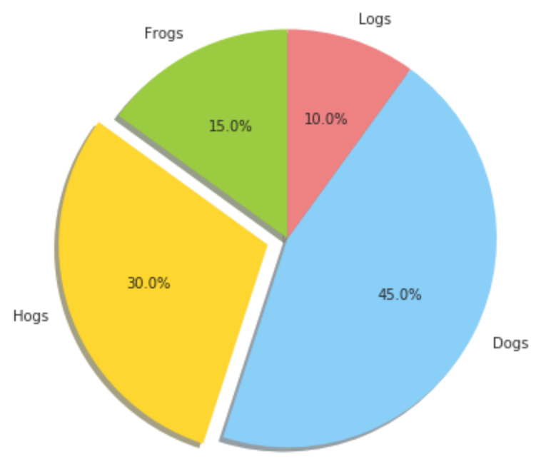
円グラフ
explodeに設定する値によって、円からどの程度分離させるか設定できる
labels = 'Frogs', 'Hogs', 'Dogs', 'Logs'
sizes = [15, 30, 45, 10]
colors = ['yellowgreen', 'gold', 'lightskyblue', 'lightcoral']
explode = (0, 0.1, 0, 0)  # 円から切り離して表示させることが可能

# グラフの大きさ指定
plt.figure(figsize=(15, 6))

# startangleは各要素の出力を開始する角度を表す(反時計回りが正), 向きはcounterclockで指定可能
plt.pie(sizes, explode=explode, labels=labels, colors=colors,
        autopct='%1.1f%%', shadow=True, startangle=90)
plt.axis('equal')
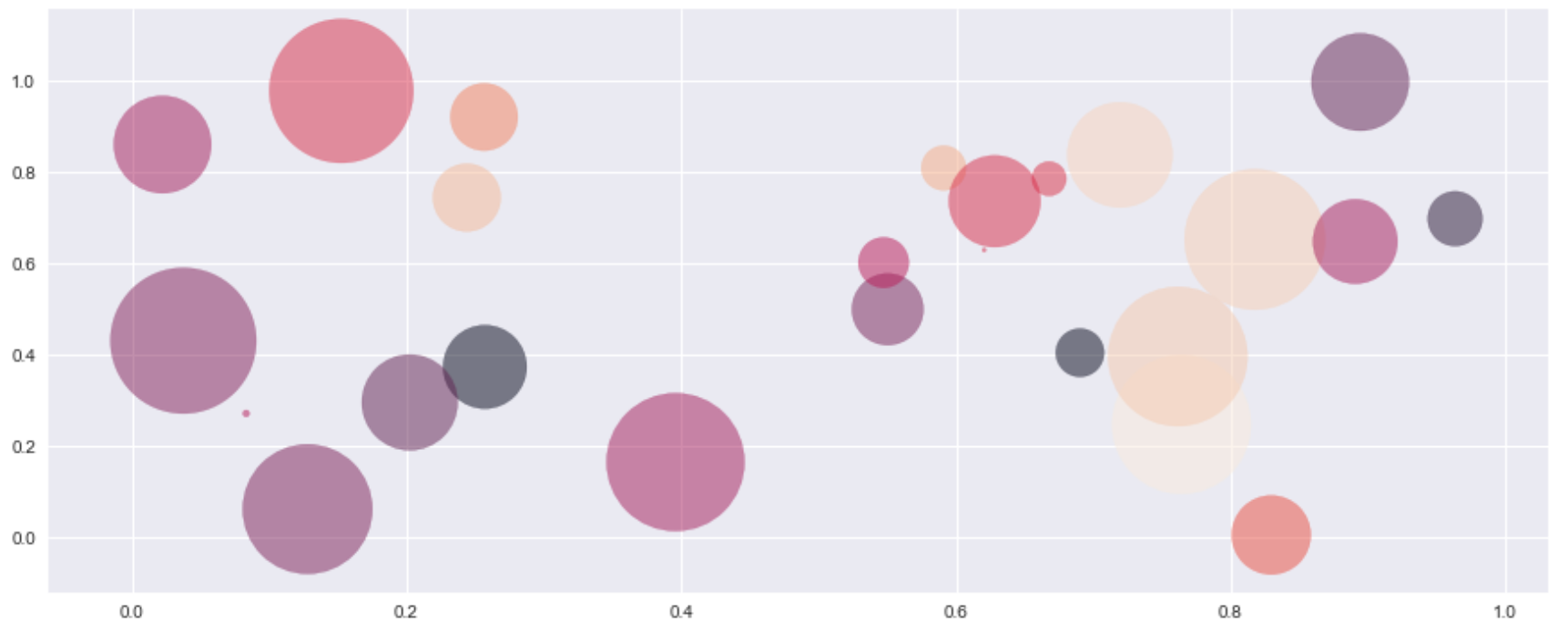
バブルチャート
N = 25

# X,Y軸
x = np.random.rand(N)
y = np.random.rand(N)

# color番号
colors = np.random.rand(N)

# バブルの大きさ
area = 10 * np.pi * (15 * np.random.rand(N))**2

# グラフの大きさ指定
plt.figure(figsize=(15, 6))

plt.scatter(x, y, s=area, c=colors, alpha=0.5)
plt.grid(True)
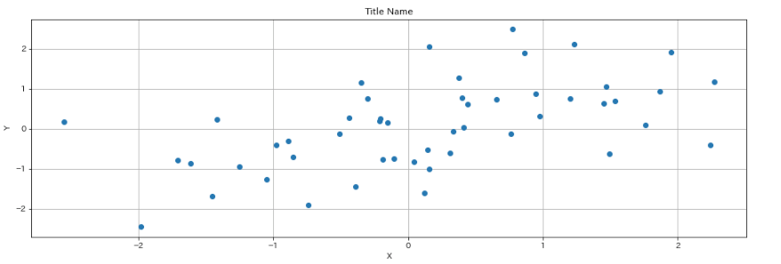
散布図を表示
#  シード値の固定
random.seed(0)
x = np.random.randn(50) # x軸のデータ
y = np.sin(x) + np.random.randn(50) # y軸のデータ
plt.figure(figsize=(16, 6)) # グラフの大きさ指定

# グラフの描写
plt.plot(x, y, "o")

# 以下でも散布図が描ける
# plt.scatter(x, y)

# title
plt.title("Title Name")
# Xの座標名
plt.xlabel("X")
# Yの座標名
plt.ylabel("Y")

# gridの表示
plt.grid(True)
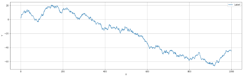
連続した値を与えることで、曲線を描くことも可能
# シード値の指定
np.random.seed(0)
# データの範囲
numpy_data_x = np.arange(1000)

# 乱数の発生と積み上げ
numpy_random_data_y = np.random.randn(1000).cumsum()

# グラフの大きさを指定
plt.figure(figsize=(20, 6))

# label=とlegendでラベルをつけることが可能
plt.plot(numpy_data_x,numpy_random_data_y,label="Label")
plt.legend()

plt.xlabel("X")
plt.ylabel("Y")
plt.grid(True)
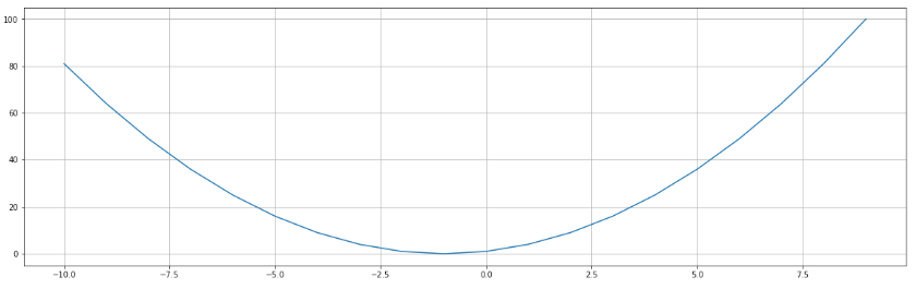
関数グラフの描画
下記関数をグラフにプロットする
f(x) = x^2 + 2x +1
# 関数の定義
def sample_function(x):
    return (x**2 + 2*x + 1)

x = np.arange(-10, 10)
plt.figure(figsize=(20, 6))
plt.plot(x, sample_function(x))
plt.grid(True)
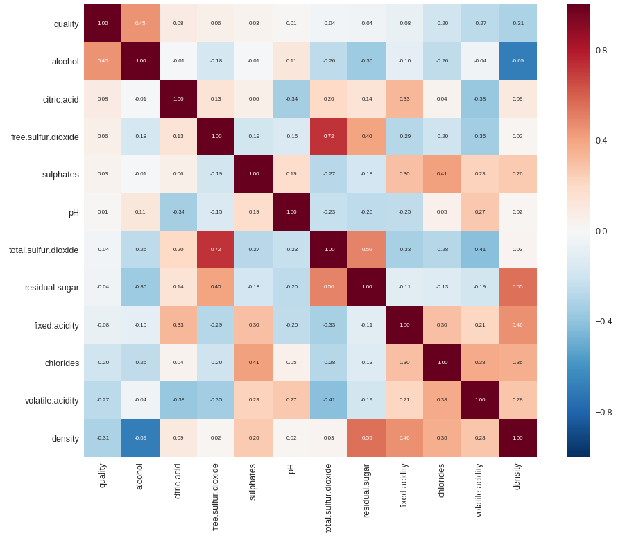
ヒートマップを表示
k = 13 # 表示する特徴量の数
corrmat = train.corr()
cols = corrmat.nlargest(k, 'quality').index # リストの最大値から順にk個の要素の添字(index)を取得
# df_train[cols].head()
cm = np.corrcoef(train[cols].values.T) # 相関関数行列を求める ※転置が必要
sns.set(font_scale=1.25)
f, ax = plt.subplots(figsize=(16, 12))
hm = sns.heatmap(cm, cbar=True, annot=True, square=True, fmt='.2f', annot_kws={'size': 8}, yticklabels=cols.values, xticklabels=cols.values)
plt.show()
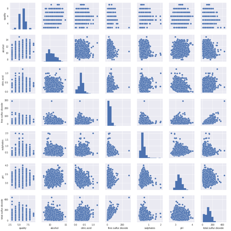
散布図をペアプロットする
sns.set()
cols = ['quality', 'alcohol', 'citric.acid', 'free.sulfur.dioxide', 'sulphates', 'pH', 'total.sulfur.dioxide'] # プロットしたい特徴量
sns.pairplot(train[cols], size = 2.0)
plt.show()
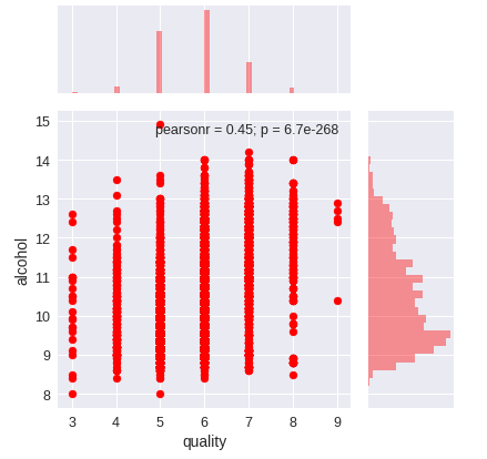
散布図とヒストグラムを同時に表示する
sns.jointplot(x="quality", y="alcohol", data=train, ratio=3, color="r", size=6)
plt.show()
ちなみに、joinplotの引数は下記のようなものが存在する。
| 変数 | 説明 |
|---|---|
| x, y | データをベクトルで指定、または、データセットの列名を文字列で指定。 |
| data | 描画に用いるデータフレーム。出力対象の列名は上記 x と y で指定します。 |
| kind | プロットの種類。以下から指定する。 "scatter" : 散布図 "reg": 散布図と回帰直線 "resid": y 軸に回帰直線からの残差 (誤差) を出力する "kde": カーネル密度推定を用いた等高線風の図 "hex": 六角形のヒートマップ |
| stat_func | 散布図の右上に表示する統計量を計算する関数。入力パラメータは、(x, y) の 2 値であり、出力は (統計量, p 値) で構成される必要があります。 |
| color | 各要素をプロットする際に用いる matplotlib の色名を指定。 |
| size | 図のサイズを数値で指定。 |
| ratio | numeric, optional Ratio of joint axes size to marginal axes height. |
| space | 散布図と散布図の外側に出力するヒストグラムの間の空きスペースの大きさを数値で指定する。 |
| dropna | True に設定すると、欠損値を乗り除きます。 |
| xlim, ylim | x軸、y軸の下限、上限をタプル (下限, 条件) で指定。 |
| joint_kws, marginal_kws, annot_kws | プロットに用いる各種オプションをディクショナリで指定。 |
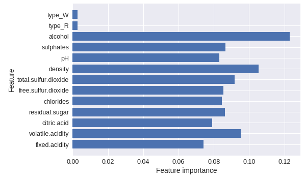
決定木やランダムフォレストで使用された特徴量を可視化する
def plot_feature_importance(model):
  n_features = X.shape[1]
  plt.barh(range(n_features), model.feature_importances_, align='center')
  plt.yticks(np.arange(n_features), X.columns)
  plt.xlabel('Feature importance')
  plt.ylabel('Feature')

# ※Xはtrain_test_splitで分割する前のtrainデータを想定
下記は使用例
ランダムフォレスト以外にも
決定木:DecisionTreeClassifier
勾配ブースティング回帰木:GradientBoostingClassifier
でも同じように利用できます。
# ランダムフォレスト
from sklearn.ensemble import RandomForestClassifier
forest = RandomForestClassifier(n_estimators=100, random_state=20181101) # n_estimatorsは構築する決定木の数
forest.fit(X_train, y_train)

# 表示
plot_feature_importance(forest)
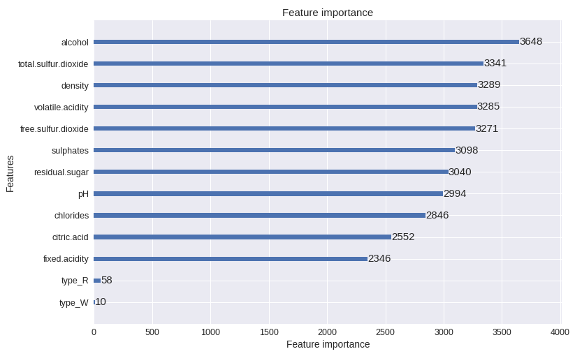
LightGBMで使用された特徴量を可視化する
import lightgbm as lgb
# 可視化(modelはlightgbmで学習させたモデル)
lgb.plot_importance(model, figsize=(12, 8))
plt.show()
可視化って素晴らしい!