はじめに
デザイン性の高い画面をXAML化しているとUserControlから派生させたカスタムコントロールを幾つも作って配置する作業が多くなります。その際微妙に異なる要素を持ったカスタムコントロールを都度作るのは不効率です。WPF(XAML)には、ContentPresenterというタグがあり、子供の要素を持つこのできるカスタムコントロールを作成することができます。
App.xaml
  <Application x:Class="ContentPresenterSample.App"
             xmlns="http://schemas.microsoft.com/winfx/2006/xaml/presentation"
             xmlns:x="http://schemas.microsoft.com/winfx/2006/xaml"
             xmlns:local="clr-namespace:ContentPresenterSample"
             StartupUri="MainWindow.xaml">

    <Application.Resources>
        <ResourceDictionary>
            <Style TargetType="{x:Type local:SingleControl}">
                <Setter Property="Margin" Value="0" />
                <Setter Property="SnapsToDevicePixels" Value="True" />
                <Setter Property="Template">
                    <Setter.Value>
                        <ControlTemplate TargetType="{x:Type local:SingleControl}">
                            <Border BorderBrush="Blue" BorderThickness="1">
                                <Button Margin="5">ボタン</Button>
                            </Border>
                        </ControlTemplate>
                    </Setter.Value>
                </Setter>
            </Style>

            <Style TargetType="{x:Type local:ParentControl}">
                <Setter Property="Margin" Value="0" />
                <Setter Property="SnapsToDevicePixels" Value="True" />
                <Setter Property="Template">
                    <Setter.Value>
                        <ControlTemplate TargetType="{x:Type local:ParentControl}">
                            <ContentPresenter Margin="{TemplateBinding Padding}" SnapsToDevicePixels="{TemplateBinding SnapsToDevicePixels}" />
                        </ControlTemplate>
                    </Setter.Value>
                </Setter>
            </Style>
        </ResourceDictionary>
    </Application.Resources>
</Application>
SingleControl.cs
namespace ContentPresenterSample
{
    public class SingleControl: UserControl
    {
    }
}
ParentControl.cs
namespace ContentPresenterSample
{
    public class ParentControl : UserControl
    {
    }
}
MainWindow.xaml
<Window x:Class="ContentPresenterSample.MainWindow"
        xmlns="http://schemas.microsoft.com/winfx/2006/xaml/presentation"
        xmlns:x="http://schemas.microsoft.com/winfx/2006/xaml"
        xmlns:local="clr-namespace:ContentPresenterSample"
        Title="MainWindow"
        Width="525"
        Height="350">

    <Grid>
        <StackPanel HorizontalAlignment="Center" Orientation="Horizontal">
            <local:SingleControl Width="100" Height="100" Margin="0,0,10,0"/>

            <local:ParentControl Width="100" Height="100">
                <Border BorderBrush="Blue" BorderThickness="1">
                    <Button Margin="5">ボタン</Button>
                </Border>
            </local:ParentControl>
        </StackPanel>
    </Grid>
</Window>
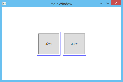
左側のコントロールは、Styleの中にデザインと子要素を内包していますが、右側のコントロールはContentPresenterを使用して子要素を持てるようにしています。ContentPresenterを使えば子要素の違う枠だけ描画するカスタムコントロールなども作成できます。