Next.jsを使ったサイトのサンプルフォーマットとなるようなものを作りました.
作った画面
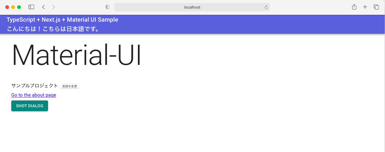
Marterial UIのサンプルページを少し加工して
- ヘッダ部の「こんにちは!こちらは日本語です。」
- ボディ中央部の「サンプルプロジェクト」
以上2箇所の文言をi18n対応しています。
すぐ横にある「言語を変更」ボタンクリックで英語表記に変えることができます。
Githubリポジトリ
手順説明
- Next.jsのセットアップ
- TypeScript対応
- Material UIの実装
- next-i18nextを使ったi18n(多言語化)対応【こちらは後半にて】
Next.jsのセットアップ
任意のディレクトリを作成
mkdir next-materialui-n18n-sample
cd next-materialui-n18n-sample
npm初期化でpackage.jsonを作る
npm init -y

Wrote to /Users/***/package.json:

{
  "name": "next-materialui-n18n-sample",
  "version": "1.0.0",
  "description": "",
  "main": "index.js",
  "scripts": {
    "test": "echo \"Error: no test specified\" && exit 1"
  },
  "keywords": [],
  "author": "",
  "license": "MIT"
}
Next.jsのインストール
npm install --save next react react-dom
package.jsonのscriptsコマンド修正
{
  "scripts": {
    "dev": "next",
    "build": "next build",
    "start": "next start"
  },
}
ページの作成
mkdir pages
vim pages/index.js
index.js
export default () => <div> Welcome to next.js! </div>
起動確認
npm run dev
localhost:3000にアクセス
TypeScript化
参考URL
必要パッケージのインストール
npm install -D typescript @types/react @types/react-dom @types/node
プロジェクトルートにtsconfig.jsonの作成
touch tsconfig.json
tsconfig.jsonの作成
{
    "compilerOptions": {
        "sourceMap": true,
        "noImplicitAny": true,
        "module": "esnext",
        "target": "es6",
        "jsx": "preserve",
        "lib": ["dom", "dom.iterable", "esnext"],
        "allowJs": true,
        "skipLibCheck": true,
        "strict": false,
        "forceConsistentCasingInFileNames": true,
        "noEmit": true,
        "esModuleInterop": true,
        "resolveJsonModule": true,
        "isolatedModules": true,
        "moduleResolution": "node"
    },
    "include": ["src/**/*", "pages/index.tsx"],
    "exclude": ["node_modules"]
}
index.jsを.tsxファイルに変換
mv pages/index.js pages/index.tsx
とりあえずこれで実行は可能
npm run dev
localhost:3000にアクセス
Material UIの導入
Material UIとは?
Googleのマテリアルデザインをベースに開発されたUIコンポーネントのライブラリ
ReactやNext.jsにはかっこいいUI部品などはついておらず、自分でCSSを書かないかぎりは真っ白なシンプルなHTMLになってしまうので、こうしたコンポーネントライブラリを入れておけば開発が楽になる。
参考URL
パッケージのインストール
npm install --save @material-ui/core @material-ui/icons
srcフォルダの作成、theme.tsxファイルを作成
mkdir src
touch src/theme.tsx
theme.tsx
import { createMuiTheme } from '@material-ui/core/styles';
import red from '@material-ui/core/colors/red';

// Create a theme instance.
const theme = createMuiTheme({
    palette: {
        primary: {
            main: '#556cd6',
        },
        secondary: {
            main: '#19857b',
        },
        error: {
            main: red.A400,
        },
        background: {
            default: '#fff',
        },
    },
});

export default theme;
pages/_app.tsxの作成
_app.tsx
import React from 'react';
import Head from 'next/head';
import { AppProps } from 'next/app';
import { ThemeProvider } from '@material-ui/core/styles';
import CssBaseline from '@material-ui/core/CssBaseline';
import theme from '../src/theme';

export default function MyApp(props: AppProps) {
  const { Component, pageProps } = props;

  React.useEffect(() => {
    // Remove the server-side injected CSS.
    const jssStyles = document.querySelector('#jss-server-side');
    if (jssStyles) {
      jssStyles.parentElement!.removeChild(jssStyles);
    }
  }, []);

  return (
    <React.Fragment>
      <Head>
        <title>My page</title>
        <meta name="viewport" content="minimum-scale=1, initial-scale=1, width=device-width" />
      </Head>
      <ThemeProvider theme={theme}>
        {/* CssBaseline kickstart an elegant, consistent, and simple baseline to build upon. */}
        <CssBaseline />
        <Component {...pageProps} />
      </ThemeProvider>
    </React.Fragment>
  );
}
pages/_document.tsxの作成
_document.tsx
import React from 'react';
import Document, { Html, Head, Main, NextScript } from 'next/document';
import { ServerStyleSheets } from '@material-ui/core/styles';
import theme from '../src/theme';

export default class MyDocument extends Document {
    render() {
        return (
            <Html lang="en">
            <Head>
            {/* PWA primary color */}
                <meta name="theme-color" content={theme.palette.primary.main} />
                <link
                rel="stylesheet"
                href="https://fonts.googleapis.com/css?family=Roboto:300,400,500,700&display=swap"
                />
            </Head>
            <body>
                <Main />
                <NextScript />
            </body>
            </Html>
        );
    }
}

// `getInitialProps` belongs to `_document` (instead of `_app`),
// it's compatible with server-side generation (SSG).
MyDocument.getInitialProps = async (ctx) => {
    // Resolution order
    //
    // On the server:
    // 1. app.getInitialProps
    // 2. page.getInitialProps
    // 3. document.getInitialProps
    // 4. app.render
    // 5. page.render
    // 6. document.render
    //
    // On the server with error:
    // 1. document.getInitialProps
    // 2. app.render
    // 3. page.render
    // 4. document.render
    //
    // On the client
    // 1. app.getInitialProps
    // 2. page.getInitialProps
    // 3. app.render
    // 4. page.render

    // Render app and page and get the context of the page with collected side effects.
    const sheets = new ServerStyleSheets();
    const originalRenderPage = ctx.renderPage;

    ctx.renderPage = () =>
        originalRenderPage({
            enhanceApp: (App) => (props) => sheets.collect(<App {...props} />),
        });

    const initialProps = await Document.getInitialProps(ctx);

    return {
        ...initialProps,
        // Styles fragment is rendered after the app and page rendering finish.
        styles: [...React.Children.toArray(initialProps.styles), sheets.getStyleElement()],
    };
};
index.tsxファイルの編集
→ひとまず下記のサンプル通りに修正
index.tsx
import { useState } from 'react';
import Head from 'next/head';
import Link from 'next/link';

import { useTheme, makeStyles, Theme } from "@material-ui/core/styles";
import {
  Toolbar,
  Typography,
  AppBar,
  Button,
  Dialog,
  DialogActions,
  DialogContent,
  DialogContentText,
  DialogTitle,
} from "@material-ui/core";

const useStyle = makeStyles({
  root: (props: Theme) => ({
    paddingTop: props.spacing(10),
    paddingLeft: props.spacing(5),
    paddingRight: props.spacing(5),
  })
});

export default function Home() {
  const [ dialogOpen, setDialogOpen ] = useState(true);
  const classes = useStyle(useTheme());
  return (
    <div className={classes.root}>
      <Head>
        <title>My page title</title>
        <meta name="viewport" content="initial-scale=1.0, width=device-width" />
        <link rel="stylesheet" href="https://fonts.googleapis.com/css?family=Roboto:300,400,500,700&display=swap" />
      </Head>
      <Dialog open={dialogOpen} onClose={() => {setDialogOpen(false)}}>
        <DialogTitle>Dialog Sample</DialogTitle>
        <DialogContent>
          <DialogContentText>
            Easy to use Material UI Dialog.
          </DialogContentText>
        </DialogContent>
        <DialogActions>
          <Button
            color="primary"
            onClick={() => {setDialogOpen(false)}}
          >OK</Button>
        </DialogActions>
      </Dialog>
      <AppBar>
        <Toolbar>
          <Typography variant="h6" color="inherit">
            TypeScript + Next.js + Material UI Sample
          </Typography>
        </Toolbar>
      </AppBar>
      <Typography variant="h1" gutterBottom={true}>
        Material-UI
      </Typography>
      <Typography variant="subtitle1" gutterBottom={true}>
        example project
      </Typography>
      <Typography gutterBottom={true}>
        <Link href="/about">
          <a>Go to the about page</a>
        </Link>
      </Typography>
      <Button
        variant="contained"
        color="secondary"
        onClick={() => { setDialogOpen(true)}}
      >Shot Dialog</Button>
      <style jsx={true}>{`
        .root {
          text-align: center;
        }
      `}</style>
    </div>
  );
}
ひとまずこれで起動できる
npm run dev
参考リポジトリ
i18n対応について
こちらは長くなりそうなので…後編で書きたいと思います!
後編の記事はこちら