Pythonでのデータ分析を行う際の備忘録。
気が向いたら他の方に見て頂けるような記事にしたいと思いますがまずは自分用として。
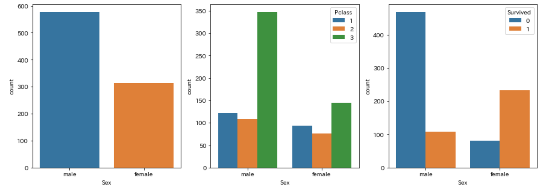
複数のグラフを一気に書く方法
fig,ax = plt.subplots(1,3,figsize=(15,5))

1つめのグラフ
sns.countplot("Sex", data=train_df,ax=ax[0])

2つめのグラフ
sns.countplot("Sex", data=train_df, hue="Pclass",ax=ax[1])

3つめのグラフ
sns.countplot("Sex", data=train_df, hue="Survived", ax=ax[2])
各種リンク(毎度検索するのがめんどくさいので)
pythonで美しいグラフ描画 -seabornを使えばデータ分析と可視化が捗る その2
Python でデータ可視化 - "Facet"で属性別グラフを一気に描く方法が便利すぎる
seabornを使ってデータを可視化する(factorplot)
seabornによる統計データ可視化(ポケモン種族値を例に)(2)