Material-UI ではアプリ全体の見た目や動作をThemeで設定することができます。
過去に数回のフロントエンド開発で Material-UI を使ってきたのですが、その中に必ずと言っていいほど設定するTheme項目があります。
そんな必ず設定するようなTheme項目をまとめました。
対象バージョンは4.0.0以降です。
尚、ここで紹介した設定項目を全て適用したThemeとデフォルトのThemeを比較できるサンプルを作成したので参考にしてください。

必ず設定しておきたいTheme項目
- ボタンのラベルが大文字になるのを防ぐ -
typography.button.textTransform="none" - TextField のバリエーションを変更する -
props.MuiTextField.variant - テーマカラーの設定 -
palette.primary - 入力コントロールの色を統一する -
props.{MuiCheckbox,MuiRadio,MuiSwitch}
ぎゅうぎゅう詰めにしたいときに設定する項目
業務アプリではとにかく画面に情報をぎゅうぎゅう詰めにしたいという要望があります。
そんな時に設定する項目です。
- フォントサイズを小さくする -
typography.fontSize - ヘッダの高さを小さくする -
mixins.toolbar.minHeight - リストのサイズを小さくする -
props.MuiList.dense=true - テーブルのサイズを小さくする -
props.MuiTable.size="small"
ボタンのラベルが大文字になるのを防ぐ - typography.button.textTransform="none"
Material-UI初心者が必ずハマるポイントです。
デフォルトではボタンのラベルが小文字から大文字に変換されてしまいます。
これを防ぐにはtypography.button.textTransform="none" を設定します。
const theme = createMuiTheme({
    typography: {
        button: {
            textTransform: "none"
        }
    }
});
TextField のバリエーションを変更する - props.MuiTextField.variant
Material-UIのTextFieldには3つのバリエーションがあります。
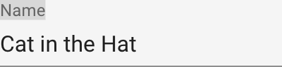
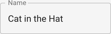
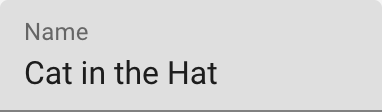
デフォルトはstandardなのですが、これは現在マテリアルデザインのドキュメントには定義されていないスタイルです。
outlinedまたはfilledへの変更をお勧めします。
const theme = createMuiTheme({
   props: {
        MuiTextField: {
            variant: "outlined"
        }
    },
});
テーマカラーの設定 - palette.primary
サンプルアプリならデフォルトのままでもいいですが、ちゃんとしたアプリなら最低限primaryカラーだけでも設定しておきましょう。
設定方法はドキュメントに書いてある通りですが、以下のように色々な設定方法があります。
import {blue} from "@material-ui/core/colors";
const theme = createMuiTheme({
    palette: {
        primary: blue,
    }
});
const theme = createMuiTheme({
    palette: {
        primary: {
            main: blue["500"],
        }
    }
});
const theme = createMuiTheme({
    palette: {
        primary: {
            light: blue["300"],
            main: blue["500"],
            dark: blue["700"],
        }
    }
})
const theme = createMuiTheme({
    palette: {
        primary: {
            light: "#64b5f6",
            main: "#2196f3",
            dark: "#1976d2",
        }
    }
})
どんな色にしたいか決めるにはドキュメントで紹介されているツールを使うと良いでしょう。
入力コントロールの色を統一する - props.{MuiCheckbox,MuiRadio,MuiSwitch}
Checkbox、Radio、Switchの3つのコンポーネントはデフォルトカラーがsecondaryになっています。
好みの問題ですが、primaryにしておいたほうが統一感があると思います。
const theme = createMuiTheme({
    props: {
        MuiCheckbox: {
            color: "primary"
        },
        MuiRadio: {
            color: "primary"
        },
        MuiSwitch: {
            color: "primary"
        },
    }
});
フォントサイズを小さくする - typography.fontSize
const theme = createMuiTheme({
    typography: {
        fontSize: 12,
    }
});
ヘッダの高さを小さくする - mixins.toolbar.minHeight
const theme = createMuiTheme({
    mixins: {
        toolbar: {
            minHeight: 42
        }
    },
});
リストのサイズを小さくする - props.MuiList.dense=true
const theme = createMuiTheme({
    props: {
        MuiList: {
            dense: true
        },
    }
});
テーブルのサイズを小さくする - props.MuiTable.size="small"
const theme = createMuiTheme({
    props: {
        MuiTable: {
            size: "small"
        },
    }
});