はじめに
私は現在,実験研究をしている修士1年生です. 実験データを可視化際に使用している Matplotlib のコードをメモします.
初めての投稿になりますので,わかりにくい箇所や間違っている箇所がございましたらご指摘ください.
図の設定
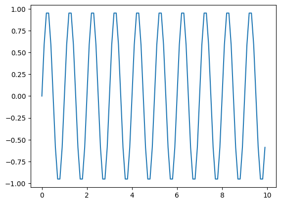
- 1枚だけグラフを表示する時
fig, ax = plt.subplots(figsize = (7, 7))
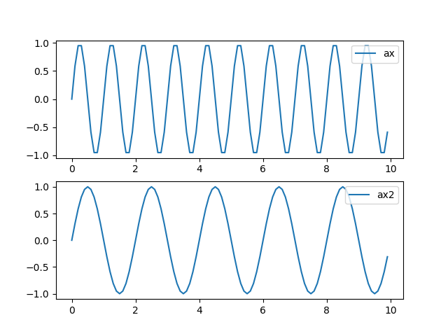
- 2枚以上グラフを表示する時
fig = plt.figure(figsize = (7, 7))
ax = fig.add_subplot(2, 1, 1)
ax2 = fig.add_subplot(2, 1, 2)
- 例
プロット
ax.plot(x, y, label = "label name")
凡例表示
- 右上に表示させる場合
ax.legend("label name", loc = "upper right", fontsize = 16)
グリッドの表示
ax.grid()
軸設定
- 軸の範囲
ax.set_xlim(0, 10)始点 or 終点だけ設定も可
ax.set_ylim(1e-5, )
- Log表記
ax.set_yscale("log")
書式
- 軸ラベル
ax.set_xlabel("label name", fontsize = 16)
- タイトル
ax.set_title("Title", fontsize =20)
- メモリ
- フォント
Tick fontplt.rcParams["font.family"] = "Arial"
- サイズ
Tick sizeax.tick_params(labelsize = 16)
保存方法
- 拡張子をPDFにする場合
fig.savefig(pathname + "/figure_1.pdf")
- 図の保存サイズ(余白をカット)
fig.savefig("figure.pdf", bbox_inches = 'tight', pad_inches = 0.1)
- 余白あり
- 余白無し