はじめに
この記事は公式リファレンスの内容をまとめたものになります。
ConstraintLayoutのAttributeってどんなのあるの? という方向けのまとめです。
自分の備忘録も兼任していたり...
Relative positioning
Viewを別Viewに対して相対的に設置する。

| Attribute | 効果 | 指定の仕方 |
|---|---|---|
| layout_constraintLeft_toLeftOf layout_constraintStart_toStartOf | 自分の左端と指定したViewの左端を揃える | Viewのid名 |
| layout_constraintLeft_toRightOf layout_constraintStart_toEndOf | 自分の左端と指定したViewの右端を揃える (自分を指定したViewの右側に配置する) | Viewのid名 |
| layout_constraintRight_toLeftOf layout_constraintEnd_toStartOf | 自分の右端と指定したViewの左端を揃える (自分を指定したViewの左側に配置する) | Viewのid名 |
| layout_constraintRight_toRightOf layout_constraintEnd_toEndOf | 自分の右端と指定したViewの右端を揃える | Viewのid名 |
| layout_constraintTop_toTopOf | 自分の上端と指定したViewの上端を揃える | Viewのid名 |
| layout_constraintTop_toBottomOf | 自分の上端と指定したViewの下端を揃える (自分を指定したViewの上側に配置する) | Viewのid名 |
| layout_constraintBottom_toTopOf | 自分の下端と指定したViewの上端を揃える (自分を指定したViewの下側に配置する) | Viewのid名 |
| layout_constraintBottom_toBottomOf | 自分の下端と指定したViewの下端を揃える | Viewのid名 |
| layout_constraintBaseline_toBaselineOf | 自分のテキストベースラインと指定したViewのテキストベースラインを揃える | Viewのid名 |
Margin
Relative positioningの__制約に対して__marginを設定する。
marginの値はマイナスの値にならない。
Attributeの書き方は他のベースレイアウトと変わらないが、__制約に対してのmargin__というところが注意点。
一般的なMargin
| Attribute | 効果 | 指定する値 |
|---|---|---|
| android:layout_marginStart | 自分の左側にmarginを適用する | dp |
| android:layout_marginEnd | 自分の右側にmarginを適用する | dp |
| android:layout_marginLeft | 自分の左側にmarginを適用する(APIレベル17より低い場合にはこちらも追加) | dp |
| android:layout_marginRight | 自分の右側にmarginを適用する(APIレベル17より低い場合にはこちらも追加) | dp |
| android:layout_marginTop | 自分の上側にmarginを適用する | dp |
| android:layout_marginBottom | 自分の下側にmarginを適用する | dp |
対象のViewがGONEの時のMargin
| Attribute | 効果 | 指定する値 |
|---|---|---|
| layout_goneMarginStart | 自分の左側にmarginを適用する | dp |
| layout_goneMarginEnd | 自分の右側にmarginを適用する | dp |
| layout_goneMarginLeft | 自分の左側にmarginを適用する(APIレベル17より低い場合にはこちらも追加) | dp |
| layout_goneMarginRight | 自分の右側にmarginを適用する(APIレベル17より低い場合にはこちらも追加) | dp |
| layout_goneMarginTop | 自分の上側にmarginを適用する | dp |
| layout_goneMarginTop | 自分の下側にmarginを適用する | dp |
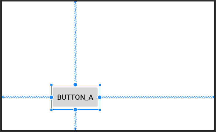
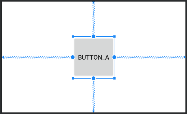
Centering positioning
Relative positioningの制約を自身の両端にかけることによって、Viewを中心に設置することができる。
<androidx.appcompat.widget.AppCompatButton
        android:id="@+id/appCompatButton2"
        android:layout_width="wrap_content"
        android:layout_height="wrap_content"
        android:text="@string/button_a"
        app:layout_constraintBottom_toBottomOf="parent"
        app:layout_constraintEnd_toEndOf="parent"
        app:layout_constraintStart_toStartOf="parent"
        app:layout_constraintTop_toTopOf="parent" />

Bias
Center positionを使用した際には、デフォルトでViewが中心に設置される。
ここにBias属性を0-1範囲で指定することで、位置の比率を変えることができる。
| Attribute | 効果 | 値の範囲 |
|---|---|---|
| layout_constraintHorizontal_bias | 水平方向のBiasを指定 | 0 - 1 |
| layout_constraintVertical_bias | 垂直方向のBiasを指定 | 0 - 1 |
<androidx.appcompat.widget.AppCompatButton
        android:id="@+id/appCompatButton2"
        android:layout_width="wrap_content"
        android:layout_height="wrap_content"
        android:text="@string/button_a"
        app:layout_constraintBottom_toBottomOf="parent"
        app:layout_constraintEnd_toEndOf="parent"
        app:layout_constraintStart_toStartOf="parent"
        app:layout_constraintTop_toTopOf="parent"
        app:layout_constraintHorizontal_bias="0.3"
        app:layout_constraintVertical_bias="0.8"/>
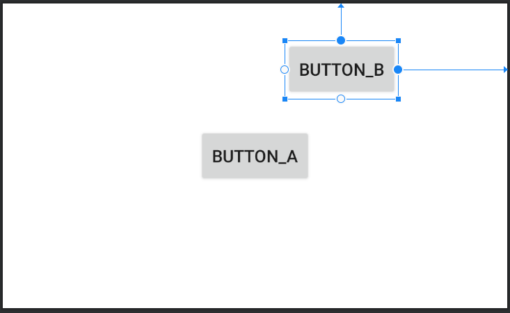
Circular positioning
別のViewの中心に対してViewの中心を角度、距離を指定して配置することができる。
→ 別Viewを中心に極座標的に配置できる。
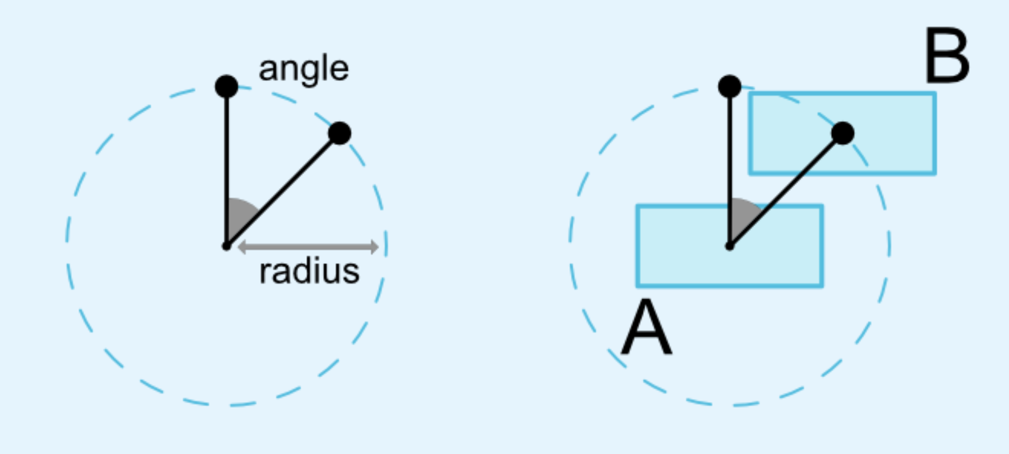
以下の3つのAttributeを設定する。
| Attribute | 効果 |
|---|---|
| layout_constraintCircle | 中心にするViewのid |
| layout_constraintCircleRadius | 角度(0 ~ 360) |
| layout_constraintCircleAngle | 距離(dp) |
<?xml version="1.0" encoding="utf-8"?>
<androidx.constraintlayout.widget.ConstraintLayout
        〜略〜 >

    <androidx.appcompat.widget.AppCompatButton
        android:id="@+id/appCompatButton"
        android:layout_width="wrap_content"
        android:layout_height="wrap_content"
        android:text="@string/button_a"
        app:layout_constraintBottom_toBottomOf="parent"
        app:layout_constraintEnd_toEndOf="parent"
        app:layout_constraintStart_toStartOf="parent"
        app:layout_constraintTop_toTopOf="parent" />

    <androidx.appcompat.widget.AppCompatButton
        android:layout_width="wrap_content"
        android:layout_height="wrap_content"
        android:text="@string/button_b"
        app:layout_constraintCircle="@id/appCompatButton"
        app:layout_constraintCircleAngle="45"
        app:layout_constraintCircleRadius="100dp"
        app:layout_constraintEnd_toEndOf="parent"
        app:layout_constraintTop_toTopOf="parent" />

</androidx.constraintlayout.widget.ConstraintLayout>
Dimensions constraints
Minimum dimensions on ConstraintLayout
Viewの最大サイズと最小サイズを制限することで、Viewの大きさを制御できる。
layout_widthとlayout_heightをwrap_contentにするかつ最大と最小を設定する必要ある。
| Attribute | 効果 |
|---|---|
| android:minWidth | Viewの最小幅を設定する |
| android:minHeihgt | Viewの最小の高さを設定する |
| android:maxWidth | Viewの最大幅を設定する |
| android:maxHeight | Viewの最大の高さを設定する |
<androidx.appcompat.widget.AppCompatButton
    android:id="@+id/appCompatButton"
    android:layout_width="wrap_content"
    android:layout_height="wrap_content"
    android:text="@string/button_a"
    android:maxWidth="35dp"
    android:minWidth="1dp"
    app:layout_constraintBottom_toBottomOf="parent"
    app:layout_constraintEnd_toEndOf="parent"
    app:layout_constraintStart_toStartOf="parent"
    app:layout_constraintTop_toTopOf="parent" />
Widgets dimension constraints
layout_width, layout_heightに以下の値を設定することで、Viewの大きさを変えることができる。
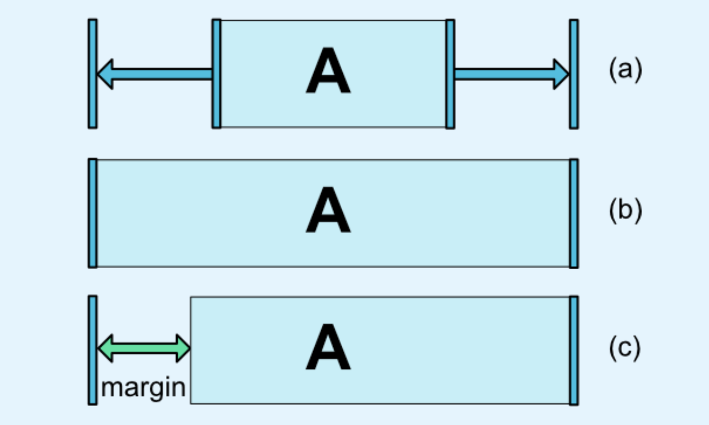
(a)layout_width or layout_heightに値を決め打ちする or wrap_contentを指定する
(b)layout_width or layout_heightを0dpに指定する
(ConstraintLayoutではmatch_parentを使うことは推奨されてない)
(c)(b)を設定した上で、marginを設定する
WRAP_CONTENT : enforcing constraints (Added in 1.1)
wrap_contentを指定すると、Viewの大きさ通りの寸法になるため、画面外にViewがはみ出たり、他のViewに被ってしまうことがある。
そこで、wrap_contentへの制限を設けることができる。
| Attribute | 指定する値 |
|---|---|
| app:layout_constrainedWidth | true or false |
| app:layout_constrainedHeight | true or false |
例)app_layout_constrainedWidthを設定しない or falseを設定

例)app_layout_constraintedWidthをtrueにする

Ratio
Viewのlayout_width, layout_heightがmatch_constraintの時に比率を用いてViewの大きさを指定できる。
| Attribute | 指定する値 |
|---|---|
| app:layout_constraintDimensionRatioh | W : H |
<androidx.appcompat.widget.AppCompatButton
    android:layout_width="wrap_content"
    android:layout_height="0dp"
    android:text="@string/button_a"
    app:layout_constraintDimensionRatio="1:1"
    app:layout_constraintBottom_toBottomOf="parent"
    app:layout_constraintEnd_toEndOf="parent"
    app:layout_constraintStart_toStartOf="parent"
    app:layout_constraintTop_toTopOf="parent" />
 layout_width, layout_heightの両方がmatch_constraintの時には、以下のようにw/hを指定することで、widthとheightのどちらを基準にするのかを選択することができる。
`app:layout_constraintDimensionRatio="w, 1:2"`
layout_width, layout_heightの両方がmatch_constraintの時には、以下のようにw/hを指定することで、widthとheightのどちらを基準にするのかを選択することができる。
`app:layout_constraintDimensionRatio="w, 1:2"`
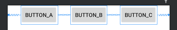
Chain
複数のViewが双方向に作用するように制約をかけている状態をChainと呼ぶ。
Chainは起点となる位置のView(Chain heads)に制約を指定することで設定することができる。

| Attribute | 効果 | 指定する値 |
|---|---|---|
| layout_constraintHorizontal_chainStyle | 水平方向にチェーンを設定 | チェーンスタイル |
| layout_constraintVertical_chainStyle | 垂直方向にチェーンを設定 | チェーンスタイル |
<androidx.appcompat.widget.AppCompatButton
    android:id="@+id/Button1"
    android:layout_width="wrap_content"
    android:layout_height="wrap_content"
    android:text="@string/button_a"
    app:layout_constraintEnd_toStartOf="@+id/Button2"
    app:layout_constraintHorizontal_chainStyle="spread"
    app:layout_constraintStart_toStartOf="parent" />

<androidx.appcompat.widget.AppCompatButton
    android:id="@+id/Button2"
    android:layout_width="wrap_content"
    android:layout_height="wrap_content"
    android:text="@string/button_b"
    app:layout_constraintEnd_toStartOf="@+id/Button3"
    app:layout_constraintStart_toEndOf="@+id/Button1" />

<androidx.appcompat.widget.AppCompatButton
    android:id="@+id/Button3"
    android:layout_width="wrap_content"
    android:layout_height="wrap_content"
    android:text="@string/button_c"
    app:layout_constraintEnd_toEndOf="parent"
    app:layout_constraintStart_toEndOf="@+id/Button2" />
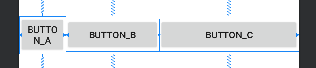
Chain Style
チェーンのスタイルは3種類(画像の赤枠)

| Style | 効果 |
|---|---|
| spread | View同士が均等になるようにmarginを設定して並べる |
| spread_inside | スタートとエンドのViewのmarginは設定せず、中のViewにのみmarginを設定されspread |
| package | Viewを一つの要素のようにくっつけた状態で均等にmarginを設定する |
Weighted Chain
Chain Styleがspread or spread_insideの時に、weightを設定してViewの幅を指定する。
weightを指定したい方向をmatch_constraintに設定する必要がある。
| Attribute | 効果 |
|---|---|
| layout_constraintHorizontal_weight | 水平方向のweightを指定 |
| layout_constraintVertical_weight | 垂直方向のweightを指定 |
<androidx.appcompat.widget.AppCompatButton
    android:id="@+id/Button1"
    android:layout_width="0dp"
    android:layout_height="wrap_content"
    android:text="@string/button_a"
    app:layout_constraintEnd_toStartOf="@+id/Button2"
    app:layout_constraintHorizontal_chainStyle="spread"
    app:layout_constraintHorizontal_weight="1"
    app:layout_constraintStart_toStartOf="parent" />

<androidx.appcompat.widget.AppCompatButton
    android:id="@+id/Button2"
    android:layout_width="0dp"
    android:layout_height="wrap_content"
    android:text="@string/button_b"
    app:layout_constraintEnd_toStartOf="@+id/Button3"
    app:layout_constraintStart_toEndOf="@+id/Button1"
    app:layout_constraintHorizontal_weight="2"/>

<androidx.appcompat.widget.AppCompatButton
    android:id="@+id/Button3"
    android:layout_width="0dp"
    android:layout_height="wrap_content"
    android:text="@string/button_c"
    app:layout_constraintEnd_toEndOf="parent"
    app:layout_constraintStart_toEndOf="@+id/Button2"
    app:layout_constraintHorizontal_weight="3"/>
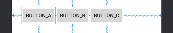
Packed Chain with Bias
Chain Styleがpackageの時に、biasを設定してViewのmarginを指定する。
| Attribute | 効果 |
|---|---|
| layout_constraintHorizontal_bias | 水平方向のbiasを指定 |
| layout_constraintVertical_bias | 垂直方向のbiasを指定 |
<androidx.appcompat.widget.AppCompatButton
    android:id="@+id/Button1"
    android:layout_width="wrap_content"
    android:layout_height="wrap_content"
    android:text="@string/button_a"
    app:layout_constraintBottom_toBottomOf="parent"
    app:layout_constraintEnd_toStartOf="@+id/Button2"
    app:layout_constraintHorizontal_chainStyle="packed"
    app:layout_constraintHorizontal_bias="0.2"
    app:layout_constraintStart_toStartOf="parent"
    app:layout_constraintTop_toTopOf="parent" />

<androidx.appcompat.widget.AppCompatButton
    android:id="@+id/Button2"
    android:layout_width="wrap_content"
    android:layout_height="wrap_content"
    android:text="@string/button_b"
    app:layout_constraintBottom_toBottomOf="parent"
    app:layout_constraintEnd_toStartOf="@+id/Button3"
    app:layout_constraintStart_toEndOf="@+id/Button1"
    app:layout_constraintTop_toTopOf="parent" />

<androidx.appcompat.widget.AppCompatButton
    android:id="@+id/Button3"
    android:layout_width="wrap_content"
    android:layout_height="wrap_content"
    android:text="@string/button_c"
    app:layout_constraintBottom_toBottomOf="parent"
    app:layout_constraintEnd_toEndOf="parent"
    app:layout_constraintStart_toEndOf="@+id/Button2"
    app:layout_constraintTop_toTopOf="parent" />
おわりに
今回はConstraintLayoutのAttributeについて、公式リファレンスの画像やサンプルコードも用いてまとめました。xmlベースでの説明になってしまいましたが、ConstraintLayoutはAndroid StudioのLayout Editorでドラックアンドドロップで作ることもできます。
この記事が皆さんのレイアウト作りの手助けになれば幸いです。