Import SQLContext and data types
from pyspark.sql import SQLContext
from pyspark.sql.types import *
Load the data
DataFrame[author: string, date: string, lang: string, text: string, lat: double, long: double, Anger: double, Disgust: double, Fear: double, Joy: double, Sadness: double, Analytical: double, Confident: double, Tentative: double, Openness: double, Conscientiousness: double, Extraversion: double, Agreeableness: double, EmotionalRange: double]
parquetFile.registerTempTable("tweets");
sqlContext.cacheTable("tweets")
tweets = sqlContext.sql("SELECT * FROM tweets")
print tweets.count()
tweets.cache()
22
Out[9]:
DataFrame[author: string, date: string, lang: string, text: string, lat: double, long: double, Anger: double, Disgust: double, Fear: double, Joy: double, Sadness: double, Analytical: double, Confident: double, Tentative: double, Openness: double, Conscientiousness: double, Extraversion: double, Agreeableness: double, EmotionalRange: double]
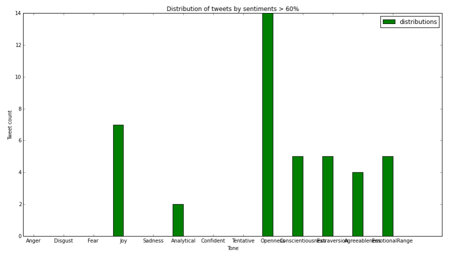
Compute the distribution of tweets by sentiments > 60%
In this section, we demonstrate how to use SparkSQL queries to compute for each tone that number of tweets that are greater than 60%
In [12]:
create an array that will hold the count for each sentiment
sentimentDistribution=[0] * 13
For each sentiment, run a sql query that counts the number of tweets for which the sentiment score is greater than 60%
Store the data in the array
for i, sentiment in enumerate(tweets.columns[-13:]):
sentimentDistribution[i]=sqlContext.sql("SELECT count(*) as sentCount FROM tweets where " + sentiment + " > 60")
.collect()[0].sentCount
In [14]:
%matplotlib inline
import matplotlib
import numpy as np
import matplotlib.pyplot as plt
ind=np.arange(13)
width = 0.35
bar = plt.bar(ind, sentimentDistribution, width, color='g', label = "distributions")
params = plt.gcf()
plSize = params.get_size_inches()
params.set_size_inches( (plSize[0]*2.5, plSize[1]*2) )
plt.ylabel('Tweet count')
plt.xlabel('Tone')
plt.title('Distribution of tweets by sentiments > 60%')
plt.xticks(ind+width, tweets.columns[-13:])
plt.legend()
plt.show()
In [15]:
from operator import add
import re
tagsRDD = tweets.flatMap( lambda t: re.split("\s", t.text))
.filter( lambda word: word.startswith("#") )
.map( lambda word : (word, 1 ))
.reduceByKey(add, 10).map(lambda (a,b): (b,a)).sortByKey(False).map(lambda (a,b):(b,a))
top10tags = tagsRDD.take(10)
%matplotlib inline
import matplotlib
import matplotlib.pyplot as plt
print(top10tags)
params = plt.gcf()
plSize = params.get_size_inches()
params.set_size_inches( (plSize[0]*2, plSize[1]*2) )
labels = [i[0] for i in top10tags]
sizes = [int(i[1]) for i in top10tags]
colors = ['yellowgreen', 'gold', 'lightskyblue', 'lightcoral', "beige", "paleturquoise", "pink", "lightyellow", "coral"]
plt.pie(sizes, labels=labels, colors=colors,autopct='%1.1f%%', shadow=True, startangle=90)
plt.axis('equal')
plt.show()
[(u'#weightloss', 1), (u'#blogengage', 1), (u'#WavesBySocialiga', 1)]
Breakdown of the top 5 hashtags by sentiment scores
In this section, we demonstrate how to build a more complex analytic which decompose the top 5 hashtags by sentiment scores. The code below computes the mean of all the sentiment scores and visualize them in a multi-series bar chart
cols = tweets.columns[-13:]
def expand( t ):
ret = []
for s in [i[0] for i in top10tags]:
if ( s in t.text ):
for tone in cols:
ret += [s.replace(':','').replace('-','') + u"-" + unicode(tone) + ":" + unicode(getattr(t, tone))]
return ret
def makeList(l):
return l if isinstance(l, list) else [l]
Create RDD from tweets dataframe
tagsRDD = tweets.map(lambda t: t )
Filter to only keep the entries that are in top10tags
tagsRDD = tagsRDD.filter( lambda t: any(s in t.text for s in [i[0] for i in top10tags] ) )
Create a flatMap using the expand function defined above, this will be used to collect all the scores
for a particular tag with the following format: Tag-Tone-ToneScore
tagsRDD = tagsRDD.flatMap( expand )
Create a map indexed by Tag-Tone keys
tagsRDD = tagsRDD.map( lambda fullTag : (fullTag.split(":")[0], float( fullTag.split(":")[1]) ))
Call combineByKey to format the data as follow
Key=Tag-Tone
Value=(count, sum_of_all_score_for_this_tone)
tagsRDD = tagsRDD.combineByKey((lambda x: (x,1)),
(lambda x, y: (x[0] + y, x[1] + 1)),
(lambda x, y: (x[0] + y[0], x[1] + y[1])))
ReIndex the map to have the key be the Tag and value be (Tone, Average_score) tuple
Key=Tag
Value=(Tone, average_score)
tagsRDD = tagsRDD.map(lambda (key, ab): (key.split("-")[0], (key.split("-")[1], round(ab[0]/ab[1], 2))))
Reduce the map on the Tag key, value becomes a list of (Tone,average_score) tuples
tagsRDD = tagsRDD.reduceByKey( lambda x, y : makeList(x) + makeList(y) )
Sort the (Tone,average_score) tuples alphabetically by Tone
tagsRDD = tagsRDD.mapValues( lambda x : sorted(x) )
Format the data as expected by the plotting code in the next cell.
map the Values to a tuple as follow: ([list of tone], [list of average score])
e.g. #someTag:([u'Agreeableness', u'Analytical', u'Anger', u'Cheerfulness', u'Confident', u'Conscientiousness', u'Negative', u'Openness', u'Tentative'], [1.0, 0.0, 0.0, 1.0, 0.0, 0.48, 0.0, 0.02, 0.0])
tagsRDD = tagsRDD.mapValues( lambda x : ([elt[0] for elt in x],[elt[1] for elt in x]) )
Use custom sort function to sort the entries by order of appearance in top10tags
def customCompare( key ):
for (k,v) in top10tags:
if k == key:
return v
return 0
tagsRDD = tagsRDD.sortByKey(ascending=False, numPartitions=None, keyfunc = customCompare)
Take the mean tone scores for the top 10 tags
top10tagsMeanScores = tagsRDD.take(10)
%matplotlib inline
import matplotlib
import numpy as np
import matplotlib.pyplot as plt
params = plt.gcf()
plSize = params.get_size_inches()
params.set_size_inches( (plSize[0]*3, plSize[1]*2) )
top5tagsMeanScores = top10tagsMeanScores[:5]
width = 0
ind=np.arange(13)
(a,b) = top5tagsMeanScores[0]
labels=b[0]
colors = ["beige", "paleturquoise", "pink", "lightyellow", "coral", "lightgreen", "gainsboro", "aquamarine","c"]
idx=0
for key, value in top5tagsMeanScores:
plt.bar(ind + width, value[1], 0.15, color=colors[idx], label=key)
width += 0.15
idx += 1
plt.xticks(ind+0.3, labels)
plt.ylabel('AVERAGE SCORE')
plt.xlabel('TONES')
plt.title('Breakdown of top hashtags by sentiment tones')
plt.legend(bbox_to_anchor=(0., 1.02, 1., .102), loc='center',ncol=5, mode="expand", borderaxespad=0.)
plt.show()