ログから出力・加工したデータをつかってグラフをプロットする方法です。
用意するもの
- GNU awk / GNU coreutils
- 記事でのデータ生成に使用
- gnuplot
- 「シェルでなんとかしてやる」という気概
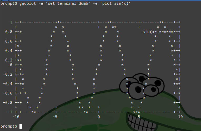
プロットする(ただしターミナル上で)
terminalは出力形式です。dumbとするとアスキーアートでグラフが描画されます。PNG画像がほしいときはpngです。
こんなかんじ:
$ gnuplot -e 'set terminal dumb' \
          -e 'plot sin(x)'
標準入力からプロット
入力は加工済みとします(ここではawkで生成)。
$ seq 100 | awk '{print $1, sin($1/10)}' \
    | gnuplot -e 'set terminal png' \
              -e 'plot "<cat" using 1:2 with lines' \
    > gnuplot_2.png
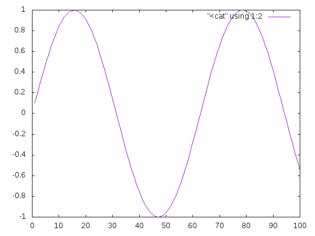
plotの対象に"<cat"を指定すると、標準出力をデータとして読み込みます。usingでプロットに用いるカラムを指定し、今回は線を付けてみました。
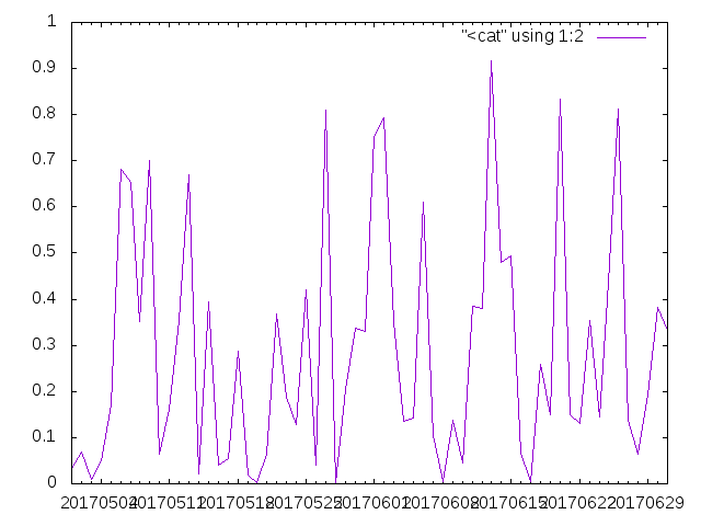
日付データをX軸に使ってプロット
時系列データはawkで生成しました。
$ date -f <(seq 100 | xargs printf "%d day\n") +"%Y%m%d" \
  | awk '{print($1, rand()*rand())}' | sort \
  | gnuplot -e 'set terminal png' \
            -e 'set xdata time'  # x軸を時系列データにする \
            -e 'set timefmt "%Y%m%d"'  # 読み込み書式を指定 \
            -e 'set format x "%Y%m%d"'  # 出力書式を指定\
            -e 'set xrange ["20170501":"20170701"]'  # 範囲を指定 \
            -e 'plot "<cat" using 1:2 with lines' > gnuplot_3.png
まとめ
データのプロットにはgnuplotを使おう。