やりたいこと
ボタンをクリックして、ダイアログをポップアップ出る。かつ、ボタンとダイアログのコンポーネントが同じではない場合。
親コンポーネント
Click.vue
<template>
<div id="app">
<v-app id="inspire">
<v-row justify="center">
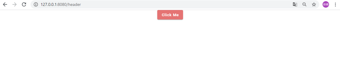
<v-btn slot="activator" color="red lighten-2" @click="dialogs.dialog = true" dark>Click Me</v-btn>
<dialog-card :dialog="dialogs"></dialog-card>
</v-row>
</v-app>
</div>
</template>
<script>
export default {
components: {
DialogCard: () => import("./DialogCard.vue")
},
data() {
return {
dialogs: {
dialog: false,
notifications: false,
sound: true,
widgets: false
}
};
},
};
</script>
- 親部分説明
:dialog="dialogs"
で子供にdialog(プロパティ)転送するデーターとします。
@clickでダイアログの表示非表示を切り替えます。
子コンポーネント
DialogCard.vue
<template>
<v-dialog v-model="dialog.dialog" max-width="600px" persistent>
<v-card>
<v-card-title>
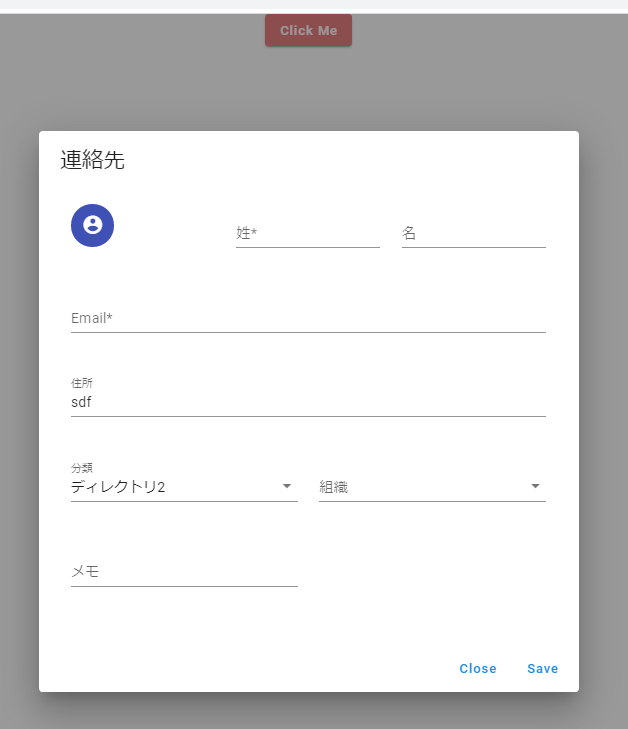
<span class="headline">連絡先</span>
</v-card-title>
<v-card-text>
<v-container>
<v-row>
<v-col cols="12" sm="6" md="4">
<v-avatar color="indigo">
<v-icon dark>mdi-account-circle</v-icon>
</v-avatar>
</v-col>
<v-col cols="12" sm="6" md="4">
<v-text-field label="姓*" required></v-text-field>
</v-col>
<v-col cols="12" sm="6" md="4">
<v-text-field label="名" required></v-text-field>
</v-col>
<v-col cols="12">
<v-text-field label="Email*" required></v-text-field>
</v-col>
<v-col cols="12">
<v-text-field label="住所"></v-text-field>
</v-col>
<v-col cols="12" sm="6">
<v-select :items="['ディレクトリ1', 'ディレクトリ2', 'ディレクトリ3']" label="分類"></v-select>
</v-col>
<v-col cols="12" sm="6">
<v-autocomplete
:items="['経理', 'プラットフォーム', 'プラットフォーム2', '人事']"
label="組織"
multiple
></v-autocomplete>
</v-col>
<v-col cols="12" sm="6">
<v-text-field label="メモ"></v-text-field>
</v-col>
</v-row>
</v-container>
</v-card-text>
<v-card-actions>
<v-spacer></v-spacer>
<v-btn color="blue darken-1" text @click="dialog.dialog = false">Close</v-btn>
<v-btn color="blue darken-1" text @click="dialog.dialog = false">Save</v-btn>
</v-card-actions>
</v-card>
</v-dialog>
</template>
<script>
export default {
props: ["dialog"],
};
</script>
- 子部分説明
v-model="dialog.dialog" で表示非表示を切り替え
props: ["dialog"] で親のデーターを受け取る
@click で表示非表示を切り替え
完成図
- 親(ボタン)
- 子(ダイアログ)