こんばんは!引き続き某フリマアプリ開発が続いています。今日はレスポンシブデザインについて学習した事をまとめてみました!
環境
rails 5.2.3
ruby 2.5.1
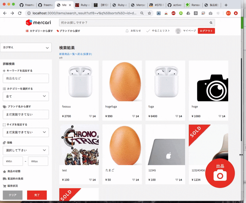
こんな感じにしたい
レスポンシブデザインとはPC以外の端末、スマホやタブレットから閲覧してもレイアウトがデバイスの画面サイズに適したデザインにできます。webサービスをモバイルフレンドリーにする方法です
作成手順
サイドメニュー部分をまず作ります
.sidemenu
  = search_form_for @q, url:search_result_items_path do |f|
  .search-sort
    .form-group
      .search-select-wrap
        .icon.fas.fa-chevron-down
        = f.select(:sorts, { '並び替え': 'id desc', '価格の安い順': 'price asc', '価格の高い順': 'price desc', '出品の古い順': 'updated_at asc', '出品の新しい順': 'updated_at desc' }, { selected: params[:q][:sorts] }, { onchange: 'this.form.submit()'} )
    .search-dropdown-content.search-extend
      %h3.visible-large
        詳細検索
      .search-form-group
        %lavel
          %i.fas.fa-plus
          %span
            キーワードを追加する
        = f.search_field:name_cont, placeholder:"商品名など", class:"search-input-default"
      .search-form-group
        %lavel
          %i.fas.fa-list-ul
          %span
            カテゴリーを選択する
          .search-select-wrap
            .icon.fas.fa-chevron-down
            = f.fields_for :category do |category|
              = category.collection_select :category_id_eq, @parents, :id, :name, {prompt: "全て"}, {class: "search-input-default select"}
      .search-form-group
        %lavel
          %i.fas.fa-tags
          %span
            ブランド名から探す
            %input.search-input-default{ name: "keyword", placeholder: "まだ実装できてない", type: "text", value: ""}/
      .search-form-group
        %lavel
          %i.fas.fa-expand
          %span
            サイズを指定する
          .search-select-wrap{"data-search" => "parent"}
            .icon.fas.fa-chevron-down
            %select.search-input-default.select{:name => "size_group"}
              %option{:value => ""} まだ実装できてない
      .search-form-group
        %lavel
        %i.fas.fa-coins
        %span
          価格
        .search-select-wrap
          .icon.fas.fa-chevron-down
          %select.search-input-default.select
            %option{value: "def0"}
              選択して下さい
        .search-select-wrap.half
          = f.number_field:price_gteq, placeholder: "¥Min", class:"search-input-default price", id: "min-price"
          %span ~
          = f.number_field:price_lteq, placeholder: "¥Max", class:"search-input-default price", id: "max-price"
      .search-form-group.clearfix
        %lavel
          %i.fas.fa-star
          %span
            商品の状態
        %div.form-group__check
          .checkbox
            .checkbox__lavel
      .search-form-group
        %label
          %i.fas.fa-truck-moving
          %span
            配送料の負担
      .search-form-group
        %label
          %i.fas.fa-shopping-cart
          %span
            販売状況
      .search-extend-btn
        = f.button "クリア", type: :reset, class:"btn-default btn-gray search-btn"
        = f.submit "完了", class: "btn-default btn-red search-btn"
まだ完成していないので中途半端なコードお許し下さい。ポイントはgem 'ransack'ソート機能部分なのですが、今回はレスポンシブについての記事なので別記事でまた書きたいと思います。
@media screen and (min-width: 1068px) {
//この中のcssプロパティは画面サイズが1068px以上の時のみ適応します
//以下一部だけ抜粋
  .search-extend-btn {
    display: flex;
  }
  .btn-default.btn-gray.search-btn {
    width: 42%;
    margin-right: 25px;
    outline: 0;
  }
  .btn-default.btn-red.search-btn {
    width: 42%;
  }
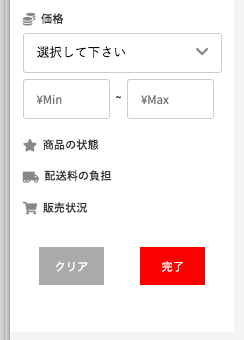
上記のscssは画面が1068px以上の場合のみ適応されるプロパティになるので以下の写真のボタンになります。
画面縮めた時用のsidemenuを準備
先項では1068px以上の時のsidemenuなので次は1068px以下の画面用のsidemenuを作ります。
.responsive-sidemenu
  .hidden-select-box
    %i.hidden-select-box__icon.fas.fa-exchange-alt
    .hidden-select-box__name 並び替え
    %select.hidden-select-box__left-search
      %option{value: ""}
      %option{value: ""}
        これはハリボテです
  .hidden-select-box
    %i.hidden-select-box__icon.fas.fa-search
    .hidden-select-box__name 詳細検索
    %button.hidden-select-box__search-box
//以下一部だけ抜粋
.hidden-select-box {
  width: 340px;
  position: relative;
  display: flex;
  &__icon.fas.fa-exchange-alt {
    position: absolute;
    right: 165px;
    top: 35%;
    color: #aaa;
    font-size: 14px;
    -webkit-transform: rotate(90deg);
    transform: rotate(90deg);
  }
  &__icon.fas.fa-search {
    position: absolute;
    right: 150px;
    top: 20%;
    color: #aaa;
    font-size: 14px;
  }
  &__name {
    position: absolute;
    right: 140px;
    top: 60%;
  }
  &__left-search {
    background: #fff;
    outline: 1px solid #ccc;
    width: 320px;
    font-size: 14px;
    height: 60px;
    padding: 10px;
    -webkit-appearance: none;
    -moz-appearance: none;
    appearance: none;
  }
  &__search-box {
    background: #fff;
    outline: 1px solid #ccc;
    width: 320px;
    font-size: 14px;
    height: 60px;
    padding: 10px;
  }
}

@media screen and (min-width: 1068px) {
  .search-extend-btn {
    display: flex;
  }
  .btn-default.btn-gray.search-btn {
    width: 42%;
    margin-right: 25px;
    outline: 0;
  }
  .btn-default.btn-red.search-btn {
    width: 42%;
  }
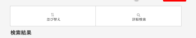
@mediaの外に書いてあげます。すると以下の画像のような検索ボックスを作れます。
このままだとこんな感じ
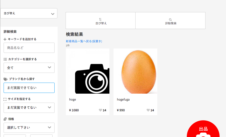
1068px以上に画面を広げた時に本来は左側のsidemenuのみ表示したいんですが、前項で作った1068px以下の時用responsive-sidemenuもこんにちはしてしまいます。
ブレイクポイント前後でレイアウトの配置が変わるレスポンシブは実装した事がありましたが、ある要素が消えて新しい要素を出現させるという実装は初めてだったのでここで躓きました。
今回の解決方法 !important
「!important」は、CSSに非常に強く指示を出せる効果的手法ですが、乱用は禁物です。あくまで、最後の手段と考えてください。乱用によって、逆にCSSが効かなくなることがあることは覚えておいてください。
CSSの優先順位を理解しよう(!importantの使い方も)
https://creive.me/archives/14805/
今回は!important使いました。display: none;とvisibility: visible;を使ってみたが表示・非表示の切り替えがうまくでませんでした。
display: none;を使うとレスポンシブのブレイクポイント切り替え前後ともに表示されない。またvisibility: hidden;も使ってみたのですが、これはdisplay:none;と違い要素が消えるわけではなく見えなくなるので、見えない要素がそこに残っています。今回の実装では使えません。
完成コード
.sidemenu {
  display: none !important;
}
//1068px以下の画面サイズの時.sidemenu配下にいる全ての要素は消えてくれます
.responsive-sidemenu {
  display: flex !important;
}
//1068px以下の画面サイズの時.responsive-sidemenu配下にいる全ての要素が表示されます

//以下一部だけ抜粋
.hidden-select-box {
  width: 340px;
  position: relative;
  display: flex;
  &__icon.fas.fa-exchange-alt {
    position: absolute;
    right: 165px;
    top: 35%;
    color: #aaa;
    font-size: 14px;
    -webkit-transform: rotate(90deg);
    transform: rotate(90deg);
  }
  &__icon.fas.fa-search {
    position: absolute;
    right: 150px;
    top: 20%;
    color: #aaa;
    font-size: 14px;
  }
  &__name {
    position: absolute;
    right: 140px;
    top: 60%;
  }
  &__left-search {
    background: #fff;
    outline: 1px solid #ccc;
    width: 320px;
    font-size: 14px;
    height: 60px;
    padding: 10px;
    -webkit-appearance: none;
    -moz-appearance: none;
    appearance: none;
  }
  &__search-box {
    background: #fff;
    outline: 1px solid #ccc;
    width: 320px;
    font-size: 14px;
    height: 60px;
    padding: 10px;
  }
}

@media screen and (min-width: 1068px) {
  .responsive-sidemenu {
  display: none !important;
  }
//1068px以上の画面サイズの場合は.responsive-sidemenu配下にいる全ての要素は消えてくれます
  .sidemenu {
    display: block !important;
  }
//1068px以上の画面サイズの場合は.sidemenu配下にいる全ての要素は表示されます
  .search-extend-btn {
    display: flex;
  }
  .btn-default.btn-gray.search-btn {
    width: 42%;
    margin-right: 25px;
    outline: 0;
  }
  .btn-default.btn-red.search-btn {
    width: 42%;
  }
ポイントは...
display: block !important;
//値はinline,inline-block,flexなど表示の仕方で変えられます
display: none !important;
この2つを表示・非表示したい要素に指定してあげます。
まとめ
某フリマサイトはPC/タブレット/スマホの3画面に対応しているので本物に近づける為にはブレイクポイントを2つ作る必要がありそうです。ただ開発期間中にそこまでこだわる事は時間的に難しいので、個人アプリではぜひ実装してみたいと思います!