はじめに
前回の記事(Create React AppのTypeScript対応プロジェクトにStorybook v6を導入した)に引き続き、今回はReact Native + Expo のプロジェクトにStorybook v6を導入できるか検討してみました。
インストール
プロジェクト作成の前にNode.jsとyarnがインストールされていることを確認します。
以下のコマンドでプロジェクトを作成することができます。
expo init my-project
コマンドを実行するとtempleteを選ぶことができるので、今回はblank (TypeScript)を選択します。
$ expo init my-project
? Choose a template: › - Use arrow-keys. Return to submit.
    ----- Managed workflow -----
    blank                 a minimal app as clean as an empty canvas
❯   blank (TypeScript)    same as blank but with TypeScript configuration
    tabs (TypeScript)     several example screens and tabs using react-navigation and TypeScript
    ----- Bare workflow -----
    minimal               bare and minimal, just the essentials to get you started
    minimal (TypeScript)  same as minimal but with TypeScript configuration
cd my-projectでフォルダに移動し、以下のコマンドでStorybookを導入することができます。
npx -p @storybook/cli sb init --type react
*Create React Appではnpx sb initコマンドでv6が導入されましたが、expoではv5が導入されてしまうので注意が必要です。
以下のコマンドを実行することでStorybookが起動します。
yarn storybook
Storybookの関連ファイルとフォルダ
ここまでのコマンド実行でプロジェクト直下に.storybookとstoriesというフォルダが作成されていると思います。
*Create React Appだとsrc/storiesというディレクトリ構成ですが、Expoの場合だとプロジェクト直下にstoriesフォルダが作成されます。

.storybookフォルダ内のファイル構成はv6から、main.jsとpreview.jsの2ファイルになりました。
main.jsではstoryのパスや適用するアドオンを定義し、preview.jsでは全ストーリーに対してグローバルにアドオンを適用したりすることができます。
main.js
module.exports = {
  "stories": [
    "../stories/**/*.stories.mdx",
    "../stories/**/*.stories.@(js|jsx|ts|tsx)"
  ],
  "addons": [
    "@storybook/addon-links",
    "@storybook/addon-essentials",
    "@storybook/addon-knobs"
  ]
}
preview.js
export const parameters = {
  actions: { argTypesRegex: "^on[A-Z].*" },
}
Storyの作成
今回はButtonコンポーネントを使って簡単なStoryを作成します。
stories直下にcomponentsフォルダを作成し、componentsフォルダの中でさらにコンポーネント単位でフォルダを作成します。
例えば、今回のケースでは、stories/components/ButtonNativeの中にButton.tsx, Button.stories.tsxの2つファイルを作成します。
Button.tsx
import React from 'react';
import { Button, ScrollView, View } from 'react-native';

const ButtonNative = (props) => {
  const { color, title, age, ...rest } = props;
  return (
    <ScrollView style={{ height: 1000 }}>
      <View style={{ width: 300 }}>
        <Button
          buttonStyle={{ width: 100 }}
          color={color}
          title={title}
          {...rest}
        />
      </View>
    </ScrollView>
  );
};

export default ButtonNative;
当たり前ですが、上記のようにScrollViewなどのReact Naviveコンポーネントにも対応しています。
Button.stories.tsx
import React from 'react';
import ButtonNative from './Button';

export default {
  title: 'native/ButtonNative',
  compoent: ButtonNative,
};

const Template = (args) => <ButtonNative {...args} />;

export const PrimaryA = Template.bind({});
PrimaryA.args = {
  color: 'blue',
  title: 'Primary Args',
};

export const LongPrimaryA = Template.bind({});
LongPrimaryA.args = {
  ...PrimaryA.args,
  title: 'Long Primary Args',
};

export const SecondaryA = Template.bind({});
SecondaryA.args = {
  color: 'red',
  title: 'Secondary Args',
};
数箇所にわけて説明します。
export default {
  title: 'native/ButtonNative',
  compoent: ButtonNative,
};
titleはStorybook内のサイドバーでの表示名を表します。

componentにはimportしたtsxファイル名を指定します。
const Template = (args) => <ButtonNative {...args} />;
こちらで各ストーリーのテンプレートを作成します。作成していくストーリーには、全てこのテンプレートを使用します。
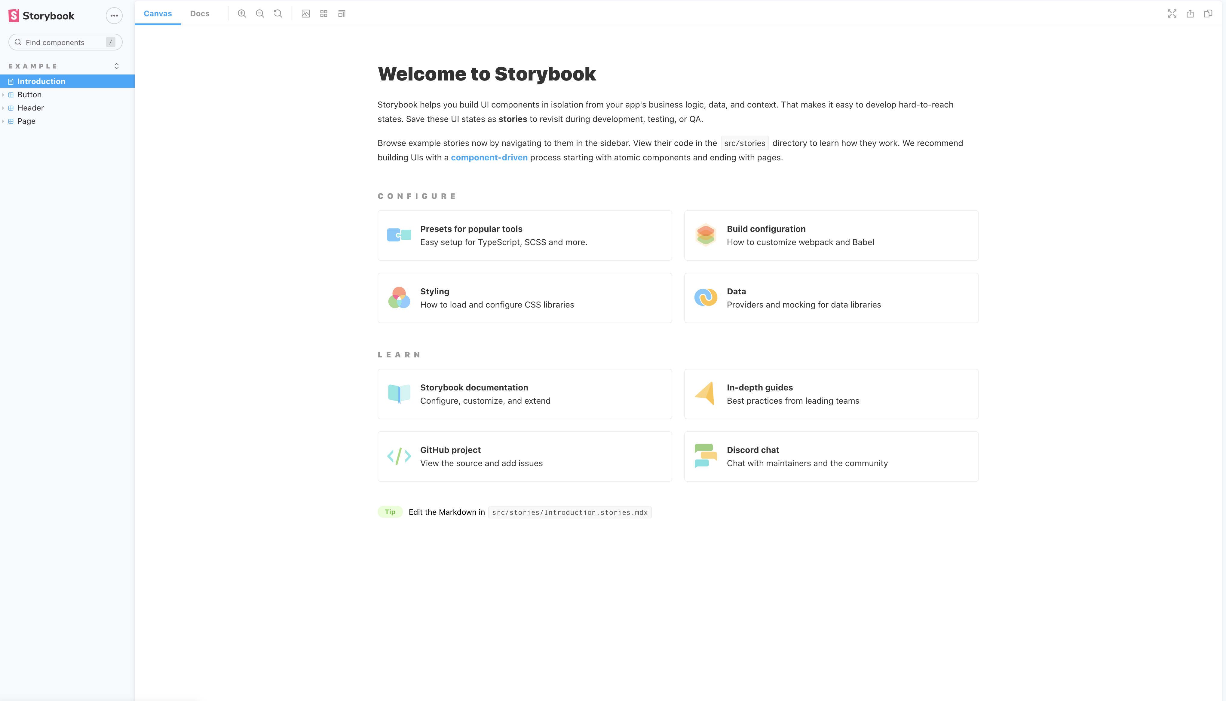
export const PrimaryA = Template.bind({});
PrimaryA.args = {
  color: 'blue',
  title: 'Primary Args',
};
PrimaryAというストーリーを作成しました。
作成したTempleteをbindし、colorとtitleにそれぞれ引数を与えます。
すると、Storybook内に作成したストーリーのコンポーネントが表示されます。
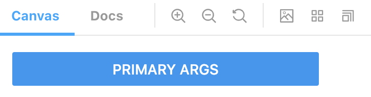
Button.stories.tsxにさらに2つのストーリーを追加します。
PrimaryAのcolorはそのままでtitleのみを変更したり、
export const LongPrimaryA = Template.bind({});
LongPrimaryA.args = {
  ...PrimaryA.args,
  title: 'Long Primary Args',
};

colorとtitleを両方とも変更したりなど、自由にstoryを作ることができます。
export const SecondaryA = Template.bind({});
SecondaryA.args = {
  color: 'red',
  title: 'Secondary Args',
};
アドオンの導入
Storybookには便利なアドオン(拡張機能)がいろいろ揃っています。
今回はaddon-knobsというアドオンを導入します。
アドオンのインストールには以下のコマンドを用い、インストール後はmain.jsに使用するアドオンを追記してください。
yarn add -D ~
main.js
module.exports = {
  stories: [
    '../stories/**/*.stories.mdx',
    '../stories/**/*.stories.@(js|jsx|ts|tsx)',
  ],
  addons: [
    '@storybook/addon-links',
    '@storybook/addon-essentials',
    '@storybook/addon-knobs',
  ],
};
addon-knobs
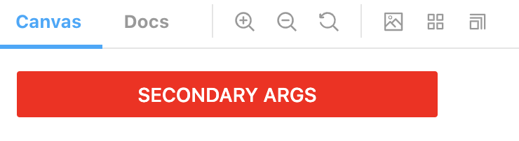
こちらのアドオンでは、Storybook下部のknobsタブ内でpropsを手動で変更することができます。
以下では、Buttonのtitle, color, disabledを変更できるようにしました。
*addon-knobsはv6の書き方に対応していないようでしたので、v5の書き方で記載しました。
Button.stories.tsx
export const Knobs = () => (
  <ButtonNative
    title={text('Name', 'ボタン')}
    color={color('Color', 'red')}
    disabled={boolean('Disabled', false)}
  />
);
以下のようにカラーマップから自由に色を変更したり、チェックボックスからDisabled状態に切り替えることができます。

React Nativeプロジェクトにおけるアドオン
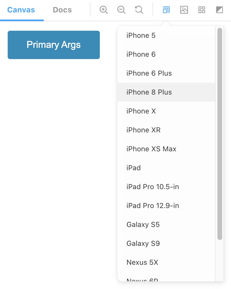
Storybookには、addon-knobsの他にも、addon-viewport, addon-console, addon-a11y, addon-docsなどの便利なアドオンが揃っています(詳しくは以下の記事をご覧ください)。 Create React AppのTypeScript対応プロジェクトにStorybook v6を導入したしかし、React Nativeでは、なんとこれらのアドオンのほとんどには対応していません...

せめて市販端末の画面サイズでコンポーネント表示を確認できる、addon-viewportには対応してほしかったのですが...
(以下はCreate React Appで導入した際の画面です)
おわりに
ほとんどのアドオンに対応していないことから、現状では、実際のReact Native + ExpoプロジェクトにStorybookを導入するのは難しそうですね...
今後の公式の対応に期待したいと思います。