はじめに
レンダリングされたコンポーネントのアサーションを行うにあたり、前回の記事でEnzymeについて学習しました。
現場で導入しようとしたところ、なんとReact Nativeではshallowレンダリングがうまくいかないという問題が発生しました。
React (Native) Testing Libraryを使えばコンポーネントのアサーションが行えるとのことなので、このたび勉強することにしました。
Testing Libraryとは
Testing Libraryの役割は、テスト用の仮想DOMの作成と作成した仮想DOMへのアクセスです。
これを利用することで、ブラウザを使わずにReactのテストを行うことができるようになります。
JestはTesting Libraryで作成された仮想DOMを使用してテストを実行し、結果(Pass/Fail)を出力するテストランナーの役割を果たします。
create-react-appのプロジェクトを作成したときのデフォルトのテストを例に考えると、render(<App />)でAppコンポーネントの仮想DOMを作成し、screen.getByText(/learn react/i)でlearn react(大文字区別なし)の文字が含まれている仮想DOMにアクセスしています。
最後にexpect(linkElement).toBeInTheDocument()で、アクセスした仮想DOMにlearn textの文字が含まれていればPassを出力するようなアサーションを行っています。
import { render, screen } from '@testing-library/react';
import App from './App';

test('renders learn react link', () => {
  render(<App />); //Appコンポーネントの仮想DOMを作成
  const linkElement = screen.getByText(/learn react/i); //仮想DOM内のテキストにアクセス
  expect(linkElement).toBeInTheDocument(); //指定テキストが含まれていればPass
});
Testing Libraryで仮想DOMにアクセスする際の鉄則は以下に記載されています。
jest-domとは
テストのPass/Failを判定することをアサーションといいます。
アサーションはexpect(linkElement).toBeInTheDocument()のように行い、expect(linkElement)の中身がtoBeInTheDocument()のmatcherに一致するかどうかでテストのPass/Failを判定します。
jest-domは仮想DOMのアサーションを簡単にするために、Custom matcherを使用してJestを拡張するライブラリです。
toBeInTheDocument()はjest-domのCustom matcherの一つです。
Testing Libraryを使用するためにjest-domは必須ではありませんが、使用することでテストの作成がより簡単になります。
実装
クリックするごとに色が赤↔青にトグルするbuttonと、buttonを非活性にするcheckboxを配置したときのテストを作成します。
buttonのテスト
buttonをクリックすると色が変わるようなケースについてテストします。
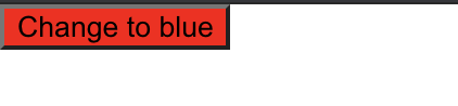
Appコンポーネント内に、クリックするごとに色が赤↔青にトグルするbuttonを作成します。
import { useState } from 'react';
import './App.css';

function App() {
  const [buttonColor, setButtonColor] = useState('red');
  const newButtonColor = buttonColor === 'red' ? 'blue' : 'red';

  return (
    <div>
      <button
        style={{ backgroundColor: buttonColor }}
        onClick={() => setButtonColor(newButtonColor)}
      >
        Change to {newButtonColor}
      </button>
    </div>
  );
}

export default App;
テストでは以下のアサーションを行います。
- ボタンのデフォルト色が赤であること
expect(colorButton).toHaveStyle({ backgroundColor: 'red' }) - クリック後のボタンの色が青であること
expect(colorButton).toHaveStyle({ backgroundColor: 'blue' }) - クリック後のボタンのラベルが'Change to red'になっていること
expect(colorButton.textContent).toBe('Change to red')
アサーションを行うにあたり、render(<App />)でAppコンポーネントの仮想DOMを作成し、const colorButton = screen.getByRole('button', { name: 'Change to blue' })でラベル名が'Change to blue'であるボタンのDOMにアクセスしています。
また、Testing LibraryのfireEventを利用することで、fireEvent.click(colorButton)のように、テスト内でボタンのクリックイベントを模擬することができます。
import { render, screen, fireEvent } from '@testing-library/react';
import App from './App';

test('button has correct initial color', () => {
  render(<App />);
  const colorButton = screen.getByRole('button', { name: 'Change to blue' });

  //ボタンのデフォルト色が赤であればPass
  expect(colorButton).toHaveStyle({ backgroundColor: 'red' });

  //ボタンのクリックイベントを発火
  fireEvent.click(colorButton);

  //ボタンの色が青になっていればPass
  expect(colorButton).toHaveStyle({ backgroundColor: 'blue' });

  //ボタンのラベルが'Change to red'になっていればPass
  expect(colorButton.textContent).toBe('Change to red');
});
checkboxのテスト
チェックするとbuttonを非活性(グレー)にするようなcheckboxのテストを考えます。
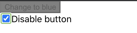
App.jsは以下のようになります。
function App() {
  const [buttonColor, setButtonColor] = useState('red');
  const [disabled, setDisabled] = useState(false);
  const newButtonColor = buttonColor === 'red' ? 'blue' : 'red';

  return (
    <div>
      <button
        style={{ backgroundColor: disabled ? 'gray' : buttonColor }}
        onClick={() => setButtonColor(newButtonColor)}
        disabled={disabled}
      >
        Change to {newButtonColor}
      </button>
      <br />
      <input
        type="checkbox"
        id="disable-button-checkbox"
        defaultChecked={disabled}
        aria-checked={disabled}
        onChange={(e) => setDisabled(e.target.checked)}
      />
      <label htmlFor="disable-button-checkbox">Disabled button</label>
    </div>
  );
}
buttonとcheckboxの状態によって、4パターンのテストを行います。
- 初期状態(button: 活性、checkbox: チェックなし)
- checkboxを2回クリックした後のそれぞれのbuttonの状態(1回目: 非活性、2回目: 活性)
- checkboxを2回クリックした後のそれぞれのbuttonの色(1回目: グレー、2回目: 赤)
- buttonを1回クリックした後にcheckboxを2回クリックしたときのそれぞれのbuttonの色(1回目: グレー、2回目: 青)
jest-domのmatcherを利用することで、buttonの活性/非活性、buttonの色、checkboxのチェック有無を以下のように判定しています。
- buttonの活性/非活性:
expect(colorButton).toBeEnabled()/expect(colorButton).toBeDisabled() - buttonの色:
expect(colorButton).toHaveStyle('background-color: gray') - checkboxのチェック有無:
expect(checkbox).toBeChecked()/expect(checkbox).not.toBeChecked()
test('initial conditions', () => {
  render(<App />);

  const colorButton = screen.getByRole('button', { name: 'Change to blue' });
  expect(colorButton).toBeEnabled();

  const checkbox = screen.getByRole('checkbox');
  expect(checkbox).not.toBeChecked();
});

test('Checkbox disables button on first click and enables on second click', () => {
  render(<App />);
  const checkbox = screen.getByRole('checkbox', { name: 'Disabled button' });
  const colorButton = screen.getByRole('button', { name: 'Change to blue' });

  fireEvent.click(checkbox);
  expect(colorButton).toBeDisabled();

  fireEvent.click(checkbox);
  expect(colorButton).toBeEnabled();
});

test('Disabled button has gray background and reverts to red', () => {
  render(<App />);
  const checkbox = screen.getByRole('checkbox', { name: 'Disable button' });
  const colorButton = screen.getByRole('button', { name: 'Change to blue' });

  fireEvent.click(checkbox);
  expect(colorButton).toHaveStyle('background-color: gray');

  fireEvent.click(checkbox);
  expect(colorButton).toHaveStyle('background-color: red');
});

test('Disabled button has gray background and reverts to blue', () => {
  render(<App />);
  const checkbox = screen.getByRole('checkbox', { name: 'Disable button' });
  const colorButton = screen.getByRole('button', { name: 'Change to blue' });

  fireEvent.click(colorButton);

  fireEvent.click(checkbox);
  expect(colorButton).toHaveStyle('background-color: gray');

  fireEvent.click(checkbox);
  expect(colorButton).toHaveStyle('background-color: blue');
});
参考資料