線グラフを書くにはplotを使う。
以下にいくつかの例を示す。
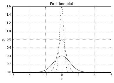
簡単な線グラフの描画
plot(x,y)のようにx,yの値を別々に渡す。
パラメータlinestyleで線のスタイルが指定できる。
import numpy as np
import matplotlib.pyplot as plt
from scipy.stats import norm

fig = plt.figure()
ax = fig.add_subplot(1,1,1)

x = np.linspace(-6,6,1000)

ax.plot(x,norm.pdf(x, loc=0.0, scale=1.0), color='black',  linestyle='solid')
ax.plot(x,norm.pdf(x, loc=0.0, scale=0.5), color='black',  linestyle='dashed')
ax.plot(x,norm.pdf(x, loc=0.0, scale=0.25), color='black', linestyle='dashdot')

ax.set_title('First line plot')
ax.set_xlabel('x')
ax.set_ylabel('y')
ax.grid(True)
fig.show()
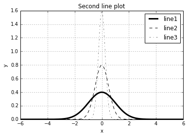
線の太さの変更
linewidthで線の太さが変えられる。
import numpy as np
import matplotlib.pyplot as plt
from scipy.stats import norm

fig = plt.figure()
ax = fig.add_subplot(1,1,1)

x = np.linspace(-6,6,1000)

ax.plot(x,norm.pdf(x, loc=0.0, scale=1.0), color='black',  linestyle='solid', linewidth = 3.0, label='line1')
ax.plot(x,norm.pdf(x, loc=0.0, scale=0.5), color='black',  linestyle='dashed',linewidth = 1.0, label='line2')
ax.plot(x,norm.pdf(x, loc=0.0, scale=0.25), color='black', linestyle='dashdot', linewidth = 0.5,label='line3')

ax.set_title('Second line plot')
ax.set_xlabel('x')
ax.set_ylabel('y')
ax.legend()
ax.grid(True)
fig.show()
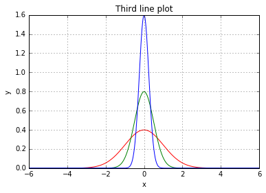
線の色の変更
線の色はcolorで変える。
import numpy as np
import matplotlib.pyplot as plt
from scipy.stats import norm

fig = plt.figure()
ax = fig.add_subplot(1,1,1)

x = np.linspace(-6,6,1000)

ax.plot(x,norm.pdf(x, loc=0.0, scale=1.0), color='red',  linestyle='solid', linewidth = 1.0)
ax.plot(x,norm.pdf(x, loc=0.0, scale=0.5), color='green',linestyle='solid',linewidth = 1.0)
ax.plot(x,norm.pdf(x, loc=0.0, scale=0.25), color='blue', linestyle='solid', linewidth = 1.0)

ax.set_title('Third line plot')
ax.set_xlabel('x')
ax.set_ylabel('y')
ax.grid(True)
fig.show()
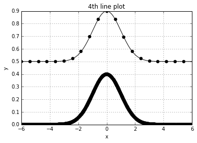
markerの描画
markerを指定すると線グラフのデータの場所にmarkerが描画される。
データが多い場合は、下の線のようにmarkerで線が見えなくなる。
markeveryを指定することで何個間隔でmarkerを描画するか指定できる。
import numpy as np
import matplotlib.pyplot as plt
from scipy.stats import norm

fig = plt.figure()
ax = fig.add_subplot(1,1,1)

x = np.linspace(-6,6,1000)

ax.plot(x,norm.pdf(x, loc=0.0, scale=1.0), color='black',  linestyle='solid', linewidth = 1.0, marker='o')
ax.plot(x,0.5 + norm.pdf(x, loc=0.0, scale=1.0), color='black',  linestyle='solid', linewidth = 1.0, marker='o', markevery = 50)

ax.set_title('4th line plot')
ax.set_xlabel('x')
ax.set_ylabel('y')
ax.grid(True)
fig.show()
markerの代表的なもの
| marker | description |
|---|---|
| . | point |
| o | circle |
| v | 下三角 |
| ^ | 上三角 |
| s | 四角 |
| + | plus |
| x | cross |
| * | star |