この投稿では、GatsbyにTailwind CSSを導入する最も手軽な手順を紹介します。
本稿で紹介する手順を適用したGatsbyプロジェクトのソースコードはGitHubにありますので、完成形のコードを確認する場合はご覧ください: https://github.com/suin/gatsby-demo-tailwind-css-01
この投稿で実現すること
大まかなスタイリングはTailwind CSSのユーティリティクラスを使い、Tailwind CSSがカバーできない細かいスタイリングは、素のCSS(CSS-in-JS)で対応できるようにします。
例えば、Tailwind CSSだけで完結するスタイリングは次のように書けるようになります:
(
  <h1 tw="text-3xl font-bold py-2">タイトル</h1>
)
例えば、Tailwind CSSに素のCSSを加える場合は、次のように書けるようになります:
(
  <pre css={[
    tw`p-4 bg-gray-900 text-white rounded`, // Tailwind CSS
    css`tab-size: 2;`, // 素のCSS (タブ文字幅を2文字に設定している)
  ]}>{'foo:\n\tbar:\n\t\tbuz: true'}</pre>
)
↓描画結果

扱わない技術
できるだけ最低限の手順にしたかったので、他の解説記事で扱っている以下の技術は扱いません。
- PostCSS
- emotion (CSS-in-JSライブラリ)
- styled-component (CSS-in-JSライブラリ)
- PurgeCSS
- SCSS
これらは後々知っておいたほうがいいと考えられますが、GatsbyでTailwind CSSを当座使う当たっては後回しにしても良いと考えました。本稿で説明する手順では、emotionについては内部的に使われますが、気にならない程度になってます。本稿はCSS-in-JSでスタイリングすることを目的にするのでSCSSは扱いません。
また、本稿ではtwin.macroというTailwind CSSをReactで扱うライブラリを使うため、その競合となるtailwind.macroについては扱いません。
GatsbyにTailwind CSSを導入する手順
パッケージにインストール
まず必要なパッケージをインストールします。
yarn add twin.macro @emotion/core @emotion/styled gatsby-plugin-emotion
twin.macroは、Tailwind CSSのユーティリティクラスをCSS-in-JSとして扱えるようにするライブラリです。なので、React上でTailwind CSSを使うには、classNameプロパティではなく、twプロパティなどを使います。使い方の詳細は後述します。
tailwindcssパッケージはtwin.macroを入れれば入ってくるので、明示的に入れる必要はありません。
Tailwind CSSの基本スタイルを当てる
gatsby-browser.jsに次の1行を追記して、Tailwind CSSの基本スタイルを当てます。
import "tailwindcss/dist/base.css"
emotionプラグインを有効にする
gatsby-config.jsにgatsby-plugin-emotionを追加して、CSS-in-JSが使えるようにします。
module.exports = {
  plugins: [`gatsby-plugin-emotion`],
}
Tailwind CSSの設定ファイルを生成する
プロジェクトルートにTailwind CSSの設定ファイルtailwind.config.jsを作っておきます。中身は変更しなくて構いません。
npx tailwindcss init
上のコマンドを実行する次のファイルが生成されます:
module.exports = {
  purge: [],
  theme: {
    extend: {},
  },
  variants: {},
  plugins: [],
}
Babelマクロの設定を追加する
Babelマクロの設定をpackage.jsonに追加して、twin.macroを使えるようにします。
{
  "babelMacros": {
    "twin": {
      "config": "./tailwind.config.js",
      "preset": "emotion",
      "hasSuggestions": true,
      "debug": false
    }
  }
}
ちなみに、babel-plugin-macrosパッケージは別途インストールする必要はありません。twin.macroを入れると勝手に入るため。
作成・変更したファイルの確認
ここまでの手順で以下のファイルが作成・変更されたことを確認します。
.
├── gatsby-browser.js → Tailwind CSSの基本スタイルをimportしているか?
├── gatsby-config.js → emotionプラグインが有効になっているか?
├── package.json → Babelマクロの設定が追加されているか?
└── tailwind.config.js → Tailwind CSSの設定ファイルが生成されているか?
以上がGatsbyにTailwind CSSを導入する手順です。
twin.macroをReactで使うには
twin.macroをReactで使う最もシンプルな書き方はtwプロパティにTailwind CSSのクラスを書いていく方法です:
import "twin.macro"

const Title = ({ children }) =>
  <h1 tw="text-3xl font-bold py-2">{children}</h1>
上の書き方は、twを使って更に簡潔に書くこともできます:
import tw from "twin.macro"

const Title = tw.p`text-3xl font-bold py-2`
Tailwind CSSのクラスを使いつつ、素のスタイル(CSS-in-JS)を当てるには、cssプロパティとcssタグを使います:
import tw, { css } from "twin.macro"

const Code = ({ children }) => (
  <pre css={[
    tw`p-4 bg-gray-900 text-white rounded`,
    css`tab-size: 2;`,
  ]}>{children}</pre>
)
条件に応じてスタイルを切り替えるには、styledを使います:
import tw, { styled } from "twin.macro"

const Link = styled.a(({ small }) => [
  tw`text-white bg-black px-8 py-2 rounded`,
  small ? tw`text-sm` : tw`text-lg`,
])

const Links = () => (
  <>
    <Lin href="#">大きい文字のリンク</Link>
    <Link small href="#">小さい文字のリンク</Link>
  </>
)
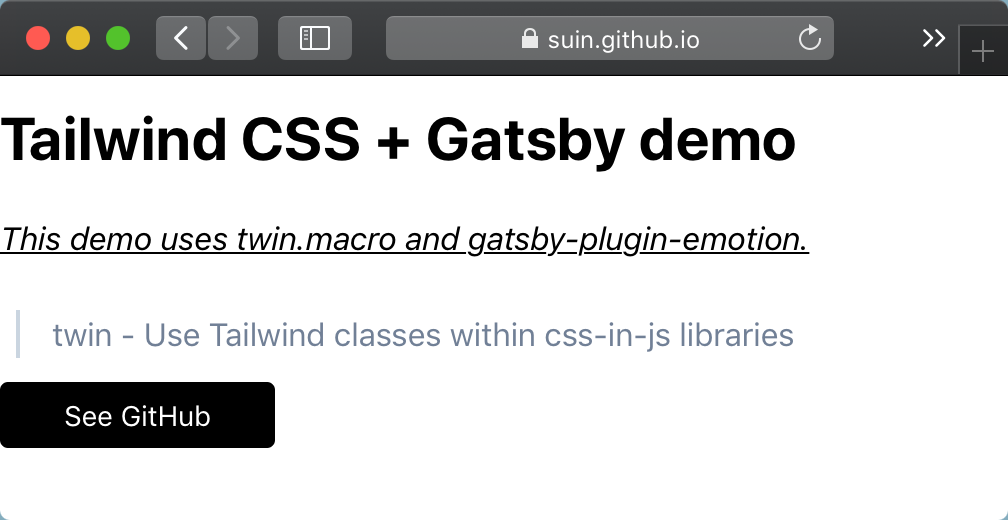
以上のすべての使い方を組み合わせた例が以下になります:
import React from "react"
import tw, { css, styled } from "twin.macro"

// Using `tw` prop:
const Title = ({ children }) => <h1 tw="text-3xl font-bold py-2">{children}</h1>

// Using `css` prop:
const Description = ({ children }) => (
  <p
    css={[
      tw`py-2 italic`,
      css`
        text-decoration: underline;
      `,
    ]}
  >
    {children}
  </p>
)

// Conditional styles:
const Link = styled.a(({ small }) => [
  tw`text-white bg-black px-8 py-2 rounded`,
  small ? tw`text-sm` : tw`text-lg`,
])

// Create and style new elements using tw
const Quote = tw.p`border-l-2 border-gray-400 text-gray-600 pl-4 ml-2 my-4`

const IndexPage = () => (
  <>
    <Title>Tailwind CSS + Gatsby demo</Title>
    <Description>
      This demo uses twin.macro and gatsby-plugin-emotion.
    </Description>
    <Quote>twin - Use Tailwind classes within css-in-js libraries</Quote>
    <Link small href="https://github.com/suin/gatsby-demo-tailwind-css-01">
      See GitHub
    </Link>
  </>
)

export default IndexPage
↓ 描画結果
描画結果のHTMLがどうなるのか気になる方は、デモページをご覧ください。
デモページ: https://suin.github.io/gatsby-demo-tailwind-css-01/
ビルド後のpublicディレクトリの中身がどうなるか見てみたい方は、GitHubをご覧ください。
GitHub: https://github.com/suin/gatsby-demo-tailwind-css-01/tree/gh-pages