Rのグラフィクスパッケージであるggplotの基本的な使い方を備忘録的にまとめていこうと思います。
library(ggplot2)
df<-diamonds    #今回はggplotパッケージに含まれるdiamondsデータセットを使います。df(dataframe)に代入します。
head(df)     #dfの内容確認
扱うデータセットをdfなどの変数に代入しておくと、後々違うデータセットで同様の分析を行いたい時などに
df<-diamonds
の部分のみを変更すればよいので便利だと思います。
# A tibble: 6 x 10
  carat cut       color clarity depth table price     x     y     z
  <dbl> <ord>     <ord> <ord>   <dbl> <dbl> <int> <dbl> <dbl> <dbl>
1 0.23  Ideal     E     SI2      61.5    55   326  3.95  3.98  2.43
2 0.21  Premium   E     SI1      59.8    61   326  3.89  3.84  2.31
3 0.23  Good      E     VS1      56.9    65   327  4.05  4.07  2.31
4 0.290 Premium   I     VS2      62.4    58   334  4.2   4.23  2.63
5 0.31  Good      J     SI2      63.3    58   335  4.34  4.35  2.75
6 0.24  Very Good J     VVS2     62.8    57   336  3.94  3.96  2.48
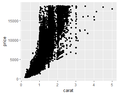
散布図
ggplot(df,aes(x=carat,y=price))+        #ggplotにdfのデータを与え、x軸、y軸を指定
  geom_point()                          #geom_***の***の部分で描くグラフの種類を指定
ちなみに、画像ファイルを出力するには、ggsave()関数が便利です。
ggsave(filename ="scatter1.png" ,width = 10,height = 8,units = "cm",dpi = 100)
# filename引数で画像の形式を指定できる(jpg,pngなど)
# width,height引数で画像のサイズを指定
# dpi引数で画像の解像度を指定
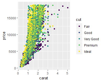
color
color引数を指定することで、各グループを色分けすることができます。
ggplot(df,aes(x=carat,y=price,color=cut))+
  geom_point()
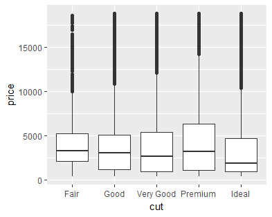
箱ひげ図(boxplot)
ggplot(df,aes(x=cut,y=price))+        #箱ひげ図を描くときは、x軸は数値データではなくグループを表すデータにする
  geom_boxplot()
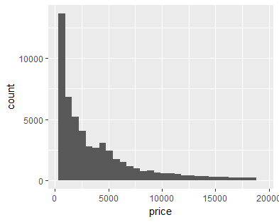
ヒストグラム(count)
ggplot(df,aes(x=price))+          #ヒストグラムはx軸のみで、数値データを指定
  geom_histogram()
カウントではなく、密度のヒストグラムを描きたいときは、
y = ..density..
を加える。これは、各グループのヒストグラムを比較するときに便利です。
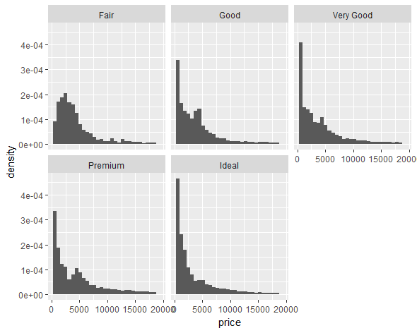
各グループ別にグラフを描きたいときにはfacet_***関数が便利です。
ggplot(df,aes(x=price, y = ..density..))+
  geom_histogram()+
  facet_wrap(~cut)               #cutのグループ別にグラフを描く
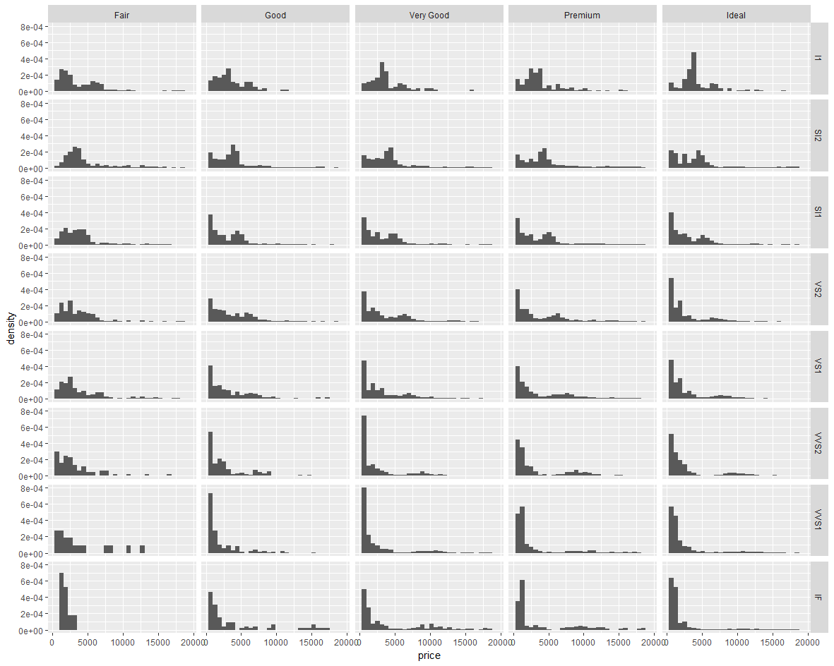
ggplot(df,aes(x=price, y = ..density..))+
  geom_histogram()+
  facet_grid(clarity~cut)               #cutとclarityの組み合わせで分けてグラフを描く
一つのグラフでヒストグラムを比較したいときには、position引数、fill引数、alpha引数を利用します。
position引数はヒストグラムの描き方を指定し、fill引数はヒストグラムの色塗り分けを指定し、alpha引数は色塗りの透明度を指定します。
ggplot(df,aes(x=price, y = ..density..,fill=cut))+
  geom_histogram(position = "identity",alpha=0.3)
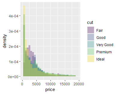
cutのグループ分けが多く、少し比較しづらいですね。。
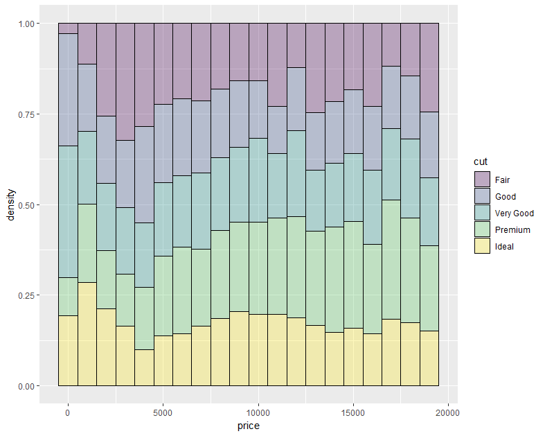
アロケーション(割合を表現する図)
geom_histogram()関数を使ってアロケーションのグラフを描くことができます。
ggplot(df,aes(x=price, y = ..density..,fill=cut))+
  geom_histogram(position = "fill",alpha=0.3,color="black")
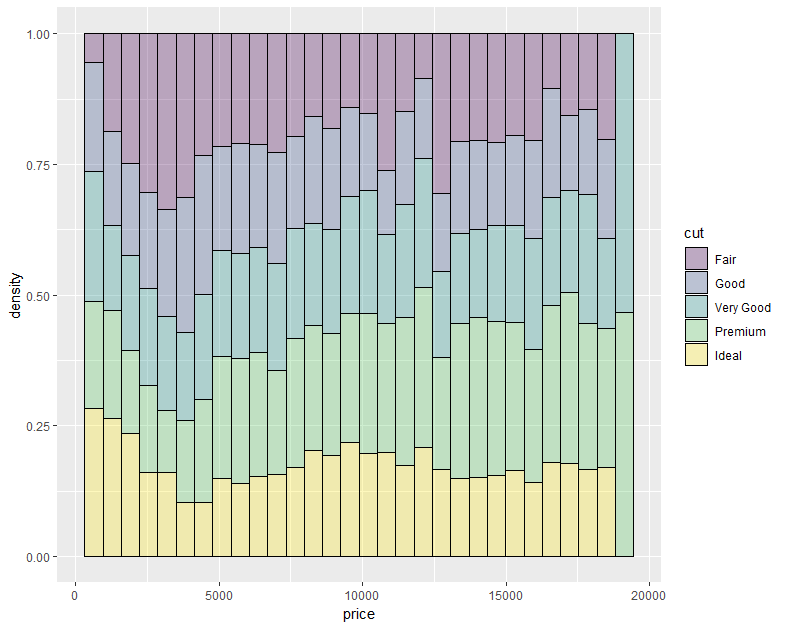
binwidth引数を指定することで、priceの区切り方を指定できます。
ggplot(df,aes(x=price, y = ..density..,fill=cut))+
  geom_histogram(position = "fill",alpha=0.3,color="black",binwidth = 1000)   #priceを1000区切りにする。
とりあえず、今日はここまでにします。
公式ホームページがとても分かりやすく解説してくれています。
作例を眺めているだけでも、データの可視化のアイデアを思いつくのではないでしょうか!
https://ggplot2.tidyverse.org/reference/index.html