最近HPを作成する仕事が入ってきました。
そこまでがんばらなくても良いのですが、少しだけ動きを付けたいということで、少し古いのですが、
Animate.cssで動きを付けました。
導入
導入は簡単。
上記サイトの「Download Animate.css」をクリックすれば、CSSが表示されるので、それをlinkタグで読み込むだけ。
<link rel="stylesheet" href="css/animate.css">
動かしたい要素にクラスを付与
<h1 class="animated flip" id="top_title">Enjoy</h1>
これだけで動きます。
今回はflipにしてみました。
ただし、これだけだといっかいぐるりと回るだけ。
永遠に動き続けるようにする
style当てます。animation-iteration-countをinfiniteにしてあげれば、ずっと動くようになります。
# top_title{
/* X回繰り返す */
-webkit-animation-iteration-count: infinite;
-moz-animation-iteration-count: infinite;
-ms-animation-iteration-count: infinite;
-o-animation-iteration-count: infinite;
animation-iteration-count: infinite;
}
これだと、ひたすら回り続ける上、終了直後に開始され、しつこい動きになってしまいます。
そこで、時間間隔をあけるようにします。
まずは、一回の動きが何秒かけて動かしたいかを考えます。
いろいろ試したところ2秒だと綺麗な動きをたもてたまま、焦った印象もなく期待通りの1回の動きをしてくれましたので、animation-durationを2sにしました。
# top_title{
/* X回繰り返す */
-webkit-animation-iteration-count: infinite;
-moz-animation-iteration-count: infinite;
-ms-animation-iteration-count: infinite;
-o-animation-iteration-count: infinite;
animation-iteration-count: infinite;

/* X秒かけてアニメーションする */
-webkit-animation-duration: 2s;
-moz-animation-duration: 2s;
-ms-animation-duration: 2s;
-o-animation-duration: 2s;
animation-duration: 2s;

}
次に、終了から開始の間隔を調整したいところですが、
animate.cssをみてみるとこんな記載が。
@keyframes flip {
  from {
    -webkit-transform: perspective(400px) scale3d(1, 1, 1) translate3d(0, 0, 0)
      rotate3d(0, 1, 0, -360deg);
    transform: perspective(400px) scale3d(1, 1, 1) translate3d(0, 0, 0) rotate3d(0, 1, 0, -360deg);
    -webkit-animation-timing-function: ease-out;
    animation-timing-function: ease-out;
  }


  40% {
    -webkit-transform: perspective(400px) scale3d(1, 1, 1) translate3d(0, 0, 150px)
      rotate3d(0, 1, 0, -190deg);
    transform: perspective(400px) scale3d(1, 1, 1) translate3d(0, 0, 150px)
      rotate3d(0, 1, 0, -190deg);
    -webkit-animation-timing-function: ease-out;
    animation-timing-function: ease-out;
  }

  50% {
    -webkit-transform: perspective(400px) scale3d(1, 1, 1) translate3d(0, 0, 150px)
      rotate3d(0, 1, 0, -170deg);
    transform: perspective(400px) scale3d(1, 1, 1) translate3d(0, 0, 150px)
      rotate3d(0, 1, 0, -170deg);
    -webkit-animation-timing-function: ease-in;
    animation-timing-function: ease-in;
  }

  80% {
    -webkit-transform: perspective(400px) scale3d(0.95, 0.95, 0.95) translate3d(0, 0, 0)
      rotate3d(0, 1, 0, 0deg);
    transform: perspective(400px) scale3d(0.95, 0.95, 0.95) translate3d(0, 0, 0)
      rotate3d(0, 1, 0, 0deg);
    -webkit-animation-timing-function: ease-in;
    animation-timing-function: ease-in;
  }

  to {
    -webkit-transform: perspective(400px) scale3d(1, 1, 1) translate3d(0, 0, 0)
      rotate3d(0, 1, 0, 0deg);
    transform: perspective(400px) scale3d(1, 1, 1) translate3d(0, 0, 0) rotate3d(0, 1, 0, 0deg);
    -webkit-animation-timing-function: ease-in;
    animation-timing-function: ease-in;
  }
}
40%⇨50%⇨80%⇨to(100%)で動きが調整されています。
この割合のまま動いてくれた上で、終了から開始までの間隔を付けてあげればOKということで、
表計算ソフト登場
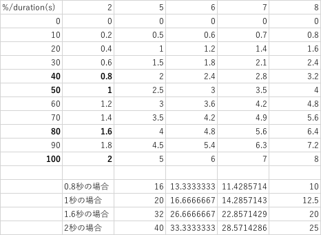
- duration(s)が2秒の場合の40%,50%,80%,100%の秒数はそれぞれ0.8秒,1秒,1.6秒,2秒ということがわかります。
- duration(s)を仮に5秒、6秒、7秒、8秒にした場合も計算してみました。
- 格duration(s)の際に0.8秒,1秒,1.6秒,2秒が何%に当たるのかも計算。
- duration(s)が5秒の場合は0.8秒は16%、1秒は20%.......
- 今回の場合は5秒と8秒が比較的綺麗な数値になったので、どちらかにしようと思います。
- まぁ、5秒に1回動くようなものならOKなので今回は5秒のdurationでやってみます。
ということで、CSSを変更
# top_title{
/* X回繰り返す */
-webkit-animation-iteration-count: infinite;
-moz-animation-iteration-count: infinite;
-ms-animation-iteration-count: infinite;
-o-animation-iteration-count: infinite;
animation-iteration-count: infinite;

/* X秒かけてアニメーションする */
-webkit-animation-duration: 5s;
-moz-animation-duration: 5s;
-ms-animation-duration: 5s;
-o-animation-duration: 5s;
animation-duration: 5s;

}
さらにこの計算結果にあわせて@keyframes flipも変えてあげます。
@keyframes flip {
  from {
    -webkit-transform: perspective(400px) scale3d(1, 1, 1) translate3d(0, 0, 0)
      rotate3d(0, 1, 0, -360deg);
    transform: perspective(400px) scale3d(1, 1, 1) translate3d(0, 0, 0) rotate3d(0, 1, 0, -360deg);
    -webkit-animation-timing-function: ease-out;
    animation-timing-function: ease-out;
  }

  16% {
    -webkit-transform: perspective(400px) scale3d(1, 1, 1) translate3d(0, 0, 150px)
      rotate3d(0, 1, 0, -190deg);
    transform: perspective(400px) scale3d(1, 1, 1) translate3d(0, 0, 150px)
      rotate3d(0, 1, 0, -190deg);
    -webkit-animation-timing-function: ease-out;
    animation-timing-function: ease-out;
  }

  20% {
    -webkit-transform: perspective(400px) scale3d(1, 1, 1) translate3d(0, 0, 150px)
      rotate3d(0, 1, 0, -170deg);
    transform: perspective(400px) scale3d(1, 1, 1) translate3d(0, 0, 150px)
      rotate3d(0, 1, 0, -170deg);
    -webkit-animation-timing-function: ease-in;
    animation-timing-function: ease-in;
  }

  32% {
    -webkit-transform: perspective(400px) scale3d(0.95, 0.95, 0.95) translate3d(0, 0, 0)
      rotate3d(0, 1, 0, 0deg);
    transform: perspective(400px) scale3d(0.95, 0.95, 0.95) translate3d(0, 0, 0)
      rotate3d(0, 1, 0, 0deg);
    -webkit-animation-timing-function: ease-in;
    animation-timing-function: ease-in;
  }

  40% {
    -webkit-transform: perspective(400px) scale3d(1, 1, 1) translate3d(0, 0, 0)
      rotate3d(0, 1, 0, 0deg);
    transform: perspective(400px) scale3d(1, 1, 1) translate3d(0, 0, 0) rotate3d(0, 1, 0, 0deg);
    -webkit-animation-timing-function: ease-in;
    animation-timing-function: ease-in;
  }
  to {
    -webkit-transform: perspective(400px) scale3d(1, 1, 1) translate3d(0, 0, 0)
      rotate3d(0, 1, 0, 0deg);
    transform: perspective(400px) scale3d(1, 1, 1) translate3d(0, 0, 0) rotate3d(0, 1, 0, 0deg);
    -webkit-animation-timing-function: ease-in;
    animation-timing-function: ease-in;
  }
}
動きのイメージとしては、40%になったら、toと同じ値をぶこんであげれば、それ以降は動かないで残りの60%を過ごしてくれるイメージ
これで、ほぼほぼ完了。
動き出す秒数を考える。
私の場合、bootstrapを使って、読み込み時に画面サイズを調整していました。
読み込み時点で、このアニメーションが動くと、それに合わせて、画面サイズを調整してしまっていたので、
アニメーションが動き出す秒数をanimation-delayで調整。1秒あれば、読み込み完了するでしょうという適当名考えで1sにしました。
# top_title{
/* X回繰り返す */
-webkit-animation-iteration-count: infinite;
-moz-animation-iteration-count: infinite;
-ms-animation-iteration-count: infinite;
-o-animation-iteration-count: infinite;
animation-iteration-count: infinite;

/* X秒かけてアニメーションする */
-webkit-animation-duration: 5s;
-moz-animation-duration: 5s;
-ms-animation-duration: 5s;
-o-animation-duration: 5s;
animation-duration: 5s;

/* X秒おいてからアニメーションする */
-webkit-animation-delay: 1s;
-moz-animation-delay:1s;
-ms-animation-delay:1s;
-o-animation-delay:1s;
animation-delay:1s;

}
以上で終わり。