はじめに
自分がStreamlitを使っていて、「便利だな~」「こんなエレメントあったのかw」と思ったものを独断と偏見でまとめてみました。
使い方は公式ドキュメントがすごく見やすいので、エレメントごとに公式のURLを添付しながら紹介します。
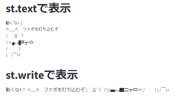
アスキーアートを表示させたい
以下のようなアスキーアート(AA)を表示させたいとします。その時に使えるのがst.textです
art = """
動くなッ!
∧__∧ ファボを打ち込むぞ
( `Д´ )
(っ▄︻▇〓┳═☆
/   )
( / ̄∪
"""

st.title("st.textで表示")
st.text(art)

st.title("st.writeで表示")
st.write(art)
結果
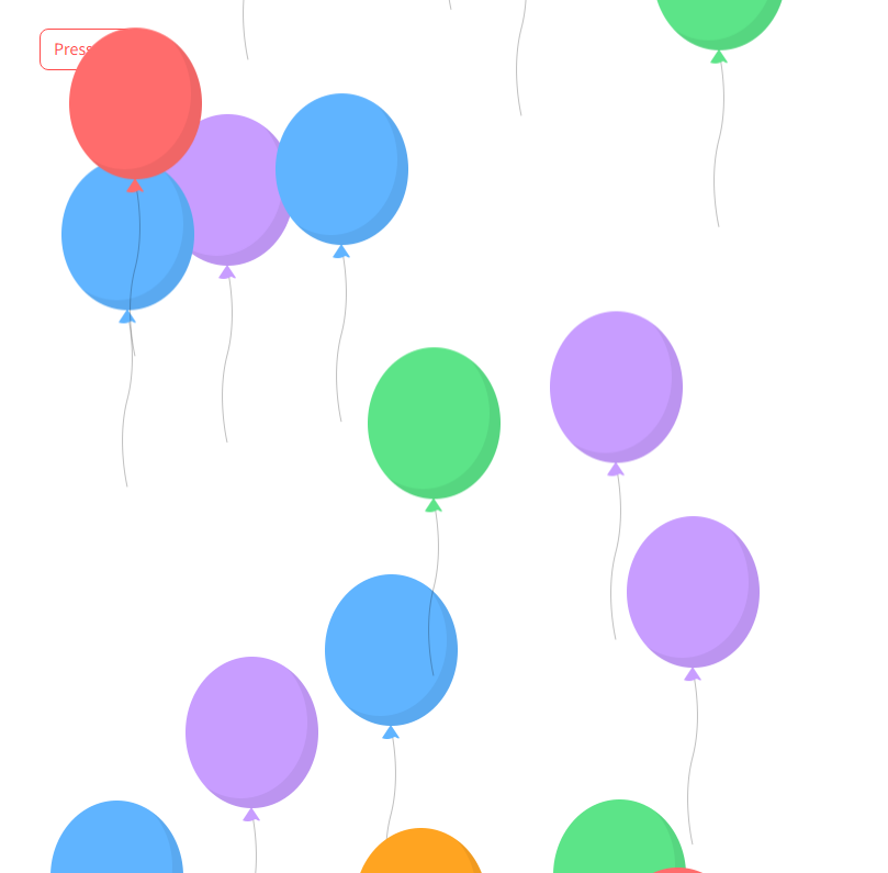
風船を飛ばそう
Twitterで誕生日になると飛ぶ奴です...
st.button("Press me")

st.balloons()
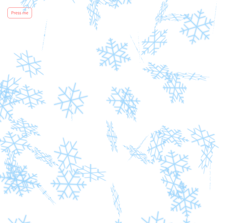
雪を降らせそう
雪が降ります...
st.button("Press me")

st.snow()
見やすいテキストボックスを使う
一応、ステータスを表すものなんですが色を駆使して見やすくデザインすることもできます。
st.error("This is an error message")

st.warning("This is a warning message")

st.info("This is an info message")

st.success("This is a success message")

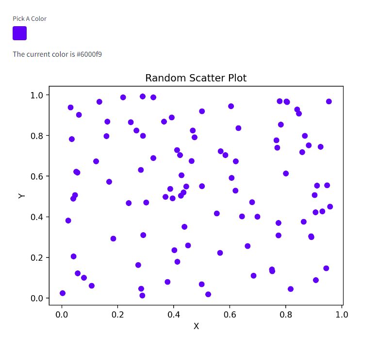
カラーピッカーを使ってみる
Streamlitではカラーピッカーを使うこともできます。
以下のコードはカラーピッカーで設定した色を使用し、サンプルグラフを描画しているものです。
import streamlit as st
import numpy as np
import matplotlib.pyplot as plt

# カラーピッカーを表示
color = st.color_picker('Pick A Color', '#00f900')
st.write('The current color is', color)

# ランダムなデータを生成
x = np.random.rand(100)
y = np.random.rand(100)

# 散布図を描画
plt.scatter(x, y, color=color)

# グラフのタイトルと軸ラベルを設定
plt.title('Random Scatter Plot')
plt.xlabel('X')
plt.ylabel('Y')

# グラフを表示
st.pyplot(plt)
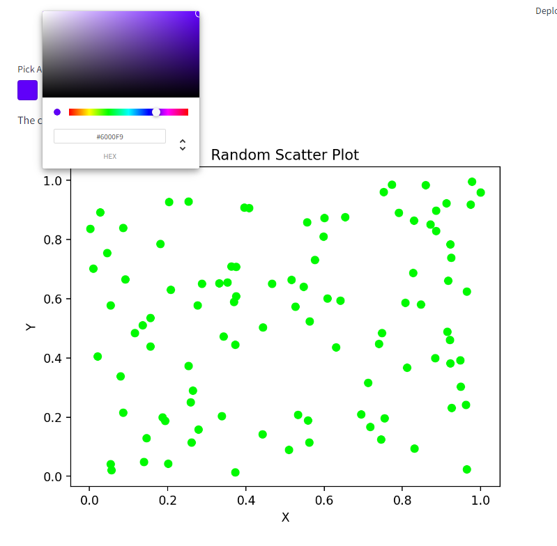
色が変わります。
レイアウトを工夫する
ここからは自分が使って少し便利だったレイアウトエレメントを紹介してみます。
st.expander
表示する情報量を制限したりしたいときに活用できます。
import streamlit as st
import numpy as np
import matplotlib.pyplot as plt

with st.expander("st.expanderとは"):
    st.write("このようにして、ユーザーがクリックすると、追加の情報を表示できるようになります。")

    x = np.linspace(0, 10, 100)
    y = np.sin(x)

    plt.plot(x, y)
    st.pyplot(plt)

クリックすると、
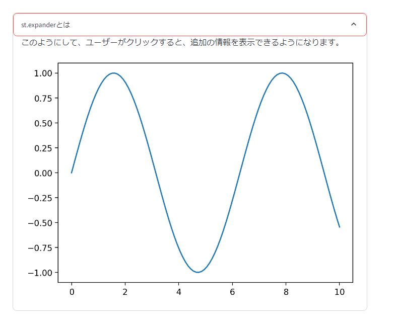
こうなります。
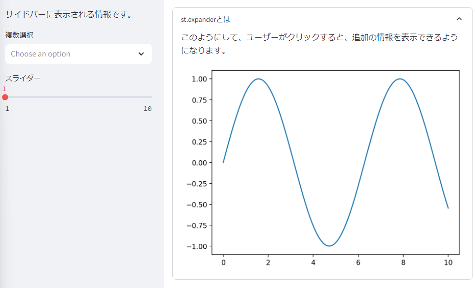
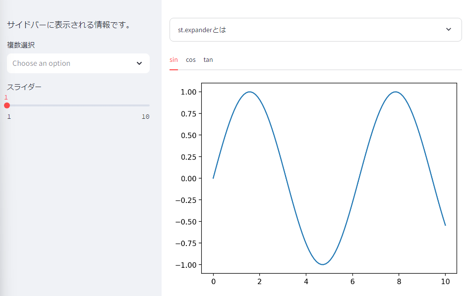
st.sidebar
サイドに情報を表示しています。自分の場合は下の例のように何かを入力してもらうことが多いですね。
with st.sidebar:
st.write("サイドバーに表示される情報です。")
st.multiselect("複数選択", ["A", "B", "C"])
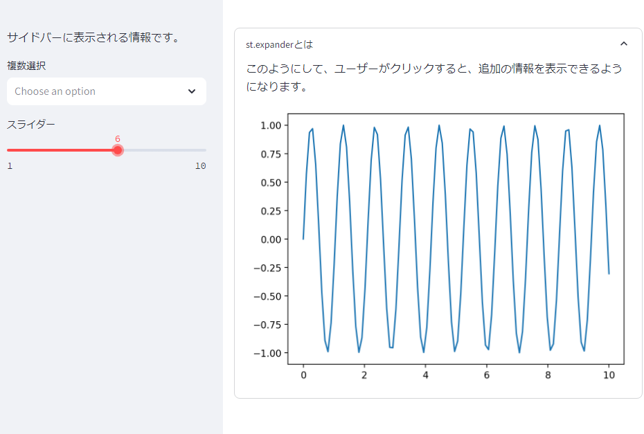
num = st.slider("スライダー", 1, 10, 1)
with st.expander("st.expanderとは"):
st.write("このようにして、ユーザーがクリックすると、追加の情報を表示できるようになります。")
x = np.linspace(0, 10, 100)
y = np.sin(x*num)
plt.plot(x, y)
st.pyplot(plt)
スライダーを動かすと...
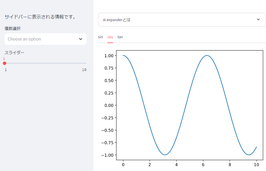
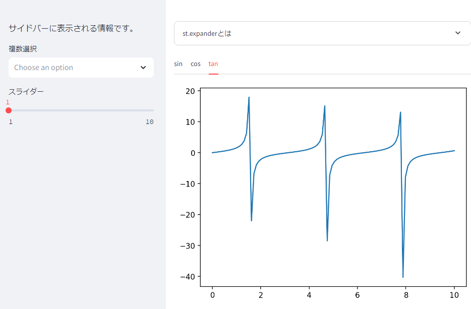
st.tabs
タブを作って表示する情報を切り替えることができます。例では三角関数のグラフをプロットさせています。
tab1, tab2, tab3 = st.tabs(["sin", "cos", "tan"])

with tab1:
    x = np.linspace(0, 10, 100)
    y = np.sin(x*num)

    fig, ax = plt.subplots()
    plt.plot(x, y)
    st.pyplot(fig)

with tab2:
    x = np.linspace(0, 10, 100)
    y = np.cos(x*num)

    fig, ax = plt.subplots()
    plt.plot(x, y)
    st.pyplot(fig)

with tab3:
    x = np.linspace(0, 10, 100)
    y = np.tan(x*num)

    fig, ax = plt.subplots()
    plt.plot(x, y)
    st.pyplot(fig)
まとめ
今回は独断と偏見で面白い&少し便利なものを紹介させていただきました。
ほかにも紹介したいものや、サードパーティー製のエレメントもあるのでそれらもいつか紹介したいですね。