2017.8.31 記入・調査した内容です
Githubでの検索結果順
スター順
https://github.com/search?o=desc&q=grid+layouts+drag&s=forks&type=Repositories&utf8=%E2%9C%93
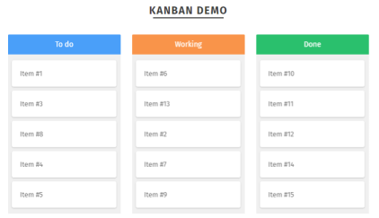
Gridster
オリジナル:https://github.com/ducksboard/gridster.js
フォーク(dustmoo):https://github.com/dustmoo/gridster.js
フォーク(dsmorse):https://github.com/dsmorse/gridster.js
デモ:http://dsmorse.github.io/gridster.js/#demos
- 領域は固定、もしくは画面に合わせて変動
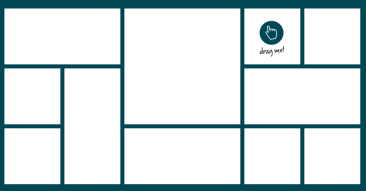
https://strml.github.io/react-grid-layout/examples/0-showcase.html - 固定の場合には画面サイズ小では横スクロール表示
- 変動の場合には画面サイズに合わせてグリッドカラム幅が変動
- マルチ表示可能だが、それぞれでアイテムをドロップできない
- リサイズ機能:有り
- Stich 自由な位置へ配置可能(ブラウザ幅小の場合には横スクロール表示)
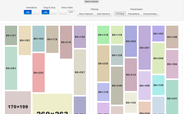
React-Grid-Layout
- Packery or Gridsterをリスペクトして作成
gridsterはdsmorse版の方 - Reactベース
- レスポンシブに対応
- ブラウザ幅に合わせて、改行かカラム幅変動かが選べる
- サイズ・位置固定のカラムを混ぜることも可能 https://strml.github.io/react-grid-layout/examples/5-static-elements.html
- ローカルストレージ保存
- 画面サイズ毎に配置を自動保存 https://strml.github.io/react-grid-layout/examples/8-localstorage-responsive.html
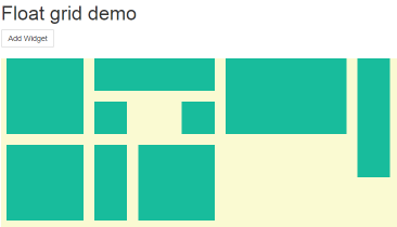
Packery
https://packery.metafizzy.co/
https://packery.metafizzy.co/draggable.html#drop-placeholder
- Commercial license $25~
- オープンソースはGPL v3
- ブラウザ幅の変動により、X軸カラム数が変動(パタパタと改行)
- Draggabilly、jQuery UI DraggableのJSライブラリを使用可能
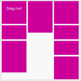
Muuri
- Drag&Dropで配置を変更
- 自由な場所にはおけない(配置は変更可能)
- ブラウザ幅の変動により、X軸カラム数が変動(パタパタと改行)
- 看板レイアウトもある。
vue-grid-layout
- React-Grid-Layoutから影響を受けて作成
- Vueベース
https://github.com/jbaysolutions/vue-grid-layout
the-grid
https://github.com/vpusher/the-grid
デモ:https://www.webcomponents.org/element/vpusher/the-grid/demo/demo/index.html
Polymer 2.0.ベースです。
デモの方法
Githubからリポジトリをダウンロードし、commandで以下を実行する
bower install
polymer serve -o
ブラウザが起動したら以下へアクセス
http://127.0.0.1:8081/components/the-grid/demo/
デモを試したみた感じでは、
- タイル表示
- ドラッグ&ドロップ(ただし空き領域にのみドロップ可能)
- リサイズ(ただし空き領域にのみリサイズ可能)
- 自動でレイアウト調整機能は無さそう
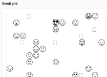
- 絵文字利用可能(絵文字Grid)
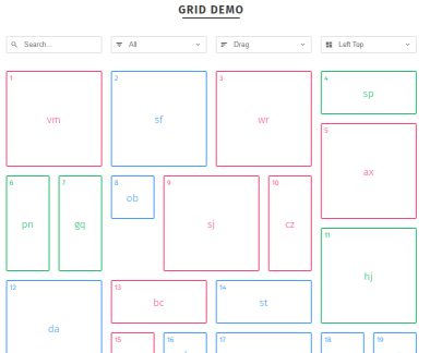
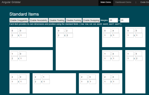
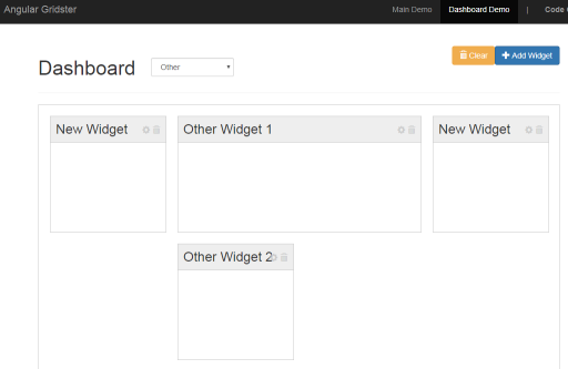
Angular Gridster
- Angularベース
- 幅が変わっても横に並ぶカラム数は固定
- 自由な場所に配置可能
- レスポンシブで画面サイズに合わせてカラムの幅が変わる。
- 狭くなったら1カラムレイアウトに変わる
Shapeshift
https://github.com/McPants/jquery.shapeshift
http://mcpants.github.io/jquery.shapeshift/
- レスポンシブに対応
- ブラウザ幅に合わせて、改行かカラム幅変動かが選べる
- アイテム単位でのリサイズ機能が無い
- 最後の更新が2014年で止まっている
Freewall
-
スタイルが選べるのが特徴
-
表示する機器に合わせて表示も変わる
-
ブラウザ幅に合わせてコンテンツ列が動的に変わる
-
アイテム単位でのリサイズ機能が無い
Drag
http://kombai.github.io/freewall/example/draggable.html -
Frexスタイル

http://kombai.github.io/freewall/example/flex-grid.html -
Windowスタイル(Windowsメトロのような)

http://kombai.github.io/freewall/example/metro-style.html -
Imagesスタイル(google 画像検索のように、横に並ぶ)

http://kombai.github.io/freewall/example/image-layout.html -
Pinterestスタイル(縦に並ぶ)

http://kombai.github.io/freewall/example/pinterest-layout.html -
Grid(真四角)レイアウト
http://kombai.github.io/freewall/example/grid-layout.html
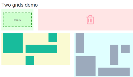
Gridstack
https://github.com/troolee/gridstack.js
http://troolee.github.io/gridstack.js/demo/
Gridsterのインスピレーションを受けたGridstack
- リサイズ可能
- 自由な場所に配置可能
- レスポンシブで画面サイズに合わせてカラムの幅が変わる。
- 狭くなったら1カラムレイアウトに変わる
- 削除イベントがある。
- マルチ機能あり。グリッド→グリッドへドロップ可能
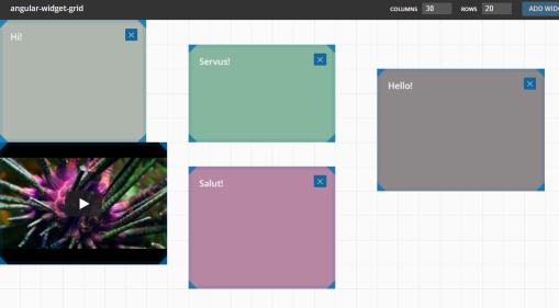
angular-widget-grid
https://github.com/patbuergin/angular-widget-grid
http://patbuergin.github.io/angular-widget-grid/
- ブラウザ全体をカラム数で割り、配置する。
- ブラウザ幅を超えて配置はできない。
- 自動でグリッド位置は変わらない
GridList
https://github.com/hootsuite/grid
http://hootsuite.github.io/grid/
- +とーで拡大縮小できるのが特色