ガイドのページ のDecoratedClassまでを試しました。
スタート
create-react-app
create-react-appは導入済みという前提で進みます。
未導入の場合はGetting Startに添って導入を
material-ui/Button.d.ts at master · mui-org/material-ui
create-react-appコマンドでプロジェクトの雛形を作成します。
# create-react-app-typescriptを使ってreactテンプレートを作成
create-react-app material-ui-guide-type-script --scripts-version=react-scripts-ts

cd material-ui-guide-type-script

# 動作確認
npm i
npm start
いつもの画面が出ればOK
Material-UIのインストール
公式ページではnpm で説明があったのでnpm で進めました。
Installation - Material-UI
# material-uiインストール
npm install @material-ui/core
# SVGアイコンもインストール
npm install @material-ui/icons
Material-UIのテスト
以下を追加する
import Button from '@material-ui/core/Button';
<Button variant="outlined">Hello World!!</Button>
以下のようになる。
App.tsx
import Button from '@material-ui/core/Button';
import * as React from 'react';
import './App.css';
import logo from './logo.svg';

class App extends React.Component {
  public render() {
    return (
      <div className="App">
        <header className="App-header">
          <img src={logo} className="App-logo" alt="logo" />
          <h1 className="App-title">Welcome to React</h1>
        </header>
        <p className="App-intro">
          To get started, edit <code>src/App.tsx</code> and save to reload.
        </p>
        <Button variant="outlined">Hello World!!</Button>
      </div>
    );
  }
}

export default App;
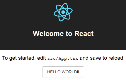
実行する。 ボタンが表示されてればOK
ガイドに添って進める
ガイドにも書いてありますが、TypeStylesでのwithStylesの使い方はちょっと難しいとのことです。
src/components/DecoratedSFC.tsx を作成
Usage of withStyles
- 最初にwithStylesを呼び出すデコレータ関数を作成します。
- withStylesをインポートしています。
import { withStyles } from '@material-ui/core/styles';

const decorate = withStyles(({ palette, spacing }) => ({
  root: {
    padding: spacing.unit,
    backgroundColor: palette.background.default,
    color: palette.primary.main
  },
}));
propsの為のインターフェースを作成します。
- サンプルはPropsでしたが接頭詞Iを追加しています。
- TypographyPropsを使うために、TypographyPropsをインポートしています。
import { TypographyProps } from '@material-ui/core/Typography';

interface IProps {
    text: string;
    type: TypographyProps['variant'];
    color: TypographyProps['color'];
};
DecoratedSFC
コンポーネントを定義します。
サンプルに添ってTypographyを使うので、Typographyをインポートします。
import Typography from '@material-ui/core/Typography';

const DecoratedSFC = decorate<IProps>(({ text, type, color, classes }) => (
    <Typography variant={type} color={color} classes={classes}>
        {text}
    </Typography>
));
DecoratedSFC.tsx は最終的に以下のようになります。
DecoratedSFC.tsx
import { withStyles } from '@material-ui/core/styles';
import { TypographyProps } from '@material-ui/core/Typography';
import Typography from '@material-ui/core/Typography';
import * as React from 'react';


// 最初にwithStylesを呼び出すデコレータ関数を作成
const decorate = withStyles(({ palette, spacing }) => ({
    root: {
        backgroundColor: palette.background.default,
        color: palette.primary.main,
        padding: spacing.unit,
    },
}));


// propsの為のインターフェースを作成
interface IProps {
    text: string;
    type: TypographyProps['variant'];
    color: TypographyProps['color'];
};


// コンポーネントを定義します
const DecoratedSFC = decorate<IProps>(({ text, type, color, classes }) => (
    <Typography variant={type} color={color} classes={classes}>
        {text}
    </Typography>
));

// エクスポート定義
export default DecoratedSFC;
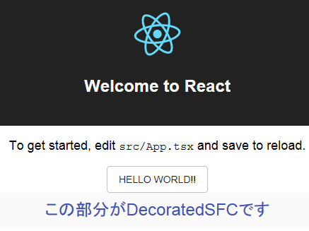
DecoratedSFCを使う
App.tsx
以下を追加します
import DecoratedSFC from './components/DecoratedSFC';

<DecoratedSFC text={'この部分がDecoratedSFCです'} color={'secondary'} type={'display2'} />
以下のようになります。
App.tsx
import Button from '@material-ui/core/Button';
import * as React from 'react';
import './App.css';
import DecoratedSFC from './components/DecoratedSFC';
import logo from './logo.svg';

class App extends React.Component {
  public render() {
    return (
      <div className="App">
        <header className="App-header">
          <img src={logo} className="App-logo" alt="logo" />
          <h1 className="App-title">Welcome to React</h1>
        </header>
        <p className="App-intro">
          To get started, edit <code>src/App.tsx</code> and save to reload.
        </p>
        <Button variant="outlined">Hello World!!</Button>
        <DecoratedSFC text={'この部分がDecoratedSFCです'} color={'secondary'} type={'headline'} />
      </div>
    );
  }
}

export default App;
結果
DecoratedClass
クラスを使います。
クラスの場合にはdecorateで囲います。
DecoratedClass.tsxを作成
DecoratedClass.tsx
import { withStyles, WithStyles } from '@material-ui/core/styles';
import { TypographyProps } from '@material-ui/core/Typography';
import Typography from '@material-ui/core/Typography';
import * as React from 'react';


// 最初にwithStylesを呼び出すデコレータ関数を作成
const decorate = withStyles(({ palette, spacing }) => ({
    root: {
        backgroundColor: palette.background.default,
        color: palette.primary.main,
        padding: spacing.unit,
    },
}));


// propsの為のインターフェースを作成
interface IProps {
    text: string;
    type: TypographyProps['variant'];
    color: TypographyProps['color'];
};


// クラスを定義します
const DecoratedClass = decorate(
    class extends React.Component<IProps & WithStyles<'root'>> {
        public render() {
            const { text, type, color, classes } = this.props
            return (
                <Typography variant={type} color={color} classes={classes}>
                    {text}
                </Typography>
            );
        }
    }
);

// エクスポート定義
export default DecoratedClass;
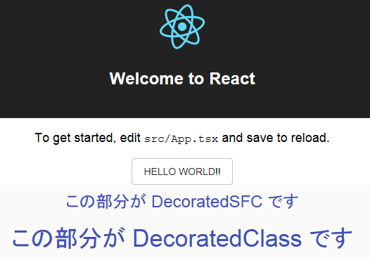
DecoratedClassを使う
App.tsxに追加します。
App.tsx
import DecoratedClass from './components/DecoratedClass';
<DecoratedClass text={'この部分が DecoratedClass です'} color={'textSecondary'} type={'display1'} />
結果
参考
各プロパティの定義方法は以下にあります。
Typography - Material-UI