1年間Flutter開発を続けてきた中で、Expandedとやらが便利だと言う話は至る所で聞いてきました。
ただ、自分でうまく活用できたことがなく、目を逸らし続けてきたので、
ここらでちゃんと理解しようと思います。
Expandedの解説記事になるので、初心者向けだと思ってください。
目次
- Expandedとは
- 動作確認
- Rowに対して、Expandedを単独で渡すパターン
- Columnに対して、複数要素の1つとしてEXpandedを渡すパターン
- 実用的な実装例
Expandedとは
以下、basic.dartより引用
A widget that expands a child of a [Row], [Column], or [Flex]
so that the child fills the available space.
(訳)
このウィジェットは、[Row]、[Column]または[Flex]の子を展開するウィジェットであり、
子要素が利用可能なスペースを埋めるようにします。
利用可能なスペースとは。
未経験の身からすると、この類の説明は分かりずらい。
ただ、もう少し読んでみたら、こんなことが書いてました。
Using an [Expanded] widget makes a child of a [Row], [Column], or [Flex]
expand to fill the available space along the main axis
(訳)
[Expanded]ウィジェットを使用すると、[Row]、[Column]または[Flex]の子要素が主軸に沿って
利用可能なスペースを埋めるように展開されます
あー、なるほど。
要するに、
- 子要素のサイズを、親ウィジェットの主とする方向へいっぱいにまで広げてくれる。(Columnであれば縦方向。Rowであれば横方向。みたいに)
- 複数の要素を持たせた時にあくまでその他の要素のサイズに影響は与えない。
- Row、Column、Flexの子要素として使用することで、期待値を受け取れる。
ということらしいです。
動作確認
Expandedを単独で渡した場合と、複数要素の1つとして渡す場合を確認しよう。
あと、RowとColumnのどちらも確認したいから以下2パターンで確認。
Rowに対して、Expandedを単独で渡すパターン
サンプルコード
@override
Widget build(BuildContext context) {
return Scaffold(
  appBar: AppBar(
    title: const Text('Sample'),
  ),
  body: Center(
    child: Row(
      children: [
        Expanded( // 幅を持たないContainerをExpandedでラップ
          child: Container(
            height: 100,
            decoration: const BoxDecoration(
              color: Colors.blue,
            ),
            child: const Center(child: Text('Expanded')),
          ),
        )
      ],
    ),
  ),
);
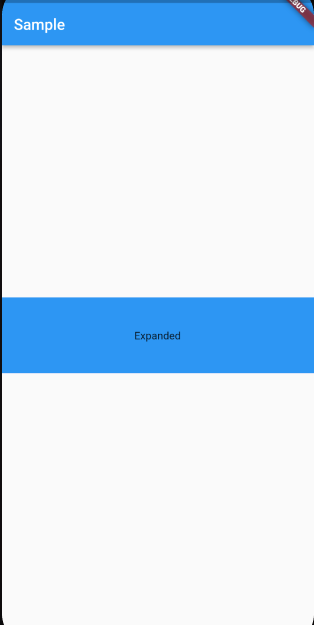
表示結果
解説
Rowの子要素に対して、Expandedでラップした、幅を持たないContaierを表示させた。
この場合、Rowに対してExpandedを渡しているため、作用するのは横方向。
かつ、他の子要素が存在しないため、横幅いっぱいが利用可能なスペースとなる。
Columnに対して、複数要素の1つとしてExpandedを渡すパターン
サンプルコード
@override
Widget build(BuildContext context) {
return Scaffold(
  appBar: AppBar(
    title: const Text('Sample'),
  ),
  body: Center(
    child: Column(
      children: [
        Expanded( // 高さを持たないContaierをExpandedでラップ
          child: Container(
            width: 80,
            decoration: const BoxDecoration(
              color: Colors.red,
            ),
            child: const Center(
              child: Text('Expanded'),
            ),
          ),
        ),
        Container(
          height: 100,
          width: 80,
          decoration: const BoxDecoration(
            color: Colors.blue,
          ),
        ),
        Container(
          height: 100,
          width: 80,
          decoration: const BoxDecoration(
            color: Colors.yellow,
          ),
        ),
      ],
    ),
  ),
);
表示結果

解説
Containerの子要素に対して、Expandedでラップした、高さを持たないContaierを表示させた。
この場合、Containerに対してExpandedを渡しているため、作用するのは縦方向。
さらに今回は、Columnの子要素に他の要素が含まれているため、それらの領域を除くスペースが利用可能なスペースとなる。
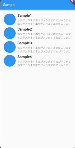
もう少し実用的な実装例
例えば、こんなUIを作りたいとします。
サンプルコード
final List<String> sampleList = ['Sample1', 'Sample2', 'Sample3', 'Sample4'];

ListView(
    padding: const EdgeInsets.symmetric(horizontal: 20),
    children: [
      const SizedBox(height: 20.0),
      ...sampleList.map(
        (e) => Padding(
          padding: const EdgeInsets.only(bottom: 8.0),
          child: Row(
            crossAxisAlignment: CrossAxisAlignment.center,
            children: [
              Container(
                height: 65.0,
                width: 65.0,
                decoration: const BoxDecoration(
                    color: Colors.blue, shape: BoxShape.circle),
              ),
              const SizedBox(width: 10.0),
              Expanded(  // 領域の指定がないColumn全体をExpnadedでラップする
                child: Column(
                  crossAxisAlignment: CrossAxisAlignment.start,
                  children: [
                    Text(
                      e,
                      style: const TextStyle(
                        fontSize: 20.0,
                        fontWeight: FontWeight.bold,
                      ),
                    ),
                    const SizedBox(height: 5.0),
                    const Text(
                      '本文が入ります本文が入ります本文が入ります本文が入ります本文が入ります本文が入ります本文が入ります',
                      overflow: TextOverflow.ellipsis,
                      maxLines: 2,
                      style: TextStyle(
                        color: Colors.grey,
                      ),
                    ),
                  ],
                ),
              )
            ],
          ),
        ),
      )
    ],
),
解説
今回、Rowの子要素として、Columnを子要素にもつExpandedウィジェットを実装した。
紛らわしいが、この時にExpandedが利用可能なスペースを埋める作用をするのは、横方向ということになる。
したがって、両サイドのPaddingと、左側の丸を除いたスペースがColumnの領域であることに決定した形になる。
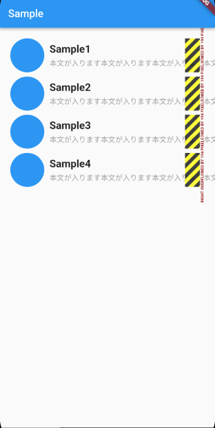
もし、これがExpandedによって横方向の大きさを決めなかったら、「本文が入ります」のoverflowとmaxLinesが作用しなくなる。
※以下実装例
最後に
パッケージによって異なりますが、使いたいウィジェットにカーソルを当ててcommandを押しながらクリックすると、ウィジェットの使い方が書かれているので、参考文献が少ないものは、除いてみるのをお勧めします。