plotly.jsの使い方を勉強したのでまとめます
https://plotly.com/javascript/
1. インストール
1-1. ダウンロードして使う
公式からダウンロードできますので、それを自サーバーに置いて参照します
plotly-latest.min.js
<head>
  <script src="plotly-latest.min.js"></script>
</head>
1-2. CDNから使う
<head>
  <script src="https://cdn.plot.ly/plotly-latest.min.js"></script>
</head>
<head>
  <script src="https://cdn.plot.ly/plotly-1.2.0.min.js"></script>
</head>
1-3. webpackで使う
確認していませんが ify-loader@v1.1.0+ を使ってwebpackでビルドすることも出来るようです
https://github.com/plotly/plotly-webpack
2. 使い方
適当なタグをDOMのターゲットにしてplotly.jsに書き換えてもらうだけです
<head>
  <script src="https://cdn.plot.ly/plotly-latest.min.js"></script>
</head>

<body>
  <img src="img/ex1.png">
  <div id="myDiv"><!-- ここにグラフを表示する --></div>
  <script>
    var data = [{
      values: [19, 26, 55],
      labels: ['Residential', 'Non-Residential', 'Utility'],
      type: 'pie'
    }];

    var layout = {
      height: 400,
      width: 500
    };

    Plotly.newPlot('myDiv', data, layout);
  </script>
</body>

3. 線グラフ/散布図
この辺をやっていきます
https://plotly.com/javascript/line-and-scatter/
https://plotly.com/javascript/line-charts/
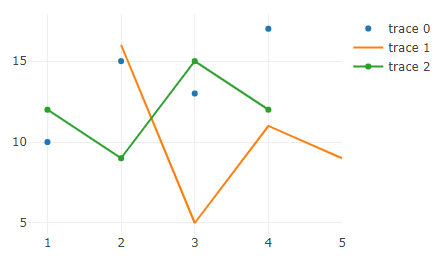
3-1. 基本編
typeを'scatter'にすると散布図になります
modeはマーカーのみ、線のみ、マーカー+線の3つが選べます
(modeを省略するとline+markerになります)
var trace1 = {
  x: [1, 2, 3, 4],
  y: [10, 15, 13, 17],
  mode: 'markers',
  type: 'scatter'
};

var trace2 = {
  x: [2, 3, 4, 5],
  y: [16, 5, 11, 9],
  mode: 'lines',
  type: 'scatter'
};

var trace3 = {
  x: [1, 2, 3, 4],
  y: [12, 9, 15, 12],
  mode: 'lines+markers',
  type: 'scatter'
};

var data = [trace1, trace2, trace3];

var layout = {
  hovermode:'closest',
  autosize: false,
  width:500,
  height:400
};

Plotly.newPlot('myDiv', data, layout);
3-2. マウスオーバーで表示を出す
nameとtextの値を指定するとマウスオーバーで表示に出すようにできます
var trace1 = {
  x: [1, 2, 3, 4, 5],
  y: [1, 6, 3, 6, 1],
  mode: 'markers',
  type: 'scatter',
  name: 'Team A',
  text: ['A-1', 'A-2', 'A-3', 'A-4', 'A-5'],
  marker: { size: 12 }
};

var trace2 = {
  x: [1.5, 2.5, 3.5, 4.5, 5.5],
  y: [4, 1, 7, 1, 4],
  mode: 'markers',
  type: 'scatter',
  name: 'Team B',
  text: ['B-a', 'B-b', 'B-c', 'B-d', 'B-e'],
  marker: { size: 12 }
};

var data = [ trace1, trace2 ];

var layout = {
  xaxis: {
    range: [ 0.75, 5.25 ]
  },
  yaxis: {
    range: [0, 8]
  },
  title:'Data Labels Hover',
  height: 400,
  width: 500
};

Plotly.newPlot('myDiv', data, layout);

3-3. プロット上に値ラベルをつける
modeをmarkers+textにすると値ラベルを表示するようになります
var trace1 = {
  x: [1, 2, 3, 4, 5],
  y: [1, 6, 3, 6, 1],
  mode: 'markers+text',
  type: 'scatter',
  name: 'Team A',
  text: ['A-1', 'A-2', 'A-3', 'A-4', 'A-5'],
  textposition: 'top center',
  textfont: {
    family:  'Raleway, sans-serif'
  },
  marker: { size: 12 }
};

var trace2 = {
  x: [1.5, 2.5, 3.5, 4.5, 5.5],
  y: [4, 1, 7, 1, 4],
  mode: 'markers+text',
  type: 'scatter',
  name: 'Team B',
  text: ['B-a', 'B-b', 'B-c', 'B-d', 'B-e'],
  textfont : {
    family:'Times New Roman'
  },
  textposition: 'bottom center',
  marker: { size: 12 }
};

var data = [ trace1, trace2 ];

var layout = {
  xaxis: {
    range: [ 0.75, 5.25 ]
  },
  yaxis: {
    range: [0, 8]
  },
  legend: {
    y: 0.5,
    yref: 'paper',
    font: {
      family: 'Arial, sans-serif',
      size: 20,
      color: 'grey',
    }
  },
  title:'Data Labels on the Plot',
  width:500,
  height:400
};

Plotly.newPlot('myDiv', data, layout);
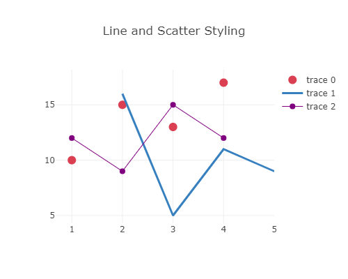
3-4. マーカーと線の色を指定する
marker要素とline要素に色とsizeを指定します
var trace1 = {
  x: [1, 2, 3, 4],
  y: [10, 15, 13, 17],
  mode: 'markers',
  marker: {
    color: 'rgb(219, 64, 82)',
    size: 12
  }
};

var trace2 = {
  x: [2, 3, 4, 5],
  y: [16, 5, 11, 9],
  mode: 'lines',
  line: {
    color: 'rgb(55, 128, 191)',
    width: 3
  }
};

var trace3 = {
  x: [1, 2, 3, 4],
  y: [12, 9, 15, 12],
  mode: 'lines+markers',
  marker: {
    color: 'rgb(128, 0, 128)',
    size: 8
  },
  line: {
    color: 'rgb(128, 0, 128)',
    width: 1
  }
};

var data = [trace1, trace2, trace3];

var layout = {
  title: 'Line and Scatter Styling',
  height: 400,
  width: 500
};

Plotly.newPlot('myDiv', data, layout);
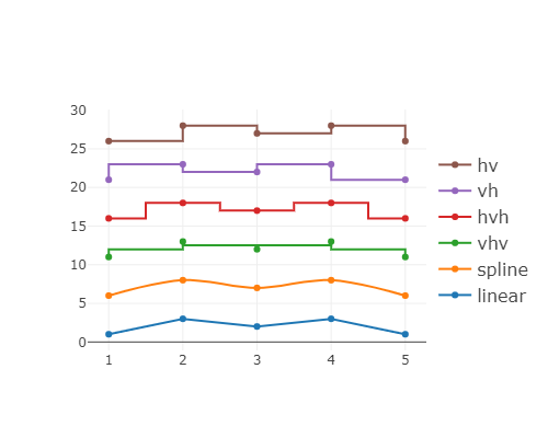
3-5. 連結線の形状を指定する
各データのline要素内にshape要素を与えると散布図を繋ぐ線の形を変更できます
var trace1 = {
  x: [1, 2, 3, 4, 5],
  y: [1, 3, 2, 3, 1],
  mode: 'lines+markers',
  name: 'linear',
  line: {shape: 'linear'},
  type: 'scatter'
};

var trace2 = {
  x: [1, 2, 3, 4, 5],
  y: [6, 8, 7, 8, 6],
  mode: 'lines+markers',
  name: 'spline',
  text: ['tweak line smoothness<br>with "smoothing" in line object', 'tweak line smoothness<br>with "smoothing" in line object', 'tweak line smoothness<br>with "smoothing" in line object', 'tweak line smoothness<br>with "smoothing" in line object', 'tweak line smoothness<br>with "smoothing" in line object', 'tweak line smoothness<br>with "smoothing" in line object'],
  line: {shape: 'spline'},
  type: 'scatter'
};

var trace3 = {
  x: [1, 2, 3, 4, 5],
  y: [11, 13, 12, 13, 11],
  mode: 'lines+markers',
  name: 'vhv',
  line: {shape: 'vhv'},
  type: 'scatter'
};

var trace4 = {
  x: [1, 2, 3, 4, 5],
  y: [16, 18, 17, 18, 16],
  mode: 'lines+markers',
  name: 'hvh',
  line: {shape: 'hvh'},
  type: 'scatter'
};

var trace5 = {
  x: [1, 2, 3, 4, 5],
  y: [21, 23, 22, 23, 21],
  mode: 'lines+markers',
  name: 'vh',
  line: {shape: 'vh'},
  type: 'scatter'
};

var trace6 = {
  x: [1, 2, 3, 4, 5],
  y: [26, 28, 27, 28, 26],
  mode: 'lines+markers',
  name: 'hv',
  line: {shape: 'hv'},
  type: 'scatter'
};

var data = [trace1, trace2, trace3, trace4, trace5, trace6];

var layout = {
  legend: {
    y: 0.5,
    traceorder: 'reversed',
    font: {size: 16},
    yref: 'paper',
  },
  height: 400,
  width: 500
};

Plotly.newPlot('myDiv', data, layout);
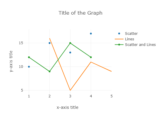
3-6. 軸ラベルをつける
layout要素にxaxis要素を与えるとx軸ラベル、yaxis要素を与えるとy軸ラベルをつけられます
var trace1 = {
  x: [1, 2, 3, 4],
  y: [10, 15, 13, 17],
  mode: 'markers',
  name: 'Scatter'
};

var trace2 = {
  x: [2, 3, 4, 5],
  y: [16, 5, 11, 9],
  mode: 'lines',
  name: 'Lines'
};

var trace3 = {
  x: [1, 2, 3, 4],
  y: [12, 9, 15, 12],
  mode: 'lines+markers',
  name: 'Scatter and Lines'
};

var data = [trace1, trace2, trace3];

var layout = {
  title: 'Title of the Graph',
  xaxis: {
    title: 'x-axis title'
  },
  yaxis: {
    title: 'y-axis title'
  },
  height: 400,
  width: 550
};

Plotly.newPlot('myDiv', data, layout);
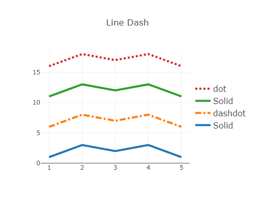
3-7. 線のスタイルを指定する
line要素にdash要素を与えると点線/ダッシュなどのスタイルが指定できます
var trace1 = {
  x: [1, 2, 3, 4, 5],
  y: [1, 3, 2, 3, 1],
  mode: 'lines',
  name: 'Solid',
  line: {
    dash: 'solid',
    width: 4
  }
};

var trace2 = {
  x: [1, 2, 3, 4, 5],
  y: [6, 8, 7, 8, 6],
  mode: 'lines',
  name: 'dashdot',
  line: {
    dash: 'dashdot',
    width: 4
  }
};

var trace3 = {
  x: [1, 2, 3, 4, 5],
  y: [11, 13, 12, 13, 11],
  mode: 'lines',
  name: 'Solid',
  line: {
    dash: 'solid',
    width: 4
  }
};

var trace4 = {
  x: [1, 2, 3, 4, 5],
  y: [16, 18, 17, 18, 16],
  mode: 'lines',
  name: 'dot',
  line: {
    dash: 'dot',
    width: 4
  }
};

var data = [trace1, trace2, trace3, trace4];

var layout = {
  title: 'Line Dash',
  xaxis: {
    range: [0.75, 5.25],
    autorange: false
  },
  yaxis: {
    range: [0, 18.5],
    autorange: false
  },
  legend: {
    y: 0.5,
    traceorder: 'reversed',
    font: {
      size: 16
    }
  },
  height: 400,
  width: 500
};

Plotly.newPlot('myDiv', data, layout);
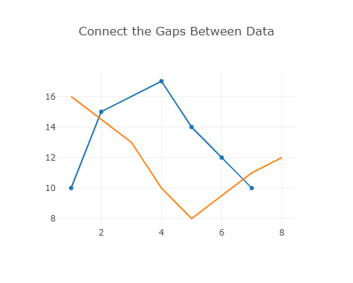
3-8. データに間隔が空いている場合
nullを入れておけば飛ばして繋いでくれます
var trace1 = {
  x: [1, 2, 3, 4, 5, 6, 7, 8],
  y: [10, 15, null, 17, 14, 12, 10, null, 15],
  mode: 'lines+markers',
  connectgaps: true
};

var trace2 = {
  x: [1, 2, 3, 4, 5, 6, 7, 8],
  y: [16, null, 13, 10, 8, null, 11, 12],
  mode: 'lines',
  connectgaps: true
};

var data = [trace1, trace2];

var layout = {
  title: 'Connect the Gaps Between Data',
  showlegend: false
};

Plotly.newPlot('myDiv', data, layout);
3-9. 最初と最後だけmarkerをつける
plotly.jsの機能としてはそういうオプションはないけど、データを並べ替えちゃえば出来るよ!という奴みたいです。公式のexampleに載ってるということは機能要望があったけど、こういう書き方で実現できるから対応しないよという事なのかな?
var xData = [
  [2001, 2002, 2003, 2004, 2005, 2006, 2007, 2008, 2009, 2010, 2011, 2013],
  [2001, 2002, 2003, 2004, 2005, 2006, 2007, 2008, 2009, 2010, 2011, 2013],
  [2001, 2002, 2003, 2004, 2005, 2006, 2007, 2008, 2009, 2010, 2011, 2013],
  [2001, 2002, 2003, 2004, 2005, 2006, 2007, 2008, 2009, 2010, 2011, 2013]
];

var yData = [
  [74, 82, 80, 74, 73, 72, 74, 70, 70, 66, 66, 69],
  [45, 42, 50, 46, 36, 36, 34, 35, 32, 31, 31, 28],
  [13, 14, 20, 24, 20, 24, 24, 40, 35, 41, 43, 50],
  [18, 21, 18, 21, 16, 14, 13, 18, 17, 16, 19, 23]
];

var colors = ['rgba(67,67,67,1)', 'rgba(115,115,115,1)', 'rgba(49,130,189, 1)',
  'rgba(189,189,189,1)'
];

var lineSize = [2, 2, 4, 2];

var labels = ['Television', 'Newspaper', 'Internet', 'Radio'];

var data = [];

for ( var i = 0 ; i < xData.length ; i++ ) {
  var result = {
    x: xData[i],
    y: yData[i],
    type: 'scatter',
    mode: 'lines',
    line: {
      color: colors[i],
      width: lineSize[i]
    }
  };
  var result2 = {
    x: [xData[i][0], xData[i][11]],
    y: [yData[i][0], yData[i][11]],
    type: 'scatter',
    mode: 'markers',
    marker: {
      color: colors[i],
      size: 12
    }
  };
  data.push(result, result2);
}

var layout = {
  showlegend: false,
  height: 600,
  width: 600,
  xaxis: {
    showline: true,
    showgrid: false,
    showticklabels: true,
    linecolor: 'rgb(204,204,204)',
    linewidth: 2,
    autotick: false,
    ticks: 'outside',
    tickcolor: 'rgb(204,204,204)',
    tickwidth: 2,
    ticklen: 5,
    tickfont: {
      family: 'Arial',
      size: 12,
      color: 'rgb(82, 82, 82)'
    }
  },
  yaxis: {
    showgrid: false,
    zeroline: false,
    showline: false,
    showticklabels: false
  },
  autosize: false,
  margin: {
    autoexpand: false,
    l: 100,
    r: 20,
    t: 100
  },
  annotations: [
    {
      xref: 'paper',
      yref: 'paper',
      x: 0.0,
      y: 1.05,
      xanchor: 'left',
      yanchor: 'bottom',
      text: 'Main Source for News',
      font:{
        family: 'Arial',
        size: 30,
        color: 'rgb(37,37,37)'
      },
      showarrow: false
    },
    {
      xref: 'paper',
      yref: 'paper',
      x: 0.5,
      y: -0.1,
      xanchor: 'center',
      yanchor: 'top',
      text: 'Source: Pew Research Center & Storytelling with data',
      showarrow: false,
      font: {
        family: 'Arial',
        size: 12,
        color: 'rgb(150,150,150)'
      }
    }
  ]
};

for( var i = 0 ; i < xData.length ; i++ ) {
  var result = {
    xref: 'paper',
    x: 0.05,
    y: yData[i][0],
    xanchor: 'right',
    yanchor: 'middle',
    text: labels[i] + ' ' + yData[i][0] +'%',
    showarrow: false,
    font: {
      family: 'Arial',
      size: 16,
      color: 'black'
    }
  };
  var result2 = {
    xref: 'paper',
    x: 0.95,
    y: yData[i][11],
    xanchor: 'left',
    yanchor: 'middle',
    text: yData[i][11] +'%',
    font: {
      family: 'Arial',
      size: 16,
      color: 'black'
    },
    showarrow: false
  };

  layout.annotations.push(result, result2);
}

Plotly.newPlot('myDiv', data, layout);

4. 棒グラフ
このページの例を見ていきます
https://plotly.com/javascript/bar-charts/
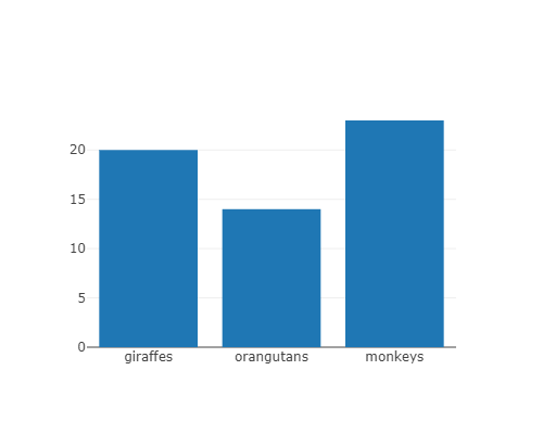
4-1. 基本編
typeをbarにしてやると棒グラフになります
var data = [
  {
    x: ['giraffes', 'orangutans', 'monkeys'],
    y: [20, 14, 23],
    type: 'bar'
  }
];

var layout = {
  height: 400,
  width: 500
}

Plotly.newPlot('myDiv', data, layout);
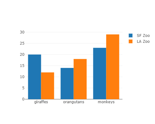
4-2. 複数データの棒グラフ
複数データを配列にして入れてやればまとめて棒グラフにしてくれます
var trace1 = {
  x: ['giraffes', 'orangutans', 'monkeys'],
  y: [20, 14, 23],
  name: 'SF Zoo',
  type: 'bar'
};

var trace2 = {
  x: ['giraffes', 'orangutans', 'monkeys'],
  y: [12, 18, 29],
  name: 'LA Zoo',
  type: 'bar'
};

var data = [trace1, trace2];

var layout = {
  barmode: 'group',
  height: 400,
  width: 500
};

Plotly.newPlot('myDiv', data, layout);
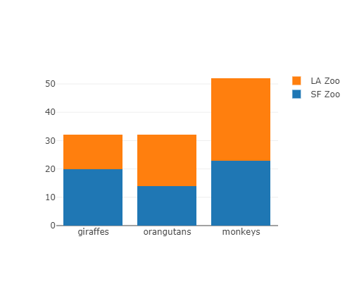
4-3. 積み上げ棒グラフ
layoutにbarmode: 'stack'を入れてやると積み上げ棒グラフになります
var trace1 = {
  x: ['giraffes', 'orangutans', 'monkeys'],
  y: [20, 14, 23],
  name: 'SF Zoo',
  type: 'bar'
};

var trace2 = {
  x: ['giraffes', 'orangutans', 'monkeys'],
  y: [12, 18, 29],
  name: 'LA Zoo',
  type: 'bar'
};

var data = [trace1, trace2];

var layout = {
  barmode: 'stack',
  height: 400,
  width: 500
};

Plotly.newPlot('myDiv', data, layout);
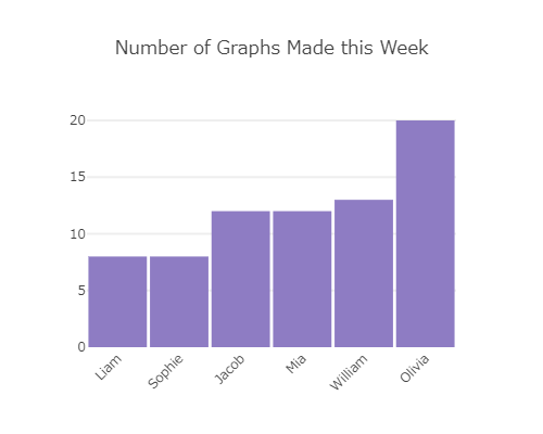
4-4. マウスオーバー表示を指定する
text要素を書いておけば、その文字列を表示してくれます
var trace1 = {
  x: ['Liam', 'Sophie', 'Jacob', 'Mia', 'William', 'Olivia'],
  y: [8.0, 8.0, 12.0, 12.0, 13.0, 20.0],
  type: 'bar',
  text: ['4.17 below the mean', '4.17 below the mean', '0.17 below the mean', '0.17 below the mean', '0.83 above the mean', '7.83 above the mean'],
  marker: {
    color: 'rgb(142,124,195)'
  }
};

var data = [trace1];

var layout = {
  title: 'Number of Graphs Made this Week',
  font:{
    family: 'Raleway, sans-serif'
  },
  showlegend: false,
  xaxis: {
    tickangle: -45
  },
  yaxis: {
    zeroline: false,
    gridwidth: 2
  },
  bargap :0.05,
  height: 400,
  width: 500
};

Plotly.newPlot('myDiv', data, layout);
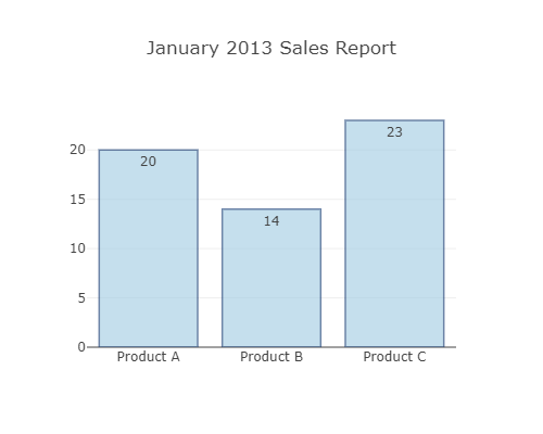
4-5. 値ラベルをつける
text要素に値を入れてtextposition要素を指定するとラベルが表示されますので、text要素に値を書いておけば値ラベルになります。text要素は文字列じゃないとダメなようで、exampleにあったコードではmap(String)して文字列に変えています。
var xValue = ['Product A', 'Product B', 'Product C'];

var yValue = [20, 14, 23];

var trace1 = {
  x: xValue,
  y: yValue,
  type: 'bar',
  text: yValue.map(String),
  textposition: 'auto',
  hoverinfo: 'none',
  marker: {
    color: 'rgb(158,202,225)',
    opacity: 0.6,
    line: {
      color: 'rgb(8,48,107)',
      width: 1.5
    }
  }
};

var data = [trace1];

var layout = {
  title: 'January 2013 Sales Report',
  barmode: 'stack',
  height: 400,
  width: 500
};

Plotly.newPlot('myDiv', data, layout);
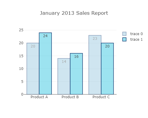
4-6. 複数棒グラフ+値ラベル
複数データの棒グラフでも同様です
var xValue = ['Product A', 'Product B', 'Product C'];

var yValue = [20, 14, 23];
var yValue2 = [24, 16, 20];

var trace1 = {
  x: xValue,
  y: yValue,
  type: 'bar',
  text: yValue.map(String),
  textposition: 'auto',
  hoverinfo: 'none',
  opacity: 0.5,
  marker: {
    color: 'rgb(158,202,225)',
    line: {
      color: 'rgb(8,48,107)',
      width: 1.5
    }
  }
};

var trace2 = {
  x: xValue,
  y: yValue2,
  type: 'bar',
  text: yValue2.map(String),
  textposition: 'auto',
  hoverinfo: 'none',
  marker: {
    color: 'rgba(58,200,225,.5)',
    line: {
      color: 'rgb(8,48,107)',
      width: 1.5
    }
  }
};

var data = [trace1,trace2];

var layout = {
  title: 'January 2013 Sales Report',
  height: 400,
  width: 500
};

Plotly.newPlot('myDiv', data, layout);
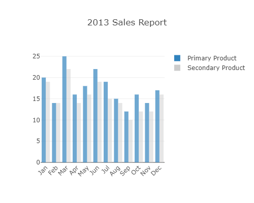
4-7. 軸ラベルを回転する
tickangleを指定すれば軸ラベルを回転できます
var trace1 = {
  x: ['Jan', 'Feb', 'Mar', 'Apr', 'May', 'Jun', 'Jul', 'Aug', 'Sep', 'Oct', 'Nov', 'Dec'],
  y: [20, 14, 25, 16, 18, 22, 19, 15, 12, 16, 14, 17],
  type: 'bar',
  name: 'Primary Product',
  marker: {
    color: 'rgb(49,130,189)',
    opacity: 0.7,
  }
};

var trace2 = {
  x: ['Jan', 'Feb', 'Mar', 'Apr', 'May', 'Jun', 'Jul', 'Aug', 'Sep', 'Oct', 'Nov', 'Dec'],
  y: [19, 14, 22, 14, 16, 19, 15, 14, 10, 12, 12, 16],
  type: 'bar',
  name: 'Secondary Product',
  marker: {
    color: 'rgb(204,204,204)',
    opacity: 0.5
  }
};

var data = [trace1, trace2];

var layout = {
  title: '2013 Sales Report',
  xaxis: {
    tickangle: -45
  },
  barmode: 'group',
  height: 400,
  width: 500
};

Plotly.newPlot('myDiv', data, layout);
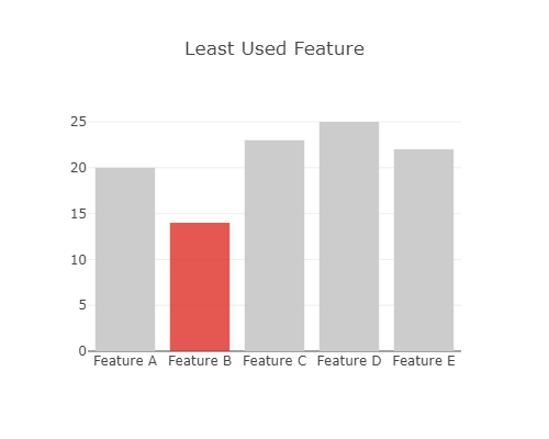
4-8. 特定の棒グラフの色を変える
marker要素のcolorを配列で入れてやればそれぞれの色を指定できます
var trace1 = {
  x: ['Feature A', 'Feature B', 'Feature C', 'Feature D', 'Feature E'],
  y: [20, 14, 23, 25, 22],
  marker:{
    color: ['rgba(204,204,204,1)', 'rgba(222,45,38,0.8)', 'rgba(204,204,204,1)', 'rgba(204,204,204,1)', 'rgba(204,204,204,1)']
  },
  type: 'bar'
};

var data = [trace1];

var layout = {
  title: 'Least Used Feature',
  height: 400,
  width: 500
};

Plotly.newPlot('myDiv', data, layout);
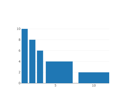
4-9. それぞれの幅を指定する
width要素に配列を入れればそれぞれの幅を指定できます
var trace0 = {
  type: 'bar',
  x: [1, 2, 3, 5.5, 10],
  y: [10, 8, 6, 4, 2],
  width: [0.8, 0.8, 0.8, 3.5, 4]
}

var data = [trace0]

var layout = {
  height: 400,
  width: 500
};

Plotly.newPlot('myDiv', data, layout);
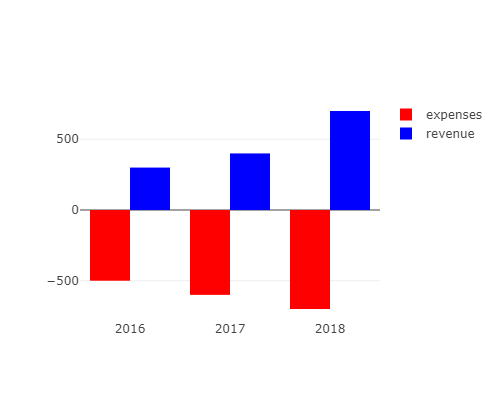
4-10. 逆さ棒グラフを書く
逆さに棒グラフを書く機能はないけど棒の下端の位置を動かす機能はあるようで、-500から高さ500のグラフを書けば逆さになるという例です
var data = [
  {
    type: 'bar',
    x: ['2016','2017','2018'],
    y: [500,600,700],
    base: [-500,-600,-700],
    hovertemplate: '%{base}',
    marker: {
      color: 'red'
    },
    name: 'expenses'
  },
  {
    type: 'bar',
    x: ['2016','2017','2018'],
    y: [300,400,700],
    base: 0,
    marker: {
      color: 'blue'
    },
    name: 'revenue'
  }]

var layout = {
  height: 400,
  width: 500
};

Plotly.newPlot('myDiv', data, layout);
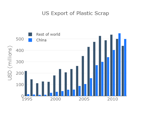
4-11. 色やスタイルを指定する
なんか色々指定しましたという例みたいです
var trace1 = {
  x: [1995, 1996, 1997, 1998, 1999, 2000, 2001, 2002, 2003, 2004, 2005, 2006, 2007, 2008, 2009, 2010, 2011, 2012],
  y: [219, 146, 112, 127, 124, 180, 236, 207, 236, 263, 350, 430, 474, 526, 488, 537, 500, 439],
  name: 'Rest of world',
  marker: {color: 'rgb(55, 83, 109)'},
  type: 'bar'
};

var trace2 = {
  x: [1995, 1996, 1997, 1998, 1999, 2000, 2001, 2002, 2003, 2004, 2005, 2006, 2007, 2008, 2009, 2010, 2011, 2012],
  y: [16, 13, 10, 11, 28, 37, 43, 55, 56, 88, 105, 156, 270, 299, 340, 403, 549, 499],
  name: 'China',
  marker: {color: 'rgb(26, 118, 255)'},
  type: 'bar'
};

var data = [trace1, trace2];

var layout = {
  title: 'US Export of Plastic Scrap',
  xaxis: {tickfont: {
      size: 14,
      color: 'rgb(107, 107, 107)'
    }},
  yaxis: {
    title: 'USD (millions)',
    titlefont: {
      size: 16,
      color: 'rgb(107, 107, 107)'
    },
    tickfont: {
      size: 14,
      color: 'rgb(107, 107, 107)'
    }
  },
  legend: {
    x: 0,
    y: 1.0,
    bgcolor: 'rgba(255, 255, 255, 0)',
    bordercolor: 'rgba(255, 255, 255, 0)'
  },
  barmode: 'group',
  bargap: 0.15,
  bargroupgap: 0.1,
  height: 400,
  width: 500
};

Plotly.newPlot('myDiv', data, layout);
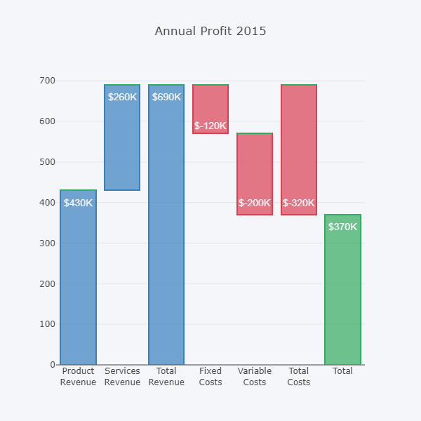
4-12. ウォーターフォールチャート
積み上げ棒グラフの一番下に表示するデータの表示色を透明にすることでウォーターフォールグラフを実現しています。実際に使うときには自動で計算してウォーターフォールになるようにする感じでしょうか。
// Base

var xData = ['Product<br>Revenue', 'Services<br>Revenue',
  'Total<br>Revenue', 'Fixed<br>Costs',
  'Variable<br>Costs', 'Total<br>Costs', 'Total'
];

var yData = [400, 660, 660, 590, 400, 400, 340];

var textList = ['$430K', '$260K', '$690K', '$-120K', '$-200K', '$-320K', '$370K'];

//Base

var trace1 = {
  x: xData,
  y: [0, 430, 0, 570, 370, 370, 0],
  marker: {
    color: 'rgba(1,1,1,0.0)'
  },
  type: 'bar'
};

//Revenue

var trace2 = {
  x: xData,
  y: [430, 260, 690, 0, 0, 0, 0],
  type: 'bar',
  marker: {
    color: 'rgba(55,128,191,0.7)',
    line: {
      color: 'rgba(55,128,191,1.0)',
      width: 2
    }
  }
};

//Cost

var trace3 = {
  x: xData,
  y: [0, 0, 0, 120, 200, 320, 0],
  type: 'bar',
  marker: {
    color: 'rgba(219, 64, 82, 0.7)',
    line: {
      color: 'rgba(219, 64, 82, 1.0)',
      width: 2
    }
  }
};

//Profit

var trace4 = {
  x: xData,
  y: [0, 0, 0, 0, 0, 0, 370],
  type: 'bar',
  marker: {
    color: 'rgba(50,171, 96, 0.7)',
    line: {
      color: 'rgba(50,171,96,1.0)',
      width: 2
    }
  }
};

var data = [trace1, trace2, trace3, trace4];

var layout = {
  title: 'Annual Profit 2015',
  barmode: 'stack',
  paper_bgcolor: 'rgba(245,246,249,1)',
  plot_bgcolor: 'rgba(245,246,249,1)',
  width: 600,
  height: 600,
  showlegend: false,
  annotations: []
};

for ( var i = 0 ; i < 7 ; i++ ) {
  var result = {
    x: xData[i],
    y: yData[i],
    text: textList[i],
    font: {
      family: 'Arial',
      size: 14,
      color: 'rgba(245,246,249,1)'
    },
    showarrow: false
  };
  layout.annotations.push(result);
};

Plotly.newPlot('myDiv', data, layout);
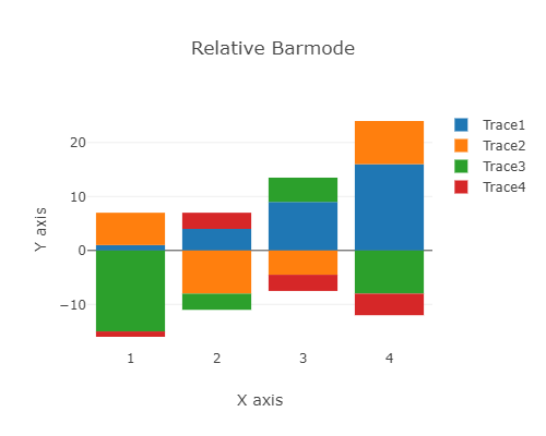
4-13. relative bar plot
barmodeをrelativeにすると棒グラフを重ねて表示するようになります
var trace1 = {
  x: [1, 2, 3, 4],
  y: [1, 4, 9, 16],
  name: 'Trace1',
  type: 'bar'
};
var trace2 = {
  x: [1, 2, 3, 4],
  y: [6, -8, -4.5, 8],
  name: 'Trace2',
  type: 'bar'
};
var trace3 = {
  x: [1, 2, 3, 4],
  y: [-15, -3, 4.5, -8],
  name: 'Trace3',
  type: 'bar'
 }

 var trace4 = {
  x: [1, 2, 3, 4],
  y: [-1, 3, -3, -4],
  name: 'Trace4',
  type: 'bar'
 }

var data = [trace1, trace2, trace3, trace4];
var layout = {
  xaxis: {title: 'X axis'},
  yaxis: {title: 'Y axis'},
  barmode: 'relative',
  title: 'Relative Barmode',
  height: 400,
  width: 500
};

Plotly.newPlot('myDiv', data, layout);
5. 円グラフ
このページの例などをやっていきます
https://plotly.com/javascript/pie-charts/
5-1. 基本編
var data = [{
  values: [19, 26, 55],
  labels: ['Residential', 'Non-Residential', 'Utility'],
  type: 'pie'
}];

var layout = {
  height: 400,
  width: 500
};

Plotly.newPlot('myDiv', data, layout);

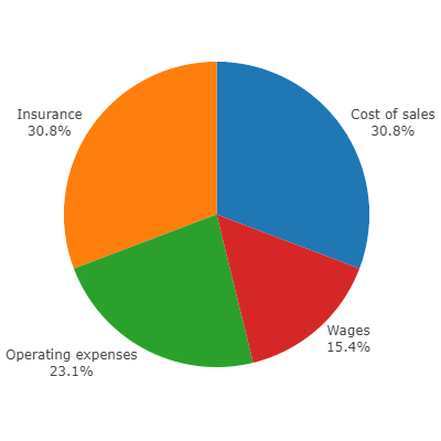
5-2. ラベルを要素脇に表示する
var data = [{
  type: "pie",
  values: [2, 3, 4, 4],
  labels: ["Wages", "Operating expenses", "Cost of sales", "Insurance"],
  textinfo: "label+percent",
  textposition: "outside",
  automargin: true
}]

var layout = {
  height: 400,
  width: 400,
  margin: {"t": 0, "b": 0, "l": 0, "r": 0},
  showlegend: false
  }

Plotly.newPlot('myDiv', data, layout)
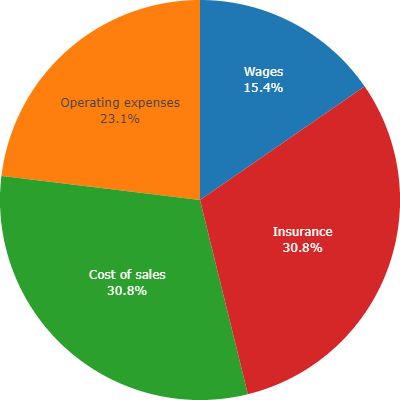
textpositionがoutsideだとこんな感じ
insideに変えるとこんな感じ
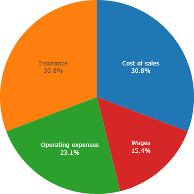
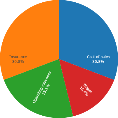
5-3. ラベルを回転させる
insidetextorientationをradialにするとラベルを回転してくれます
var data = [{
  type: "pie",
  values: [2, 3, 4, 4],
  labels: ["Wages", "Operating expenses", "Cost of sales", "Insurance"],
  textinfo: "label+percent",
  textposition: "inside",
  automargin: true,
  insidetextorientation: "radial"
}]

var layout = {
  height: 400,
  width: 400,
  margin: {"t": 0, "b": 0, "l": 0, "r": 0},
  showlegend: false
  }

Plotly.newPlot('myDiv', data, layout)
5-4. ラベルの表示順を指定する
sortをfalseにすると要素を入力した順に反時計回りで表示するようになります。sortは省略するとtrueになるので先程までの表示ではデータを大きい順に並べ替えて表示していたわけです。
var data = [{
  type: "pie",
  values: [2, 3, 4, 4],
  labels: ["Wages", "Operating expenses", "Cost of sales", "Insurance"],
  textinfo: "label+percent",
  textposition: "inside",
  automargin: true,
  sort: false,
  direction: 'clockwise'
}]

var layout = {
  height: 400,
  width: 400,
  margin: {"t": 0, "b": 0, "l": 0, "r": 0},
  showlegend: false
  }

Plotly.newPlot('myDiv', data, layout)
directionをclockwiseにしたので時計回りです
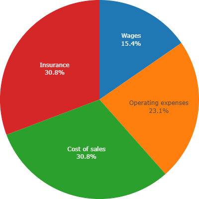
directionをcounterclockwiseにするか、省略すると反時計回りになります
5-5. 色を変える
データのmarker要素にcolorsを渡すことで色を指定できます
var data = [{
  type: "pie",
  values: [2, 3, 4, 4],
  labels: ["Wages", "Operating expenses", "Cost of sales", "Insurance"],
  marker: {
    colors: ['rgb(242, 242, 242)',
             'rgb(191, 191, 191)',
             'rgb(0, 112, 192)',
             'rgb(255, 0, 0)']
  },
  textinfo: "label+percent",
  textposition: "inside",
  automargin: true,
  sort: false,
  direction: 'clockwise'
}]

var layout = {
  height: 400,
  width: 400,
  margin: {"t": 0, "b": 0, "l": 0, "r": 0},
  showlegend: false
  }

Plotly.newPlot('myDiv', data, layout)

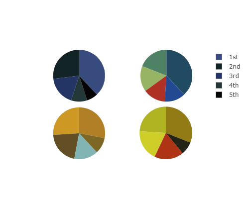
5-6. 複数の円グラフを並べる
複数のデータを配列にして入れてgridを指定すればまとめて表示してくれます
var allLabels = ['1st', '2nd', '3rd', '4th', '5th'];

var allValues = [
  [38, 27, 18, 10, 7],
  [28, 26, 21, 15, 10],
  [38, 19, 16, 14, 13],
  [31, 24, 19, 18, 8]
];

var ultimateColors = [
  ['rgb(56, 75, 126)', 'rgb(18, 36, 37)', 'rgb(34, 53, 101)', 'rgb(36, 55, 57)', 'rgb(6, 4, 4)'],
  ['rgb(177, 127, 38)', 'rgb(205, 152, 36)', 'rgb(99, 79, 37)', 'rgb(129, 180, 179)', 'rgb(124, 103, 37)'],
  ['rgb(33, 75, 99)', 'rgb(79, 129, 102)', 'rgb(151, 179, 100)', 'rgb(175, 49, 35)', 'rgb(36, 73, 147)'],
  ['rgb(146, 123, 21)', 'rgb(177, 180, 34)', 'rgb(206, 206, 40)', 'rgb(175, 51, 21)', 'rgb(35, 36, 21)']
];

var data = [{
  values: allValues[0],
  labels: allLabels,
  type: 'pie',
  name: 'Starry Night',
  marker: {
    colors: ultimateColors[0]
  },
  domain: {
    row: 0,
    column: 0
  },
  hoverinfo: 'label+percent+name',
  textinfo: 'none'
},{
  values: allValues[1],
  labels: allLabels,
  type: 'pie',
  name: 'Sunflowers',
  marker: {
    colors: ultimateColors[1]
  },
  domain: {
    row: 1,
    column: 0
  },
  hoverinfo: 'label+percent+name',
  textinfo: 'none'
},{
  values: allValues[2],
  labels: allLabels,
  type: 'pie',
  name: 'Irises',
  marker: {
    colors: ultimateColors[2]
  },
  domain: {
    row: 0,
    column: 1
  },
  hoverinfo: 'label+percent+name',
  textinfo: 'none'
},{
  values: allValues[3],
  labels: allLabels,
  type: 'pie',
  name: 'The Night Cafe',
  marker: {
    colors: ultimateColors[3]
  },
  domain: {
    x: [0.52,1],
    y: [0, 0.48]
  },
  hoverinfo: 'label+percent+name',
  textinfo: 'none'
}];

var layout = {
  height: 400,
  width: 500,
  grid: {rows: 2, columns: 2}
};

Plotly.newPlot('myDiv', data, layout);
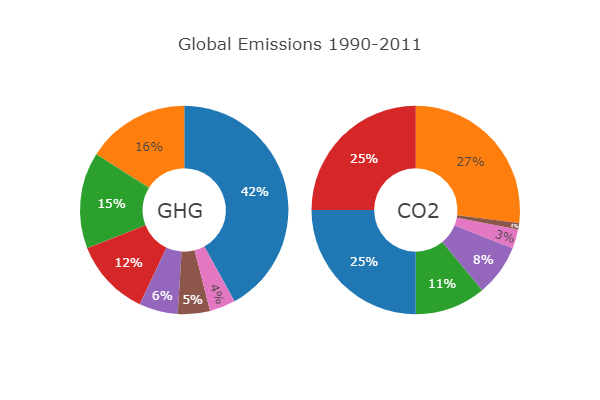
5-7. ドーナツプロット
holeに穴のサイズを入れるとドーナツプロットになります
var data = [{
  values: [16, 15, 12, 6, 5, 4, 42],
  labels: ['US', 'China', 'European Union', 'Russian Federation', 'Brazil', 'India', 'Rest of World' ],
  domain: {column: 0},
  name: 'GHG Emissions',
  hoverinfo: 'label+percent+name',
  hole: .4,
  type: 'pie'
},{
  values: [27, 11, 25, 8, 1, 3, 25],
  labels: ['US', 'China', 'European Union', 'Russian Federation', 'Brazil', 'India', 'Rest of World' ],
  text: 'CO2',
  textposition: 'inside',
  domain: {column: 1},
  name: 'CO2 Emissions',
  hoverinfo: 'label+percent+name',
  hole: .4,
  type: 'pie'
}];

var layout = {
  title: 'Global Emissions 1990-2011',
  annotations: [
    {
      font: {
        size: 20
      },
      showarrow: false,
      text: 'GHG',
      x: 0.17,
      y: 0.5
    },
    {
      font: {
        size: 20
      },
      showarrow: false,
      text: 'CO2',
      x: 0.82,
      y: 0.5
    }
  ],
  height: 400,
  width: 600,
  showlegend: false,
  grid: {rows: 1, columns: 2}
};

Plotly.newPlot('myDiv', data, layout);
まとめ
JavaScriptのグラフライブラリらしからぬ多機能っぷりです
レッツトライ