HTMLとCSSのみを使ってインタラクティブなボタン集を作っていきます。
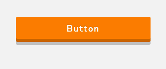
ホバーした時に押せる(ボタンが凹む)ような挙動をするボタンの実装
言葉で説明しても伝えきる自信が無いので、スクリーンショットを見てください。
→GIF画像を作りました
以下コードです。
HTML
<div class="button">
	<a href="#">button</a>
</div>
CSS
.button {
	width: 300px;
	font-size: 19px;
	font-weight: bold;
	text-align: center;
}
.button a {
	padding: 11px 10px 8px;
	display: block;
	background: #e7ae00;
	-webkit-border-radius: 10px;
	-moz-border-radius: 10px;
	border-radius: 10px;
	box-shadow: 0 6px 0 #b48800,0 12px 0 rgba(0,0,0,0.2);
	-webkit-transition: color 0.3s, background-color 0.3s, box-shadow 0.3s, -webkit-transform 0.3s;
	transition: color 0.3s, background-color 0.3s, box-shadow 0.3s, transform 0.3s;
	text-shadow: 0px -1px 0px rgba(0,0,0,0.25);
	color: #fff;
	text-decoration: none;
}
.button a:hover {
	box-shadow: 0 3px 0 #ce9b00,0 6px 0px rgba(0,0,0,0.2);
	-webkit-transform: translateY(3px);
	transform: translateY(3px);
	background: #ffc71b;
}
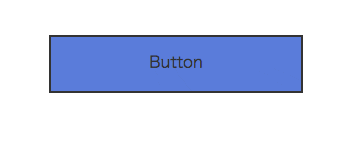
上から背景がするりと降りてくるボタン
ちょっと画像が荒いですが、、、
gif画像作りました
HTML
<a class="button" href="#">Button</a>
CSS
.button {
	display: inline-block;
	width: 200px;
	height: 54px;
	text-align: center;
	text-decoration: none;
	line-height: 54px;
	outline: none;
	position: relative;
	z-index: 2;
	background-color: #587ed3;
	border: 2px solid #333;
	color: #333;
	line-height: 50px;
	overflow: hidden;
}
.button:before,
.button:after {
	position: absolute;
	z-index: -1;
	display: block;
	content: '';
}
.button:after {
	top: -100%;
	width: 100%;
	height: 100%;
}
.button,
.button:before,
.button:after {
	-webkit-transition: all .3s;
	transition: all .3s;
}

.button:hover {
	color: #4b68aa;
	border: 2px solid #4b68aa;
}
.button:hover:after {
	top: 0;
	background-color: #fff;
}
ふわっと背景が変わるボタン
内側に白のbox−shadowを入れているところがポイントです。
HTML
<a href="#" class="button">ボタン</a>
CSS
.button {
   padding: 6px 0;
   text-align: center;
   display: block;
   width: 150px;
   font-weight: bold;
   color: #eb5503;
   border: 1px solid #eb5503;
   -webkit-border-radius: 5px;
   -moz-border-radius: 5px;
   border-radius: 5px;
   background: #fff;
   font-size: 13px;
   -moz-box-shadow: 0px 3px 0px #eb5403,inset 0px 0px 2px #fff;
   -webkit-box-shadow: 0px 3px 0px #eb5403,inset 0px 0px 2px #fff;
   box-shadow: 0px 3px 0px #eb5403,inset 0px 0px 2px #fff;
   -webkit-transition: all 0.3s linear;
   -webkit-transform-origin: 50% 50%;
   -moz-transition: all 0.3s linear;
   -mox-transform-origin: 50% 50%;
}
.button:hover {
   background: #eb5503;
   color: #fff;
   text-decoration: none;
}
注) IE8,IE9ではうまく動かないものが多いです。
CSS3の登場でCSSのみで実装できるボタンの幅がかなり広がったようです。
今度いろいろなボタンをまとめてみようと思います。
簡単に作れるGIF画像であまり荒くならない方法を教えていただけるとうれしいです。
現在はCloudAppってやつで作ってます。