最近は facebook や instagram などを中心に多くのアプリでも見るようになってきた、読み込み時に表示される UIプレースホルダー。(スケルトンデザインとも言うよう)
ページ読み込み時のユーザーの体感速度を高めるための一つとして有効な手段です。
そんな UI プレースホルダーを HTML と CSS のみで作成しました。
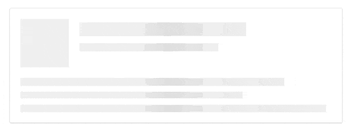
最終的にはこれを作ります
コードは github で確認できます。
https://github.com/sottar/ui-placeholder
STEP1
まずは ui-placeholder を作成するための箱を作ります

HTML
<div class="placeholder-wrapper">
  <div class="placeholder-item">
  </div>
</div>
CSS
.placeholder-item {
  background: #fff;
  border: 1px solid;
  border-color: #e5e6e9 #dfe0e4 #d0d1d5;
  border-radius: 3px;
  padding: 15px;
  margin: 0 auto;
  max-width: 480px;
  min-height: 156px;
  box-sizing: border-box;
}
STEP2
css の background で animation させる背景を設定します。
css3 のグラデーションを使い濃淡をつけます。

HTML
<div class="placeholder-wrapper">
  <div class="placeholder-item">
    <div class="animated-background">
    </div>
  </div>
</div>
CSS
...

.animated-background {
  background: #f6f7f8;
  background: linear-gradient(to right, #eee 8%, #ddd 18%, #eee 33%);
  background-size: 800px 104px;
  height: 135px;
  position: relative;
}
STEP3
STEP2 で設定した背景を animation を使って動かします。
CSS
...

.animated-background {
  animation-duration: 1s;
  animation-fill-mode: forwards;
  animation-iteration-count: infinite;
  animation-name: placeHolderAnimation;
  animation-timing-function: linear;
  background: #f6f7f8;
  background: linear-gradient(to right, #eee 8%, #ddd 18%, #eee 33%);
  background-size: 800px 104px;
  height: 135px;
  position: relative;
}

@keyframes placeHolderAnimation{
  0% {
    background-position: -400px 0
  }
  100% {
    background-position: 400px 0
  }
}
animation の細かい設定方法は以下で確認してください。
CSS の @keyframe, animation 属性の使い方
STEP4
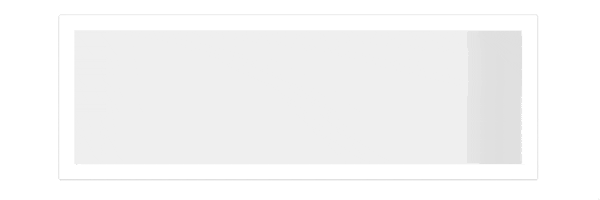
コンポーネントではない部分(アニメーションさせたくない部分)を隠していくように div を配置していきます。
下の画像の黒い枠で囲まれているところに背景の白い div を配置していくイメージです。

HTML
  <div class="placeholder-wrapper">
    <div class="placeholder-item">
      <div class="animated-background">
        <div class="background-masker head-top"></div>
        <div class="background-masker head-left"></div>
        <div class="background-masker head-right"></div>
        <div class="background-masker head-bottom"></div>
      </div>
    </div>
  </div>
CSS
...

.background-masker {
  background: #fff;
  position: absolute;
}

.background-masker.head-top,
.background-masker.head-bottom {
  top: 0;
  left: 70px;
  right: 0;
  height: 5px;
}

.background-masker.head-bottom {
  top: 25px;
  height: 10px;
}

.background-masker.head-left,
.background-masker.head-right {
  top: 5px;
  left: 70px;
  height: 20px;
  width: 15px;
}

.background-masker.head-right {
  left: 325px;
  width: 123px;
}
最終STEP
後はひたすら div で隠す位置を調整しながら目的の形を作っていきます。

HTML
  <div class="placeholder-wrapper">
    <div class="placeholder-item">
      <div class="animated-background">
        <div class="background-masker head-top"></div>
        <div class="background-masker head-left"></div>
        <div class="background-masker head-right"></div>
        <div class="background-masker head-bottom"></div>
        <div class="background-masker subhead-left"></div>
        <div class="background-masker subhead-right"></div>
        <div class="background-masker subhead-bottom"></div>
        <div class="background-masker content-top"></div>
        <div class="background-masker content-first-end"></div>
        <div class="background-masker content-second-line"></div>
        <div class="background-masker content-second-end"></div>
        <div class="background-masker content-third-line"></div>
        <div class="background-masker content-third-end"></div>
      </div>
    </div>
  </div>
CSS
...

.background-masker.content-top,
.background-masker.content-first-end,
.background-masker.content-second-line,
.background-masker.content-third-line,
.background-masker.content-second-end,
.background-masker.content-third-end {
  top: 70px;
  left: 0;
  right: 0;
  height: 15px;
}

.background-masker.content-first-end {
  top: 85px;
  left: 380px;
  height: 12px;
}

.background-masker.content-second-line {
  top: 97px;
  height: 8px;
}

.background-masker.content-second-end {
  top: 105px;
  left: 320px;
  height: 10px;
}

.background-masker.content-third-line {
  top: 115px;
  height: 9px;
}

.background-masker.content-third-end {
  top: 124px;
  left: 440px;
  height: 11px;
}
その他
作り終わった後にアニメーションする部分の高さなどを変えたりしようとすると、一つ一つの div の位置を変更しないといけないので、とてもめんどくさいです。
まずは sketch や photoshop などでデザインカンプをつくって高さなどを決めてから実装に入ったほうが良いと思います。
各 STEP ごとのコードは github で確認できます。
https://github.com/sottar/ui-placeholder