概要
Angularでちょっとしたアラートでダイアログを表示させたいので、Angular MaterialのDiaglogを使ってました。Angular MaterialについてはQiitaや各種ブログで取り上げられているものの、仕様が変わったりなどして、Diaglogを使ったときに上手く動かず苦労しました。ので、備忘をかねて本ページで参考サイトのリンクやサンプルソースをのせます。
Angular Materialのインストール
@donuziumさんのAngular Materialのインストールから使い始めまでにて分かりやすく解説されています。一点注意すべきは、Angular本体のメジャーバージョンとAngular Materialのバージョンが異なる場合、ビルドで失敗する可能性がるので使用しているAngular本体のバージョンに合わせてインストールしましょう。
Diaglogを使用にあたっての参考サイト
まずはDialog | Angular Materialを読みましょう。@TsuyoshiUshio@githubさんのAngular 4 マテリアルデザインのダイアログの記事に解説がされています。
また、こちらのブログ記事【Angular】10分で分かるAngularMaterialのDialogの使い方のサンプルソースもイメージがつきやすいと思います。なお2018年5月現在、コンポーネント名が「mat」始まりになっていますので注意してください。
サンプルソース
上記参考サイトの内容を少し編集したものをのせます。Angular5で動作すること確認しています。
Moduleの設定
test.module.ts
import { NgModule }      from '@angular/core';
import { CommonModule } from '@angular/common';
import { FormsModule } from '@angular/forms';
import { BrowserAnimationsModule } from '@angular/platform-browser/animations';
import { MatDialogModule } from '@angular/material';
import { AlertDialogComponent }  from './alert-dialog.component';

@NgModule({
  imports:[ CommonModule ,FormsModule , BrowserAnimationsModule , MatDialogModule ],
  declarations: [ AlertDialogComponent ],
  entryComponents: [ AlertDialogComponent ]
})
export class TestModule { }
ダイアログの表示用コンポーネント
alert-dialog.component.ts
import { Component, OnInit, Inject} from '@angular/core';
import {MAT_DIALOG_DATA, MatDialogRef} from '@angular/material';

@Component({
  selector:'app-alert-dialog',
  template: `
   <h2 mat-dialog-title>{{data.title}}</h2>
        <mat-dialog-content>
           {{data.message}}
        </mat-dialog-content>
    <mat-dialog-actions>
        <table cellspacing="15">
           <tr>
             <td>
                 <button mat-raised-button (click)="onClickOkButton()">OK</button>
             </td>
             <td>
                 <button mat-raised-button mat-dialog-close="cancel">キャンセル</button>
             </td>
           </tr>
        </table>

    </mat-dialog-actions>
  `
})
export class AlertDialogComponent  {

    constructor(
        @Inject(MAT_DIALOG_DATA) public data : any,
        public matDialogRef : MatDialogRef<AlertDialogComponent>) { }


    onClickOkButton():void {
        // OKボタンが押されたときは「OK」を呼び出し元に渡す。
        this.matDialogRef.close('OK');
    }

}
ダイアログの呼び出し元コンポーネント
alert-test.component.ts
import { Component , OnInit} from '@angular/core';
import { MatDialog} from '@angular/material';
import { AlertDialogComponent } from './alert-dialog.component';

@Component({
  selector:'app-alert-test',
  template: `
   <input type ="button" (click)="onDelete($event)" value ="削除" />{{this.alertDialogResult}}
  `
})
export class AlertTestComponent  {
    // アラートの押されたボタンの結果格納用
    alertDialogResult = '';

    constructor( public matDialog : MatDialog){ }

    // 削除ボタンが押されたとき
    onDelete(event:string){
      // ダイアログの表示
      let dialog = this.matDialog.open(AlertDialogComponent, {
                  'data' : {'title': '削除確認' , 'message' : '削除しても大丈夫ですか?'},
                  'height' : '300px',
                  'width' : '500px',
                  'disableClose' : false
                 });

      // ボタンの結果を取得
      dialog.afterClosed().subscribe( (result:any) => {
            // 結果をセット
            this.alertDialogResult = result;
      });
    }

}
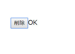
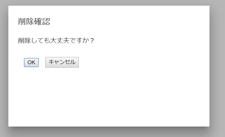
サンプルはこんなかんじで表示されます。
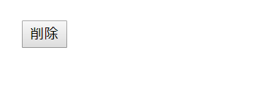
削除ボタンを押すとダイアログが表示されます。
OKボタンを押すと、パラメータが元の画面へ反映されます。