
概要
- pythonによるエネルギーデータ(電力量)を可視化します。
- Excelではなく、pythonのplotlyというライブラリを使用します。
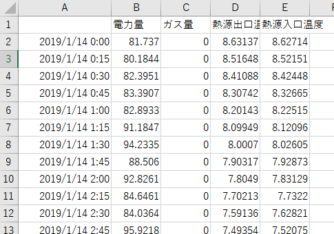
入力データ
- 今回使用するのは、電力量データとタイムスタンプのみです。
ソースコード
# ライブラリのインポート
import pandas as pd
import plotly.express as px

# sampleデータの読み込み
data = pd.read_csv('./sample.csv',encoding='shift-jis',index_col=[0],parse_dates=[0])

# データのリサンプリング(1日毎の合計)
data_month_sum = data.resample('D').sum()

# 線グラフの描画
px.line(data_frame=data_month_sum,
        x=data_month_sum.index,
        y='電力量',
        color_discrete_sequence=['yellow'])
実行結果

まとめ
- エクセルではできないインタラクティブなグラフを作成できる。
- 知っていれば、圧倒的に早く可視化でき、データを俯瞰できる。