TL;DR
matplotlibで任意の位置(Axesの外側など)に点や線を描くには、transform を使います。
準備
ライブラリ
import matplotlib.pyplot as plt
import matplotlib.transforms as transforms
import matplotlib
import numpy as np
import pandas as pd
必要に応じて、%matplotlib inline などの追加も忘れないように。
今回使用しているライブラリのバージョンは下記の通りです。
print("numpy version: ", np.__version__)
print("pandas version: ", pd.__version__)
print("matplotlib version: ", matplotlib.__version__)
numpy version:  1.19.4
pandas version:  1.1.5
matplotlib version:  3.3.4
説明用のベースになるグラフ
関数化しておきます。
def base(figsize=None):
    fig, ax = plt.subplots(figsize=figsize)

    df = pd.DataFrame(np.arange(12).reshape(2,6))
    ax.set_xticks(np.arange(0, 10, .5))
    ax.set_yticks(np.arange(0, 12, .5))
    ax.scatter(df.iloc[0].values, df.iloc[1].values)
    ax.grid(True)
    return ax, fig
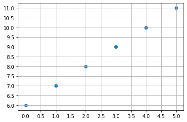
グラフは下記のようになります。
base()
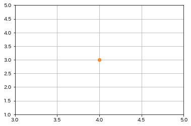
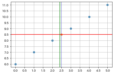
Axesの中心/グラフの中央に点を描く
グラフの中央という言い方が多少誤解を招くかもしれません。正確に言うと、Axesの中央です。
x, y軸の表示範囲や数値に影響されない、常にAxesの中心に点を描きます。
ax, fig = base()

# ax.transAxes を使い実現する
def draw_scatter_in_center(ax, **kwargs):
    ax.scatter([0.5], [0.5], transform=ax.transAxes, **kwargs)
draw_scatter_in_center(ax)
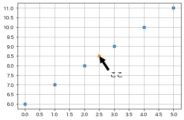
中心のオレンジの点は結果です。
直接座標 (2.5, 8.5)を指定すると違い、グラフの表示範囲が変化しても、中心に点を描くことができます。
ax, fig = base()
draw_scatter_in_center(ax)
# グラフの表示範囲を変える
ax.set_xlim(3, 5)
ax.set_ylim(1, 5)
Axesの中心/グラフの中央に線を描く
ax, fig = base()
draw_scatter_in_center(ax)

# Axesの中央に縦と横の直線
ax.add_line(matplotlib.lines.Line2D([0.5, 0.5], [0, 1],
            c="blue", alpha=0.3, transform=ax.transAxes))
ax.axhline(np.mean(ax.get_ybound()))
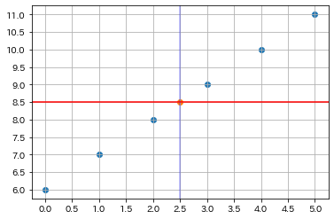
ax.add_line と ax.axhline の二つの方法が出来ます。
ちなみに、transform=ax.transAxesで実現しているが、他に色んな transform が指定できます。 transform=fig.transFigure だと、座標系の中心ではないので、使い分けを注意してください。
ax.add_line(matplotlib.lines.Line2D([0.5, 0.5], [0, 1],
            c="green", transform=fig.transFigure))
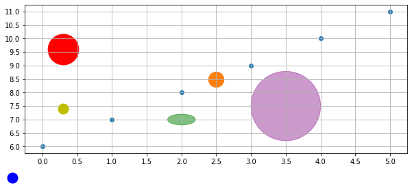
任意の位置に円を描く
円を描くには、 Circle、Ellipse 、ax.scatter 、ax.plot など色んな方法があります。
横縦軸の比率が変化すると、元々円を描いたが見た目は楕円(緑)になってしまいます。
確実に円にするため、
- 比率を計算し、見た目が円の楕円を描く(紫)
-
ax.scatterを使用する(赤)
ax, fig = base(figsize=(10, 4))
draw_scatter_in_center(ax, s=500)

from matplotlib import patches as mp

# 円を描いたが、見た目は楕円(緑)
ax.add_artist(mp.Circle((2, 7), .2, alpha=0.5,
              transform=ax.transData, color="g"))

# 比率を計算し、見た目が円の楕円を描く(紫)
xscale, yscale = (ax.transData.transform([1, 1]) -
                  ax.transData.transform([0, 0]))
radius_x = 1
radius_y = radius_x * xscale / yscale
ax.add_patch(mp.Ellipse((3.5, 7.5), radius_x, radius_y,
             color="purple", alpha=0.4))

# 左上の赤い円を描く
ax.scatter(.1, .7, marker="o", s=2000, color="r",
           transform=ax.transAxes)

# 左下の黄色い円を描く
ax.plot(.1, .3, "yo", fillstyle="full", markersize=15,
        transform=ax.transAxes)

# 座標軸外の右下の青い円を描く
ax.plot(.1, 0, "bo", fillstyle="full", markersize=15,
        transform=fig.transFigure, clip_on=False)
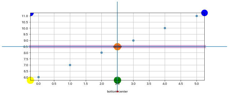
色々描いてみる
ax, fig = base(figsize=(10, 4))

# 中心に"center"の文字列を描く
draw_scatter_in_center(ax, s=500)
ax.text(0.5, 0.5, "center", ha="center", va="center",
        transform=ax.transAxes)

# 軸の外側、下中央に"bottom-center"と赤い点を描く
trans = transforms.blended_transform_factory(
    ax.transAxes, fig.transFigure)
ax.text(0.5, 0, "bottom-center", ha="center", va="center",
        transform=trans)
ax.plot(0.5, 0, "ro", fillstyle="full", markersize=5,
        transform=trans, clip_on=False)

# 縦線(青)を描く
ax.add_artist(matplotlib.lines.Line2D([0.5, 0.5], [0, 1],
              transform=trans, clip_on=False))

# 横線(青)を描く
trans2 = transforms.blended_transform_factory(
    fig.transFigure, ax.transAxes)
ax.add_artist(matplotlib.lines.Line2D([0, 1], [0.5, 0.5],
              transform=trans2, clip_on=False))

# 横線(紫)を描く。ax.axhlineだと座標軸の外に延べない。
ax.axhline(np.mean(ax.get_ybound()), c="purple",
           linewidth=10, alpha=0.3, clip_on=False)

# x軸に中央円(緑)を描く
ax.scatter(0.5, 0, marker="o", s=500, color="green",
           transform=ax.transAxes, clip_on=False)

# x, y軸左下に円(黄)を描く
ax.scatter(0, 0, marker="o", s=500, color="yellow",
           transform=ax.transAxes, clip_on=False)

# x, y軸右上に円(青)を描く
ax.plot(1, 1, "bo", fillstyle="full", markersize=20,
        transform=ax.transAxes, clip_on=False)

# x, y軸左上に円(青)を描く。clip_on=Trueなので、x, y軸の範囲内の部分しか表示されない
ax.plot(0, 1, "bo", fillstyle="full", markersize=20,
        transform=ax.transAxes)
最後に
個人的な使えそうなものを一通りまとめました。
何か間違いや指摘があればぜひコメントにて教えていただきたいです。
最新のmatplotlibのドキュメントはpandas, numpyと同じスタイルになり、すごく読みやすくなりました。
matplotlibはやはりplotlyなどのライブラリと比べ、自由度が高く使いやすいです。