インポート
import numpy as np
from scipy import stats
import pandas as pd
import pystan
import matplotlib.pyplot as plt
from matplotlib.figure import figaspect
from matplotlib.markers import MarkerStyle
import seaborn as sns
%matplotlib inline
データ読み込み
attendance1 = pd.read_csv('./data/data-attendance-1.txt')
attendance1['A'] = pd.Categorical(attendance1['A'])
5.1 重回帰
5.1.2 データの分布の確認
11.3で使用するグラフとコードを共通化したため、長くなってしまってます。
def pairplot(df, **kwargs):
    import numpy as np
    import matplotlib.pyplot as plt
    from matplotlib.figure import figaspect
    import seaborn as sns

    def corrplot(x, y, data, cmap=None, correlation='pearson', **kwargs):
        from scipy import stats
        from matplotlib.patches import Ellipse

        if correlation is 'spearman':
            r = stats.spearmanr(data[x], data[y])[0]
        else:
            r = stats.pearsonr(data[x], data[y])[0]
        if cmap is None:
            cmap = 'coolwarm'
        if type(cmap) is str:
            cmap = plt.get_cmap(cmap)
        color = cmap((r+1)/2)
        ax.axis('off')
        ax.add_artist(Ellipse((0.5, 0.5), width=np.sqrt(1+r), height=np.sqrt(1-r), angle=45, color=color))
        ax.text(0.5, 0.5, '{:.2f}'.format(r), size='x-large', horizontalalignment='center', verticalalignment='center')

    def crosstabplot(x, y, data, ax, **kwargs):
        import pandas as pd

        cross = pd.crosstab(data[x], data[y]).values
        size = cross / cross.max() * 500
        crosstab_kws = kwargs['crosstab_kws'] if 'crosstab_kws' in kwargs else {}
        scatter_kws = dict(color=sns.color_palette()[0], alpha=0.3)
        scatter_kws.update(crosstab_kws['scatter_kws'] if 'scatter_kws' in crosstab_kws else {})
        text_kws = dict(size='x-large')
        text_kws.update(crosstab_kws['text_kws'] if 'text_kws' in crosstab_kws else {})
        for (xx, yy), count in np.ndenumerate(cross):
            ax.scatter(xx, yy, s=size[xx, yy], **scatter_kws)
            ax.text(xx, yy, count, horizontalalignment='center', verticalalignment='center', **text_kws)

    def catplot(x, y, hue, data, orient, ax, **kwargs):
        box_kws = dict(color='w')
        box_kws.update(kwargs['box_kws'] if 'box_kws' in kwargs else {})
        sns.boxplot(x, y, data=data, orient=orient, ax=ax, **box_kws)
        strip_kws = dict(color=None if hue else sns.color_palette()[0])
        strip_kws.update(kwargs['strip_kws'] if 'strip_kws' in kwargs else {})
        sns.stripplot(x, y, hue, data, orient=orient, ax=ax, **strip_kws)
        legend = ax.get_legend()
        if legend:
            plt.setp(legend, visible=False)

    def scatterplot(x, y, hue, data, ax, **kwargs):
        if hue:
            hues = data[hue].unique()
            colors = sns.color_palette(n_colors=hues.size)
            for h, c in zip(hues, colors):
                ax.scatter(x, y, data=data.query('{col}=={value}'.format(col=hue, value=h)), color=c, **kwargs)
        else:
            ax.scatter(x, y, data=data, **kwargs)

    n_variables = df.columns.size
    hue = kwargs['hue'] if 'hue' in kwargs else None
    figsize = kwargs['figsize'] if 'figsize' in kwargs else figaspect(1) * 0.5 * n_variables
    _, axes = plt.subplots(n_variables, n_variables, figsize=figsize)
    plt.subplots_adjust(hspace=0.1, wspace=0.1)

    for i in range(n_variables):
        axes[i, i].get_shared_x_axes().join(*axes[i:n_variables, i])
        if i > 1:
            axes[i, 0].get_shared_y_axes().join(*axes[i, :i-1])

    for (row, col), ax in np.ndenumerate(axes):
        x = df.columns[col]
        y = df.columns[row]
        x_data = df[x]
        y_data = df[y]
        x_dtype = x_data.dtype.name
        y_dtype = y_data.dtype.name
        if x_dtype == 'category':
            x_categories = x_data.cat.categories
        if y_dtype == 'category':
            y_categories = y_data.cat.categories

        if row == col: # diagonal
            hue_data = df[hue] if hue else None
            if x_dtype == 'category':
                bar_kws = dict(alpha=0.4)
                bar_kws.update(kwargs['bar_kws'] if 'bar_kws' in kwargs else {})
                if hue:
                    cross = pd.crosstab(x_data, hue_data)
                    cross.index = cross.index.categories
                    cross.columns = cross.columns.categories if hue_data.dtype.name == 'category' else hue_data.unique()
                    cross.reset_index(inplace=True)
                    melt = pd.melt(cross, id_vars='index',var_name='hue')
                    sns.barplot('index', 'value', 'hue', data=melt, ci=None, orient='v', dodge=False, ax=ax, **bar_kws)
                    plt.setp(ax.get_legend(), visible=False)
                else:
                    cross = pd.crosstab(x_data, []).values.ravel()
                    sns.barplot(x_data.cat.categories, cross, ci=None, orient='v', color=sns.color_palette()[0], ax=ax, **bar_kws)
            else:
                dist_kws = kwargs['dist_kws'] if 'dist_kws' in kwargs else {}
                if hue:
                    hist_kws = dict(color=sns.color_palette(n_colors=hue_data.unique().size), alpha=0.4)
                    hist_kws.update(dist_kws['hist_kws'] if 'hist_kws' in dist_kws else {})
                    hue_values = df[hue].cat.categories if hue_data.dtype.name == 'category' else df[hue].unique()
                    ax.hist([df.query('{hue}=={v}'.format(hue=hue, v=v))[x] for v in hue_values], density=True, histtype='barstacked', **hist_kws)
                    sns.distplot(x_data, hist=False, ax=ax, **dist_kws)
                else:
                    sns.distplot(x_data, ax=ax, **dist_kws)
        elif row < col: # upper
            corr_kws = kwargs['corr_kws'] if 'corr_kws' in kwargs else {}
            corrplot(x, y, data=df, **corr_kws)
        else: # lower
            if x_dtype == 'category' and y_dtype == 'category':
                crosstabplot(x, y, data=df, ax=ax)
            else:
                cat_kws = kwargs['cat_kws'] if 'cat_kws' in kwargs else {}
                if x_dtype == 'category':
                    catplot(x, y, hue, df, 'v', ax, **cat_kws)
                elif y_dtype == 'category':
                    catplot(x, y, hue, df, 'h', ax, **cat_kws)
                else:
                    scatter_kws = kwargs['scatter_kws'] if 'scatter_kws' in kwargs else {}
                    scatterplot(x, y, hue, df, ax, **scatter_kws)
        if row < n_variables-1:
            plt.setp(ax, xlabel='')
            plt.setp(ax.get_xticklabels(), visible=False)
        else:
            plt.setp(ax, xlabel=x)
            if x_dtype == 'category':
                plt.setp(ax, xticks=np.arange(x_categories.size), xticklabels=x_data.cat.categories)
        if col > 0:
            plt.setp(ax, ylabel='')
            plt.setp(ax.get_yticklabels(), visible=False)
        else:
            plt.setp(ax, ylabel=y)
            if row > 0 and y_dtype == 'category':
                plt.setp(ax, yticks=np.arange(y_categories.size), yticklabels=y_data.cat.categories)

    return axes
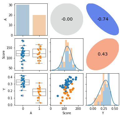
pairplot(attendance1, hue='A', corr_kws=dict(correlation='spearman'))
plt.show()
5.1.6 データのスケーリング
data = dict(
    N=attendance1.index.size,
    A=attendance1['A'],
    Score=attendance1['Score']/200,
    Y=attendance1['Y']
)
fit = pystan.stan('./stan/model5-3.stan', data=data, seed=1234)
5.1.7 推定結果の解釈
fit
出力は省略
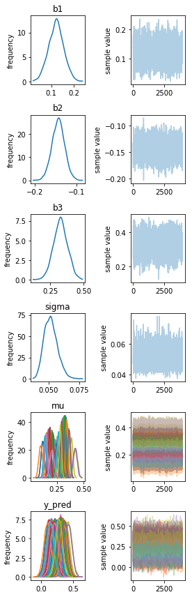
fit.traceplot()
fig = plt.gcf()
plt.setp(fig, size_inches=figaspect(len(fit.model_pars)/2))
plt.tight_layout()
plt.show()
5.1.8 図によるモデルのチェック
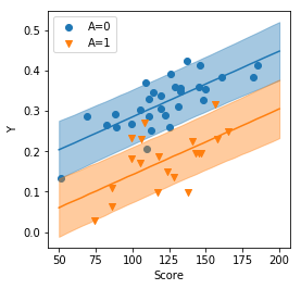
ms = fit.extract()

prob = [10, 50, 90]
np.random.seed(1234)

Score_new = np.linspace(50, 200, 30)
y_pred = ms['b1'].reshape((-1, 1, 1)) + ms['b2'].reshape((-1, 1, 1))*attendance1['A'].cat.codes.values.reshape((1, -1, 1)) + ms['b3'].reshape((-1, 1, 1))*Score_new.reshape((1, 1, -1))/200
y_pred += np.random.normal(scale=ms['sigma'].reshape((-1, 1, 1)), size=y_pred.shape)
y_pred0 = y_pred[:, attendance1['A']==0, :]
y_pred1 = y_pred[:, attendance1['A']==1, :]
columns = ['p{}'.format(p) for p in prob]
d_qua0 = pd.DataFrame(dict(A=0, Score=Score_new))
d_qua0 = pd.concat([d_qua0, pd.DataFrame(np.percentile(y_pred0, prob, axis=(0, 1)).T, columns=columns)], axis=1)
d_qua1 = pd.DataFrame(dict(A=1, Score=Score_new))
d_qua1 = pd.concat([d_qua1, pd.DataFrame(np.percentile(y_pred1, prob, axis=(0, 1)).T, columns=columns)], axis=1)
d_qua = pd.concat([d_qua0, d_qua1], ignore_index=True)

plt.figure(figsize=figaspect(1))
ax = plt.axes()
for i in range(2):
    d_part = d_qua.query('A==@i').sort_values('Score')
    color = sns.color_palette()[i]
    ax.scatter('Score', 'Y', data=attendance1.query('A==@i'), color=color, marker=MarkerStyle.filled_markers[i], label='A={}'.format(i))
    ax.plot('Score', 'p50', data=d_part, color=color, label='')
    ax.fill_between('Score', 'p10', 'p90', data=d_part, color=color, alpha=0.4)
ax.legend()
plt.setp(ax, xlabel='Score', ylabel='Y')
plt.show()
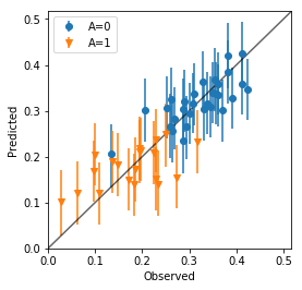
d_qua = np.percentile(ms['y_pred'], prob, axis=0).T
d_qua = pd.DataFrame(np.hstack((attendance1, d_qua)), columns=attendance1.columns.tolist()+['p{}'.format(p) for p in prob])

plt.figure(figsize=figaspect(1))
ax = plt.axes()
for v in d_qua['A'].unique():
    d_part = d_qua.query('A == {}'.format(v))
    err_lower = d_part['p50'] - d_part['p10']
    err_upper = d_part['p90'] - d_part['p50']
    ax.errorbar('Y', 'p50', data=d_part, yerr=[err_lower, err_upper], fmt='.', marker=MarkerStyle.filled_markers[int(v)], label='A={}'.format(v))
# ax.axline(1, 1)
_, xmax = ax.get_xlim()
_, ymax = ax.get_ylim()
lim = (0, max(xmax, ymax))
ax.plot(lim, lim, c='k', alpha=3/5)
ax.legend()
plt.setp(ax, xlim=lim, ylim=lim, xlabel='Observed', ylabel='Predicted')
plt.show()
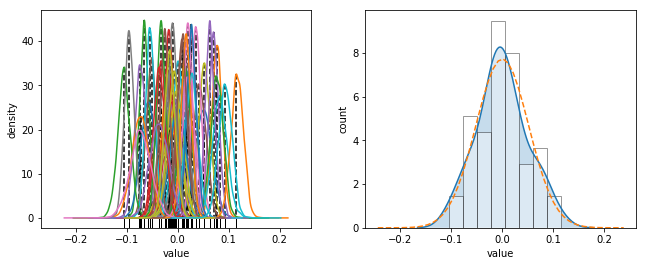
PythonにはRのdensity関数に相当するようなものはない(ですよね?)ので、MAP推定値を求めるのにカーネル密度推定してから、元のデータの区間をデータ数で分割した点における最大密度を使用しています。データ数が増えた場合には必要な精度に応じて調整してください。
ms = fit.extract()
N_mcmc = len(ms['lp__'])
d_noise = pd.DataFrame(attendance1['Y'].values - ms['mu'], columns=['noise{}'.format(i) for i in range(len(attendance1.index))])

def get_map(col):
    kernel = stats.gaussian_kde(col)
    dens_x = np.linspace(col.min(), col.max(), kernel.n)
    dens_y = kernel.pdf(dens_x)
    mode_i = np.argmax(dens_y)
    mode_x = dens_x[mode_i]
    mode_y = dens_y[mode_i]
    return pd.Series([mode_x, mode_y], index=['X', 'Y'])

d_mode = d_noise.apply(get_map).T

_, (ax1, ax2) = plt.subplots(1, 2, figsize=figaspect(3/8), sharex=True)
d_noise.plot.kde(ax=ax1, legend=False)
ax1.vlines(d_mode['X'], d_mode['Y'], 0, linestyles='dashed')
sns.rugplot(d_mode['X'], ax=ax1, color='k')
plt.setp(ax1, xlabel='value', ylabel='density')

s_MAP = get_map(ms['sigma'])

sns.distplot(d_mode['X'], hist_kws={'edgecolor':'k', 'facecolor':'w'}, kde_kws={'shade':True}, ax=ax2)
xmin, xmax = ax2.get_xlim()
dens_x = np.linspace(xmin, xmax, 50)
ax2.plot(dens_x, stats.norm.pdf(dens_x, scale=s_MAP['X']), linestyle='dashed')
plt.setp(ax2, xlabel='value', ylabel='count')

plt.show()
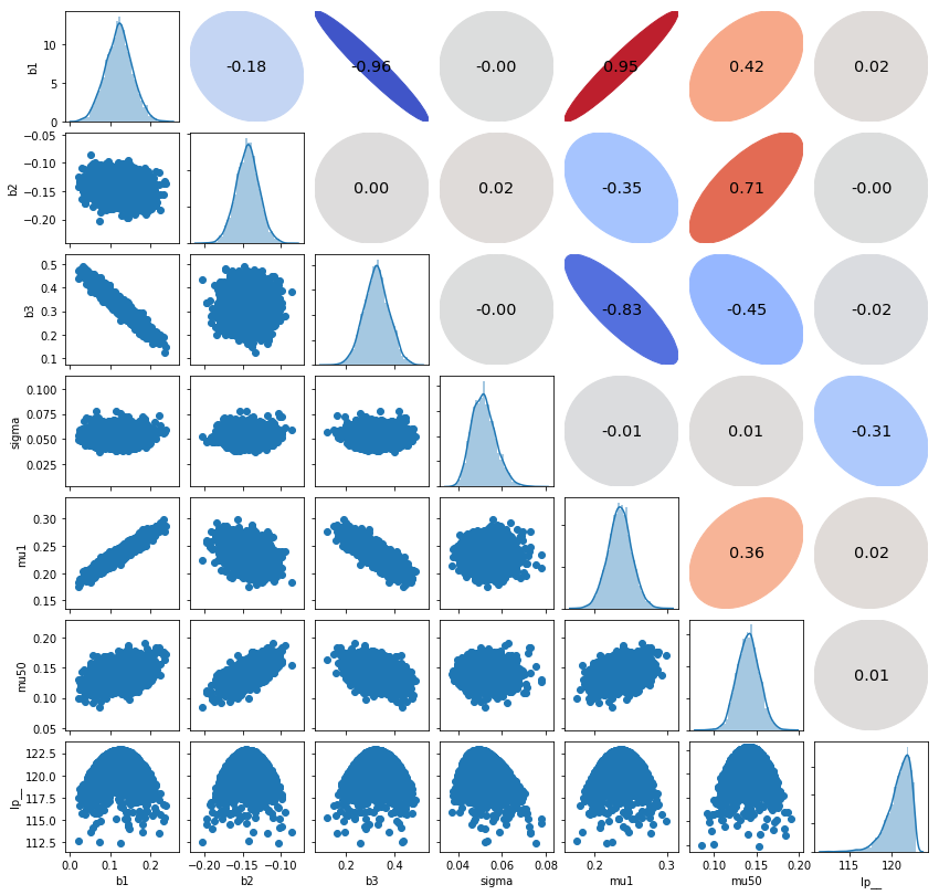
d = pd.DataFrame()
for name in ms.keys():
    if name == 'y_pred':
        continue
    elif name != 'mu':
        d[name] = ms[name]
    else:
        d['mu1'] = ms[name][:, 0]
        d['mu{}'.format(ms[name].shape[1])] = ms[name][:, -1]
pairplot(d)
plt.show()