インポート
import numpy as np
from scipy import stats
import pandas as pd
from japanmap import pref_names, picture
import japanmap
import pystan
import matplotlib as mpl
import matplotlib.pyplot as plt
from matplotlib import cm
from matplotlib.figure import figaspect
import seaborn as sns
%matplotlib inline
from bokeh.io import output_notebook
from bokeh.resources import INLINE
from bokeh.plotting import figure, show
from bokeh.models import ColumnDataSource, LabelSet
from bokeh.models.tickers import FixedTicker
output_notebook(resources=INLINE)
データ読み込み
map_temperature = pd.read_csv('./data/data-map-temperature.txt')
map_neighbor = pd.read_csv('./data/data-map-neighbor.txt')
map_JIS = pd.read_csv('./data/data-map-JIS.txt', header=None)
map_JIS.columns = ('prefID', 'name')
12.8 地図を使った空間構造
data = dict(
    N=map_temperature.index.size,
    Y=map_temperature['Y'],
    I=map_neighbor.index.size,
    From=map_neighbor['From'],
    To=map_neighbor['To']
)

stanmodel = pystan.StanModel('./stan/model12-14.stan')
fit = stanmodel.sampling(data=data, seed=1234, init=lambda: dict(r=map_temperature['Y'], s_r=1, s_Y=0.1))
def draw_map(ax, temperatures):
    norm = mpl.colors.Normalize(vmin=9, vmax=19)
    sm = cm.ScalarMappable(norm=norm, cmap='binary')
    colors = {}
    for prefID, temperature in zip(map_temperature['prefID'], temperatures):
        r, g, b, a = sm.to_rgba(temperature, bytes=True)
        colors[prefID] = (int(r),) * 3
    ax.imshow(picture(colors))

_, (ax1, ax2) = plt.subplots(1, 2, figsize=figaspect(3/8))

draw_map(ax1, map_temperature['Y'])

ms = fit.extract()
est = ms['r'].mean(axis=0)
draw_map(ax2, est)

plt.show()
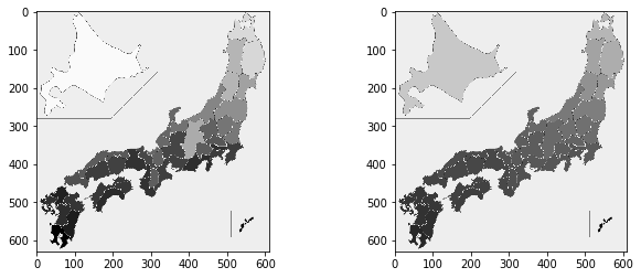
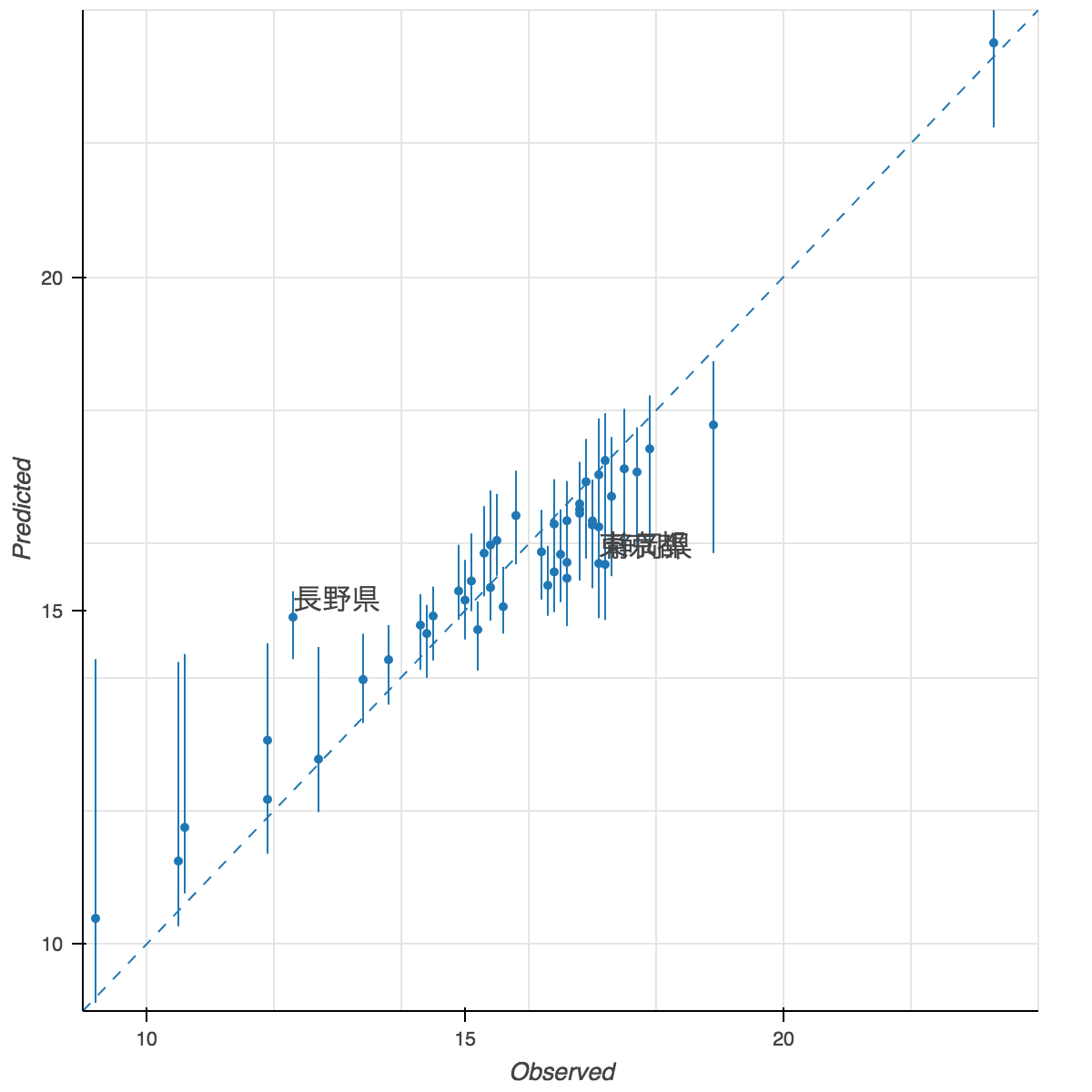
この終盤に来てのmatplotlib日本語化は心折れたので、bokehに逃げました。東京と静岡が重なっているのも見なかったことにしました。
probs = (2.5, 50, 97.5)
d_est = pd.DataFrame(np.percentile(ms['r'], probs, axis=0).T, columns=['p{}'.format(p) for p in probs])
d_est['x'] = map_temperature['Y']
d_all = pd.concat([map_JIS, d_est], axis=1)
d_all['diff'] = d_all['x'] - d_all['p50']
top3_diff = d_all.iloc[np.argsort(-np.abs(d_all['diff']))[:3]]

source = ColumnDataSource(d_all)
p = figure(x_range=(9, 24), y_range=(9, 24))
p.scatter(x='x', y='p50', source=source)
p.multi_line([(x, x) for x in d_all['x']], [(y1, y2) for y1, y2 in zip(d_all['p2.5'], d_all['p97.5'])])
p.line((9, 24), (9, 24), line_dash='dashed')
p.add_layout(LabelSet(x='x', y='p50', text='name', source=ColumnDataSource(top3_diff)))
p.xaxis.axis_label = 'Observed'
p.yaxis.axis_label = 'Predicted'
ticks = list(range(0, 26, 5))
p.xaxis.ticker = FixedTicker(ticks=ticks)
p.yaxis.ticker = FixedTicker(ticks=ticks)
show(p)
d_noise = map_temperature['Y'].values.reshape((1, -1)) - ms['r']

def get_map(col):
    kernel = stats.gaussian_kde(col)
    dens_x = np.linspace(col.min(), col.max(), kernel.n)
    dens_y = kernel.pdf(dens_x)
    mode_i = np.argmax(dens_y)
    mode_x = dens_x[mode_i]
    mode_y = dens_y[mode_i]
    return pd.Series([mode_x, mode_y], index=['X', 'Y'])

d_mode = pd.DataFrame(d_noise).apply(get_map).T
d_mode.columns = ('X', 'Y')
s_MAP = get_map(ms['s_Y'])['X']
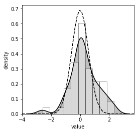
plt.figure(figsize=figaspect(1))
ax = plt.axes()
sns.distplot(d_mode['X'], color='k', hist_kws=dict(facecolor='w', edgecolor='k'), kde_kws=dict(shade=True), ax=ax)
xmin, xmax = ax.get_xlim()
xx = np.linspace(xmin, xmax, 50)
ax.plot(xx, stats.norm.pdf(xx, loc=0, scale=s_MAP), color='k', linestyle='dashed')
plt.setp(ax, xlabel='value', ylabel='density', xlim=(xmin, xmax))
plt.show()