インポート
import numpy as np
import pandas as pd
import pystan
import matplotlib.pyplot as plt
from matplotlib.figure import figaspect
%matplotlib inline
データ読み込み
ss1 = pd.read_csv('./data/data-ss1.txt')
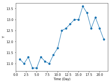
12.1 状態空間モデルことはじめ
plt.figure(figsize=figaspect(3/4))
ax = plt.axes()
ax.plot('X', 'Y', 'o-', data=ss1)
plt.setp(ax, xlabel='Time (Day)', ylabel='Y')
plt.show()
12.1.5 Stanで実装
T = ss1.index.size
data = dict(
    T=T,
    T_pred=3,
    Y=ss1['Y']
)
stanmodel = pystan.StanModel('./stan/model12-2.stan')
fit = stanmodel.sampling(data=data, pars=('mu_all', 's_mu', 's_Y'), iter=4000, thin=5, seed=1234)
12.1.6 推定結果の解釈
ms = fit.extract()

np.percentile(ms['s_mu'], (10, 50, 90))
array([0.29572894, 0.38844306, 0.50928656])
np.percentile(ms['s_Y'], (10, 50, 90))
array([0.03983209, 0.13265277, 0.26266297])
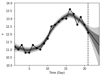
probs = (10, 25, 50, 75, 90)
d_est = pd.DataFrame(np.percentile(ms['mu_all'], (10, 25, 50, 75, 90), axis=0).T, columns=['p{}'.format(p) for p in probs])
d_est['x'] = d_est.index + 1

plt.figure(figsize=figaspect(3/4))
ax = plt.axes()

ax.plot('X', 'Y', 'o-', data=ss1, color='k')
ax.plot('x', 'p50', data=d_est, color='k')
ax.fill_between('x', 'p10', 'p90', data=d_est, color='k', alpha=0.2)
ax.fill_between('x', 'p25', 'p75', data=d_est, color='k', alpha=0.4)
ylim = (10, 14)
ax.vlines(T, ylim[0], ylim[1], linestyles='dashed')
plt.setp(ax, xlabel='Time (Day)', ylabel='Y', xlim=(1, 24), ylim=ylim)
plt.show()
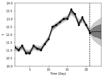
12.1.7 状態の変化をなめらかにする
stanmodel = pystan.StanModel('./stan/model12-4.stan')
fit = stanmodel.sampling(data=data, pars=('mu_all', 's_mu', 's_Y'), seed=1234)
ms = fit.extract()

probs = (10, 25, 50, 75, 90)
d_est = pd.DataFrame(np.percentile(ms['mu_all'], (10, 25, 50, 75, 90), axis=0).T, columns=['p{}'.format(p) for p in probs])
d_est['x'] = d_est.index + 1

plt.figure(figsize=figaspect(3/4))
ax = plt.axes()

ax.plot('X', 'Y', 'o-', data=ss1, color='k')
ax.plot('x', 'p50', data=d_est, color='k')
ax.fill_between('x', 'p10', 'p90', data=d_est, color='k', alpha=0.2)
ax.fill_between('x', 'p25', 'p75', data=d_est, color='k', alpha=0.4)
ylim = (10, 14)
ax.vlines(T, ylim[0], ylim[1], linestyles='dashed')
plt.setp(ax, xlabel='Time (Day)', ylabel='Y', xlim=(1, 24), ylim=ylim)
plt.show()