インポート
import numpy as np
from scipy import stats
import pandas as pd
import pystan
import matplotlib.pyplot as plt
from matplotlib.figure import figaspect
from matplotlib.ticker import ScalarFormatter
import seaborn as sns
%matplotlib inline
データ読み込み
rental = pd.read_csv('./data/data-rental.txt')
7.2 対数をとるか否か
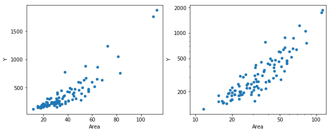
_, (ax1, ax2) = plt.subplots(1, 2, figsize=figaspect(3/8))
rental.plot.scatter('Area', 'Y', ax=ax1)
plt.setp(ax1, xticks=np.arange(20, 120, 20), yticks=np.arange(500, 2000, 500))
rental.plot.scatter('Area', 'Y', ax=ax2)
xticks = (1,2,5,10,20,50,100)
yticks = (200,500,1000,2000)
ax2.get_xaxis().set_major_formatter(ScalarFormatter())
plt.setp(ax2, xscale='log', yscale='log', yticks=(10,20,50,100,200,500,1000,2000))
plt.setp(ax2, xticks=xticks, xticklabels=xticks, yticks=yticks, yticklabels=yticks, xlim=(9, 120))
plt.show()
N_new = 50
Area_new = np.linspace(10, 120, N_new)
data = {col: rental[col] for col in rental.columns}
data['N'] = rental.index.size
data['N_new'] = N_new
data['Area_new'] = Area_new
fit1 = pystan.stan('./stan/model7-1.stan', data=data, seed=1234)
for key in ['Area', 'Y', 'Area_new']:
    data[key] = np.log10(data[key])
fit2 = pystan.stan('./stan/model7-2.stan', data=data, seed=1234)
ms1 = fit1.extract()
ms2 = fit2.extract()
for key in ['y_pred', 'y_new']:
ms2[key] = np.power(10, ms2[key])
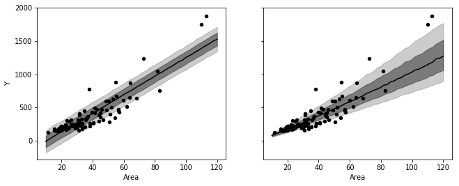
_, axes = plt.subplots(1, 2, figsize=figaspect(3/8), sharex=True, sharey=True)
for ms, ax in zip([ms1, ms2], axes):
d_est = np.percentile(ms['y_new'], (10, 25, 50, 75, 90), axis=0)
ax.fill_between(Area_new, d_est[0], d_est[-1], color='k', alpha=0.2)
ax.fill_between(Area_new, d_est[1], d_est[-2], color='k', alpha=0.4)
ax.plot(Area_new, d_est[2], color='k')
rental.plot.scatter('Area', 'Y', ax=ax, color='k')
plt.show()
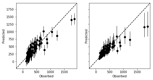
_, axes = plt.subplots(1, 2, figsize=figaspect(1/2), sharex=True, sharey=True)
for ms, ax in zip([ms1, ms2], axes):
    d_est = np.percentile(ms['y_pred'], (10, 50, 90), axis=0)
    ax.errorbar(rental['Y'], d_est[1], yerr=[d_est[1]-d_est[0], d_est[-1]-d_est[1]], fmt='o', color='k', elinewidth=1)
    xmin, xmax = ax.get_xlim()
    ymin, ymax = ax.get_ylim()
    lim = (min(xmin, ymin), max(xmax, ymax))
    ax.plot(lim, lim, c='k', linestyle='dashed')
    plt.setp(ax, xlim=lim, ylim=lim, xlabel='Obserbed', ylabel='Predicted')
plt.show()
N_mcmc1 = len(ms1['lp__'])
N_mcmc2 = len(ms2['lp__'])
d_noise1 = pd.DataFrame(rental['Y'].values - ms1['mu'], columns=['noise{}'.format(i) for i in range(rental.index.size)])
d_noise2 = pd.DataFrame(np.log10(rental['Y'].values) - ms2['mu'], columns=['noise{}'.format(i) for i in range(rental.index.size)])
d_est1 = d_noise1.join(pd.Series(np.arange(N_mcmc1), name='mcmc'))
d_est2 = d_noise2.join(pd.Series(np.arange(N_mcmc2), name='mcmc'))
def get_map(col):
kernel = stats.gaussian_kde(col)
dens_x = np.linspace(col.min(), col.max(), kernel.n)
dens_y = kernel.pdf(dens_x)
mode_i = np.argmax(dens_y)
mode_x = dens_x[mode_i]
mode_y = dens_y[mode_i]
return pd.Series([mode_x, mode_y], index=['X', 'Y'])
d_mode1 = d_noise1.apply(get_map).T
d_mode2 = d_noise2.apply(get_map).T
s_MAP1 = get_map(ms1['s_Y'])['X']
s_MAP2 = get_map(ms2['s_Y'])['X']
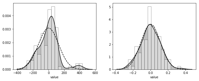
_, axes = plt.subplots(1, 2, figsize=figaspect(3/8))
for d_mode, s_MAP, ax in zip([d_mode1, d_mode2], [s_MAP1, s_MAP2], axes):
sns.distplot(d_mode['X'], bins=16, color='k', hist_kws={'facecolor': 'w', 'edgecolor': 'k'}, kde_kws={'shade': True}, ax=ax)
xdata = ax.lines[0].get_xdata()
ax.plot(xdata, stats.norm.pdf(xdata, scale=s_MAP), color='k', linestyle='dashed')
plt.setp(ax, xlabel='value')
plt.show()