はじめに
python及びnumpy, pandas, seaborn といったライブラリを使ってデータを扱う練習をします。
データはkaggleのデータを使います。
今回は2016 New Coder Surveyのデータを使います。
データの内容は以下のようなものです。簡単にいうと、どんな人がコーディングの学習しているかのデータです。
Free Code Camp is an open source community where you learn to code and build projects for nonprofits.
CodeNewbie.org is the most supportive community of people learning to code.
Together, we surveyed more than 15,000 people who are actively learning to code. We reached them through the twitter accounts and email lists of various organizations that help people learn to code.
Our goal was to understand these people's motivations in learning to code, how they're learning to code, their demographics, and their socioeconomic background.
また、前提としてipython notebook上で実行を行っています。
バージョンは
pyenv: anaconda3-2.4.0 (Python 3.5.2 :: Anaconda 2.4.0)
です。
この分野に精通している方は内容について温かい目で見て頂き何かお気づきの点がありましたらアドバイス頂けますと幸いです。
「このデータを使って自分だったらこんな分析をする」 といった内容をコメント頂いても嬉しいです!(コードベースで頂けますと参考になります!)
ライブラリのimport
使いそうなものは一旦読み込んでおきます。
import numpy as np
from numpy.random import randn
import pandas as pd
from pandas import Series, DataFrame
import matplotlib.pyplot as plt
import seaborn as sns
%matplotlib inline
データの読み込み
2016 New Coder Surveyからデータをダウンロードして「code_survey.csv」という名前で同じフォルダに入れました。
survey_df = pd.read_csv('corder_survey.csv')
データの概観
shape
survey_df.shape
(15620, 113)
なるほど。結構項目ありますね。行の数が15620(データの対象人数)、列の数(回答項目)が113。
info
infoも使うといいかもしれません。
survey_df.info()
<class 'pandas.core.frame.DataFrame'>
RangeIndex: 15620 entries, 0 to 15619
Columns: 113 entries, Age to StudentDebtOwe
dtypes: float64(85), object(28)
memory usage: 13.5+ MB
describe
survey_df.describe()
各列の'count', 'mean', 'std', 'min', '25%', '50%', '75%', 'max'といった情報が分かります。
データが多すぎるのでデータは省略。
カラムチェック
for col in survey_df.columns:
    print(col)
これで113項目を全て表示してみました。今回は練習なので使うカラムをはじめにピックアップしておこうと思います。
Gender: 性別
HasChildren: 子供の有無
EmploymentStatus: 現状の雇用形態
Age: 年齢
Income: 収入
HoursLearning: 学習時間
SchoolMajor: 専攻
各項目の概観
Gender
countplot
性別のデータから見てみます。ヒストグラムを作ってみます。
seabornのcountplotが便利です。
sns.countplot('Gender', data=survey_df)
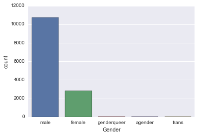
日本なら男女で分けてしまいそうですが、多様性があり海外っぽいですね。
ちなみに、単純なヒストグラムならmatplotlibでplt.histとかあります。
(棒グラフを作るplt.barもありますが、データの頻度分布からヒストグラムを作るときはplt.histが楽です。
dataset = randn(100)
plt.hist(dataset)
(randnは正規分布に従った乱数を生成してくれます)
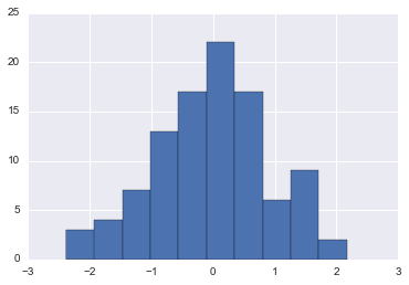
色々なオプションもあります。
# normed: 正規化, alpha: 透明度, color: 色, bins: ビン数
plt.hist(dataset, normed=True, alpha=0.8, color='indianred', bins=15)
HasChildren
同様に子供の有無もcountplotを使って描画してみます。
sns.countplot('HasChildren', data=survey_df)
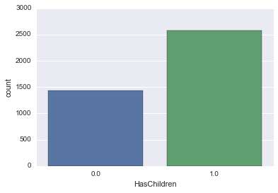
0か1だと分かりにくいので子供なしをNo、子供ありをYesとしてみます。
survey_df['HasChildren'].loc[survey_df['HasChildren'] == 0] = 'No'
survey_df['HasChildren'].loc[survey_df['HasChildren'] == 1] = 'Yes'
これで変換出来ました。
df.map
mapを使った変換でも良さそうです。
survey_df['HasChildren'] = survey_df['HasChildren'].map({0: 'No', 1: 'Yes'})
sns.countplot('HasChildren', data=survey_df)
sns.countplot('HasChildren', data=survey_df)

少し分かりやすいですね!
EmploymentStatus
現状の雇用形態もcountplotで表してみます。
sns.countplot('EmploymentStatus', data=survey_df)
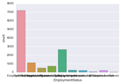
なんかごちゃっとして分かりにくい。。
というわけで軸を変えてみます。
countplot 軸の変更
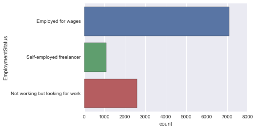
sns.countplot(y='EmploymentStatus', data=survey_df)
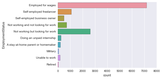
見やすい!
Age
これもcountplotを使ってみます。
sns.countplot('Age', data=survey_df)
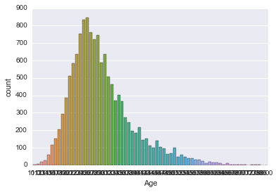
カラフルで綺麗ですけど、グラフとしては見にくいですね。
というわけでグラフを滑らかにしてみます。
kde plot
カーネル密度推定 ( kde: kernel density plot ) を使います。やり方自体は簡単です。
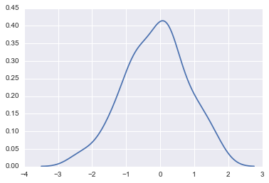
sns.kdeplot(survey_df['Age'])
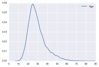
20代から30代の方が多いんですね。想像通りといったところでしょうか。
ただ、ある程度年齢が上がっても裾は広がっていますね。
カーネル密度推定
ここで、カーネル密度推定を少し考えてみます。(Wikipediaやその他サイトを見るとちゃんとした解説が見れるかと思います。)
カーネル密度推定
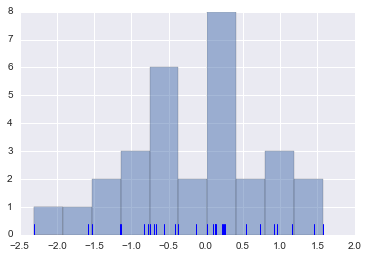
dataset = randn(30)
plt.hist(dataset, alpha=0.5)
sns.rugplot(dataset)
rugplotは各標本点を棒で示してくれます。
このグラフの各標本点それぞれに対して、カーネル関数(一例として正規分布を考えると分かりやすい)を作ってそれを足し合わせるイメージです。
sns.kdeplot(dataset)
カーネル密度推定をする上で
- カーネル関数: 各標本点の影響度の広がり方
- バンド幅: カーネル関数の広がりの幅
の2つを決定する必要があります。
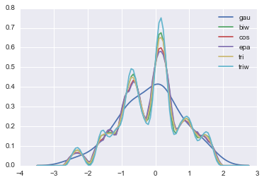
カーネル関数
色々なカーネル関数を用いることも出来ます。
デフォルトは gau (ガウス分布、正規分布)です。
kernel_options = ["gau", "biw", "cos", "epa", "tri", "triw"]
for kernel in kernel_options:
    sns.kdeplot(dataset, kernel=kernel, label=kernel)
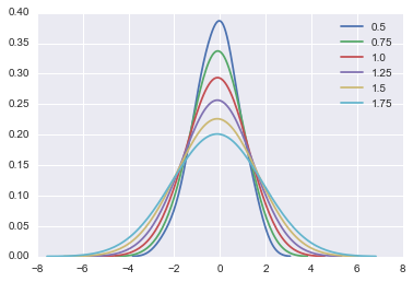
バンド幅
バンド幅も代えられます。
for bw in np.arange(0.5, 2, 0.25):
  sns.kdeplot(dataset, bw=bw, label=bw)
ここまででカーネル密度推定の説明は一旦区切り、次にいきます。
Income
ここでもkdeplotを使います。
sns.kdeplot(survey_df['Income'])
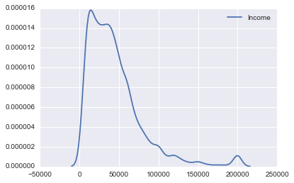
単位はドルでしょうから年収ですね。
データをもう少し見てみます。
describe
survey_df['Income'].describe()
RuntimeWarning: Invalid value encountered in median
count      7329.000000
mean      44930.010506
std       35582.783216
min        6000.000000
25%                NaN
50%                NaN
75%                NaN
max      200000.000000
Name: Income, dtype: float64
四分位点がNaNになる問題は記事作成時点で既に解決済みではあるようですが、merge待ちみたいです。
気にせずバージョンアップを待ちます。
describe() returns RuntimeWarning: Invalid value encountered in median RuntimeWarning #13146
boxplot
boxplot(boxplot)を作成したいと思います。
sns.boxplot(survey['Income'])
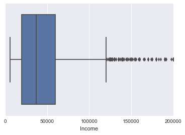
左の縦線から順に箱ひげの最小、第一四分位点(Q1)、中央値、第三四分位点(Q3)、箱ひげの最大を表します。IQR = Q3-Q1 として (最小値 - IQR1.5) ~ (最大値 + IQR1.5 ) から外れたものを箱ひげから外れた外れ値として黒の点で表されます。
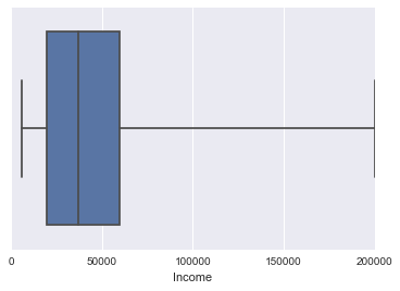
外れ値をなしで表現することも出来ます。
sns.boxplot(survey['Income'], whips=np.inf)
violinplot
boxplotにkdeの情報を持たせたヴァヴィオリンプロットというものもあります。
sns.violinplot(survey_df['Income'])
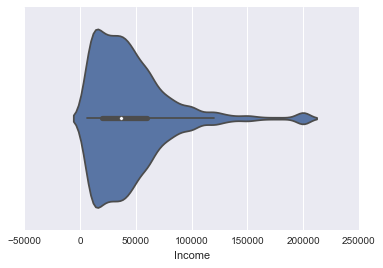
分布がより分かりやすいですね!
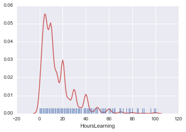
HoursLearning
学習時間を見てみます。
まずはkdeプロットをしてみます。
sns.kdeplot(survey_df['HoursLearning'])
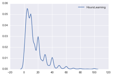
時間的に1週間の学習量ですね。
また極値が目立ちますが、これはきりのよい数字で起こっています。普通はきりの良い数字でアンケートに答えるのでこうなってしまいますね。
violinplotもしておきます。
sns.violinplot(survey_df['HoursLearning'])
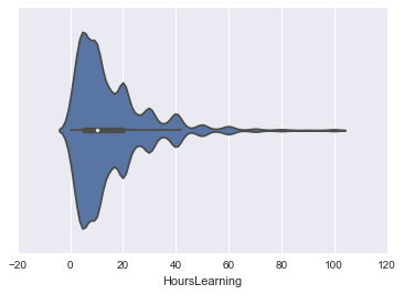
kdeプロットの特徴が反映されています。
また、countplotとkdeplotの両方を一緒に生成出来るdistplotというものもあります。
nanは削除して使っています。
hours_learning = survey_df['HoursLearning']
hours_learning = hours_learning.dropna()
sns.distplot(hours_learning)
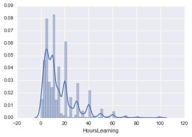
ヒストグラムをラグプロットに変えたり、オプションも付けることが出来ます。
便利です!
sns.distplot(hours_learning, rug=True, hist=False, kde_kws={'color':'indianred'})
SchoolMajor
連続値ですとkdeplotが活躍しますが、これはカテゴリ分けなのでcountplotを使います。
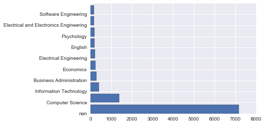
sns.countplot(y='SchoolMajor' , data=survey_df)
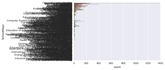
見にくいです。。カテゴリ数が多すぎるのですね。
上位10個くらいが見たいです。
collections.Counter
from collections import Counter
major_count = Counter(survey_df['SchoolMajor'])
major_count.most_common(10)
標準ライブラリのcollectionsを使うことでカウントします。
さらにmost_common(10)とすることでその中の上位10件を取得することが出来ます。
[(nan, 7170),
 ('Computer Science', 1387),
 ('Information Technology', 408),
 ('Business Administration', 284),
 ('Economics', 252),
 ('Electrical Engineering', 220),
 ('English', 204),
 ('Psychology', 187),
 ('Electrical and Electronics Engineering', 164),
 ('Software Engineering', 159)]
グラフに表示させましょう。
X = []
Y = []
major_count_top10 = major_count.most_common(10)
for record in major_count_top10:
    X.append(record[0])
    Y.append(record[1])

# [nan, 'Computer Science', 'Information Technology', 'Business Administration', 'Economics', 'Electrical Engineering', 'English', 'Psychology', 'Electrical and Electronics Engineering', 'Software Engineering']
# [7170, 1387, 408, 284, 252, 220, 204, 187, 164, 159]

plt.barh(np.arange(10), Y)
plt.yticks(np.arange(10), X)
こちらを参考にしました。
棒グラフ -matplotlib入門
plt.barhを使うとplt.barの軸を変えることが出来ます。yticksを使ってラベルもつけました。
さて、nanは表示させたくないですし、逆順に並び替えたいです。
X = []
Y = []
major_count_top10 = major_count.most_common(10)
major_count_top10.reverse()
for record in major_count_top10:
    # record[0] == record[0]に関しては下に補足あり
    if record[0] == record[0]:
        X.append(record[0])
        Y.append(record[1])

# ['Software Engineering', 'Electrical and Electronics Engineering', 'Psychology', 'English', 'Electrical Engineering', 'Economics', 'Business Administration', 'Information Technology', 'Computer Science']
# [159, 164, 187, 204, 220, 252, 284, 408, 1387]

plt.barh(np.arange(9), Y)
plt.yticks(np.arange(9), X)
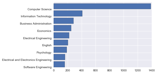
考えていたグラフが出来ました!
[追記] if record[0] == record[0]: について
ここは、NaN同士の比較のときだけFalseが返ってくるということでこういう実装をしました。(以下のURLも参照)
しかし、分かりにくさがあるので
@shiracamus さんに紹介頂きました実装方法のほうが分かりやすいです。私もこちらを今後使おうと思います。
if record[0] == record[0]:
の部分を以下のように変更。
if pd.notnull(record[0]):
データの関連
Gender と HasChildren
まず、Genderは簡単のために男女だけにします。
male_female_df = survey_df.where((survey_df['Gender'] == 'male') + (survey_df['Gender'] == 'female') )
countplotのhueを使うことで層別にカウントすることができます。
countplot(hue)
sns.countplot('Gender', data=male_female_df, hue='HasChildren')
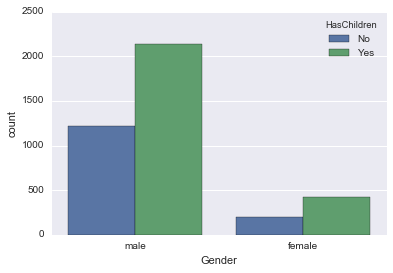
男女とも同じような子持ちの割合みたいですね。
Gender と Age
countplot以外のグラフでも層別に表すことが出来ます。FacetGridを使います。
sns.FacetGrid
fig = sns.FacetGrid(male_female_df, hue='Gender', aspect=4)
fig.map(sns.kdeplot, 'Age', shade=True)
oldest = male_female_df['Age'].max()
fig.set(xlim=(0, oldest))
fig.add_legend()
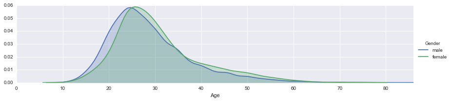
若干男性のほうが若い側にありますね。
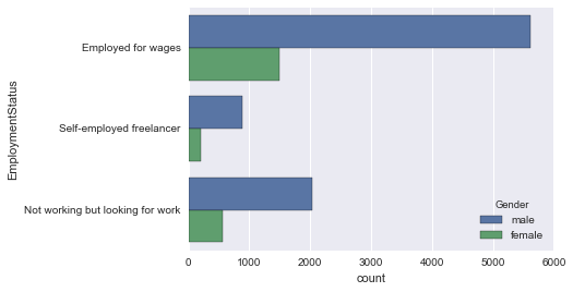
EmploymentStatus と Gender
EmploymentStatusは複数あるので上位の数件だけ使いたいと思います。
# male_female_dfは survey_dfのGenderを男女に絞ったもの
# EmploymentStatusの上位5件を取得
from collections import Counter
employ_count = Counter(male_female_df['EmploymentStatus'])
employ_count_top = employ_count.most_common(5)
print(employ_count_top)
employ_list =[]

for record in employ_count_top:
     if record[0] == record[0]:
        employ_list.append(record[0])

def top_employ(status):
    return status in employ_list

# applyを使ってemploy_listに入った項目の行だけを取得
new_survey_df = male_female_df.loc[male_female_df['EmploymentStatus'].apply(top_employ)]

sns.countplot(y='EmploymentStatus', data=new_survey_df)
これで上位3件の項目だけになりました。
countplotのhueを使って男女の層別に見てみます。
sns.countplot(y='EmploymentStatus', data=employ_df, hue='Gender')
EmploymentStatus と HasChildren
まず、HasChildrenをNo->0, Yes->1に変換しておきます。
new_survey_df['HasChildren'] = new_survey_df['HasChildren'].map({'No': 0, 'Yes': 1})
ここでfactorplotを使います。EmploymentStatusが子供の有無にどれくらい関わっているか見てみます。
factorplot
sns.factorplot('EmploymentStatus', 'HasChildren', data=new_survey_df, aspect=2)
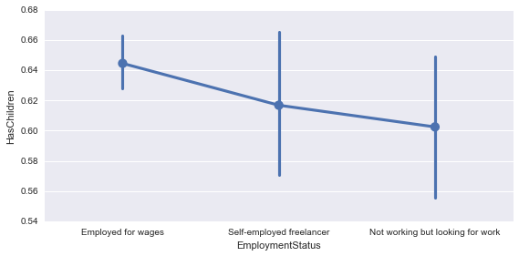
Emloyed for wagesが少し値が高いですね。これは納得感があります。
また、factorplotも層別に見ることが出来るので男女に違いがないか見てみます。
sns.factorplot('EmploymentStatus', 'HasChildren', data=new_survey_df, aspect=2, hue='Gender')
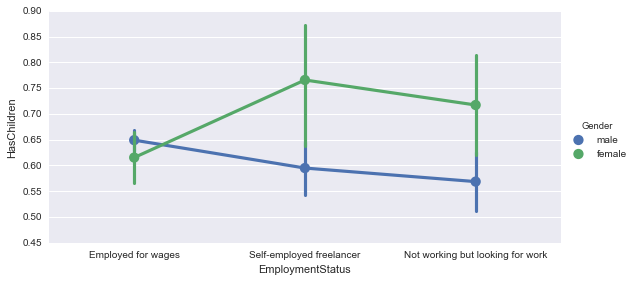
これはなかなか面白いですね。男女で見ると実は全然違いました。
雇用事情と照らし合わせると色々と考えられることがありそうです。
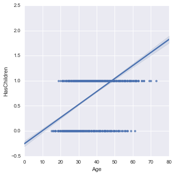
Age と HasChildren
lmplot
回帰直線で関係を見てみたいと思います。回帰直線には lmplotを使います。
sns.lmplot('Age', 'HasChildren', data=new_survey_df)
さて、lmplotも層別に見ることが出来るのでやってみたいと思います。
まずはEmploymentStatusで層別にします。
sns.lmplot('Age', 'HasChildren', data=new_survey_df, hue='EmploymentStatus')
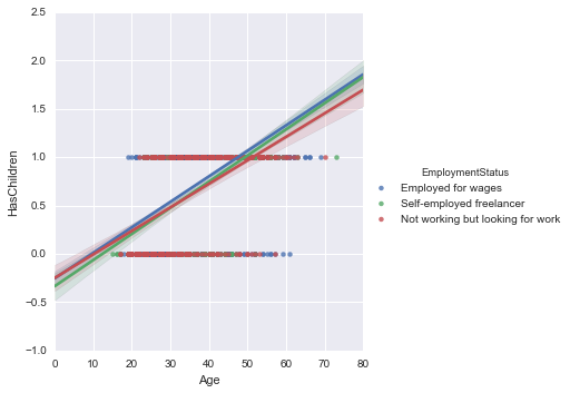
一般には Employed for wagesの値が少し高いですが、前項で見たように男女で分けるともう少しはっきり分かれそうですね。
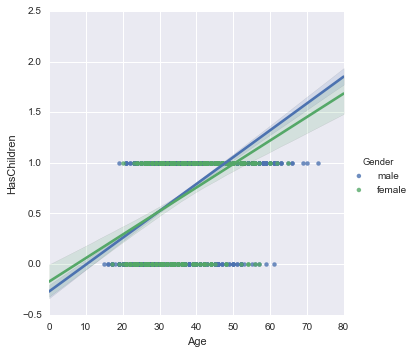
ついでに、Genderでも層別にしておきます。
sns.lmplot('Age', 'HasChildren', data=new_survey_df, hue='Gender')
複数のグラフを並べて表示する
複数のグラフを並べて表示させる方法もあります。subplotsを使って2つのグラフを描画しました。
fig, (axis1, axis2) = plt.subplots(1, 2, sharey=True)
sns.regplot('HasChildren', 'Age', data=new_survey_df, ax=axis1)
sns.violinplot(y='Age', x='HasChildren', data=new_survey_df, ax=axis2)
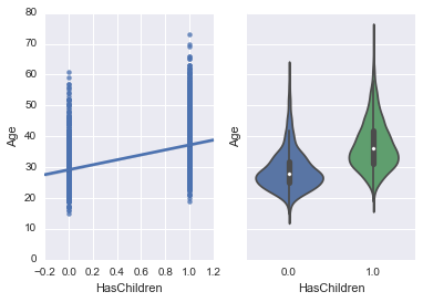
regplotというのはlmplotの低レベルバージョンで、単純な回帰を作る上では同じです。
regplotsを使ったのはsubplotsで使える関数はmatplotlib Axesオブジェクトを返すものに限られるようでlmplotが使えなかったからです。
詳しい説明は
Plotting with seaborn using the matplotlib object-oriented interface
が分かりやすかったです。
この記事でいう "Axis-level" functionは使えるようです。
(regplot, boxplot, kdeplot, and many others)
これに対して "Figure-level" functionも紹介されていてその中にlmplotもあります。
(lmplot, factorplot, jointplot and one or two others)
ほとんどAxisで一部Figureって感じですかね。
それでFigureに関してはFacetGridが良いみたいです。
Plotting on data-aware grids
FacetGridでも複数のグラフを並べられます。
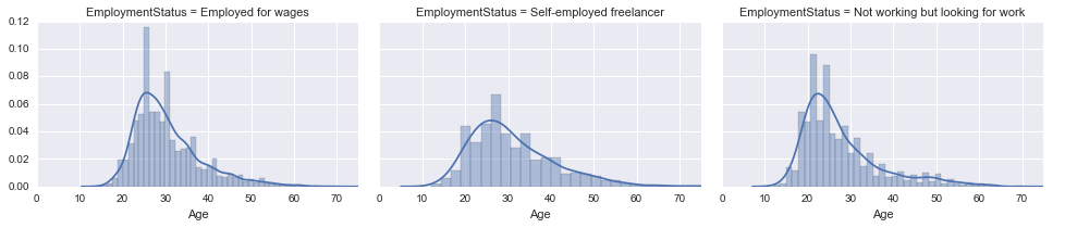
Age の分布を EmploymentStatusごとに並べて表示してみました。
fig = sns.FacetGrid(new_survey_df, col='EmploymentStatus', aspect=1.5)
fig.map(sns.distplot, 'Age')
oldest = new_survey_df['Age'].max()
fig.set(xlim=(0, oldest))
fig.add_legend()
おわりに
出てくるものの整理
- df.shape
- df.info()
- df.describe()
- df.read_csv
- sns.countplot
- plt.hist
- plt.bar
- sns.kdeplot
- df.loc
- df.map
- sns.rugplot
- sns.boxplot
- sns.violinplot
- sns.distplot
- collections.Counter
- collections.Counter.most_common
- plt.barh
- pd.where
- sns.countplot(hue)
- sns.FacetGrid
- df.apply
- sns.lmplot
- sns.lmplot(hue)
- plt.subplots
pythonの使い方で参考にしたもの
Pythonを始めた時から知っていたかったベターな書き方
Python pandas データ選択処理をちょっと詳しく <後編>
参考
【世界で2万人が受講】実践 Python データサイエンス
丁寧な解説でわかりやすくておすすめの動画講座です。
質問しても翌日には回答が返ってくるところもポイントです。
Pythonによるデータ分析入門 ―NumPy、pandasを使ったデータ処理
オライリーのデータ分析の書籍です。よくまとまっています。
Start Python Club
Pythonのコミュニティです。データ分析に特化しているわけではありませんが、Pythonについて幅広く活動されているのでPythonを使うのであれば行ってみると楽しいと思います。