1...displayプロパティー基礎
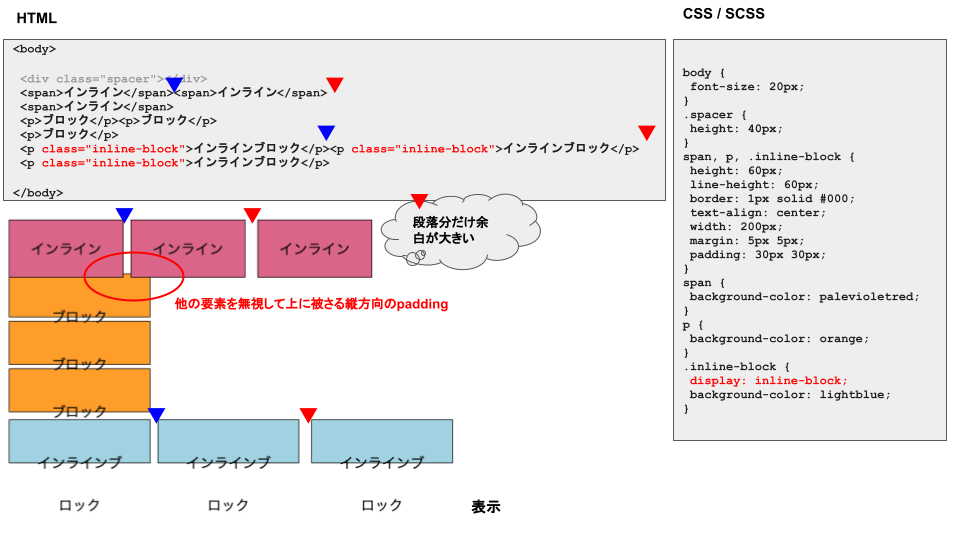
①インライン要素
- 幅と高さは中の要素分だけ。
-
marginは横にしか効かない。段落を変えるとmargin同志の間に少し余白ができる。 -
paddingは縦横に効く。縦方向は他の要素を無視して被さる。 - 段落の有無に無関係で横に並ぶ。
②ブロック要素
- 幅と高さは指定できて、要素は含まない。(要素の高さが50px、指定した高さが50pxの時高さは100pxでなく50pxになる。)
-
marginは縦横に効き、他の要素には干渉しない。 -
paddingは縦横に効くが中の要素は下方に押し出される。 - 段落の有無に無関係で段落ができる。(横に並ばない。)
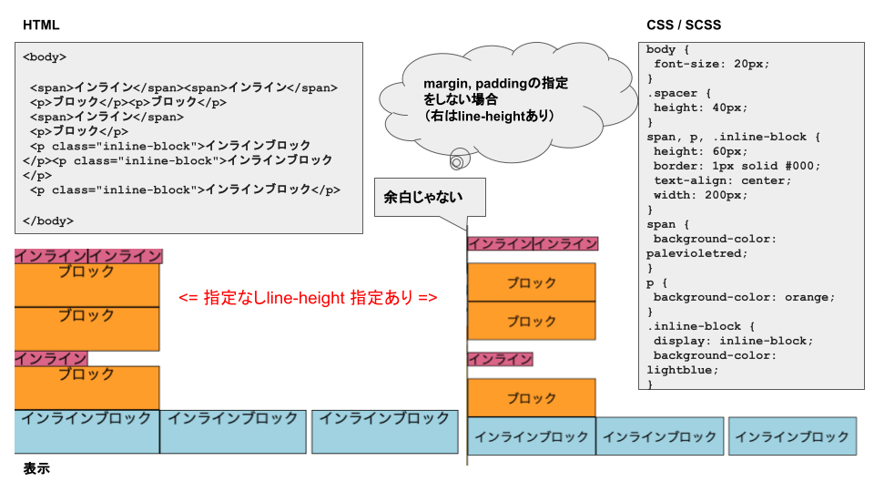
③インラインブロック要素
- CSSで指定する。
- 幅と高さはブロック要素と同じ。
-
marginはインライン要素と同じ。 -
paddingはブロック要素と同じ。 - 段落はインライン要素と同じ。
こんな感じ。
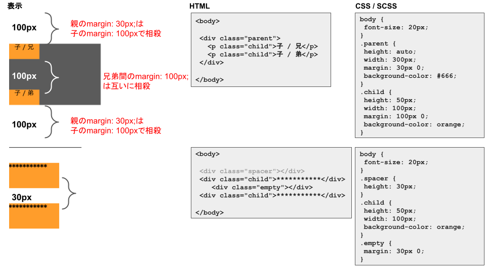
④ブロック要素のマージン相殺
ボーダーで囲まれていないブロック要素の上下のmarginは相殺される。
これはインライン要素、インラインブロック要素では起きない。
こんな感じ。
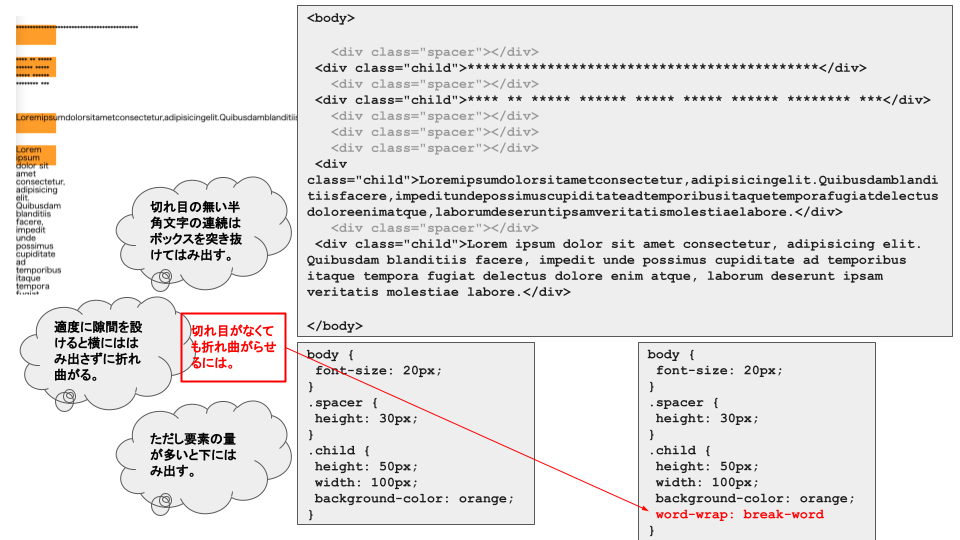
⑤おまけ・・・切れ目の無い半角文字の要素が中にある時
切れ目の無い半角文字の連続は右横からはみ出してしまう。
適度に切れ目を設けると折れ曲がるが、量が多いと下からはみ出す。
切れ目なく折れ曲がらせるには``word-wrap: break-word;`を指定する。
こんな感じ。
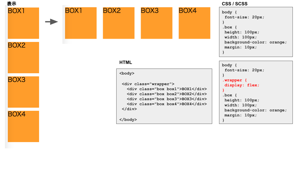
2...flexbox
①基本の横並べ
- 横並べにしたい要素の親要素に
display: flexを指定する。 - 初期値は左から右に横に並ぶ。(
flex-direction: row;の状態)
省略記法:df=>display: flex;
こんな感じ。
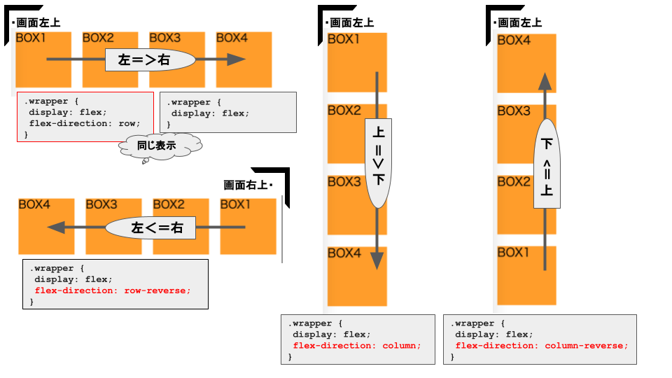
②flex-direction
- 基本の並べる向きと開始位置
省略記法:
fd=>flex-direction +
c=>column
cr=>column-reverse
r=>row
rr=>row-reverse
こんな感じ。
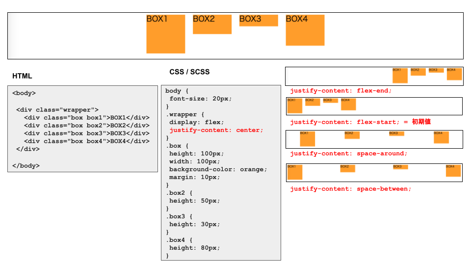
③横の位置決めjustify-content
省略記法:
jcc=>justify-content: center
jcfs=>justify-content: flex-start
jcfe=>justify-content: flex-end
jcsaro=>justify-content: space-around
jcsb=>justify-content: space-between
こんな感じ。
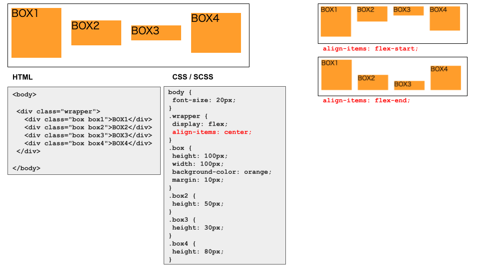
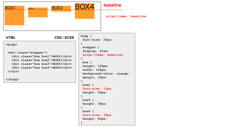
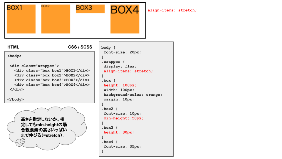
④縦の位置決めalign-items
省略記法:
aic=>align-items: center;
aifs=>align-items: flex-start;
aife=>align-items: flex-end;
aic=>align-items: center;
aic=>align-items: center;
こんな感じ。
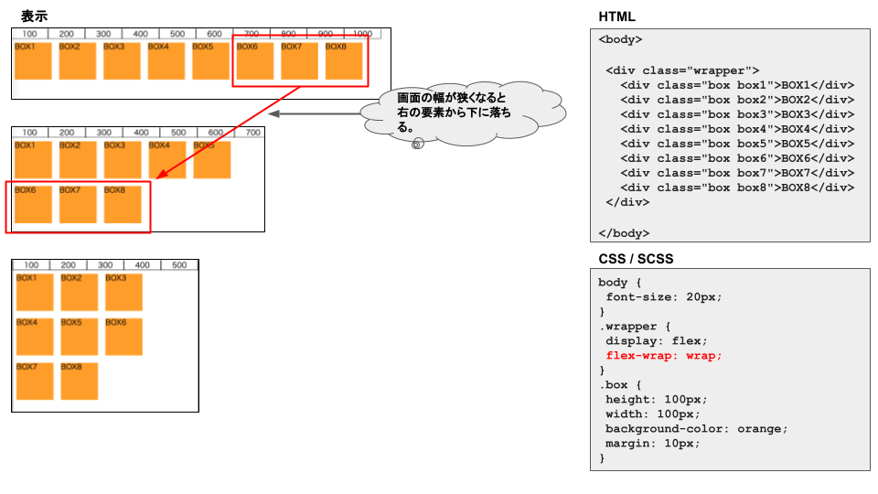
⑤カラム落ちさせるflex-wrap
省略記法:fwr=>flex-wrap + w=>wrap
こんな感じ。