1...ついつい忘れがちなインライン要素たち
特徴
-
width(横幅)とheight(高さ)の指定ができず、内包する要素次第。(margin: o auto;で中央寄せ不可) - 改行できない。(横に並ぶ。)
-
marginは、上下には効くが左右には効かない。 -
paddingは上下左右に効くが他の要素を無視して被さる。
メンバー
<a></a><br>-
<img>と<img/> -
<input>と<input/> <label></label><textarea></textarea><span></span><small></small><strong></strong>
付き合い方
-
displayでinline指定、又はinline-block指定する。 -
<img>はブロック要素の「背景画像」で指定する。
2...画像話あれやこれや
画像の形式と適正
- JPEG : 写真
- PNG : イラスト、ロゴ、画像文字。透明色の利用。
- GIF : 極めて短時間のアニメーションを作れるが、今はあまり使われない。
- SVG : 拡大しても劣化しないベクター形式。AdobeのIllustlatorがこの形式。(ちなみにPhotoshopはBMP:ビットマップ形式)
3... 横中央寄せ
①text-align: center;
.inline {
   text-align: center;
}
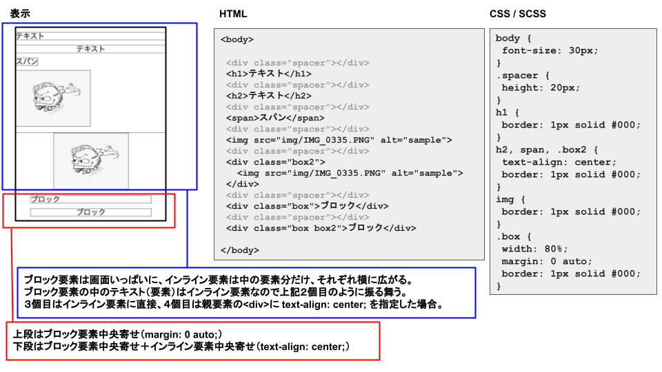
インライン要素の中の要素の横中央寄せ。
中央寄せにしたい要素そのものでなく親要素に指定する。
中の要素がテキストの場合も、あくまで中央にくるのは中のテキスト。(テキストはタグで囲まれていないけどインライン要素。)
省略記法:tac=>text-align: center;
②margin: 0 auto;
.block {
   width: 80%;
   max-width: 1000px;
   margin: 0 auto;
}
ブロック要素そのものの横中央寄せ。
widthの指定必須。(そうでないとブロック要素は横幅いっぱいに広がるので中央寄せに見えない。)
省略記法:m0-a=>margin: 0 auto;
①②をまとめるとこんな感じ。
③display: inline-block;
.inline-block {
  display: inline-block;
}
インライン要素の横幅を指定せず横中央寄せ。
省略記法:dib=>display: inline-block;
4...縦中央寄せ
①heightとline-heightを揃える
.sample {
   height: 60px;
   line-height: 60px
}
ボタンのデザインなどによく使われる。
テキストが複数行になると使えない。
省略記法:h60=>height: 60px; lh60=>line-height: 60px;
②上下のpaddingの数字を揃える
.sample2 {
   padding: 10px 0;
}
複数行のテキストでも対応可。
①②をまとめるとこんな感じ。
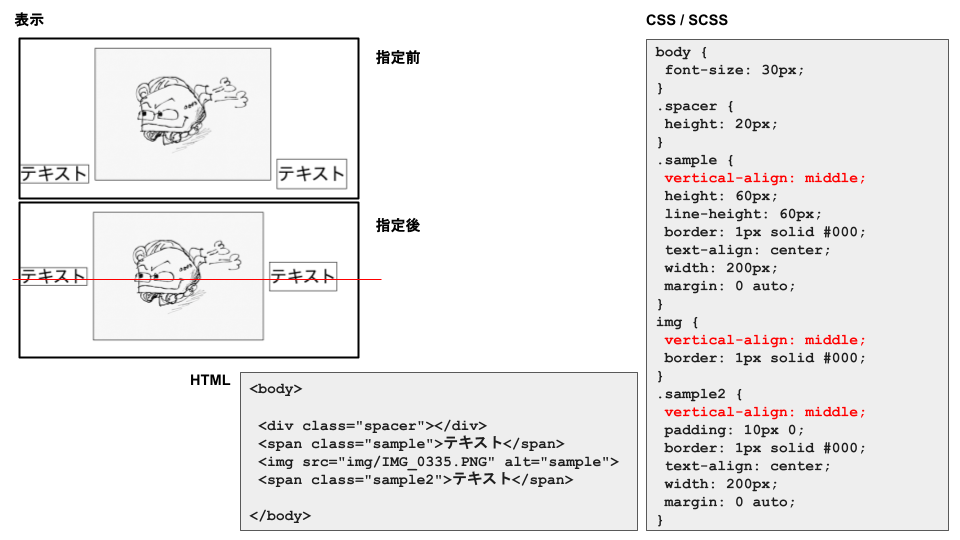
③複数のインライン要素の縦中央寄せ
.sample {
   vertical-align: center;
}
縦中央寄せにしたいインライン要素全てに指定する。
ブロック要素には効かない。
省略記法:vam=>vertical-align: middle;
こんな感じ。
5...ブロック要素の縦横中央寄せ
①position: absolute;+transform: translateXY
.sample {
   position: absolute;
   top: 50%;
   left: 50%;
   transform: translate -50% -50%;
}
省略記法:
poa=>position: absolute;
t50%=>top: 50%;
l50%=>left: 50%
trft=>transform: translate( x y )「x」「y」それぞれに「-50%」を入力
こんな感じ。
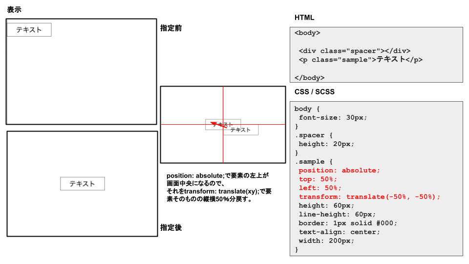
position: absolute;で要素の左上が画面中央になるので、それをtransform: translate(xy);で要素そのものの縦横50%分戻す。
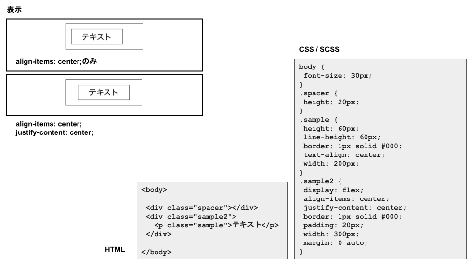
②display: flex;
.sample {
   display: flex;
   align-items: center;
   justify-content: center;
}
省略記法:
df=>display: flex;
aic=>align-items: center;
jcc=>`justify-content: center;
こんな感じ