これまでにRで作成したグラフを備忘録としてまとめる(随時更新予定; 2024/6/21更新)。
グラフの作成にはpalmerpenguinsのデータを基本的に使用した。
ggplot2で作る箱ヒゲ図
ggplot2を用いて,箱ヒゲ図の作成と有意差検定を表示する。以下のサイトを参考にした。
以下がスクリプト
#用いるライブラリ
library("palmerpenguins")
head(penguins)

library("ggsignif")
library("ggplot2")
library("ggbeeswarm")

library(multcomp)

#箱ヒゲ図の基本形を作成
colum <- c("species", "bill_length_mm")
data <- penguins[, colum]
head(data)

plot <- ggplot(data, aes(x=species, y=bill_length_mm))+
  geom_boxplot(fill="white")+
  geom_quasirandom(aes(color = species), size = 0.5, alpha =0.5)+
  theme_classic()
plot
ここまでで,箱ヒゲ図が完成。
次に有意差検定の表示をする。まずは多重比較。
#多重比較
#最初にTukey testで確認しておく
compr<-aov(bill_length_mm~species,data)
summary(compr)
TukeyHSD(compr)
#以下がtukey testの結果
> summary(compr)
             Df Sum Sq Mean Sq F value Pr(>F)
species       2   7194    3597   410.6 <2e-16 ***
Residuals   339   2970       9
---
Signif. codes:  0 ‘***’ 0.001 ‘**’ 0.01 ‘*’ 0.05 ‘.’ 0.1 ‘ ’ 1
2 observations deleted due to missingness
> TukeyHSD(compr)
  Tukey multiple comparisons of means
    95% family-wise confidence level

Fit: aov(formula = bill_length_mm ~ species, data = data)

$species
                      diff       lwr        upr     p adj
Chinstrap-Adelie 10.042433  9.024859 11.0600064 0.0000000
Gentoo-Adelie     8.713487  7.867194  9.5597807 0.0000000
Gentoo-Chinstrap -1.328945 -2.381868 -0.2760231 0.0088993
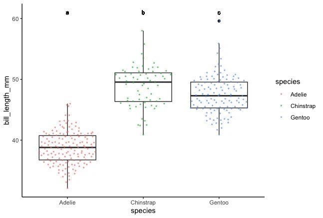
実際に図中に表示を入れる。
#multicomp packageを用いた検定
compr<-aov(bill_length_mm~species,data)
tukey<-glht(compr,linfct=mcp(species="Tukey"))
cld(tukey)

#手動で文字を入れる
plot2 <- ggplot(data, aes(x=species, y=bill_length_mm))+
  geom_boxplot(fill="white")+
  geom_quasirandom(aes(color = species), size = 0.5, alpha =0.5)+
  theme_classic() +
  geom_text(aes(x = 1, y = 61, label = "a"), size=3) +
  geom_text(aes(x = 2, y = 61, label = "b"), size=3) +
  geom_text(aes(x = 3, y = 61, label = "c"), size=3)
plot2
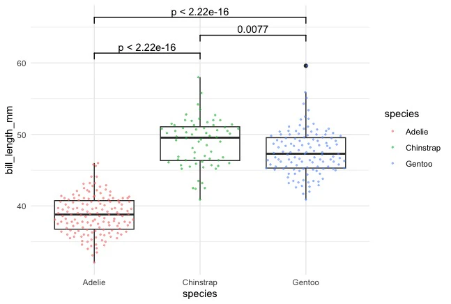
2群間比較の場合は以下の通り。
#2群間比較
plot3 <- plot +
  geom_signif(comparisons = list(c("Adelie", "Chinstrap")),
                          test = "t.test",
                          na.rm = TRUE,
                          map_signif_level = FALSE, y_position=60,
                          col = "black") + theme_minimal()+
  geom_signif(comparisons = list(c("Adelie", "Gentoo")),
              test = "t.test",
              na.rm = TRUE,
              map_signif_level = FALSE, y_position=65,
              col = "black") + theme_minimal()+
  geom_signif(comparisons = list(c("Chinstrap", "Gentoo")),
              test = "t.test",
              na.rm = TRUE,
              map_signif_level = FALSE, y_position=62.5,
              col = "black") + theme_minimal()
plot3
ggplot2で作るバイオリンプロット
箱ヒゲ図を作成したデータを用いて,バイオリンプロットも作成してみた(以下サイトを参照)。
以下がスクリプト。geom_boxplot()の代わりにgeom_violin()を用いる。
#用いるライブラリ
library("ggplot2")

library("palmerpenguins")
head(penguins)
colum <- c("species", "bill_length_mm")
data <- penguins[, colum]
head(data)

#violin plotの作成
plot <- ggplot(data, aes(x=species, y=bill_length_mm))+
  geom_violin(aes(fill = species),scale = "count")+
  geom_jitter(height = 0, width = 0.1)+
  theme_classic()
plot
以下のような図が作成できる。

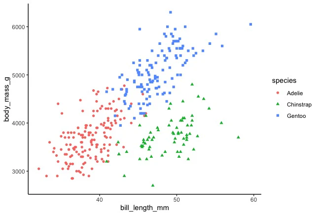
ggplot2で作る散布図
geom_point()で散布図を作成する(以下URL参照)。
以下がスクリプト。まずは基本形を作成する。
#用いるライブラリ
library("ggplot2")

library("palmerpenguins")
head(penguins)
colum <- c("species", "bill_length_mm", "body_mass_g")
data <- penguins[, colum]
head(data)

#散布図の作成
plot <- ggplot(data, aes(x=bill_length_mm, y=body_mass_g, colour = species, shape=species))+
  geom_point(aes(fill = species))+
  theme_classic()
plot
また,回帰直線を追加することもできる。
plot2 <- plot+
  geom_smooth(method = "lm", aes(colour=species), show.legend = FALSE)
plot2

ridgeline plot
以下のURL先を参考にした。
#用いるライブラリ
library(ggridges)
library(ggplot2)
library(hrbrthemes)
library("palmerpenguins")

#データの成型
head(penguins)
colum <- c("species", "bill_length_mm","sex")
data <- penguins[, colum]
data<-na.omit(data)
head(data)

#plotの作成
ggplot(data, aes(x = bill_length_mm, y = species, fill=as.factor(sex))) +
  geom_density_ridges(scale=1.2, rel_min_height=0.01,alpha = .2) +
  theme_ipsum() +
  labs(fill="sex")+
  scale_fill_cyclical(values = c("blue", "green"), guide = "legend")
