Rのパッケージであるggplot2で複数のグラフを描画し,並べて表示したいことがあるかもしれません。power point上などで図を貼り付けて並べる方法もありますが,ここではggplot2で描画したグラフをpatchworkパッケージを用いて並べる方法を備忘録としてまとめたいと思います。
用いるデータ,パッケージ
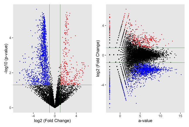
ここでは,RNA-seq解析で得られたデータを用いて,volcano plotとMA plotを並べて表示します。
RNA-seq dataはTCCパッケージを用いて作成したシミュレーションデータを使用します(以下を参照)。
グラフの描画にはシミュレーションデータ(TCC_simulation_data.csv)の内,m.value (log2 (Fold change)),a.value (平均発現量),p.value (p値)を使用します。
また,Rの以下のパッケージを使用します。
ggplot2 (ver. 3.4.4)
dplyr (ver. 1.1.3)
patchwork (ver. 1.1.3)
グラフの描画
まず,Volcano plotを以下のように描画します。
countdata <- read.csv("TCC_simulation_data.csv")
countdata <- mutate(countdata, thcolor = ifelse(p.value >= 0.05 , 0,
                                                ifelse(m.value >= 1, 1,
                                                       ifelse(m.value <= -1, 2,0))))

plot1 <- ggplot() +
  geom_point(aes(x = countdata$m.value, y = -log10(countdata$p.value), color = as.factor(countdata$thcolor)), size = 0.1) +
  labs(x = "log2 (Fold Change)", y = "-log10 (p-value)") +
  scale_color_manual(values = c("black", "red", "blue")) +
  geom_hline(yintercept = -log10(0.05), size = 0.2, color = "dark green") +
  geom_vline(xintercept = -1, size = 0.2, color = "dark green") +
  geom_vline(xintercept = 1, size = 0.2, color = "dark green") +
  theme(legend.position = "none", panel.grid = element_blank())
次に,MA plotを以下のように描画します。
plot2 <- ggplot() +
  geom_point(aes(x = countdata$a.value, y = countdata$m.value, color = as.factor(countdata$thcolor)), size = 0.1) +
  labs(x = "a-value", y = "log2 (Fold Change)") +
  scale_color_manual(values = c("black", "red", "blue")) +
  geom_hline(yintercept = 1, size = 0.2, color = "dark green") +
  geom_hline(yintercept = -1, size = 0.2, color = "dark green") +
  theme(legend.position = "none", panel.grid = element_blank())
最後に,二つのグラフを並べて表示します。
plot1 + plot2
以上のスクリプトを実行し,グラフを描画すると以下のようになります。
fold changeが1以上の遺伝子を赤、-1以下のものを青、それ以外を黒色でプロットしました。