挨拶と背景
こんにちは。Xamarin + Visual Studio + C# で賢いお絵描きアプリを作ろうとして苦戦している shiatsumat です。
アプリ開発は初めてなのですが、Xamarin.Android での開発は凄く楽しいなと感じています。C# 向けの薄いラッパーが掛かっているだけと言えばそうなのですが、Visual Studio + C# という開発環境がやはり充実しているように思います。
UI はなかなか奥が深くて、思わぬところで悪戦苦闘したのでまとめて報告します。開発中のソースコードはdevelopブランチから見られます。
長々書いていますが、色々使える知識を並べたつもりなので、適当に拾い読みしてください。が、ScrollView がバグる ・ 原因と巧妙な解決法 が本題です。Xamarin でなく Android Studio + Java で開発する人も使えるテクニックかと思います。
カスタムコントロールのデザインを AXML で作る
さて、ペンの色や太さなどを設定するためのダイアログを作りたかったのですが、Android には色を選択するための標準のコントロールが無いので自作することにしました。とりあえず RGBA を指定する NumberPicker を並べただけのものを作りました。
<?xml version="1.0" encoding="utf-8"?>
<LinearLayout xmlns:android="http://schemas.android.com/apk/res/android"
    android:orientation="vertical"
    android:layout_width="wrap_content"
    android:layout_height="wrap_content"
    android:layout_gravity="center"
    android:padding="20dp">
    <LinearLayout
        android:orientation="horizontal"
        android:layout_width="wrap_content"
        android:layout_height="wrap_content"
        android:layout_gravity="center">
        <RelativeLayout
            android:layout_width="wrap_content"
            android:layout_height="match_parent"
            android:minWidth="30dp">
            <TextView
                android:text="R"
                android:textSize="20dp"
                android:layout_width="wrap_content"
                android:layout_height="wrap_content"
                android:layout_centerInParent="true" />
        </RelativeLayout>
        <NumberPicker
            android:id="@+id/R"
            android:layout_width="wrap_content"
            android:layout_height="120dp" />
        <RelativeLayout
            android:layout_width="wrap_content"
            android:layout_height="match_parent"
            android:minWidth="30dp">
            <TextView
                android:text="G"
                android:textSize="20dp"
                android:layout_width="wrap_content"
                android:layout_height="wrap_content"
                android:layout_centerInParent="true" />
        </RelativeLayout>
        <NumberPicker
            android:id="@+id/G"
            android:layout_width="wrap_content"
            android:layout_height="120dp" />
    </LinearLayout>
    <LinearLayout
        android:orientation="horizontal"
        android:layout_width="wrap_content"
        android:layout_height="wrap_content"
        android:layout_gravity="center">
        <RelativeLayout
            android:layout_width="wrap_content"
            android:layout_height="match_parent"
            android:minWidth="30dp">
            <TextView
                android:text="B"
                android:textSize="20dp"
                android:layout_width="wrap_content"
                android:layout_height="wrap_content"
                android:layout_centerInParent="true" />
        </RelativeLayout>
        <NumberPicker
            android:id="@+id/B"
            android:layout_width="wrap_content"
            android:layout_height="120dp" />
        <RelativeLayout
            android:layout_width="wrap_content"
            android:layout_height="match_parent"
            android:minWidth="30dp">
            <TextView
                android:text="A"
                android:textSize="20dp"
                android:layout_width="wrap_content"
                android:layout_height="wrap_content"
                android:layout_centerInParent="true" />
        </RelativeLayout>
        <NumberPicker
            android:id="@+id/A"
            android:layout_width="wrap_content"
            android:layout_height="120dp" />
    </LinearLayout>
</LinearLayout>
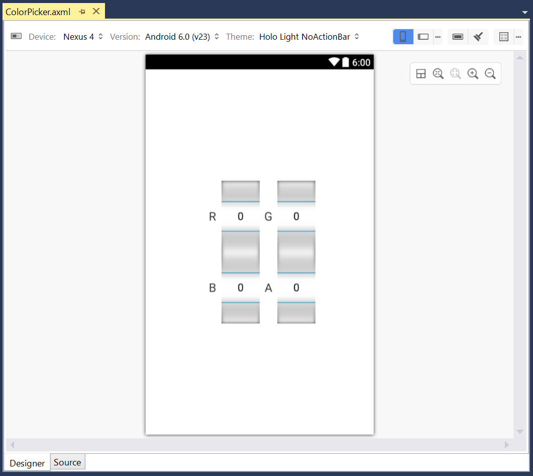
良い感じです。一見すると上下の NubmerPicker が重なっているように見えますが、グレーの部分は実際にはただの通り道なので気にする必要はありません。ちなみに UI Designer を起動するとよく固まります。Visual Studio の再起動を余儀なくされることもあります。これのせいでどれほどの時間が無駄になったことでしょうか。
AXML を Inflate してカスタムコントロールを作る
さて、この AXML を元にカスタムコントロールを作ります。(なお、ここでの Color は Android のものではなく自作の構造体です。)
using Android.Content;
using Android.Util;
using Android.Widget;

namespace tegaki_hack
{
    public class ColorPicker : LinearLayout
    {
        public NumberPicker r, g, b, a;
        public Color color
        {
            get { return new Color((byte)r.Value, (byte)g.Value, (byte)b.Value, (byte)a.Value); }
            set { r.Value = value.r; g.Value = value.g; b.Value = value.b; a.Value = value.a; }
        }

        public ColorPicker(Context context, IAttributeSet attrs) :
            base(context, attrs)
        { Initialize(); }

        public ColorPicker(Context context, IAttributeSet attrs, int defStyleAttr) :
                base(context, attrs, defStyleAttr)
        { Initialize(); }


        void Initialize()
        {
            Inflate(Context, Resource.Layout.ColorPicker, this);
            r = FindViewById<NumberPicker>(Resource.Id.R);
            b = FindViewById<NumberPicker>(Resource.Id.B);
            g = FindViewById<NumberPicker>(Resource.Id.G);
            a = FindViewById<NumberPicker>(Resource.Id.A);
            r.MinValue = b.MinValue = g.MinValue = a.MinValue = 0;
            r.MaxValue = b.MaxValue = g.MaxValue = a.MaxValue = 255;
        }
    }
}
Inflate で AXML からカスタムコントロールを錬成しています。なお、Inflate という英単語は馴染みが薄いかもしれませんが、ぺちゃんこの風船を膨らませて(inflate a baloon)何かしらの立体的なキャラクターか何かを作る、というのをイメージするとわかりやすいかと思います。
コンストラクタの引数にも注意が必要です。なお、コンテキストはコンストラクタの引数から取っても良いのですが、base のコンストラクタが呼ばれた時点で Context プロパティに入っているのでそれを使うのが楽です。継承元が元の AXML のルート要素に合わせて LinearLayout となっているのもポイントです。
カスタムコントロールの入った AXML を書く
さて、自作のクラスはそのまま AXML で使えます。名前空間の指定だけ注意してください。なお、ここでは C# の時点で名前空間が小文字ですが、C# の名前空間で大文字であっても AXML では小文字にする必要があります。
<?xml version="1.0" encoding="utf-8"?>
<ScrollView xmlns:android="http://schemas.android.com/apk/res/android"
    android:layout_width="wrap_content"
    android:layout_height="wrap_content"
    android:layout_gravity="center">
    <LinearLayout
        android:orientation="vertical"
        android:layout_width="wrap_content"
        android:layout_height="wrap_content"
        android:layout_gravity="center"
        android:padding="20dp">
        <TextView
            android:text="@string/StrokeColor"
            android:textSize="20dp"
            android:layout_width="wrap_content"
            android:layout_height="wrap_content"
            android:layout_gravity="center" />
        <tegaki_hack.ColorPicker
            android:id="@+id/StrokeColor"
            android:layout_width="wrap_content"
            android:layout_height="wrap_content"
            android:layout_gravity="center" />
        <TextView
            android:text="@string/StrokeWidth"
            android:textSize="20dp"
            android:layout_width="wrap_content"
            android:layout_height="wrap_content"
            android:layout_gravity="center" />
        <LinearLayout
            android:orientation="horizontal"
            android:layout_width="wrap_content"
            android:layout_height="wrap_content"
            android:layout_gravity="center">
            <NumberPicker
                android:id="@+id/StrokeWidthCent"
                android:layout_width="wrap_content"
                android:layout_height="120dp" />
            <RelativeLayout
                android:layout_width="wrap_content"
                android:layout_height="match_parent">
                <TextView
                    android:text="x 0.01"
                    android:textSize="20dp"
                    android:layout_width="wrap_content"
                    android:layout_height="wrap_content"
                    android:padding="10dp"
                    android:layout_centerInParent="true" />
            </RelativeLayout>
            <RelativeLayout
                android:layout_width="wrap_content"
                android:layout_height="match_parent">
                <Spinner
                    android:id="@+id/StrokeWidthPers"
                    android:layout_width="wrap_content"
                    android:layout_height="wrap_content"
                    android:entries="@array/Perses"
                    android:layout_centerInParent="true" />
            </RelativeLayout>
        </LinearLayout>
        <TextView
            android:text="@string/FillColor"
            android:textSize="20dp"
            android:layout_width="wrap_content"
            android:layout_height="wrap_content"
            android:layout_gravity="center" />
        <tegaki_hack.ColorPicker
            android:id="@+id/FillColor"
            android:layout_width="wrap_content"
            android:layout_height="wrap_content"
            android:layout_gravity="center" />
        <TextView
            android:text="@string/Linecap"
            android:textSize="20dp"
            android:layout_width="wrap_content"
            android:layout_height="wrap_content"
            android:layout_gravity="center" />
        <Spinner
            android:id="@+id/Linecap"
            android:layout_width="wrap_content"
            android:layout_height="wrap_content"
            android:layout_gravity="center"
            android:layout_marginTop="5dp"
            android:entries="@array/Linecaps" />
        <TextView
            android:text="@string/Linejoin"
            android:textSize="20dp"
            android:layout_width="wrap_content"
            android:layout_height="wrap_content"
            android:layout_gravity="center" />
        <Spinner
            android:id="@+id/Linejoin"
            android:layout_width="wrap_content"
            android:layout_height="wrap_content"
            android:layout_gravity="center"
            android:layout_marginTop="5dp"
            android:entries="@array/Linejoins" />
    </LinearLayout>
</ScrollView>
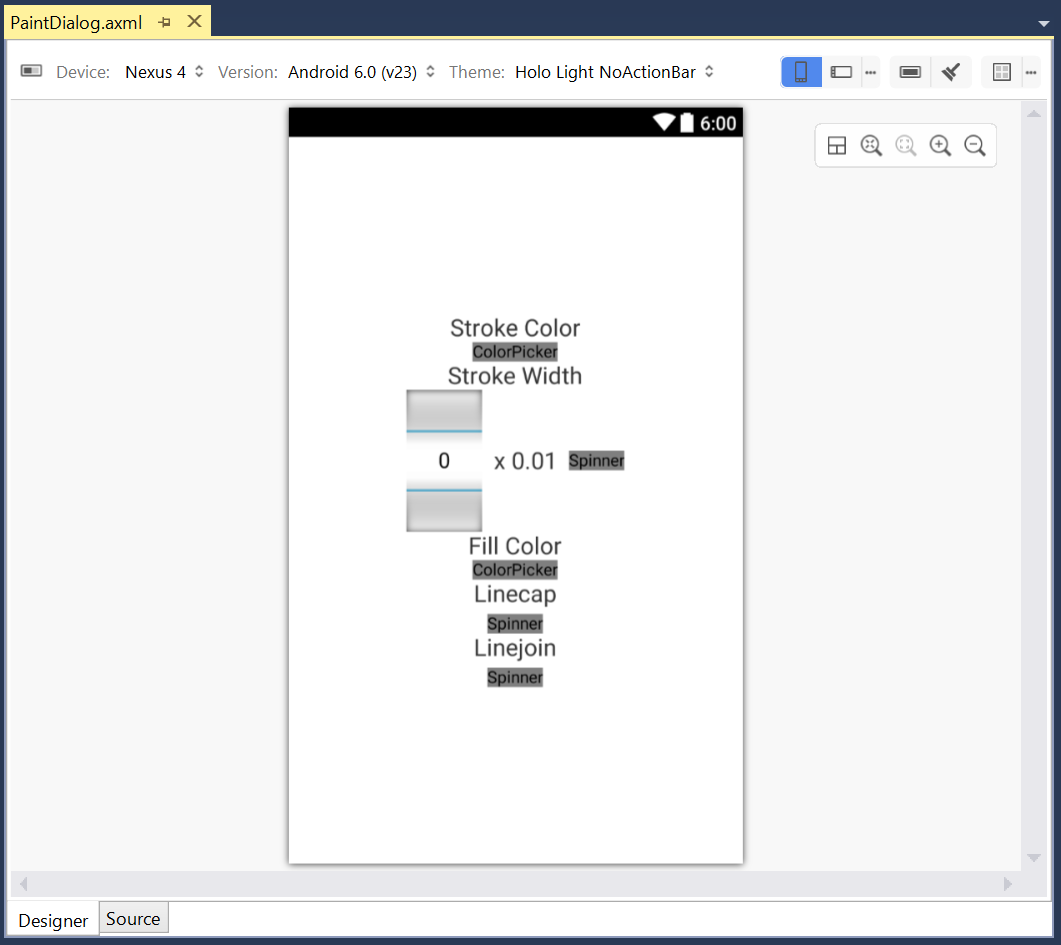
良い感じですね。実際に動かしてみないと分かりませんが(というのは伏線でここのせいでバグが起こるのですがとりあえず先に進みましょう)。
UI Designer ではカスタムコントロールの表示はサボった形になるのですが、なぜか Spinner の表示もサボられています。気になります。
XML による文字・文字配列の指定と多言語対応
ここで、TextView の文字や Spinner の文字配列を XML で指定できるというのもポイントです。特に文字配列の方はきちんと書かれている文献があまり無いので、少し苦労しました。
<?xml version="1.0" encoding="utf-8"?>
<resources>
  <string name="PaintOptions">Paint Options</string>
  <string name="StrokeColor">Stroke Color</string>
  <string name="StrokeWidth">Stroke Width</string>
  <string-array name="Perses">
    <item>Grids</item>
    <item>Pixels</item>
  </string-array>
  <string name="FillColor">Fill Color</string>
  <string name="Linecap">Linecap</string>
  <string name="Linejoin">Linejoin</string>
  <string-array name="Linecaps">
    <item>Butt</item>
    <item>Round</item>
    <item>Square</item>
  </string-array>
  <string-array name="Linejoins">
    <item>Miter</item>
    <item>Round</item>
    <item>Bevel</item>
  </string-array>
</resources>
XML にする利点としては多言語対応が出来るということが挙げられます。例えば、values フォルダではなく values-ja フォルダに入れたファイルは日本語環境で参照されます。
<?xml version="1.0" encoding="utf-8"?>
<resources>

  <string name="PaintOptions">塗り オプション</string>
  <string name="StrokeColor">ストローク色</string>
  <string name="StrokeWidth">ストローク幅</string>
  <string-array name="Perses">
    <item>グリッド</item>
    <item>ピクセル</item>
  </string-array>
  <string name="FillColor">フィル色</string>
  <string name="Linecap">端点のスタイル</string>
  <string name="Linejoin">頂点のスタイル</string>
  <string-array name="Linecaps">
    <item>無し</item>
    <item>丸</item>
    <item>四角</item>
  </string-array>
  <string-array name="Linejoins">
    <item>鋭角</item>
    <item>丸</item>
    <item>面取り</item>
  </string-array>

</resources>
AXML を Inflate してダイアログを作成する
さて、いよいよダイアログを作ります。カスタム可能なダイアログが AlertDialog という名前で用意されています(特に注意喚起をするわけではありませんが)。まずビルダーを作るという点に注意してください。また、Inflate の方法が先ほどとは異なるので注意してください。
var view = LayoutInflater.Inflate(Resource.Layout.PaintDialog, null);
var dialogBuilder = new AlertDialog.Builder(this);
dialogBuilder.SetTitle(Resource.String.PaintOptions);
dialogBuilder.SetView(view);
UI の細かい部分も設定します。view を経由して FindViewById するという点だけ注意してください。
var strokeColor = view.FindViewById<ColorPicker>(Resource.Id.StrokeColor);
var strokeWidthPers = view.FindViewById<Spinner>(Resource.Id.StrokeWidthPers);
var strokeWidthCent = view.FindViewById<NumberPicker>(Resource.Id.StrokeWidthCent);
var fillColor = view.FindViewById<ColorPicker>(Resource.Id.FillColor);
var linecap = view.FindViewById<Spinner>(Resource.Id.Linecap);
var linejoin = view.FindViewById<Spinner>(Resource.Id.Linejoin);
strokeWidthCent.MinValue = 1;
strokeWidthCent.MaxValue = 10000;
strokeWidthCent.WrapSelectorWheel = false;
ダイアログからの脱出のために OK ボタンも作ります。値を設定して戻ります。細かい部分は無視して良いです。
dialogBuilder.SetPositiveButton("OK", (s, a) =>
{
    editor.settings.paint.strokeColor = strokeColor.color;
    editor.settings.paint.strokeWidth = new SizeEither(strokeWidthCent.Value / 100.0f, strokeWidthPers.SelectedItemPosition == 0);
    editor.settings.paint.fillColor = fillColor.color;
    editor.settings.paint.linecap = (Linecap)linecap.SelectedItemPosition;
    editor.settings.paint.linejoin = (Linejoin)linejoin.SelectedItemPosition;
});
最終的にビルダーからダイアログを作ります。
var dialog = dialogBuilder.Create();
この時点ではまだダイアログは表示されなくて、ダイアログを表示するには Show メソッドを呼び出します。例えば、ボタンからダイアログを呼び出せるようにするにはこうすれば良いです。
paintButton.Click += (o, e) =>
{
    editor.ResetShapeCreator();
    strokeColor.color = editor.settings.paint.strokeColor;
    strokeWidthPers.SetSelection(editor.settings.paint.strokeWidth.isInternal ? 0 : 1);
    strokeWidthCent.Value = (int)Round(editor.settings.paint.strokeWidth.value * 100.0f);
    fillColor.color = editor.settings.paint.fillColor;
    linecap.SetSelection((int)editor.settings.paint.linecap);
    linejoin.SetSelection((int)editor.settings.paint.linejoin);
    dialog.Show();
};
が、ScrollView がバグる
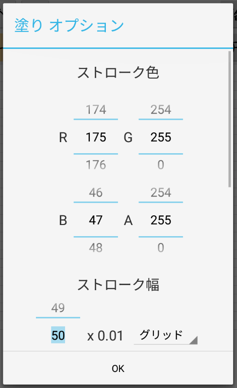
さて、満を持してデバッグしましょう(エミュレータは日本語環境に設定しました)。ボタンを押すとダイアログが出ました。
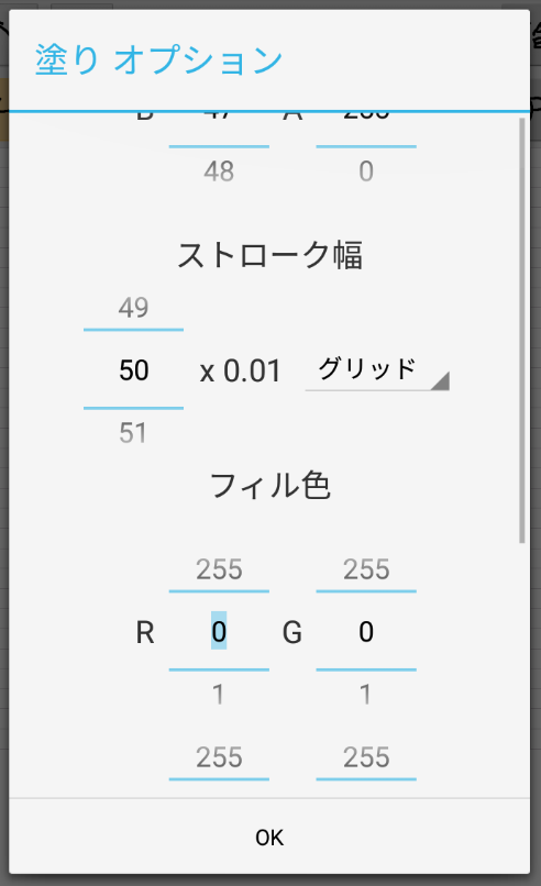
ん?なぜか一番上まで表示されません。(実際のデバッグ時には、ストローク色の設定の部分だけちょうど表示されない状態になっていて、Inflate のバグだと考え、色々と調べていたのですが、見当違いでした。)
原因と巧妙な解決法
これは、ScrollView がカスタムコントロールの大きさを上手く把握できていないことにおそらく起因します(あっさり書くことにしましたがこのことに気付くのに実際にはかなりの時間を費やしました)。
ScrollView がいきなりあると危なそうですし、FrameLayout を挟んでみれば良いような気がします(というのをいきなり思いつくはずもなく、色々調べていくうちにわかりました)。やってみましょう。
<?xml version="1.0" encoding="utf-8"?>
<ScrollView xmlns:android="http://schemas.android.com/apk/res/android"
    android:layout_width="wrap_content"
    android:layout_height="wrap_content"
    android:layout_gravity="center">
    <FrameLayout
        android:layout_width="wrap_content"
        android:layout_height="wrap_content"
        android:layout_gravity="center">
        <LinearLayout
            android:orientation="vertical"
            android:layout_width="wrap_content"
            android:layout_height="wrap_content"
            android:layout_gravity="center"
            android:padding="20dp">
        (中略)
        </LinearLayout>
    </FrameLayout>
</ScrollView>
残念ながらこれでもまだバグは取れません。FrameLayout に android:layout_gravity="center" とあるのがサイズの把握に不確定要素を加えているような気がします。このように書き換えるとどうでしょうか?
<?xml version="1.0" encoding="utf-8"?>
<ScrollView xmlns:android="http://schemas.android.com/apk/res/android"
    android:layout_width="match_parent"
    android:layout_height="match_parent">
    <FrameLayout
        android:layout_width="match_parent"
        android:layout_height="match_parent">
        <LinearLayout
            android:orientation="vertical"
            android:layout_width="wrap_content"
            android:layout_height="wrap_content"
            android:layout_gravity="center"
            android:padding="20dp">
        (中略)
        </LinearLayout>
    </FrameLayout>
</ScrollView>
見事一番上まで表示されました。お疲れさまです!
このあたりは若干バッドノウハウ感もありますが、お役に立てれば幸いです。
あとがき
UI 作りは面白いですが、これだけ複雑なライブラリとなると結構良くわからない挙動も多いなと思いました。Xamarin による開発のテクニックについてはまだまだ文献が少ないので、お絵描きアプリの開発を通じて得られた知見を少しずつ共有していきたいと思います。よろしくお願いします。