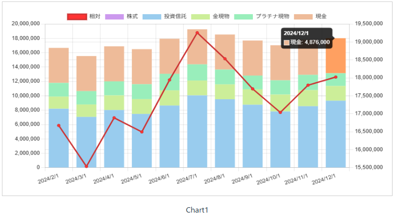
Vue-chartjsで折れ線と積み上げ棒グラフを重ねて表示する
Vue3 + TypeScript + Vue-chartjs5 + ChartJS4 という組み合わせで折れ線と積み上げ棒グラフの組み合わせチャートをどのように設定するか紹介します。
背景
Vue-chartjsを使ってチャートを描画する場合、ChartJSのバージョンに合わせて設定方法を変更する必要があります。
個人的に作ったツールで設定方法を調べるのに手間取ったので、実装例を共有してみます。
設定のポイント
1. 折れ線と棒グラフを組み合わせる
折れ線と棒グラフを組み合わせる場合、チャートのコンポーネントはBarを使います。
そこに折れ線用のデータセットを追加します。
折れ線のデータセットはChartDataset.type属性に 'line' を指定します。
2. 複数のY軸を設定する
ChartOptions.scalesにY軸用のScaleOptionを2つ書きます。
ChartDatasetの中のyAxisID属性に対応する軸を指定します。
ScaleOption.position属性に 'right' の値を指定すると右に軸が表示されます。
3. 積み上げ棒グラフを設定する
棒グラフに使用するX軸用のScaleOptionとY軸用のScaleOptionの両方で、stacked属性に true を指定します。どちらか片方だけだと表示が崩れます。
4. 値を更新する場合はChartDataオブジェクトを置き換える
chart1DataのChartDataset内のdata配列だけを更新してもチャートは再描画されません。
ChartDataset自体を置き換えると自動的に再描画してくれます。
Vueコンポーネントの全コード
前掲のチャートを描画するコンポーネントのVueファイルです。
<template>
    <div class="chartContainer">
        <Bar :data="chart1Data" :options="char1tOptions" class="chart1"/>
        {{ title }}
    </div>
</template>

<script setup lang="ts">
import { ref, onMounted, Ref } from "vue";
import * as ChartJS from 'chart.js';
import { Bar } from 'vue-chartjs';

const title = ref('Chart1');

// TSV形式のデータ
const tsvValue = `
2024/1/1	15907760	0	7448000	1663360	1920400	4876000
2024/2/1	16674640	0	8200000	1688640	1910000	4876000
2024/3/1	15534240	0	7068000	1727040	1863200	4876000
2024/4/1	16888000	0	8024000	2036800	1951200	4876000
2024/5/1	16495200	0	7480000	2060800	2078400	4876000
2024/6/1	17942240	0	8652000	2107040	2307200	4876000
2024/7/1	19256640	0	10064000	2061440	2255200	4876000
2024/8/1	18532320	0	9528000	2064320	2064000	4876000
2024/9/1	17693440	0	8764000	2137440	1916000	4876000
2024/10/1	17037120	0	7824000	2355520	1981600	4876000
2024/11/1	17796560	0	8556000	2239360	2125200	4876000
2024/12/1	18022000	0	9324000	2041600	1780400	4876000
`;

// チャートデータ
const chart1Data: Ref<ChartJS.ChartData> = ref({
    labels: [] as string[],
    datasets: [] as ChartJS.ChartDataset[]
});

// チャートオプション
const char1tOptions: Ref<ChartJS.ChartOptions> = ref({
  // コンテナリサイズ時に再描画するかどうかのフラグ。固定サイズの場合は軽量化のためにfalseにするものらしい。
  responsive: false,
  // ベース文字色(凡例など)
  color: '#333',
  scales: {
    xAxis0:
    {
      // 積み上げ棒グラフを同じX軸に表示するための設定。falseにすると別のX軸に表示される。
      // ★ポイント3
      stacked: true
    },
    yAxis0: {
      // 積み上げ棒グラフを同じY軸に表示するための設定。falseにすると先頭の値(投信)だけが表示される。
      // ★ポイント3
      stacked: true
    },
    // ★ポイント2
    yAxis1: {
      // 右に表示する設定。非表示にする場合はdisplay: falseを指定する。
      position: 'right',
      grid: {
          // グリッド線を非表示にする。
          display: true
      },
      // Y軸の最小値を0にしないための設定。trueにすると0からの軸が表示される。
      beginAtZero: false
    }
  }
});

// マウント時に1度だけ実行
onMounted(() => {
    buildChartData();
});

// TSV形式のデータをチャート用のデータに変換
const buildChartData = () => {
    const lines = tsvValue.trim().split('\n');
    const labels = [] as string[];
    const datasets: ChartJS.ChartDataset[] = [
        {
            label: '相対',
            type: 'line', // ★ポイント1
            data: [] as number[],
            backgroundColor: '#f33',
            borderColor: '#c33',
            fill: false,
            xAxisID: 'xAxis0',
            yAxisID: 'yAxis1',
        },
        {
            label: '株式',
            data: [] as number[],
            backgroundColor: '#c9e',
            xAxisID: 'xAxis0',
            yAxisID: 'yAxis0',
        },
        {
            label: '投資信託',
            data: [] as number[],
            backgroundColor: '#9ce',
            xAxisID: 'xAxis0',
            yAxisID: 'yAxis0',
        },
        {
            label: '金現物',
            data: [] as number[],
            backgroundColor: '#ce9',
            xAxisID: 'xAxis0',
            yAxisID: 'yAxis0',
        },
        {
            label: 'プラチナ現物',
            data: [] as number[],
            backgroundColor: '#9eb',
            xAxisID: 'xAxis0',
            yAxisID: 'yAxis0',
        },
        {
            label: '現金',
            data: [] as number[],
            backgroundColor: '#eb9',
            xAxisID: 'xAxis0',
            yAxisID: 'yAxis0',
        }
    ];
    for (let i = 1; i < lines.length; i++) {
        const items = lines[i].split('\t');
        labels.push(items[0]);
        for (let j = 0; j < 6; j++) {
            datasets[j].data.push(parseFloat(items[j + 1]));
        }
    }
    // ★ポイント4
    chart1Data.value = {
        labels,
        datasets
    };
};

</script>

<style scoped>
.chart1 {
    height: 400px;
    width: 800px;
    border: 1px solid #ccc;
    margin: 1rem;
    padding: 1rem;
}
.chartContainer {
    display: flex;
    flex-direction: column;
    align-items: center;
    justify-content: center;
}
</style>
確認したバージョン
- vue: 3.5.13
- vue-chartjs: 5.3.2
- chart.js: 4.4.7
- @types/chartjs: 0.0.31