Seaborn
matplotlibで描くにはちょっと面倒なグラフでも、seabornを使えば割と簡単にかけてしまうことに感動した。
matplotlibでこれを描こうとすると、だいたいこんな感じになるとおもう。超適当だから間違ってるかもしれんが、
import itertools
fig, axes = plt.subplots(2, 3)
col_f = 'Pclass'
col_f_domain = [1, 2, 3]
row_f = 'Sex'
row_f_domain = ['male', 'female']
for i, (r, c) in enumerate(itertools.product(row_f_domain, row_f_domain)):
    row_i = i // 3
    col_i = i % 3
    ax = axes[row_i][col_i]
    # (以下略)
そうそう、forループ回すよな。
これ、seabornだと1行なんだぜ・・・
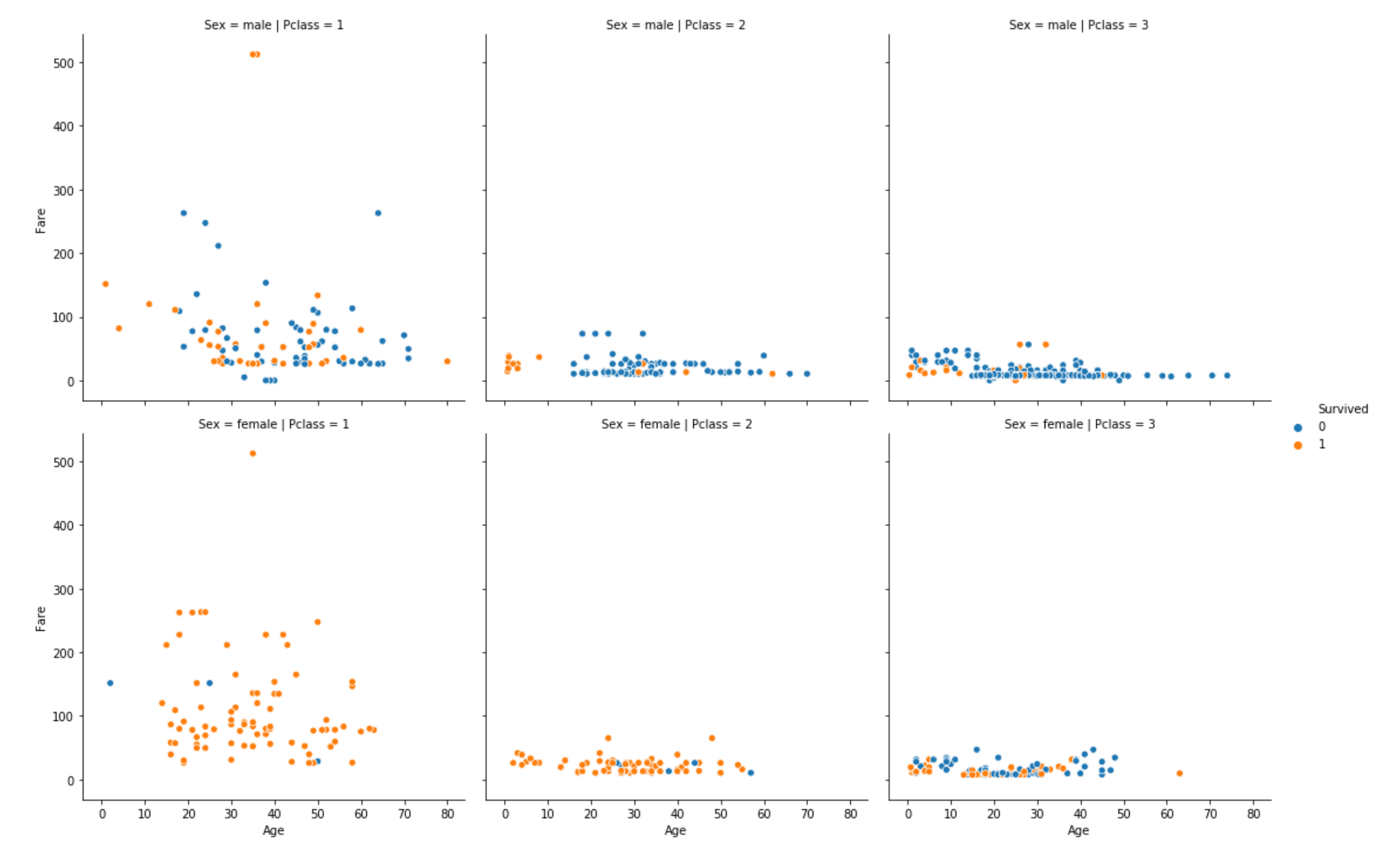
sns.relplot(x='Age', y='Fare', hue='Survived', col='Pclass', row='Sex', data=train_data)
最後に
EDA(Exploratory Data Analysis, 探索的データ探索)をするときは、比較対象とする特徴量や水準を変えながらたくさんグラフを書くことになるから、このように複雑なプロットもサクッとかけてしまうツールは重宝する。
逆に、matplotlibは、こう言ったハイレベルなツールでは手の届かない痒いところまでできるのが良いところ。Seabornじゃ描けなそうなプロットはmatplotlibで描こう、って感じかなと。